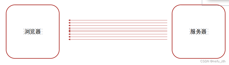
CSS精灵图
- 场景:项目中将多张小图片,合并成一张大图片,这张大图片称之为精灵图
- 优点:将多次发送转换为一次发送。减少服务器发送次数,减轻服务器的压力,提高页面加载速度
精灵图的使用步骤
- 创建一个盒子
- 通过PxCook量取小图片大小,将小图片的宽高设置给盒子
- 将精灵图设置为盒子的背景图片
- 通过PxCook测量小图片左上角坐标,分别取负值设置给盒子的background-position:xy
<!DOCTYPE html>
<html lang="en">
<head>
    <title>Document</title>
    <style>
        span {
            display: inline-block;
            width: 18px;
            height: 24px;
            background-color: pink;
            background-image: url(./images/taobao.png);
            /* 背景图位置属性: 改变背景图的位置 */
            /* 水平方向位置  垂直方向的位置 */
            /* 想要向左侧移动图片, 位置取负数;  */
            background-position: -3px 0;
        }

        b {
            display: block;
            width: 25px;
            height: 21px;
            background-color: green;
            background-image: url(./images/taobao.png);
            background-position: 0 -90px;
        }
    </style>
</head>
<body>
    <!-- <img src="./images/taobao.png" alt=""> -->
    <!-- 精灵图的标签都用行内标签  span, b, i -->
    <span></span>


    <b></b>
</body>
</html>
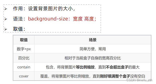
背景图片大小
<!DOCTYPE html>
<html lang="en">
<head>
    <meta charset="UTF-8">
    <meta http-equiv="X-UA-Compatible" content="IE=edge">
    <meta name="viewport" content="width=device-width, initial-scale=1.0">
    <title>Document</title>
    <style>
        .box {
            width: 400px;
            height:300px;
            background-color: pink;
            background-image: url(./images/1.jpg);
            background-repeat: no-repeat;
            /* background-size: 300px; */
            /* background-size: 50%; */

            /* 如果图的宽或高与盒子的尺寸相同了, 另一个方向停止缩放 -- 导致盒子可能有留白 */
            background-size: contain;
            /* 保证宽或高和盒子尺寸完全相同 , 导致图片显示不全 */
            /* background-size: cover; */

            /* 工作中, 图的比例和盒子的比例都是相同的, contain 和cover效果完全相同; */
        }
    </style>
</head>
<body>
    <div class="box"></div>
</body>
</html>
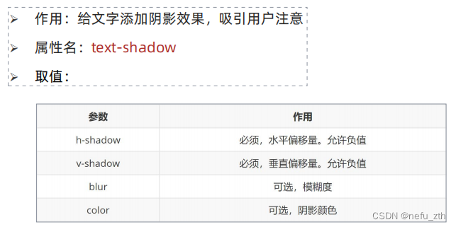
文字阴影
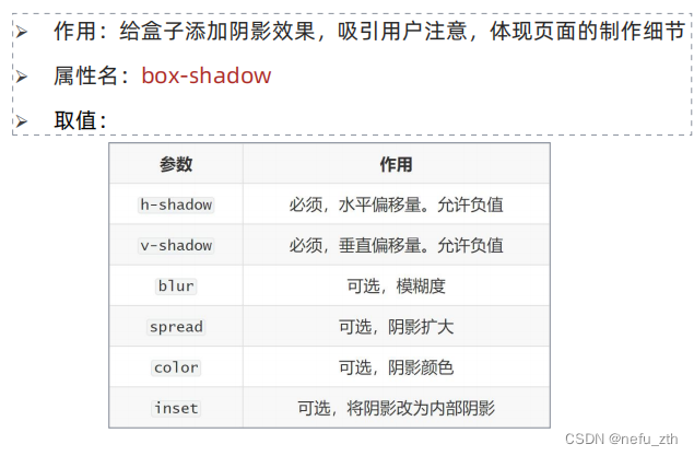
盒子阴影(六个属性按顺序书写)
<!DOCTYPE html>
<html lang="en">
<head>
<meta charset="UTF-8">
<meta http-equiv="X-UA-Compatible" content="IE=edge">
<meta name="viewport" content="width=device-width, initial-scale=1.0">
<title>Document</title>
<style>
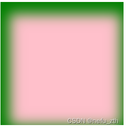
.box {
width: 200px;
height: 200px;
background-color: pink;
box-shadow: 5px 10px 20px 10px green inset;
/* 注意: 外阴影, 不能添加outset, 添加了会导致属性报错 */
/* box-shadow: 5px 10px 20px 10px green outset; */
}
</style>
</head>
<body>
<div class="box"></div>
</body>
</html>
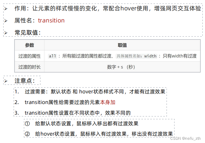
过渡
<!DOCTYPE html>
<html lang="en">
<head>
    <meta charset="UTF-8">
    <meta http-equiv="X-UA-Compatible" content="IE=edge">
    <meta name="viewport" content="width=device-width, initial-scale=1.0">
    <title>Document</title>
    <style>
        /* 过渡配合hover使用, 谁变化谁加过渡属性 */
        .box {
            width: 200px;
            height: 200px;
            background-color: pink;
            /* 宽度200, 悬停的时候宽度600, 花费1秒钟 */
            /* transition: width 1s, background-color 2s; */

            /* 如果变化的属性多, 直接写all,表示所有 */
            transition: all 1s;
        }

        .box:hover {
            width: 600px;
            background-color: red;
        }
    </style>
</head>
<body>
    <div class="box"></div>
</body>
</html>


 文章介绍了CSS精灵图技术,通过合并多个小图片为一张大图来减少HTTP请求,从而提高页面加载速度。详细阐述了精灵图的使用步骤,包括设置背景图片和调整background-position。此外,还提到了CSS的background-size、文字阴影、盒子阴影和过渡效果等其他美化和性能优化方法。


 扫一扫
扫一扫


 被折叠的 条评论
为什么被折叠?
被折叠的 条评论
为什么被折叠?
 到【灌水乐园】发言


