


 这篇博客介绍了如何利用Flex布局(弹性盒模型)来创建一个简单的响应式网页。主要内容包括弹性盒的主轴方向设置、元素的放大与缩小规则,以及在网页布局中的应用。通过设置`flex: 1 1 auto`,实现了元素根据屏幕尺寸自动调整大小,确保内容区域在不同设备上都能适配显示。示例代码展示了如何用Flex布局构建包含头部、主要内容区域(包含滚动条)的页面结构。
首先,介绍一下弹性盒的一些特点:
详情可以点击链接查看:弹性盒
效果如下:
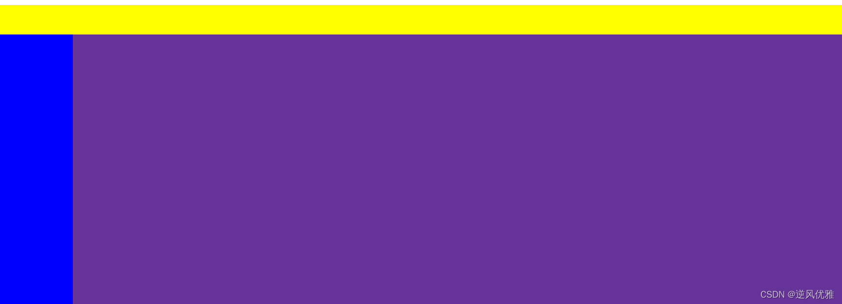
完整代码实现部分:
<!DOCTYPE html>
<html lang="en">
<head>
    <meta charset="UTF-8">
    <meta name="viewport" content="width=device-width, initial-scale=1.0">
    <title>Document</title>
</head>
<style>
    html{
      padding: 0;
      margin: 0;
      border: 0;
    }
    *{
      box-sizing: border-box;
      position: relative;
      padding: 0;
      margin: 0;
    }
    .layout{
      width: 100vw;
      height: 100vh;
      background: #eeeeee;
      display: flex;
      flex-direction: column;/*弹性盒主轴的方向:默认为水平,column为竖直方向*/
    }
    .head{
      background: yellow;
    }
    .main{
      flex: 1 1 auto;/*表示即放大又缩小*/
      background: rebeccapurple;
      display: flex;
    }
    .expand{
      /*设置定位,然后使top,left,right,bottom都为0,目的是:使得该元素被整个铺满*/
      position: absolute;
      top: 0;
      left: 0;
      right: 0;
      bottom: 0;
      display: flex;
    }

    .slider{
      background: blue;
      overflow-y: auto;
    }

    .content{
      background: #42b983;
      overflow-y: auto;
    }

    </style>
<body>
    <div class="layout">
        <div class="head">
          <div style="height: 40px;"></div>
        </div>
        <div class="main">
          <div class="expand">
            <div class="slider">
              <div style="width: 100px;"></div>
            </div>
            <div class="content">
              <div class="expand">
                <div style="height: 1000px;"></div>
              </div>
            </div>
          </div>
        </div>
      </div>
</body>
<script>

</script>
</html>
通过flex布局,实现以最少的代码,搭建网页的布局。
注意:flex 属性 是 flex-grow、flex-shrink、flex-basis三个属性的缩写。
flex: 11 auto 表示可以放大和缩小
flex: 0 1 auto 表示 不放大但会缩小(flex属性的默认值)
flex:0 0 auto 表示不放大也不缩小


 扫一扫
扫一扫


 997
997

 被折叠的 条评论
为什么被折叠?
被折叠的 条评论
为什么被折叠?
 到【灌水乐园】发言


