


 本文深入探讨Matplotlib数据可视化库的高级应用,包括注解股票图表、子图管理、自定义填充、共享X轴、多Y轴绘制、图例定制、Basemap地理绘图以及3D图形绘制等,旨在帮助读者掌握复杂数据可视化技巧。
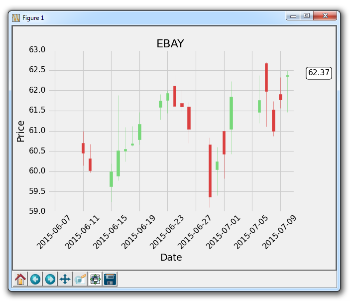
第十八章 注解股票图表的最后价格
在这个 Matplotlib 教程中,我们将展示如何跟踪股票的最后价格的示例,通过将其注解到轴域的右侧,就像许多图表应用程序会做的那样。
虽然人们喜欢在他们的实时图表中看到历史价格,他们也想看到最新的价格。 大多数应用程序做的是,在价格的y轴高度处注释最后价格,然后突出显示它,并在价格变化时,在框中将其略微移动。 使用我们最近学习的注解教程,我们可以添加一个bbox。
我们的核心代码是:
bbox_props = dict(boxstyle='round',fc='w', ec='k',lw=1)

ax1.annotate(str(closep[-1]), (date[-1], closep[-1]),
             xytext = (date[-1]+4, closep[-1]), bbox=bbox_props)
我们使用ax1.annotate来放置最后价格的字符串值。 我们不在这里使用它,但我们将要注解的点指定为图上最后一个点。 接下来,我们使用xytext将我们的文本放置到特定位置。 我们将它的y坐标指定为最后一个点的y坐标,x坐标指定为最后一个点的x坐标,再加上几个点。我们这样做是为了将它移出图表。 将文本放在图形外面就足够了,但现在它只是一些浮动文本。
我们使用bbox参数在文本周围创建一个框。 我们使用bbox_props创建一个属性字典,包含盒子样式,然后是白色(w)前景色,黑色(k)边框颜色并且线宽为 1。 更多框样式请参阅 matplotlib 注解文档。
最后,这个注解向右移动,需要我们使用subplots_adjust来创建一些新空间:
plt.subplots_adjust(left=0.11, bottom=0.24, right=0.87, top=0.90, wspace=0.2, hspace=0)
这里的完整代码如下:
import matplotlib.pyplot as plt
import matplotlib.dates as mdates
import matplotlib.ticker as mticker
from matplotlib.finance import candlestick_ohlc
from matplotlib import style

import numpy as np
import urllib
import datetime as dt

style.use('fivethirtyeight')
print(plt.style.available)

print(plt.__file__)

def bytespdate2num(fmt, encoding='utf-8'):
    strconverter = mdates.strpdate2num(fmt)
    def bytesconverter(b):
        s = b.decode(encoding)
        return strconverter(s)
    return bytesconverter

def graph_data(stock):

    fig = plt.figure()
    ax1 = plt.subplot2grid((1,1), (0,0))

    stock_price_url = 'http://chartapi.finance.yahoo.com/instrument/1.0/'+stock+'/chartdata;type=quote;range=1m/csv'
    source_code = urllib.request.urlopen(stock_price_url).read().decode()
    stock_data = []
    split_source = source_code.split('\n')
    for line in split_source:
        split_line = line.split(',')
        if len(split_line) == 6:
            if 'values' not in line and 'labels' not in line:
                stock_data.append(line)

    date, closep, highp, lowp, openp, volume = np.loadtxt(stock_data,
                                                          delimiter=',',
                                                          unpack=True,
                                                          converters={0: bytespdate2num('%Y%m%d')})

    x = 0
    y = len(date)
    ohlc = []

    while x < y:
        append_me = date[x], openp[x], highp[x], lowp[x], closep[x], volume[x]
        ohlc.append(append_me)
        x+=1

    candlestick_ohlc(ax1, ohlc, width=0.4, colorup='#77d879', colordown='#db3f3f')

    for label in ax1.xaxis.get_ticklabels():
        label.set_rotation(45)

    ax1.xaxis.set_major_formatter(mdates.DateFormatter('%Y-%m-%d'))
    ax1.xaxis.set_major_locator(mticker.MaxNLocator(10))
    ax1.grid(True)

    bbox_props = dict(boxstyle='round',fc='w', ec='k',lw=1)

    ax1.annotate(str(closep[-1]), (date[-1], closep[-1]),
                 xytext = (date[-1]+3, closep[-1]), bbox=bbox_props)

##    # Annotation example with arrow
##    ax1.annotate('Bad News!',(date[11],highp[11]),
##                 xytext=(0.8, 0.9), textcoords='axes fraction',
##                 arrowprops = dict(facecolor='grey',color='grey'))
##
##
##    # Font dict example
##    font_dict = {'family':'serif',
##                 'color':'darkred',
##                 'size':15}
##    # Hard coded text
##    ax1.text(date[10], closep[1],'Text Example', fontdict=font_dict)

    plt.xlabel('Date')
    plt.ylabel('Price')
    plt.title(stock)
    #plt.legend()
    plt.subplots_adjust(left=0.11, bottom=0.24, right=0.87, top=0.90, wspace=0.2, hspace=0)
    plt.show()

graph_data('EBAY')
结果为:
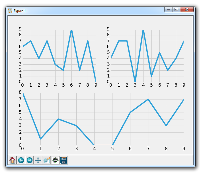
第十九章 子图
在这个 Matplotlib 教程中,我们将讨论子图。 有两种处理子图的主要方法,用于在同一图上创建多个图表。 现在,我们将从一个干净的代码开始。 如果你一直关注这个教程,那么请确保保留旧的代码,或者你可以随时重新查看上一个教程的代码。
首先,让我们使用样式,创建我们的图表,然后创建一个随机创建示例绘图的函数:
import random
import matplotlib.pyplot as plt
from matplotlib import style

style.use('fivethirtyeight')

fig = plt.figure()

def create_plots():
    xs = []
    ys = []

    for i in range(10):
        x = i
        y = random.randrange(10)

        xs.append(x)
        ys.append(y)
    return xs, ys
现在,我们开始使用add_subplot方法创建子图:
ax1 = fig.add_subplot(221)
ax2 = fig.add_subplot(222)
ax3 = fig.add_subplot(212)
它的工作原理是使用 3 个数字,即:行数(numRows)、列数(numCols)和绘图编号(plotNum)。
所以,221 表示两行两列的第一个位置。222 是两行两列的第二个位置。最后,212 是两行一列的第二个位置。
2x2:

+-----+-----+
|  1  |  2  |
+-----+-----+
|  3  |  4  |
+-----+-----+

2x1:

+-----------+
|     1     |
+-----------+
|     2     |
+-----------+
译者注:原文此处表述有误,译文已更改。
译者注:
221是缩写形式,仅在行数乘列数小于 10 时有效,否则要写成2,2,1。
此代码结果为:
这就是add_subplot。 尝试一些你认为可能很有趣的配置,然后尝试使用add_subplot创建它们,直到你感到满意。
接下来,让我们介绍另一种方法,它是subplot2grid。
删除或注释掉其他轴域定义,然后添加:
ax1 = plt.subplot2grid((6,1), (0,0), rowspan=1, colspan=1)
ax2 = plt.subplot2grid((6,1), (1,0), rowspan=4, colspan=1)
ax3 = plt.subplot2grid((6,1), (5,0), rowspan=1, colspan=1)
所以,add_subplot不能让我们使一个绘图覆盖多个位置。 但是这个新的subplot2grid可以。 所以,subplot2grid的工作方式是首先传递一个元组,它是网格形状。 我们传递了(6,1),这意味着整个图表分为六行一列。 下一个元组是左上角的起始点。 对于ax1,这是0,0,因此它起始于顶部。 接下来,我们可以选择指定rowspan和colspan。 这是轴域所占的行数和列数。
6x1:

          colspan=1
(0,0)   +-----------+
        |    ax1    | rowspan=1
(1,0)   +-----------+
        |           |
        |    ax2    | rowspan=4
        |           |
        |           |
(5,0)   +-----------+
        |    ax3    | rowspan=1
        +-----------+
结果为:
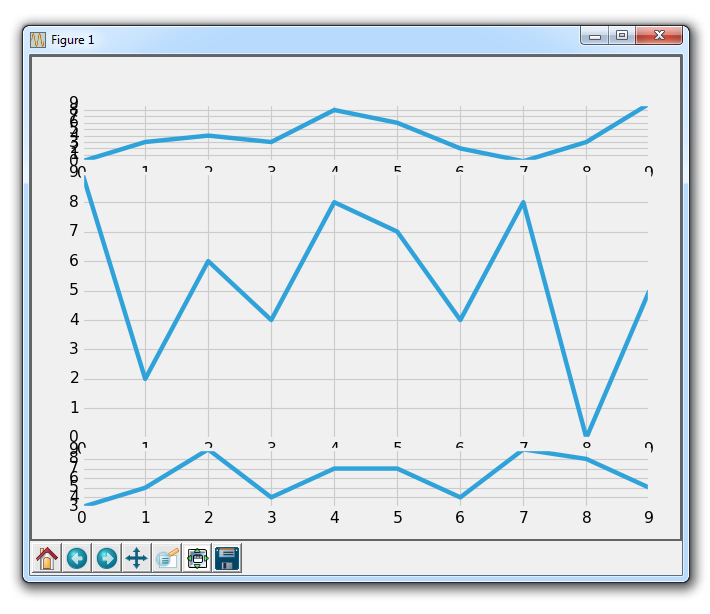
显然,我们在这里有一些重叠的问题,我们可以调整子图来处理它。
再次,尝试构思各种配置的子图,使用subplot2grid制作出来,直到你感到满意!
我们将继续使用subplot2grid,将它应用到我们已经逐步建立的代码中,我们将在下一个教程中继续。
第二十一章 更多指标数据
在这篇 Matplotlib 教程中,我们介绍了添加一些简单的函数来计算数据,以便我们填充我们的轴域。 一个是简单的移动均值,另一个是简单的价格 HML 计算。
这些新函数是:
def moving_average(values, window):
    weights = np.repeat(1.0, window)/window
    smas = np.convolve(values, weights, 'valid')
    return smas

def high_minus_low(highs, lows):
    return highs-lows
你不需要太过专注于理解移动均值的工作原理,我们只是对样本数据来计算它,以便可以学习更多自定义 Matplotlib 的东西。
我们还想在脚本顶部为移动均值定义一些值:
MA1 = 10
MA2 = 30
下面,在我们的graph_data函数中:
ma1 = moving_average(closep,MA1)
ma2 = moving_average(closep,MA2)
start = len(date[MA2-1:])

h_l = list(map(high_minus_low, highp, lowp))
在这里,我们计算两个移动均值和 HML。
我们还定义了一个『起始』点。 我们这样做是因为我们希望我们的数据排成一行。 例如,20 天的移动均值需要 20 个数据点。 这意味着我们不能在第 5 天真正计算 20 天的移动均值。 因此,当我们计算移动均值时,我们会失去一些数据。 为了处理这种数据的减法,我们使用起始变量来计算应该有多少数据。 这里,我们可以安全地使用[-start:]绘制移动均值,并且如果我们希望的话,对所有绘图进行上述步骤来排列数据。
接下来,我们可以在ax1上绘制 HML,通过这样:
ax1.plot_date(date,h_l,'-')
最后我们可以通过这样向ax3添加移动均值:
ax3.plot(date[-start:], ma1[-start:])
ax3.plot(date[-start:], ma2[-start:])
我们的完整代码,包括增加我们所用的时间范围:
import matplotlib.pyplot as plt
import matplotlib.dates as mdates
import matplotlib.ticker as mticker
from matplotlib.finance import candlestick_ohlc
from matplotlib import style

import numpy as np
import urllib
import datetime as dt

style.use('fivethirtyeight')
print(plt.style.available)

print(plt.__file__)

MA1 = 10
MA2 = 30

def moving_average(values, window):
    weights = np.repeat(1.0, window)/window
    smas = np.convolve(values, weights, 'valid')
    return smas

def high_minus_low(highs, lows):
    return highs-lows

def bytespdate2num(fmt, encoding='utf-8'):
    strconverter = mdates.strpdate2num(fmt)
    def bytesconverter(b):
        s = b.decode(encoding)
        return strconverter(s)
    return bytesconverter

def graph_data(stock):

    fig = plt.figure()
    ax1 = plt.subplot2grid((6,1), (0,0), rowspan=1, colspan=1)
    plt.title(stock)
    ax2 = plt.subplot2grid((6,1), (1,0), rowspan=4, colspan=1)
    plt.xlabel('Date')
    plt.ylabel('Price')
    ax3 = plt.subplot2grid((6,1), (5,0), rowspan=1, colspan=1)

    stock_price_url = 'http://chartapi.finance.yahoo.com/instrument/1.0/'+stock+'/chartdata;type=quote;range=1y/csv'
    source_code = urllib.request.urlopen(stock_price_url).read().decode()
    stock_data = []
    split_source = source_code.split('\n')
    for line in split_source:
        split_line = line.split(',')
        if len(split_line) == 6:
            if 'values' not in line and 'labels' not in line:
                stock_data.append(line)

    date, closep, highp, lowp, openp, volume = np.loadtxt(stock_data,
                                                          delimiter=',',
                                                          unpack=True,
                                                          converters={0: bytespdate2num('%Y%m%d')})

    x = 0
    y = len(date)
    ohlc = []

    while x < y:
        append_me = date[x], openp[x], highp[x], lowp[x], closep[x], volume[x]
        ohlc.append(append_me)
        x+=1

    ma1 = moving_average(closep,MA1)
    ma2 = moving_average(closep,MA2)
    start = len(date[MA2-1:])

    h_l = list(map(high_minus_low, highp, lowp))

    ax1.plot_date(date,h_l,'-')

    candlestick_ohlc(ax2, ohlc, width=0.4, colorup='#77d879', colordown='#db3f3f')

    for label in ax2.xaxis.get_ticklabels():
        label.set_rotation(45)

    ax2.xaxis.set_major_formatter(mdates.DateFormatter('%Y-%m-%d'))
    ax2.xaxis.set_major_locator(mticker.MaxNLocator(10))
    ax2.grid(True)

    bbox_props = dict(boxstyle='round',fc='w', ec='k',lw=1)

    ax2.annotate(str(closep[-1]), (date[-1], closep[-1]),
                 xytext = (date[-1]+4, closep[-1]), bbox=bbox_props)

##    # Annotation example with arrow
##    ax2.annotate('Bad News!',(date[11],highp[11]),
##                 xytext=(0.8, 0.9), textcoords='axes fraction',
##                 arrowprops = dict(facecolor='grey',color='grey'))
##
##
##    # Font dict example
##    font_dict = {'family':'serif',
##                 'color':'darkred',
##                 'size':15}
##    # Hard coded text
##    ax2.text(date[10], closep[1],'Text Example', fontdict=font_dict)

    ax3.plot(date[-start:], ma1[-star
最低0.47元/天 解锁文章


 1460
1460

 被折叠的 条评论
为什么被折叠?
被折叠的 条评论
为什么被折叠?
 到【灌水乐园】发言


