import pandas as pd
import numpy as np
from pyecharts.charts import Radar
import pyecharts.options as opts
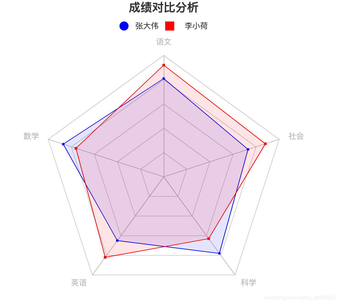
data1 =[81,87,65,78,73]
data2 =[92,76,82,63,88]
雷达图
ind=['语文','数学','英语','科学','社会']
rii=[]for i in ind:
rii.append(opts.RadarIndicatorItem(i,max_=100))
r=(
Radar().add_schema(rii,center=['50%','55%']).add('张大伟',[data1],color='blue',symbol='circle',areastyle_opts=opts.AreaStyleOpts(opacity=0.1)).add('李小荷',[data2],color='red',symbol='square',areastyle_opts=opts.AreaStyleOpts(opacity=0.1)).set_series_opts(label_opts=opts.LabelOpts(is_show=False)).set_global_opts(
title_opts=opts.TitleOpts(title='成绩对比分析',pos_left='center'),
legend_opts=opts.LegendOpts(pos_top=30)))
r.render_notebook()
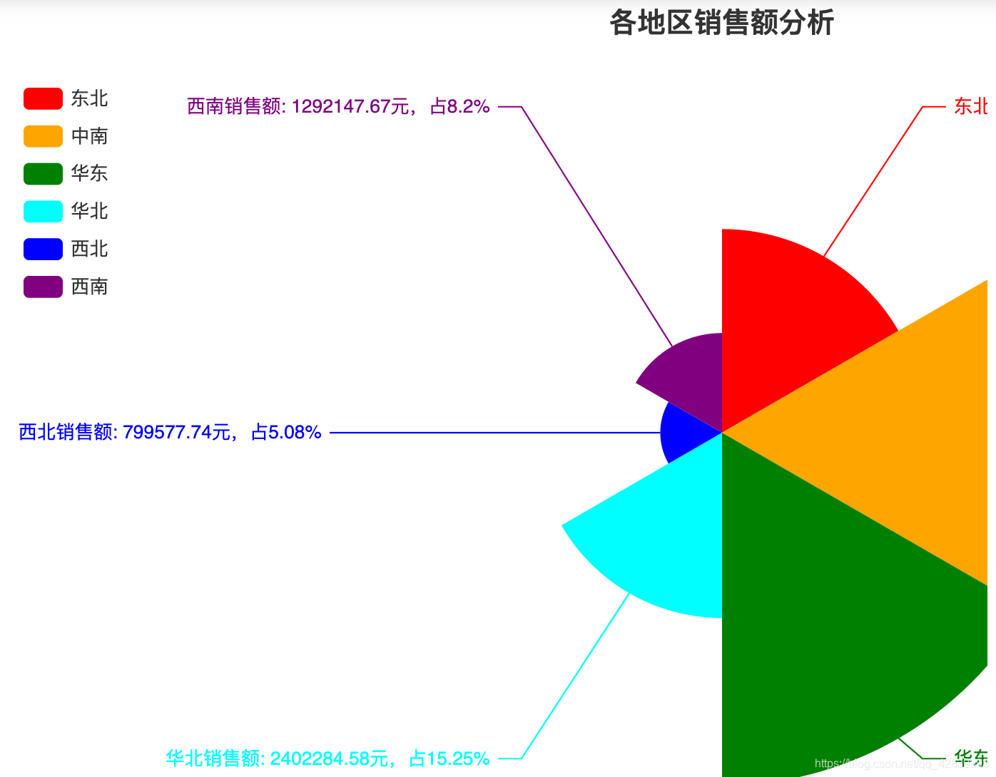
玫瑰图
df = pd.read_csv("sales.csv",header =None)
data = df.iloc[:,[11,16]].groupby(11).sum()from pyecharts.charts import Pie
from pyecharts.faker import Faker
import pyecharts.options as opts
x =list(data.index)
y =list(np.round(data[16],2))
pie=(
Pie().add("",list(zip(x, y)), radius=("0%","90%"), center=("50%","55%"), rosetype="area").set_colors(["red","orange","green","cyan","blue","purple"]).set_series_opts(label_opts=opts.LabelOpts(formatter="{b}销售额: {c}元,占{d}%")).set_global_opts(
title_opts=opts.TitleOpts(title="各地区销售额分析", subtitle="", pos_left="center"),
legend_opts=opts.LegendOpts(orient="vertical", pos_top="10%", pos_left="0")))
pie.render_notebook()


 6343
6343

 被折叠的 条评论
为什么被折叠?
被折叠的 条评论
为什么被折叠?
 到【灌水乐园】发言


