


文章目录
Seaborn是基于matplotlib的Python可视化库。它提供了一个高级界面来绘制有吸引力的统计图形。
import numpy as np
import matplotlib.pyplot as plt
import seaborn as sns
数据集
seaborn自带了一些经典的数据集,用于基本的绘制图表示例数据。在联网状态下,可通过load_dataset 接口进行获取,首次下载后即可通过缓存加载。返回数据集格式为Pandas.DataFrame对象。
seaborn.load_dataset( name , cache = True , data_home = None , ** kws )
常用的经典数据集如下:
- iris:鸢尾花,与sklearn中数据集一致,仅有数值型数据
- tips:小费,主要是中餐和晚餐的数据集,既有分类数据也有数值数据,可用于探索数据间的回归关系
- titanic:泰坦尼克,经典数据集
关系图
核心函数
seaborn 提供了几个用于表达双变量关系的图表,主要包括散点和线图两类,主要提供了3个 seaborn 接口:
- relplot:(relation plot) 图形级通用接口,依赖于 FacetGrid 类,返回该类实例。relplot可通过kind参数选择绘制图表是scatter还是line类型。
- scatterplot:散点图,等价于 relplot(kind=‘scatter’)。
- lineplot:折线图,等价于 relplot(kind=‘line’)。
其中relplot为figure-level(可简单理解为操作对象是matplotlib中figure),而后两者是axes-level(对应操作对象是matplotlib中的axes)。但实际上接口调用方式和传参模式都是一致的。
其核心参数主要包括以下几个:
- data:pandas.DataFrame, numpy.ndarray, mapping, or sequence
- x, y:vector or key in data,指定 x 轴和 y 轴位置的变量
- hue, size, style:vector or key in data,用不同色调(颜色)、大小、样式分组的变量
- row, col:vector or key in data,不同facets绘制的子图
- palette:string, list, dict, or matplotlib.colors.Colormap,调色板
- legend:auto, brief, full, or False,图例
- kind:string, scatter or line,默认为scatter类型。
- kwargs:dict,其他axes-level接口关键参数
- ax:matplotlib.axes.Axes,scatterplot和lineplot设置坐标系统的参数
散点图
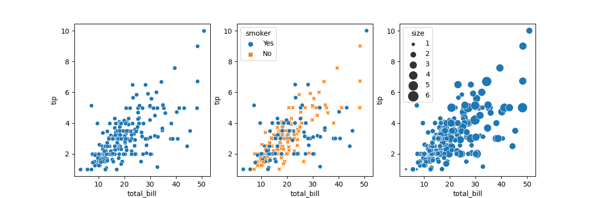
以小费数据集为例,绘制两变量散点图如下:
tips = sns.load_dataset("tips")
sns.relplot(x="total_bill", y="tip", data=tips)
sns.relplot(x="total_bill", y="tip", hue="smoker", style="smoker",data=tips)
sns.relplot(x="total_bill", y="tip", size="size", sizes=(15, 200), data=tips)
折线图
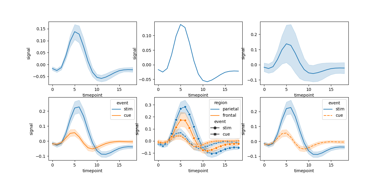
seaborn 中折线图的默认行为是将同一x轴上的多个测量值的平均值作为折线图中的点的位置,并围绕平均值表达的 95% 置信区间。置信区间是使用 bootstrapping 计算的,对于较大的数据集可以禁用它们,也可以定义为标准差。
fmri = sns.load_dataset("fmri")
sns.relplot(x="timepoint", y="signal", kind="line", data=fmri)
sns.relplot(x="timepoint", y="signal", ci=None, kind="line", data=fmri)
sns.relplot(x="timepoint", y="signal", kind="line", ci="sd", data=fmri)

sns.relplot(x="timepoint", y="signal", hue="event", kind="line", data=fmri)
sns.relplot(x="timepoint", y="signal", hue="region", style="event",
            dashes=False, markers=True, kind="line", data=fmri)
sns.relplot(x="timepoint", y="signal", hue="event", style="event",
            kind="line", data=fmri)
分面图
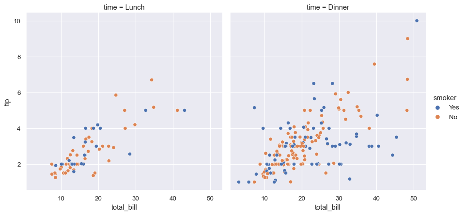
由于 relplot 是基于FacetGrid,很容易分面可视化。
sns.relplot(x="total_bill", y="tip", hue="smoker",
            col="time", data=tips);
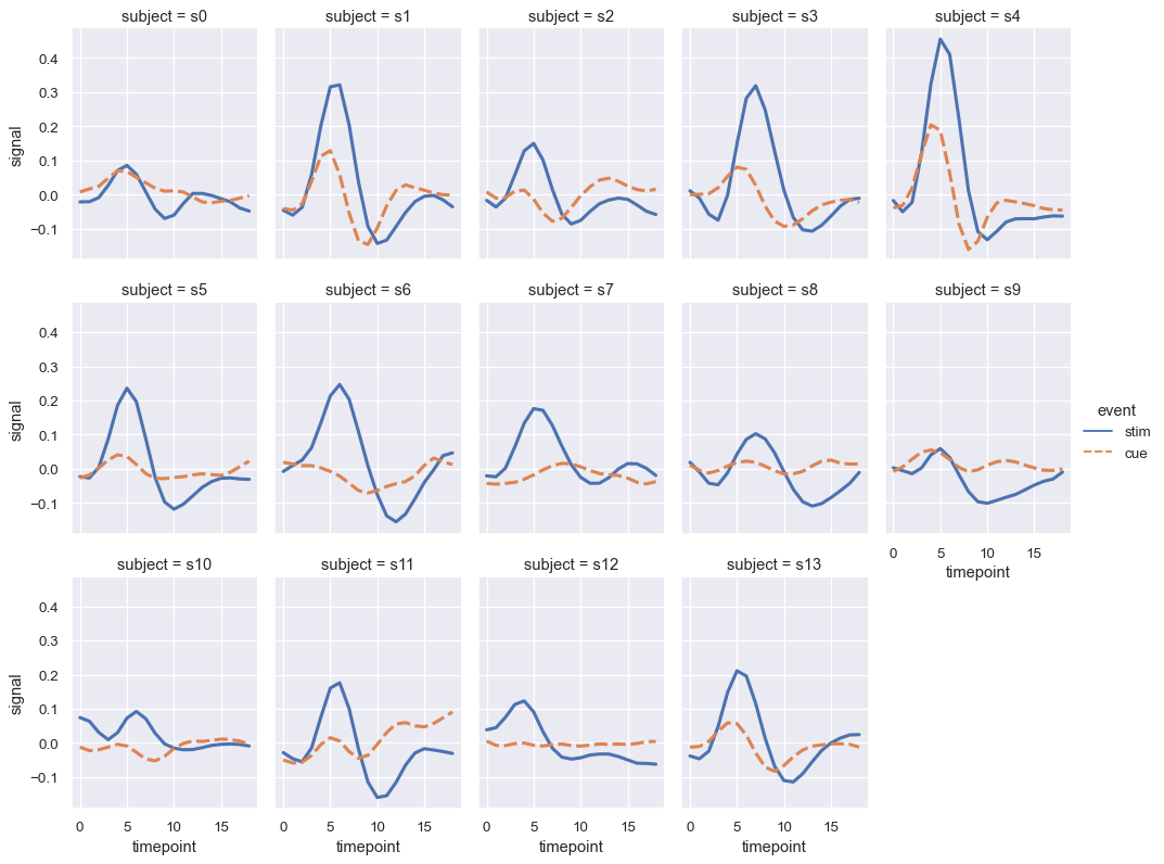
当您想要检查变量的多个级别的影响时,最好在列上对该变量进行分面,然后将分面包装到行中,同时可能希望减小图形大小。这些可视化通常被称为点阵图或小倍数,非常有效。
sns.relplot(x="timepoint", y="signal", hue="event", style="event",
            col="subject", col_wrap=5,
            height=3, aspect=.75, linewidth=2.5,
            kind="line", data=fmri.query("region == 'frontal'"))
分布图
核心函数
变量分布可用于表达一组数值的分布趋势,包括集中程度、离散程度等。seaborn 内置接口如下
- displot:(distribution plot) 图形级通用接口,依赖于 FacetGrid 类,返回该类实例。接口内置了直方图(histogram, default)、核密度估计图(kde,kernel density estimation)、经验累积分布图(ecdf,empirical cumulative distribution function)以及rug图。
- histplot:单变量或双变量直方图,等价于 displot(kind=‘hist’)。
- kdeplot:单变量或双变量核密度估计,等价于 displot(kind=‘kde’)。
- ecdfplot:经验累积分布图,等价于 displot(kind=‘ecdf’)。
- rugplot:地毯图,沿 x 和 y 轴边缘绘制刻度,通过 displot(rug=True) 来添加。
- distplot:已弃用,单变量分布图。
其中displot为figure-level(可简单理解为操作对象是matplotlib中figure),而后两者是axes-level(对应操作对象是matplotlib中的axes)。但实际上接口调用方式和传参模式都是一致的。
其核心参数主要包括以下几个:
- data:pandas.DataFrame, numpy.ndarray, mapping, or sequence
- x, y:vector or key in data,指定 x 轴和 y 轴位置的变量
- hue:vector or key in data,用不同色调(颜色)分组的变量
- row, col:vector or key in data,不同facets绘制的子图
- palette:string, list, dict, or matplotlib.colors.Colormap,调色板
- legend:bool,是否显示图例
- kind:string, one of {hist, kde, ecdf},默认为hist类型。
- rug:bool,在边缘绘制地毯图
- kwargs:dict,其他axes-level接口关键参数
- ax:matplotlib.axes.Axes,axes-level接口设置坐标系统的参数
直方图
直方图 seaborn.histplot 专用参数:
- weights:vector or key in data,加权变量
- stat:str,在每个 bin 中的聚合统计方法
count: 计数frequency: 频率,样本数量除以 bin 宽度probability: orproportion,标准化使得条形高度总和为 1percent: 标准化使得条形高度总和为 100density: 标准化使得直方图的总面积等于 1
- General_norm:bool,是否将归一化将应用于整个数据集,如果False,则单独归一化
- bins:str, number, vector, or a pair of such values,bin的数量,bin数组
- binwidth:number or pair of numbers, bin 的宽度
- multiple:one of {laye, dodg, stack, fill},多分组堆叠的方式,仅适用于单变量分布
- element:{bars, step, poly},直方图统计的可视化表示,仅适用于单变量分布
- fill:bool,是否填充直方图下方的空间,仅适用于单变量分布
- shrink:number,相对于 binwidth 缩放每个条的宽度,仅适用于单变量分布
- kde:bool,是否显示kde,仅适用于单变量分布
- thresh:number or None,统计数据小于或等于此阈值的单元格将是透明的,仅适用于二元分布
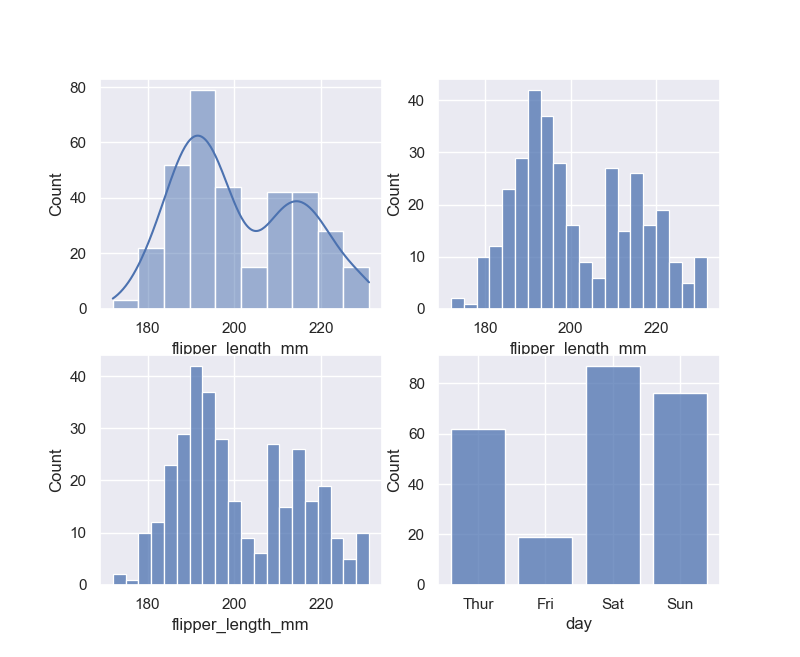
默认情况下,displot()/histplot()根据数据的方差和样本数量选择默认的 bin 大小,它们取决于对数据结构的特定假设,可以用binwidth参数设置,也可指定bin的数量。shrink参数可以稍微缩小bin以强调轴的分类性质。
penguins = sns.load_dataset("penguins")
sns.displot(penguins, x="flipper_length_mm", kde = True)
sns.displot(penguins, x="flipper_length_mm", binwidth=3)
sns.displot(penguins, x="flipper_length_mm", bins=20)
tips = sns.load_dataset("tips")
sns.displot(tips, x="day", shrink=.8)
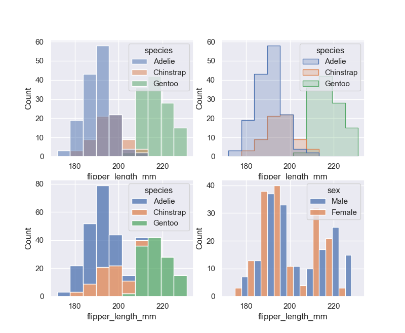
默认情况下,不同的直方图相互分层,在某些情况下,它们可能难以区分。一种选择是将直方图的视觉表示从条形图更改为阶梯图。或者,不是将每个条分层,而是可以堆叠或垂直移动。在此图中,完整直方图的轮廓展示单变量分布:
sns.displot(penguins, x="flipper_length_mm", hue="species")
sns.displot(penguins, x="flipper_length_mm", hue="species", element="step")
sns.displot(penguins, x="flipper_length_mm", hue="species", multiple="stack")
sns.displot(penguins, x="flipper_length_mm", hue="sex", multiple="dodge")
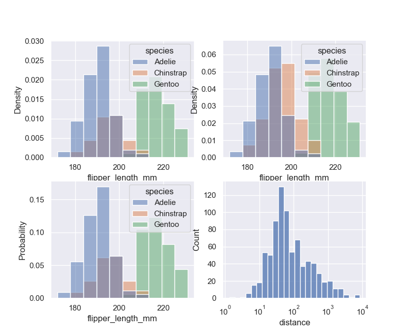
还有一点要注意,当子集的观察数量不等时,比较它们的计数分布可能并不理想。一种解决方案是使用参数对计数进行归一化。默认情况下,归一化应用于整个分布,因此这只是重新调整条形的高度。通过设置common_norm=False,每个子集将被独立标准化。密度归一化缩放条形,使它们的面积总和为 1。另一种选择是将条形标准化为它们的高度总和为 1,这在变量是离散时最有意义:
sns.displot(penguins, x="flipper_length_mm", hue="species", stat="density")
sns.displot(penguins, x="flipper_length_mm", hue="species", stat="density", common_norm=False)
sns.displot(penguins, x="flipper_length_mm", hue="species", stat="probability")
planets = sns.load_dataset("planets")
sns.displot(data=planets, x="distance", log_scale=True)
核密度估计
直方图旨在通过分箱和计数观察来近似生成数据的潜在概率密度函数。核密度估计 (KDE) 为同一问题提供了不同的解决方案。KDE 图不是使用离散箱,而是使用高斯核平滑观察,产生连续密度估计。
核密度 seaborn.kdeplot 专用参数:
- bw_meod:string, scalar, or callable, optional,要使用的平滑带宽的方法;passed to
scipy.stats.gaussian_kde. - bw_adjust:number, optional,平滑带宽的缩放因子
- cbar:bool,添加颜色条以注释双变量图中的颜色映射
- multiple:one of {layer, stack, fill},多分组堆叠的方式,仅适用于单变量分布
- levels:int or vector in [0, 1],等高线的数量或者列表,仅适用于二元分布
- thresh:number in [0, 1],低于最低等高线级别时将被忽略,仅适用于二元分布
- fill:bool or None,填充单变量密度曲线下或双变量轮廓之间的区域
- cumulative:bool, optional,累积分布曲线
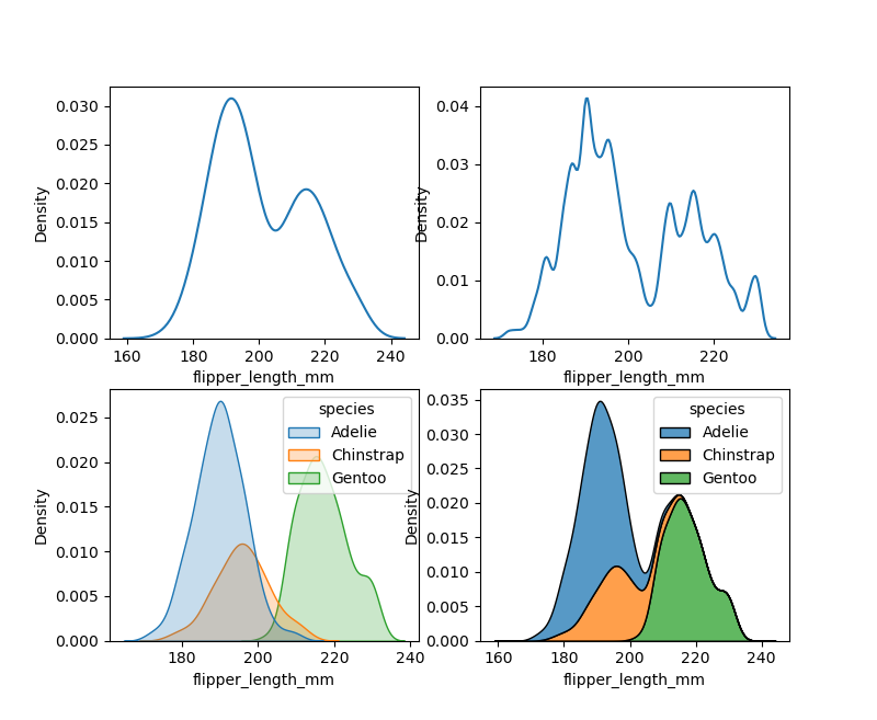
与直方图中的 bin 大小非常相似,KDE也可以调整平滑带宽 bw_adjust。如果您分配一个hue变量,将为该变量的每个级别计算单独的密度估计。
sns.displot(penguins, x="flipper_length_mm", kind="kde")
sns.displot(penguins, x="flipper_length_mm", kind="kde", bw_adjust=.25)
sns.displot(penguins, x="flipper_length_mm", hue="species", kind="kde", fill=True)
sns.displot(penguins, x="flipper_length_mm", hue="species", kind="kde", multiple="stack")
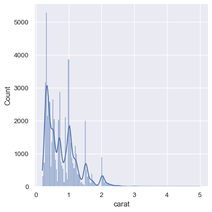
KDE 方法也不适用于离散数据或数据自然连续但特定值被过度集中的情况。要记住的重要一点是,即使数据本身并不平滑,KDE 也会始终显示平滑曲线。例如,考虑钻石重量的这种分布,可以将直方图和KDE结合起来
diamonds = sns.load_dataset("diamonds")
sns.displot(diamonds, x="carat", kde=True)
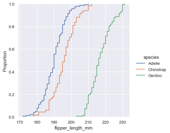
经验累积分布
经验累积分布函数(ECDF)通过每个数据点绘制了一条单调增加的曲线。与直方图或 KDE 不同,它直接表示每个数据点。这意味着没有要考虑的 bin 大小或平滑参数。此外,由于曲线是单调递增的,因此非常适合比较多个分布。
sns.displot(penguins, x="flipper_length_mm", hue="species", kind="ecdf")
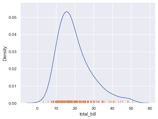
地毯图
这是一个不太常用的图表类型,其绘图方式比较朴素:即原原本本的将样本出现的位置绘制在相应坐标轴上,同时忽略出现次数的影响。
tips = sns.load_dataset("tips")
sns.kdeplot(data=tips, x="total_bill")
sns.rugplot(data=tips, x="total_bill")
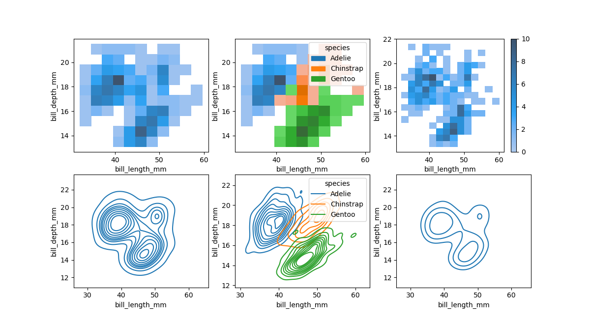
二元分布
- 双变量直方图:将平铺图的矩形内的数据分箱,然后使用填充颜色(类似于heatmap)显示每个矩形内的样本数量。与单变量图一样,bin 大小或平滑带宽的选择将决定该图表示潜在双变量分布的程度。
- 二元 KDE 图:类似地,二元 KDE 图使用 2D 高斯函数平滑 (x, y) 样本量。默认表示然后显示2D 密度的轮廓。双变量密度等值线是以密度的等比例绘制的,等高线的最低水平由thresh参数和受控的数量levels控制。
sns.displot(penguins, x="bill_length_mm", y="bill_depth_mm")
sns.displot(penguins, x="bill_length_mm", y="bill_depth_mm", hue="species")
sns.displot(penguins, x="bill_length_mm", y="bill_depth_mm", binwidth=(2, .5), cbar=True)
sns.displot(penguins, x="bill_length_mm", y="bill_depth_mm", kind="kde")
sns.displot(penguins, x="bill_length_mm", y="bill_depth_mm", hue="species", kind="kde")
sns.displot(penguins, x="bill_length_mm", y="bill_depth_mm", kind="kde", thresh=.2, levels=4)
分类图
核心函数
Seaborn 中关系型接口 (relplot) 主要用来关注两个数值变量之间的情况,如果主要变量之一是离散变量,则使用分类图接口。
catplot:(categorical plot)图形级通用接口,依赖于 FacetGrid 类,返回该类实例。此函数始终将变量之一视为分类变量,并在相关轴上的序数位置 (0, 1, … n) 绘制数据,即使数据具有数字或日期类型也是如此。函数内置了三个不同的系列的分类接口。
分类散点图:
- stripplot:分类散点图,其中一个变量是分类变量。等价于 catplot(kind=‘strip’),默认值 。
- swarmplot:绘制具有非重叠点的分类散点图。等价于 catplot(kind=‘swarm’)
分类分布图:
- boxplot:箱线图。等价于 catplot(kind=‘box’)
- violinplot:小提琴图。等价于 catplot(kind=‘violin’)
- boxenplot:为较大的数据集绘制增强型箱线图。等价于 catplot(kind=‘boxen’)
分类估计图:
- pointplot:使用散点图形显示点估计和置信区间。等价于 catplot(kind=‘point’)
- barplot:条形图。等价于 catplot(kind='b’ar)
- countplot:显示样本量的条形图。等价于 catplot(kind=‘count’)
其中catplot为figure-level(可简单理解为操作对象是matplotlib中figure),而后三个系列的是axes-level(对应操作对象是matplotlib中的axes)。但实际上接口调用方式和传参模式都是一致的。
其核心参数主要包括以下几个:
- data:pandas.DataFrame,
- x, y:vector or key in data,指定 x 轴和 y 轴位置的变量
- hue,:vector or key in data,用不同色调(颜色)分组的变量
- row, col:key in data,不同facets绘制的子图
- palette:string, list, dict, or matplotlib.colors.Colormap,调色板
- legend:bool,是否显示图例
- kind:string, one of { strip, swarm, box, violin, boxen, point, bar, count},默认为strip类型。
- order, hue_order:lists of strings, optional,绘制分类的顺序列表
- kwargs:dict,其他axes-level接口关键参数
- ax:matplotlib.axes.Axes,axes-level接口设置坐标系统的参数
散点图
相比于两列数据均为数值型数据,可以想象分类数据的散点图将会是多条竖直的散点线。绘图接口有stripplot(default)和swarmplot两种。专用参数主要包括:
- jitter:float, True/1 is special-cased, optional,开启散点少量随机”抖动“调整分类轴上的点的位置。
- dodge:bool, optional,躲避,与hue配合时若为False,则每个级别的点将绘制在彼此之上。
stripplot 是常规的散点图接口,可通过jitter参数开启散点少量随机”抖动“调整分类轴上的点的位置。swarmplot在stripplot的基础上,不仅将散点图通过抖动来实现相对分离,而且会严格讲各散点一字排开,从而便于直观观察散点的分布聚集情况,它只适用于相对较小的数据集,有时被称为“蜂群”。
也可以使用order参数在特定于绘图的基础上控制排序。
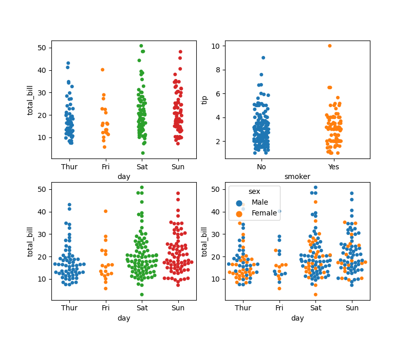
sns.catplot(x="day", y="total_bill", data=tips)
sns.catplot(x="day", y="total_bill", kind="swarm", data=tips)
sns.catplot(x="day", y="total_bill", hue="sex", kind="swarm", data=tips)
sns.catplot(x="smoker", y="tip", order=["No", "Yes"], data=tips)
分布图
与数值型变量分布类似,seaborn也提供了几个分类型数据常用的分布绘图接口。
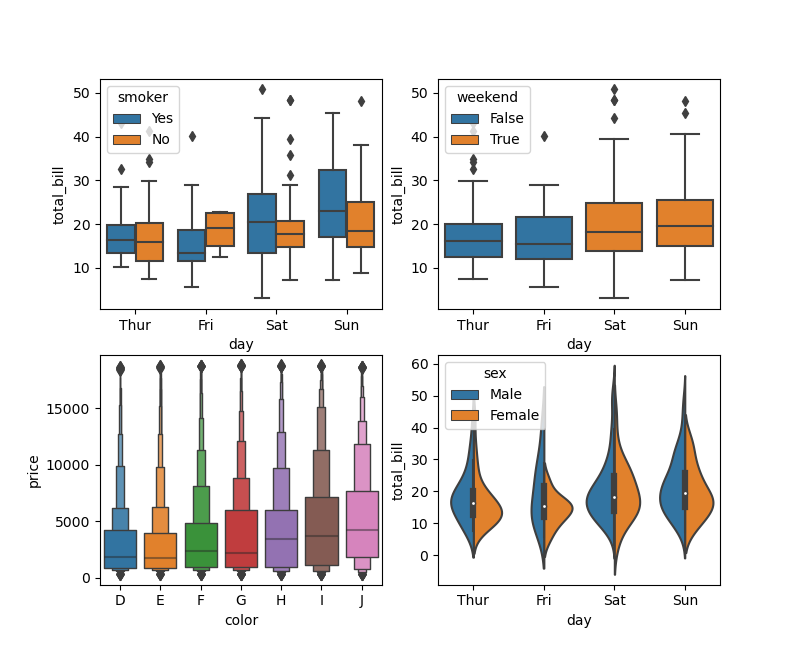
- boxplot:箱线图,以一种便于比较变量之间或跨分类变量水平的方式显示定量数据的分布。这种图显示了分布的三个四分位数和极值。“胡须”延伸到位于下四分位数和上四分位数 1.5 IQR 以内的点,然后独立显示超出此范围的观测值,常用于查看数据异常值等。
- boxenplot:是一个增强版的箱线图,即box+enhenced+plot,在标准箱线图的基础上增加了更多的分位数信息,绘图效果更为美观,信息量更大。它最适合更大的数据集
- violinplot:小提琴图,相当于boxplot+kdeplot,即在标准箱线图的基础上增加了kde图的信息,从而可更为直观的查看数据分布情况。因其绘图结果常常酷似小提琴形状,因而得名violinplot。在hue分类仅有2个取值时,还可通过设置split参数实现左右数据合并显示。
专用参数主要包括:
- dodge:bool, optional,使用hue嵌套时,元素默认应沿分类轴移动,因此它们不会重叠,这种行为被称为“躲避”。如果不需要躲避,则可以禁用。
- whis:float, optional,通过IQR比例扩展图须,此范围之外的点将被识别为异常值。
- split:bool, optional,当使用带有两个级别的变量的色调嵌套时,设为True,更容易地直接比较分布
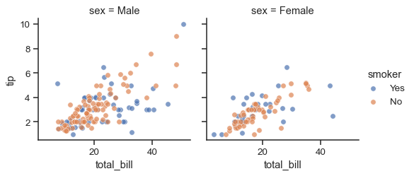
sns.catplot(x="day", y="total_bill", hue="smoker", kind="box", data=tips)
tips["weekend"] = tips["day"].isin(["Sat", "Sun"])
sns.catplot(x="day", y="total_bill", hue="weekend",
            kind="box", dodge=False, data=tips)
diamonds = sns.load_dataset("diamonds")
sns.catplot(x="color", y="price", kind="boxen",
            data=diamonds.sort_values("color"))
sns.catplot(x="day", y="total_bill", hue="sex",
            kind="violin", split=True, data=tips)
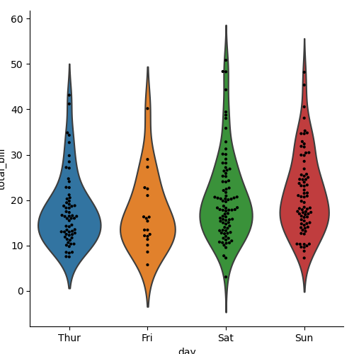
将swarmplot()/striplot()和箱线图/小提琴图来结合绘图有时也很有用:
g = sns.catplot(x="day", y="total_bill", kind="violin", inner=None, data=tips)
sns.swarmplot(x="day", y="total_bill", color="k", size=3, data=tips, ax=g.ax)
统计图
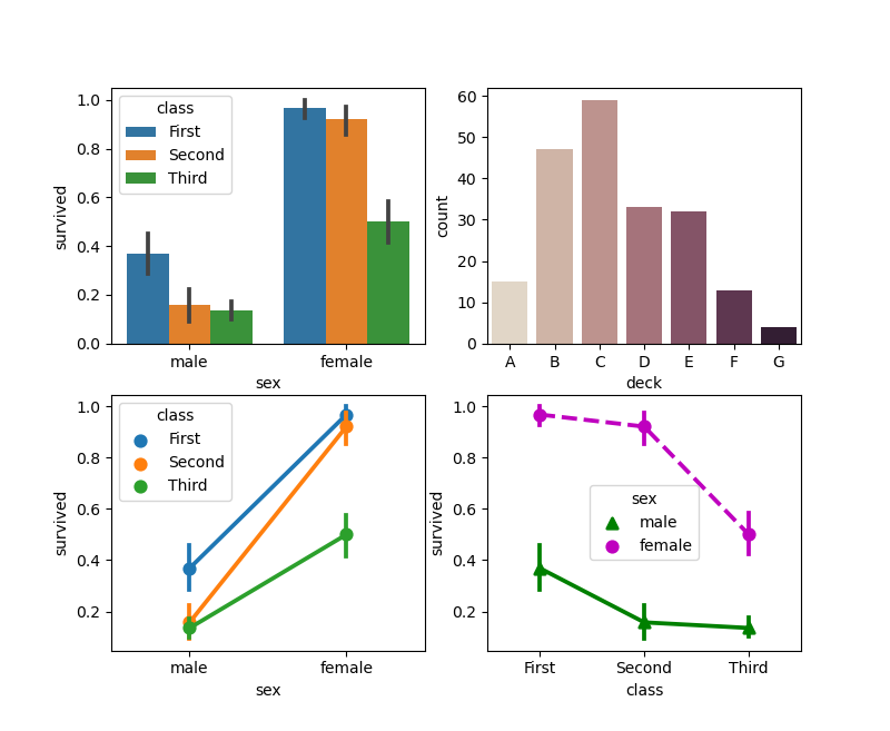
- barplot:条形图以每个矩形高度出了数据的统计量(默认取平均值),并使用误差条表示相应置信区间(confidence intervals,默认值为95%,即参数ci=.95)
- countplot:条形图的一个特例,仅用于表达各分类值计数
- pointplot:与barplot不同,pointplot以相应的点和线表达统计量和置信区间
专用参数主要包括:
- estimator:callable that maps vector -> scalar, optional,统计函数
- ci:float or “sd” or None, optional,置信区间的大小。如果为"sd",则绘制标准差。如果None,则不会绘制误差线。
- markers:string or list of strings, optional,每个hue组别的点样式。
- linestyles:string or list of strings, optional,每个hue组别的线条样式。
- join:bool, optional,如果True,将在同一hue组别的点之间相连 。
titanic = sns.load_dataset("titanic")
sns.catplot(x="sex", y="survived", hue="class", kind="bar", data=titanic)
sns.catplot(x="deck", kind="count", palette="ch:.25", data=titanic)
sns.catplot(x="sex", y="survived", hue="class", kind="point", data=titanic)
sns.catplot(x="class", y="survived", hue="sex",
            palette={"male": "g", "female": "m"},
            markers=["^", "o"], linestyles=["-", "--"],
            kind="point", data=titanic)
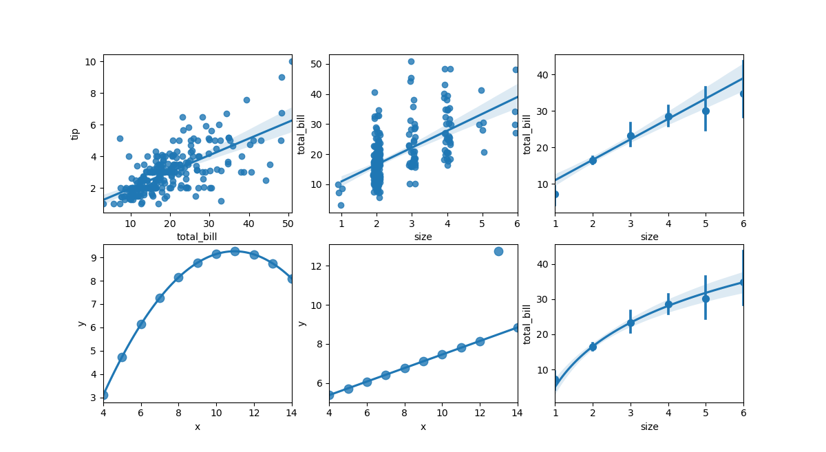
回归图
在查看双变量分布关系的基础上,seaborn还提供了简单的线性回归接口。
- lmplot:(regplot+FacetGrid)图形级通用接口,依赖于 FacetGrid 类,返回该类实例。
- regplot:(regression plot)在最简单的调用中,绘制散点图,然后拟合回归线和该回归线的 95% 置信区间。
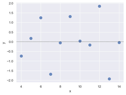
- residplot:绘制线性回归的残差图,相当于先执行regplot中的回归拟合,而后将回归值与真实值相减结果作为绘图数据。直观来看,当残差结果随机分布于y=0上下较小的区间时,说明具有较好的回归效果。
其中lmplot为figure-level(可简单理解为操作对象是matplotlib中figure),而regplot和residplot是axes-level(对应操作对象是matplotlib中的axes)。但实际上接口调用方式和传参模式都是一致的。
其核心参数主要包括以下几个:
- data:pandas.DataFrame,
- x, y:vector or key in data,指定 x 轴和 y 轴位置的变量
- hue,:vector or key in data,用不同色调(颜色)分组的变量
- row, col:key in data,不同facets绘制的子图
- palette:string, list, dict, or matplotlib.colors.Colormap,调色板
- legend:bool,是否显示图例
- {hue,col,row}_order:lists of strings, optional,分面的顺序列表
- fit_reg:bool, optional,拟合回归模型
- ci:int in [0, 100] or None, optional,置信区间的大小,回归线环绕的阴影表示。对于大型数据集,建议将此参数设置为 None 来避免该计算。
- order:int, optional,设置回归模型的阶数,如果大于 1,则用于numpy.polyfit估计多项式回归。例如设置order=2时可以拟合出抛物线型回归线
- logistic:bool, optional,假设y是一个二元变量并用于 statsmodels估计逻辑回归模型。
- lowess:bool, optional,用于statsmodels估计非参数 Lowess 模型(局部加权线性回归)。请注意,目前无法为此类模型绘制置信区间。
- robust:bool, optional,用于statsmodels估计稳健回归。这将减轻异常值的权重。
- logx:bool, optional,估计形式为 y ~ log(x) 的线性回归。请注意, x必须为正数才能使其正常工作。
- kwargs:dict,其他axes-level接口关键参数
- ax:matplotlib.axes.Axes,axes-level接口设置坐标系统的参数
sns.lmplot(x="total_bill", y="tip", data=tips)
# 还可以绘制离散 x 变量并添加一些抖动:
sns.lmplot(x="size", y="total_bill", data=tips, x_jitter=.1)
# 用离散 x 变量绘图,显示唯一值的均值和置信区间:
sns.lmplot(x="size", y="total_bill", data=tips,
                 x_estimator=np.mean)
# 拟合高阶多项式回归
ans = sns.load_dataset("anscombe")
sns.lmplot(x="x", y="y", data=ans.loc[ans.dataset == "II"],
                 scatter_kws={"s": 80},
                 order=2, ci=None)
# 拟合稳健回归并且不绘制置信区间
sns.lmplot(x="x", y="y", data=ans.loc[ans.dataset == "III"],
                 scatter_kws={"s": 80},
                 robust=True, ci=None)
# 使用 log(x) 拟合回归模型:
sns.lmplot(x="size", y="total_bill", data=tips,
                 x_estimator=np.mean, logx=True)
残差图:直观来看,当残差结果随机分布于y=0上下较小的区间时,说明具有较好的回归效果。
sns.residplot(x="x", y="y", data=anscombe.query("dataset == 'I'"),
              scatter_kws={"s": 80})
分面图
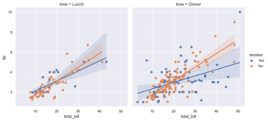
sns.lmplot(x="total_bill", y="tip", hue="smoker", col="time", data=tips)
矩阵图
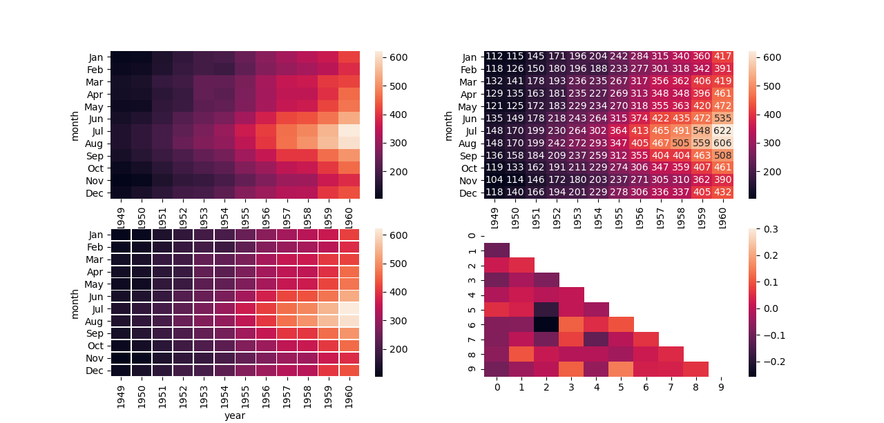
热力图
矩阵图主要用于表达一组数值型数据的大小关系,在探索数据相关性时也较为实用。
heatmap:热力图,将矩形数据绘制为颜色编码矩阵。axes-level级函数(对应操作对象是matplotlib中的axes)
其核心参数主要包括以下几个:
- data:可以强制转换为 ndarray 的二维数据集。如果提供了 Pandas DataFrame,索引/列信息将用于标记列和行。
- vmin, vmax:floats, optional,锚定颜色图的值。
- cmap:matplotlib colormap name or object, or list of colors, optional,从数据值到颜色空间的映射
- center:float, optional,绘制发散数据时居中颜色的值。
- robust:bool, optional,使用稳健的分位数而不是极值来计算颜色图范围。
- annot:bool 或矩形数据集, optional,在每个单元格中写入数据值。请注意,DataFrames 将匹配位置,而不是索引。
- fmt:str, optional,添加注释时使用的字符串格式化代码。
- linewidths:float, optional,将划分每个单元格的线的宽度。
- linecolor:color, optional,将划分每个单元格的线条的颜色。
- cbar:bool, optional,是否绘制颜色条。
- xticklabels, yticklabels:“auto”, bool, list-like, or int, optional,坐标轴标签
- mask:bool array or DataFrame, optional,数据将不会显示在mask为 True 的单元格中。带有缺失值的单元格会被自动屏蔽。
- kwargs:dict,其他axes-level接口关键参数
- ax:matplotlib.axes.Axes,axes-level接口设置坐标系统的参数
flights = sns.load_dataset("flights")
flights = flights.pivot("month", "year", "passengers")
ax = sns.heatmap(flights)
# 使用整数格式用数值注释每个单元格
ax = sns.heatmap(flights, annot=True, fmt="d")
# 在每个单元格之间添加线条
ax = sns.heatmap(flights, linewidths=.5)

# 使用掩码仅绘制矩阵的一部分
corr = np.corrcoef(np.random.randn(10, 200))
mask = np.zeros_like(corr)
mask[np.triu_indices_from(mask)] = True
ax = sns.heatmap(corr, mask=mask, vmax=.3)
聚类图
clustermap:在heatmap()基础上绘制分层聚类的热图。
其核心参数主要包括以下几个:
- data:2D array-like,用于聚类的矩形数据。不能包含 NA。
- methodstr, optional,用于计算聚类的方法,请参考有关
scipy.cluster.hierarchy.linkage() - z_score:int or None, optional,是否计算行(0)或列(1)的 Z 分数,z = (x - mean)/std。
- standard_scale:int or None, optional,是否Min-Max标准化行(0)或列(1)。
- {row,col}_cluster:bool, optional,聚类{行,列}。
- {row,col}_linkage:numpy.ndarray, optional,行或列的预计算链接矩阵。具体格式见
scipy.cluster.hierarchy.linkage()。 - {row,col}_colors:list-like or pandas DataFrame/Series, optional,行或列的颜色列表。
- mask:bool array or DataFrame, optional,数据将不会显示在mask为 True 的单元格中。带有缺失值的单元格会被自动屏蔽。
- tree_kws:dict, optional,用于绘制树状图树线的参数,详见
matplotlib.collections.LineCollection。 - kwargs:other keyword arguments,所有其他关键字参数都传递给
heatmap()
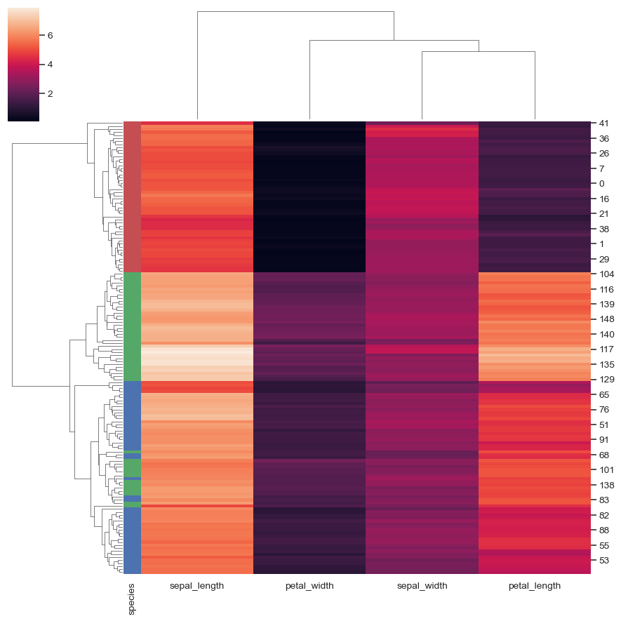
如下图表展示了鸢尾花数据集聚类图,并添加彩色标签以识别观察结果:
sns.set_theme(color_codes=True)
iris = sns.load_dataset("iris")
species = iris.pop("species")
lut = dict(zip(species.unique(), "rbg"))
row_colors = species.map(lut)
g = sns.clustermap(iris, row_colors=row_colors)
网格图
分面网格
在探索多维数据时,一种有用的方法是在数据集的不同子集上绘制同一图的多个实例。这种技术有时被称为分面网格绘图。Matplotlib 为制作多轴(multiple axes)图形提供了良好的支持,seaborn 在此基础上构建,将图形结构直接链接到数据集结构。
seaborn.FacetGrid 类将数据集映射到多个轴,这些轴排列在与数据集中变量级别相对应的行和列网格中。它生成的图通常被称为 分面网格。一个FacetGrid最多可以应用到三个维度:row,col 和 hue。图形级函数 (figure-level )relplot(),displot(),catplot()和 lmplot()都会返回该对象的实例,均可以绘制分面网格。
配对网格
当变量数不止2个时,pairplot是查看各变量间配对关系的首选。此函数将创建一个Axes 网格,可视化数据集中所有变量的单变量分布及其所有两两配对关系。显然,绘制结果中的上三角和下三角部分的子图是镜像的。
实际上,pairplot 旨在轻松绘制一些常见样式,依赖于PairGrid类实现,返回该类实例。如果您需要更大的灵活性,可以直接使用PairGrid。
其核心参数主要包括以下几个:
- data:pandas.DataFrame
- hue:name of variable in data,用不同色调(颜色)分组的变量
- hue_order:list of strings,色调水平顺序
- palette:dict or seaborn color palette,调色板
- vars:list of variable names in data,要使用的变量,否则使用每个列的数字数据类型。
- {x, y}_vars:lists of variable names in data,绘制行,列的变量名
- kind:{‘scatter’, ‘kde’, ‘hist’, ‘reg’},配对子图类型,默认scatter
- diag_kind:{‘auto’, ‘hist’, ‘kde’, None},对角线子图类型
- markers:single matplotlib marker code or list,点样式
- corner:bool,只绘制下三角网格(含对角线)
- dropna:bool,在绘图之前从数据中丢弃缺失值。
- {plot, diag, grid}_kws:dicts,关键字参数的字典。 传递到上下三角绘图函数、对角绘图函数或PairGrid
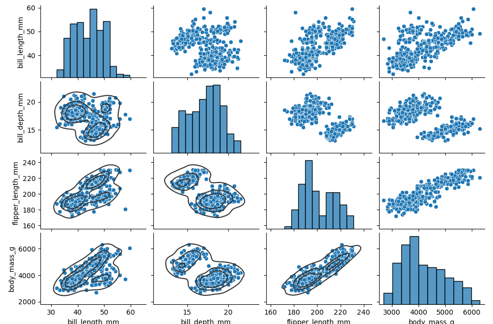
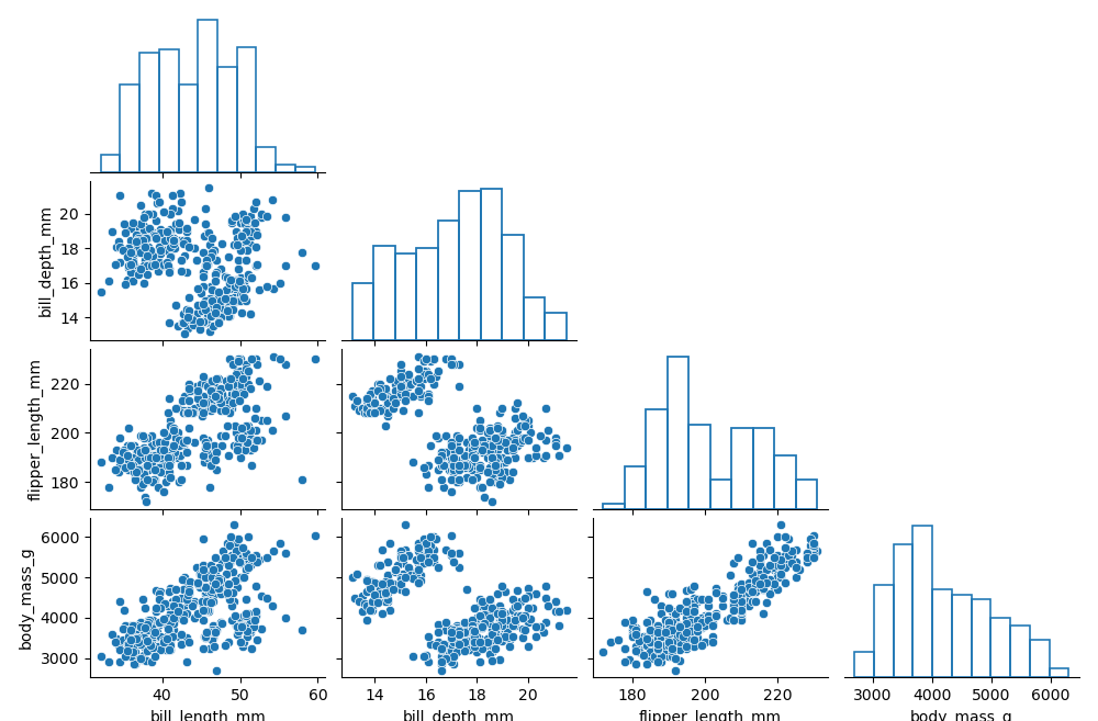
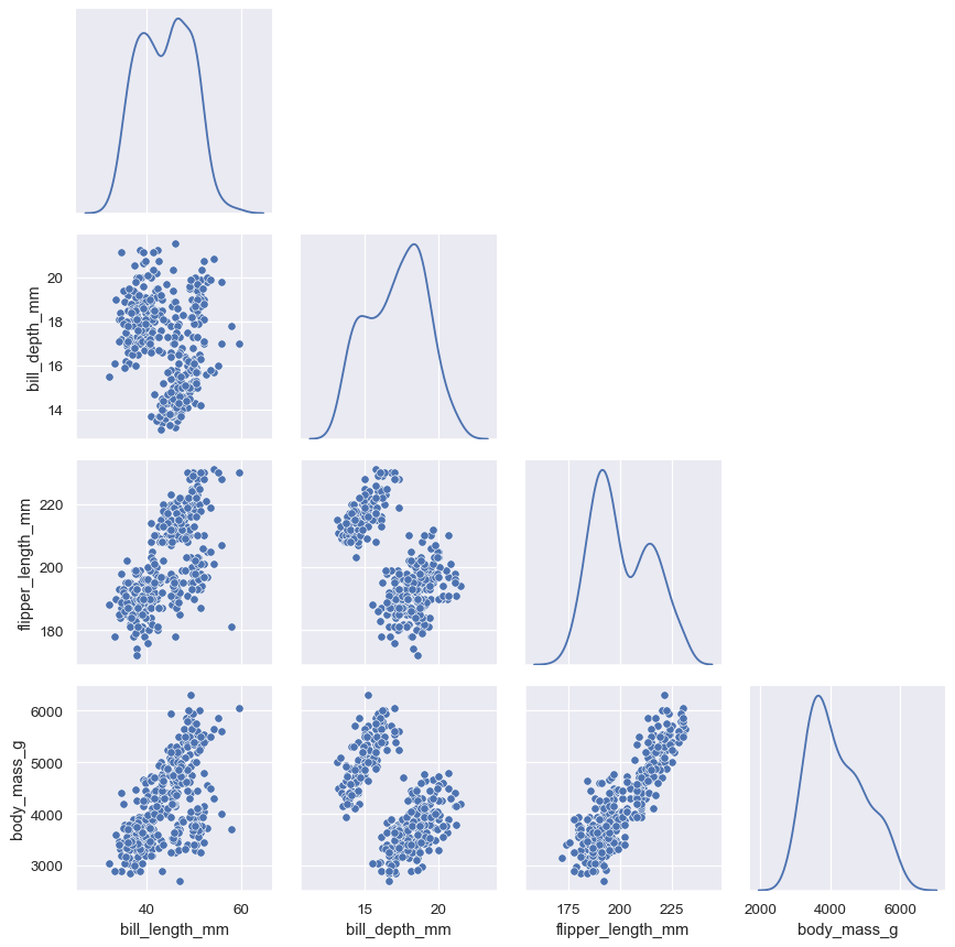
pairplot默认使用 scatterplot() 用于变量配对网格,沿对角线使用 histplot()。返回对象是 PairGrid,也可进一步自定义绘图:
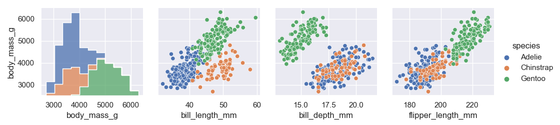
penguins = sns.load_dataset("penguins")
g = sns.pairplot(penguins)
g.map_lower(sns.kdeplot, levels=4, color=".2")
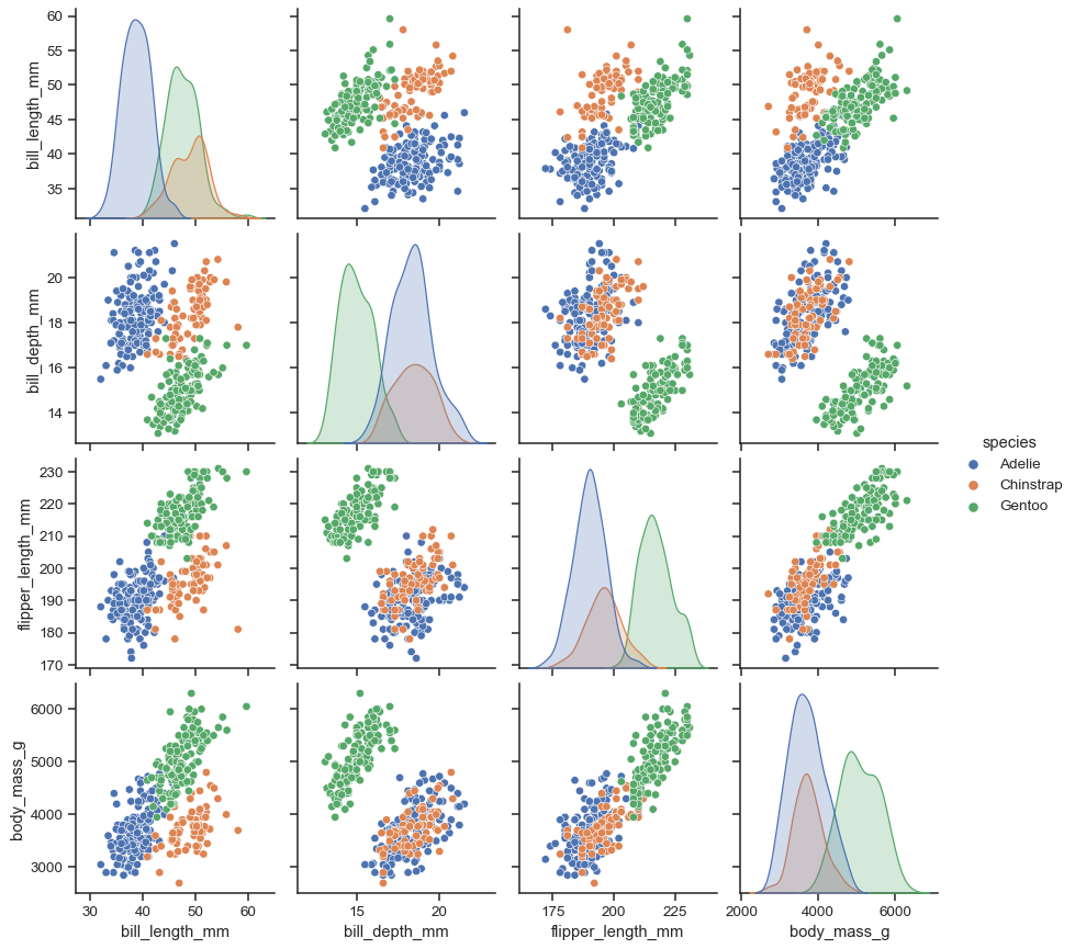
分配变量到 hue,默认对角线改为核密度估计 (KDE),也可用diag_kind强制更换。
sns.pairplot(penguins, hue="species")
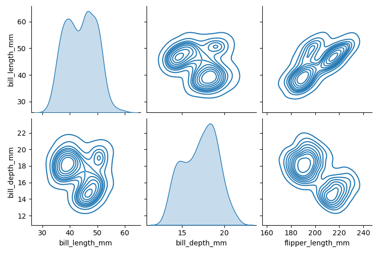
kind参数决定对角线和对角线外的绘图风格。选择要绘图的变量:vars,x_vars,y_vars
sns.pairplot(penguins, kind="kde",
    x_vars=["bill_length_mm", "bill_depth_mm", "flipper_length_mm"],
    y_vars=["bill_length_mm", "bill_depth_mm"]
)
设置为仅绘制下三角形:corner=True,并接受关键字参数的调用
sns.pairplot(penguins, corner=True, diag_kws=dict(fill=False))
联合网格
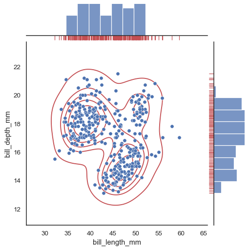
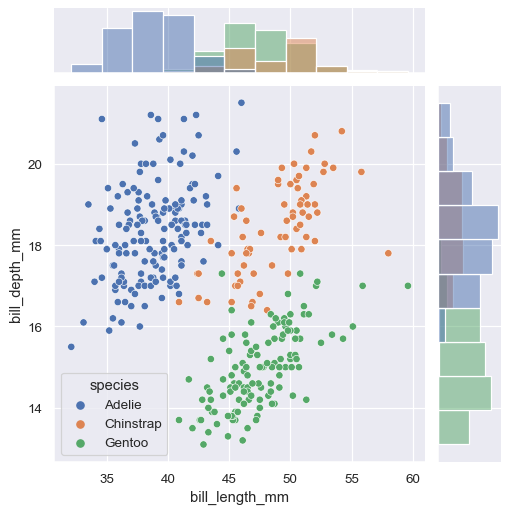
jointplot是一个联合图表接口。绘图结果主要有三部分:绘图主体用于表达两个变量关系分布,在其上侧和右侧分别体现2个变量的单变量分布。与 pairplot 类似,jointplot 依赖于JointGrid类,返回该类实例。相比之下,JointGrid可以实现更为丰富的可定制绘图接口。
其核心参数主要包括以下几个:
- data:pandas.DataFrame, numpy.ndarray, mapping, or sequence
- x, y:vectors or keys in data
- hue:name of variable in data,用不同色调(颜色)分组的变量
- hue_order:list of strings,色调水平顺序
- palette:dict or seaborn color palette,调色板
- kind:{ “scatter” , “kde” , “hist” , “hex” , “reg” , “resid” },联合图类型,默认scatter
- {x, y}lim:pairs of numbers,设置坐标轴限制
- marginal_ticks:bool,是否显示边缘图刻度
- {joint, marginal}_kws:dicts,绘图组件的其他关键字参数。
- dropna:bool,在绘图之前从数据中丢弃缺失值。
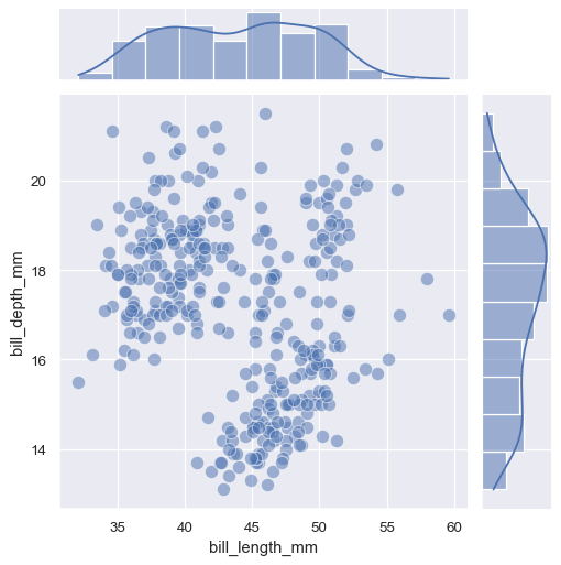
默认情况下,绘制散点图 scatterplot() 和边缘直方图 histplot() 。同样,要在绘图上添加更多层,可利用返回的 JointGrid 对象上的方法:
penguins = sns.load_dataset("penguins")
g = sns.jointplot(data=penguins, x="bill_length_mm", y="bill_depth_mm")
g.plot_joint(sns.kdeplot, color="r", zorder=0, levels=6)
g.plot_marginals(sns.rugplot, color="r", height=-.15, clip_on=False)
与 pairplot() 类似,在 jointplot() 中设置 kind 将改变主体和边缘图:
sns.jointplot(
    data=penguins,
    x="bill_length_mm", y="bill_depth_mm", hue="species",
    kind="kde"
)

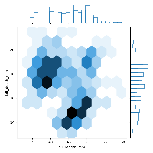
也可使用matplotlib.axes.Axes.hexbin() 绘制六角形箱:kind=“hex”。且传递其他关键字参数到基础图。
sns.jointplot(data=penguins,
    x="bill_length_mm", y="bill_depth_mm",
    kind="hex",
    marginal_kws=dict(bins=25, fill=False)
)
主题
seaborn的主题设置主要分为两组,第一组是风格(style)设置,第二组是环境(context)设置,用来缩放图形的各种元素。
set_theme方法或者set方法(set_theme的别名)可以一次设置多个主题参数,每组参数都可以直接或临时设置。
seaborn.set_theme(context='notebook', style='darkgrid', palette='deep',
	font='sans-serif', font_scale=1, color_codes=True, rc=None)
Parameters
- context:string or dict,风格设置,请参考 plotting_context()
- style:string or dict,环境设置,请参考 axes_style()
- palette:string or dict,调色板设置,请参考 color_palette()
- font:string,字体设置,请参考 matplotlib 字体管理器
- font_scale:float, optional,字体设置,字体大小
- color_codes:bool,默认 True,将使用seaborn调色板
- rc:dict or None,rc 字典参数将覆盖上述内容
Style
seaborn设置风格的方法主要有三种:
- set_theme:主题通用设置接口
- set_style:风格专用设置接口,设置后全局风格随之改变
- axes_style:在with语句中使用该函数时临时设置当前图(axes级)的风格,同时返回设置后的风格参数。
seaborn.set_style(style=None, rc=None)
seaborn.axes_style(style=None, rc=None)
Parameters
- style:dict, None, or one of {darkgrid, whitegrid, dark, white, ticks},参数字典或预配置集的名称
- rc:dict, optional,用于覆盖预设 seaborn 样式字典中的值
有5种预设 seaborn风格:darkgrid (default),whitegrid,dark,white,和ticks。它们分别适合不同的应用和个人喜好。
tips = sns.load_dataset("tips")
fig = plt.figure(figsize=(6, 4))
style = [None, 'darkgrid', 'whitegrid', 'dark', 'white', 'ticks']

for i in range(6):
    with sns.axes_style(style[i]):
        ax = plt.subplot(2, 3, i+1)
        ax.set_title(style[i])
        ax.set_xlabel(" "); ax.set_ylabel(" ")
        ax.set_xticklabels([]); ax.set_yticklabels([])
        sns.histplot(data=tips, x="total_bill")

plt.show()

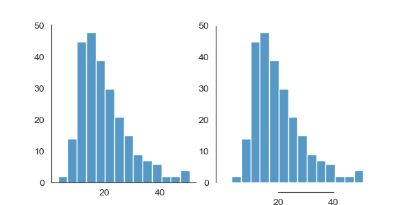
对于white和ticks样式还可以从图中删除顶部和右侧没必要的边框线,seaborn可以调用despine()函数来实现
seaborn.despine(fig=None, ax=None,
	top=True, right=True, left=False, bottom=False,
	offset=None, trim=False)
- fig:matplotlib figure, optional,指定图形的所有轴,默认当前图形
- ax:matplotlib axes, optional:指定要删除的轴,如果制定了fig则忽略
- top, right, left, bottom:boolean, optional
- offset:int or dict, optional,设置每侧轴偏移的绝对距离
- trim:bool, optional,如果为 True,则将边框限制为每个非指定轴上的最小和最大主刻度
tips = sns.load_dataset("tips")
fig = plt.figure(figsize=(6, 3))

sns.set_style("white")
ax = plt.subplot(1, 2, 1)
ax.set_xlabel(" "); ax.set_ylabel(" ")
sns.histplot(data=tips, x="total_bill")
sns.despine(ax=ax)

ax = plt.subplot(1, 2, 2)
sns.histplot(data=tips, x="total_bill")
ax.set_xlabel(" "); ax.set_ylabel(" ")
sns.despine(ax=ax, offset=10, trim=True)
plt.show()
Context
设置环境的方法有三种:
- set_theme:主题通用设置接口
- set_context:环境设置专用接口,设置后全局绘图环境随之改变
- plotting_context:在with语句中使用该函数时临时设置当前图(axes级)的绘图环境,同时返回设置后的环境系列参数。
seaborn.plotting_context(context=None, font_scale=1, rc=None)
Parameters
- context:dict, None, or one of {paper, notebook, talk, poster},参数字典或预配置集的名称
- font_scale:float, optional,单独配置字体大小
- rc:dict, optional,用于覆盖预设 seaborn 样式字典中的值
支持4种绘图环境,来控制绘图元素的比例,按相对大小的顺序,依次是paper,notebook (default),talk,和poster
tips = sns.load_dataset("tips")
fig = plt.figure(figsize=(8, 6))
context = ['paper', 'notebook', 'talk', 'poster']

sns.set_style("darkgrid")
for i in range(4):
    with sns.plotting_context(context[i]):
        ax = plt.subplot(2, 2, i+1)
        ax.set_title(context[i])
        ax.set_xlabel(" "); ax.set_ylabel(" ")
        ax.set_xticklabels([]); ax.set_yticklabels([])
        sns.histplot(data=tips, x="total_bill")

plt.show()

调色板
选择调色板的工具
由于我们眼睛的工作方式,可以使用三个组件定义特定颜色。我们通常通过指定 RGB 值在计算机中对颜色进行编程,RGB 值设置了显示器中红色、绿色和蓝色通道的强度。但是为了分析颜色的感知属性,最好Hue(色相)、Luminance(亮度)、Saturation(饱和度)三方面考虑。
使用调色板的通用函数包括以下两个:
- color_palette:返回RGB 元组列表或连续colormap。在with语句中用来配置一个临时调色板
- set_palette:设置默认调色板
seaborn.color_palette(palette=None, n_colors=None, desat=None, as_cmap=False)
seaborn.set_palette(palette, n_colors=None, desat=None, color_codes=False)
Parameters
- palette: None, string, or sequence, optional
- seaborn 预设的调色板名称
- matplotlib colormap
- matplotlib 可接受的任何格式的颜色序列
- n_colors:int, optional,调色板中的颜色数。如果None,默认值将取决于如何palette指定
- desat:float, optional,每种颜色的不饱和度
- as_cmap:bool,配色是否离散,如果为 True,则颜色返回连续colormap
- color_codes:bool,如果True且palette是seaborn 调色板,则将速记颜色代码(例如"rgb"等)重新映射到该调色板
从广义上讲,有以下三类调色板:
- 定性调色板,适合表示分类数据,定性调色板中变化的主要维度是色调
- 顺序调色板,适合表示数字数据,顺序调色板中变化的主要维度是亮度
- 发散调色板,适用于表示具有分类边界的数字数据
定性调色板
Seaborn支持6类matplotlib调色板:(deep, muted, bright, pastel, dark, colorblind)
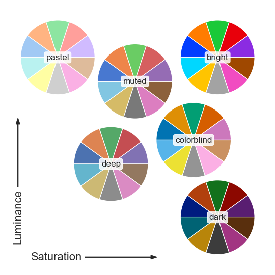
为了便于查看调色板样式,seaborn还提供了一个专门绘制颜色结果的方法palplot。
sns.palplot(sns.color_palette())

使用圆形颜色系统:当您有任意数量的类别时,可在圆形颜色空间中绘制均匀间隔的颜色(在保持亮度和饱和度不变的情况下,色调会发生变化)
seaborn.husl_palette,在 HUSL 色调空间中获取一组均匀间隔的颜色
seaborn.hls_palette,在 HLS 色调空间中获取一组均匀间隔的颜色
sns.color_palette("hls", 8)
sns.color_palette("husl", 6)

使用分类 Color Brewer 调色板:(Paired, Set2)
sns.color_palette("Set2")
sns.color_palette("Paired")


使用来自 xkcd 颜色名称制作调色板:
colors = ["windows blue", "amber", "greyish", "faded green", "dusty purple"]
sns.palplot(sns.xkcd_palette(colors))
顺序调色板
顺序调色板中变化的主要维度是亮度。当您映射数字数据时,一些 seaborn 函数将默认为顺序调色板
Seaborn包括四个感知均匀连续的色彩映射表:rocket, mako, flare, crest
sns.color_palette("rocket", as_cmap=True)
sns.color_palette("mako", as_cmap=True)
sns.color_palette("flare", as_cmap=True)
sns.color_palette("crest", as_cmap=True)


与 matplotlib 中的约定一样,每个连续的颜色图都有一个反向版本,后缀为"_r":
sns.color_palette("rocket_r", as_cmap=True)

连续的cubehelix 调色板
seaborn.cubehelix_palette,从立方体螺旋系统制作一个连续的调色板
sns.cubehelix_palette(as_cmap=True)
sns.color_palette("cubehelix", as_cmap=True) # 使用 Matplotlib 内置的cubehelix 调色板

sns.cubehelix_palette(start=.5, rot=-.5, as_cmap=True)
sns.color_palette("ch:start=.2,rot=-.3", as_cmap=True)
seaborn cubehelix_palette() 函数返回的默认调色板与 matplotlib 的默认值略有不同。


自定义顺序调色板
seaborn.dark_palette 制作一个从深色到单一color的调色板
seaborn.light_palette 制作一个从浅色到单一color的调色板
sns.light_palette("seagreen", as_cmap=True)
sns.dark_palette("#69d", reverse=True, as_cmap=True)
sns.color_palette("light:b", as_cmap=True)


顺序 Color Brewer 调色板
sns.color_palette("Blues", as_cmap=True)
sns.color_palette("YlOrBr", as_cmap=True)


发散调色板
Seaborn 预设两个感知上统一的发散调色板:vlag 和 icefire 。它们的两极都使用蓝色和红色,许多人直观地将其处理为冷和热。
sns.color_palette("vlag", as_cmap=True)
sns.color_palette("icefire", as_cmap=True)


自定义发散调色板:seaborn 函数 diverging_palette 在两种 HUSL 颜色之间制作一个发散的调色板。
sns.diverging_palette(220, 20, as_cmap=True)

matplotlib 内置的 Color Brewer 发散调色板
sns.color_palette("Spectral", as_cmap=True)
sns.color_palette("coolwarm", as_cmap=True)


调色板小部件
| 工具 | 说明 |
|---|---|
seaborn.choose_colorbrewer_palette( data_type , as_cmap = False ) | 从 ColorBrewer 集中选择一个调色板。 |
seaborn.choose_cubehelix_palette( as_cmap = False ) | 启动交互式小部件以创建顺序立方体螺旋调色板。 |
seaborn.choose_light_palette( input = 'husl' , as_cmap = False ) | 启动交互式小部件以创建轻量级顺序调色板。 |
seaborn.choose_dark_palette( input = 'husl' , as_cmap = False ) | 启动交互式小部件以创建深色顺序调色板。 |
seaborn.choose_diverging_palette( as_cmap = False ) | 启动交互式小部件以选择不同的调色板。 |
基础类
seaborn中的绘图接口大多依赖于相应的类实现,但却并未开放所有的类接口。实际上,可供用户调用的类只有3个:JointGrid、PairGrid和FacetGrid,而FacetGrid是seaborn中很多其他绘图接口的基类。
FacetGrid
FacetGrid类将数据集映射到多个轴,这些轴排列在与数据集中变量级别相对应的行和列网格中。它生成的图通常被称为分面网格。一个FacetGrid最多可以应用到三个维度:row,col 和 hue。每一个relplot(),displot(),catplot()和 lmplot()都会返回该类的实例。
class seaborn.FacetGrid(**kwargs)
其初始化核心参数主要包括以下几个:
- data:DataFrame
- row, col, hue:string (variable name),定义网格的不同维度
- col_wrap:int,每行允许的最大网格数
- share{x,y}:bool, ‘col’, or ‘row’ optional,共享x/y轴
- height, aspect:scalar,每个刻面的高度,纵横比
- palette:string, list, dict, or matplotlib.colors.Colormap,调色板
- legend_out:bool,是否中间右侧图形外显示图例
- {hue,col,row}_order:lists of strings, optional,分面的顺序列表
- hue_kws:dictionary of param -> list of values mapping,其他绘图关键字参数(例如散点图中的标记)
- despine:bool,删除顶部和右侧的边框
- margin_titles:bool,行变量的标题绘制在最后一列的右侧
- {x, y}lim:tuples,每个刻面的坐标轴限制(仅当 share{x, y} = True 时可用)
- subplot_kws:dict,传递给 matplotlib subplot(s) 方法的关键字参数字典
- gridspec_kws:dict,传递给matplotlib.gridspec.GridSpec (via matplotlib.figure.Figure.subplots())的关键字参数字典 。
FacetGrid 的基本工作流程:
- 调用FacetGrid会初始化网格会并设置 matplotlib 图形和Axes,但不会在它们上面绘制任何东西。
- 然后将绘图函数传递给
FacetGrid.map()或FacetGrid.map_dataframe()。使用自定义函数时请遵循官网规则。 - 最后,可以使用其他方法调整绘图。如更改轴标签、使用不同刻度或添加图例等操作。
例如,假设我们想检查 tips数据集中午餐和晚餐之间的差异:
在大多数情况下,使用图形级函数(例如
relplot()或catplot())比FacetGrid直接使用更好。
g = sns.FacetGrid(tips, col="sex", hue="smoker")
g.map(sns.scatterplot, "total_bill", "tip", alpha=.7)
g.add_legend()
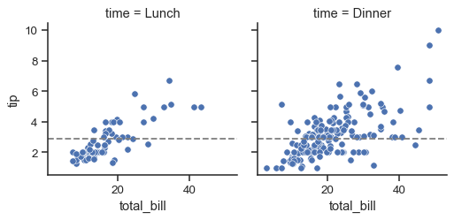
要在每个面上添加水平或垂直参考线,请使用FacetGrid.refline():
g = sns.FacetGrid(tips, col="time", margin_titles=True)
g.map_dataframe(sns.scatterplot, x="total_bill", y="tip")
g.refline(y=tips["tip"].median())
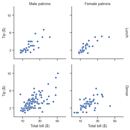
该FacetGrid对象还有一些其他有用的参数和方法来调整绘图:
g = sns.FacetGrid(tips, col="sex", row="time", margin_titles=True)
g.map_dataframe(sns.scatterplot, x="total_bill", y="tip")
g.set_axis_labels("Total bill ($)", "Tip ($)")
g.set_titles(col_template="{col_name} patrons", row_template="{row_name}")
g.set(xlim=(0, 60), ylim=(0, 12), xticks=[10, 30, 50], yticks=[2, 6, 10])
g.tight_layout()
g.savefig("facet_plot.png")
| Methods | 说明 |
|---|---|
__init__(self, data, *[, row, col, hue, …]) | 初始化 matplotlib 图和 FacetGrid 对象 |
add_legend(self[, legend_data, title, …]) | 绘制一个图例 |
despine(self, **kwargs) | 删除刻面边框 |
facet_axis(self, row_i, col_j[, modify_state]) | 激活由这些索引标识的轴并返回它 |
facet_data(self) | 每个刻面的名称索引和数据子集的生成器 |
map(self, func, *args, **kwargs) | 将绘图函数应用于数据的每个刻面的子集 |
map_dataframe(self, func, *args, **kwargs) | 类似 .map,但是将 args 作为字符串传递,并在 kwargs 中插入数据。 |
refline(self, *[, x, y, color, linestyle]) | 为每个面添加参考线 |
savefig(self, *args, **kwargs) | 保存绘图 |
set(self, **kwargs) | 设置属性通用方法 |
set_axis_labels(self[, x_var, y_var, …]) | 在网格的左列和底行上设置轴标签 |
set_titles(self[, template, row_template, …]) | 在每个面上方或网格边距上绘制标题 |
set_xlabels(self[, label, clear_inner]) | 在网格的底行标记 x 轴 |
set_xticklabels(self[, labels, step]) | 设置网格的 x 轴刻度标签 |
set_ylabels(self[, label, clear_inner]) | 在网格的底行标记 y 轴 |
set_yticklabels(self[, labels]) | 设置网格的 y 轴刻度标签 |
tight_layout(self, *args, **kwargs) | 在排除图例的矩形内调用 fig.tight_layout |
| Attributes | 说明 |
|---|---|
ax | The matplotlib.axes.Axes when no faceting variables are assigned. |
axes | matplotlib.axes.Axes网格中的对象数组 |
axes_dict | 刻面名称到相应matplotlib.axes.Axes的映射 |
figure | 访问matplotlib.figure.Figure网格下的对象 |
legend | 访问matplotlib.legend.Legend对象 |
PairGrid
PairGrid 用于在数据集中绘制配对关系的子图网格。不同的axes-level绘图函数可用于绘制上下三角形中的双变量图,并且每个变量的单变量分布可以显示在对角线上。
其初始化核心参数主要包括以下几个:
- data:pandas.DataFrame
- hue:name of variable in data,用不同色调(颜色)分组的变量
- hue_order:list of strings,色调水平顺序
- hue_kws:dictionary of param -> list of values mapping,其他绘图关键字参数(例如散点图中的标记)
- palette:dict or seaborn color palette,调色板
- vars:list of variable names in data,要使用的变量,否则使用每个列的数字数据类型。
- {x, y}_vars:lists of variable names in data,绘制行,列的变量名
- corner:bool,只绘制下三角网格(含对角线)
- height, aspect:scalar,每个刻面的高度,纵横比
- despine:bool,删除顶部和右侧的边框
- layout_pad:scalar,axes之间的填充宽度,传递给 fig.tight_layout
- dropna:bool,在绘图之前从数据中丢弃缺失值。
PairGrid 的基本工作流程:
- 调用PairGrid会初始化网格会并设置 matplotlib 图形和Axes,但不会在它们上面绘制任何东西。
- 然后将双变量函数传递给 PairGrid 的 map 系列方法,在每个Axes上绘制双变量关系。
- 最后,可以使用其他方法调整绘图。如更改轴标签、使用不同刻度或添加图例等操作。
例如,如下案例调用了PairGrid类实现,与标准pairplot不同的是效果更为丰富。
将双变量函数传递给 PairGrid.map() :
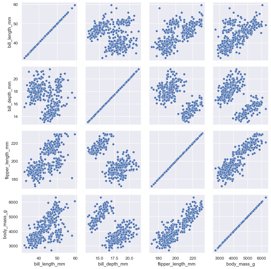
penguins = sns.load_dataset("penguins")
g = sns.PairGrid(penguins)
g.map(sns.scatterplot)
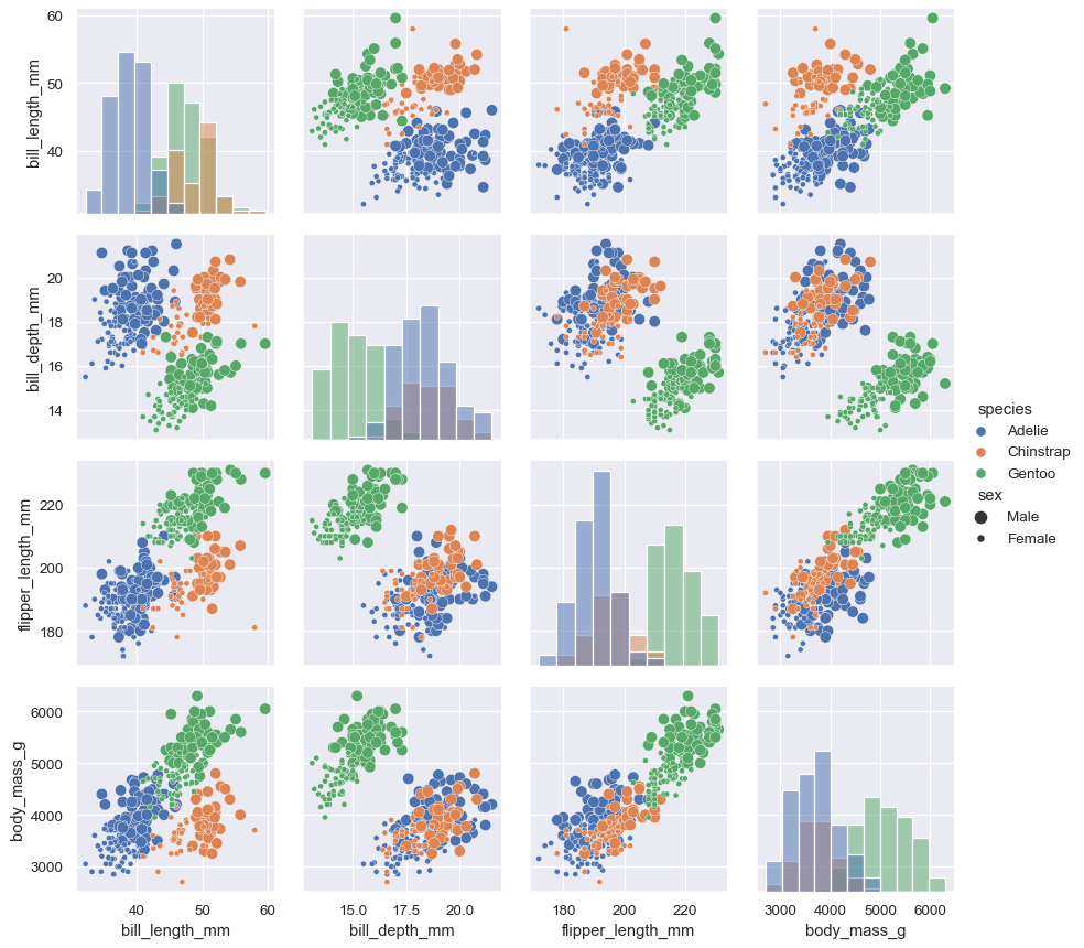
将不同的函数分别传递对角线 (map_diag) 和非对角线 (map_offdiag) 上来显示不同图:
g = sns.PairGrid(penguins, hue="species")
g.map_diag(sns.histplot)
g.map_offdiag(sns.scatterplot, size=penguins["sex"])
g.add_legend(title="", adjust_subtitles=True)
也可以在上下三角形和对角线上使用不同的函数:
g = sns.PairGrid(penguins, diag_sharey=False, corner=True)
g.map_lower(sns.scatterplot)
g.map_diag(sns.kdeplot)
默认情况下,数据集中的每个数字列都会使用。可用参数精确控制使用哪些变量:
x_vars = ["body_mass_g", "bill_length_mm", "bill_depth_mm", "flipper_length_mm"]
y_vars = ["body_mass_g"]
g = sns.PairGrid(penguins, hue="species", x_vars=x_vars, y_vars=y_vars)
g.map_diag(sns.histplot, multiple="stack", element="step")
g.map_offdiag(sns.scatterplot)
g.add_legend()
| Methods | 说明 |
|---|---|
__init__(self, data, *[, hue, hue_order, …]) | 初始化 matplotlib 图和 PairGrid 对象 |
add_legend(self[, legend_data, title, …]) | 绘制一个图例 |
map(self, func, **kwargs) | 每个子图中绘制相同函数的图 |
map_diag(self, func, **kwargs) | 对角线子图上单变量分布图 |
map_offdiag(self, func, **kwargs) | 非对角线子图上双变量分布图 |
map_upper(self, func, **kwargs) | 上三角形子图上双变量分布图 |
map_lower(self, func, **kwargs) | 下三角形子图上双变量分布图 |
savefig(self, *args, **kwargs) | 保存绘图 |
set(self, **kwargs) | 设置属性通用方法 |
tight_layout(self, *args, **kwargs) | 在排除图例的矩形内调用 fig.tight_layout |
| Attributes | 说明 |
|---|---|
figure | 访问matplotlib.figure.Figure网格下的对象 |
legend | 访问matplotlib.legend.Legend对象 |
JointGrid
JointGrid 用于绘制带有边缘分布的双变量图。不同的axes-level绘图函数可用于绘制联合图和边缘图。
其初始化核心参数主要包括以下几个:
- data:pandas.DataFrame, numpy.ndarray, mapping, or sequence
- x, y:vectors or keys in data
- hue:vector or key in data,用不同色调(颜色)分组的变量
- hue_order:list of strings,色调水平顺序
- palette:dict or seaborn color palette,调色板
- height, ratio:number,图形高度,联合图和边缘图比例
- {x, y}lim:pairs of numbers,设置坐标轴限制
- marginal_ticks:bool,是否显示边缘图刻度
- space:联合图和边缘图之间的空白
- dropna:bool,在绘图之前从数据中丢弃缺失值。
- hue_norm:tuple or matplotlib.colors.Normalize,将数据映射到 [0, 1]
JointGrid 的基本工作流程:
- 调用JointGrid会初始化网格会并设置 matplotlib 图形和Axes,但不会在它们上面绘制任何东西。
- 然后用 JointGrid 的方法接收一对函数(一个用于联合图,一个用于两个边缘图)
- 最后,可以使用其他方法调整绘图。如更改轴标签、使用不同刻度或添加图例等操作。
最简单的绘图方法,JointGrid.plot() 方法接收一对函数(一个用于联合图,一个用于两个边缘图)
g = sns.JointGrid(data=penguins, x="bill_length_mm", y="bill_depth_mm", hue="species")
g.plot(sns.scatterplot, sns.histplot)
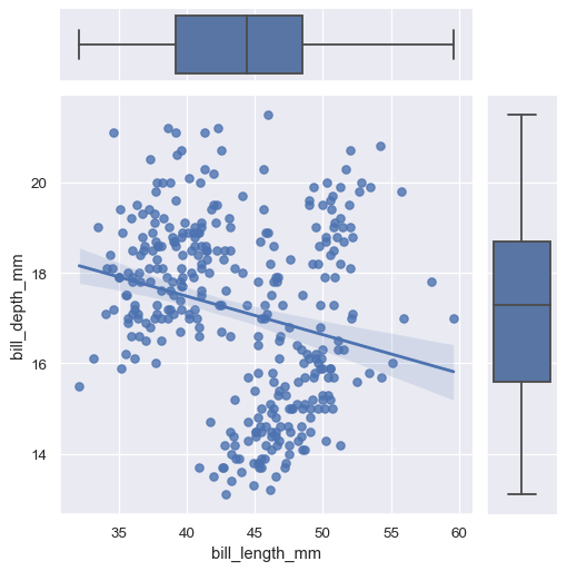
如果您需要将不同的关键字参数传递给每个函数,则必须调用 JointGrid.plot_joint() 和JointGrid.plot_marginals():
g = sns.JointGrid(data=penguins, x="bill_length_mm", y="bill_depth_mm")
g.plot_joint(sns.scatterplot, s=100, alpha=.5)
g.plot_marginals(sns.histplot, kde=True)
还可以通过访问 JointGrid 子图(ax_joint, ax_marg_x, ax_marg_y)的形式来绘图
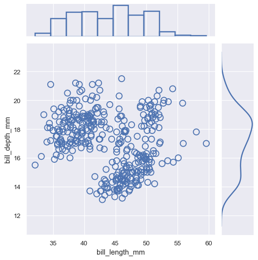
g = sns.JointGrid()
x, y = penguins["bill_length_mm"], penguins["bill_depth_mm"]
sns.scatterplot(x=x, y=y, ec="b", fc="none", s=100, linewidth=1.5, ax=g.ax_joint)
sns.histplot(x=x, fill=False, linewidth=2, ax=g.ax_marg_x)
sns.kdeplot(y=y, linewidth=2, ax=g.ax_marg_y)
JointGrid 可接受任何seaborn绘图函数
g = sns.JointGrid(data=penguins, x="bill_length_mm", y="bill_depth_mm")
g.plot(sns.regplot, sns.boxplot)
| Methods | 说明 |
|---|---|
__init__(self, *[, x, y, data, height, …]) | 初始化 matplotlib 图和 JointGrid 对象 |
plot(self, joint_func, marginal_func, **kwargs) | 传递联合图函数和边缘图函数 |
plot_joint(self, func, **kwargs) | 传递联合图函数 |
plot_marginals(self, func, **kwargs) | 传递边缘图函数 |
refline(self, *[, x, y, joint, marginal, …]) | 添加参考线 |
savefig(self, *args, **kwargs) | 保存绘图 |
set(self, **kwargs) | 设置属性通用方法 |
set_axis_labels(self[, xlabel, ylabel]) | 设置坐标轴标签 |
| Attributes | 说明 |
|---|---|
figure | 访问matplotlib.figure.Figure网格下的对象 |


 2万+
2万+

 被折叠的 条评论
为什么被折叠?
被折叠的 条评论
为什么被折叠?
 到【灌水乐园】发言


