# https://blog.youkuaiyun.com/yuetaope/article/details/123111188from plotly import graph_objects as go
from plotly import io as pio
fig = go.Figure()
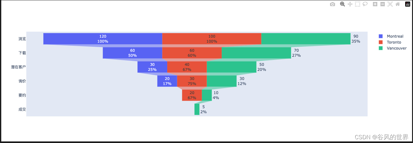
fig.add_trace(go.Funnel(
name ='Montreal',
y =["浏览","下载","潜在客户","询价"],
x =[120,60,30,20],
textinfo ="value+percent initial"))
fig.add_trace(go.Funnel(
name ='Toronto',
orientation ="h",
y =["浏览","下载","潜在客户","询价","要约"],
x =[100,60,40,30,20],
textposition ="inside",
textinfo ="value+percent previous"))
fig.add_trace(go.Funnel(
name ='Vancouver',
orientation ="h",
y =["浏览","下载","潜在客户","询价","要约","成交"],
x =[90,70,50,30,10,5],
textposition ="outside",
textinfo ="value+percent total"))
fig.show()
pio.write_image(fig,"1.png")
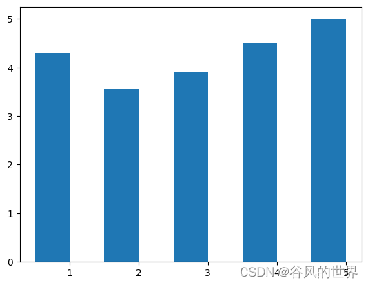
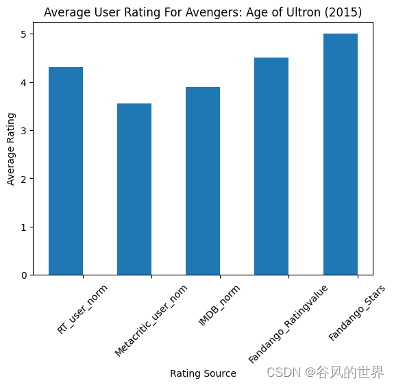
num_cols =['RT_user_norm','Metacritic_user_nom','IMDB_norm','Fandango_Ratingvalue','Fandango_Stars']
bar_heights = norm_reviews.loc[0, num_cols].values
bar_positions = arange(5)+0.75
tick_positions =range(1,6)
fig, ax = plt.subplots()
ax.bar(bar_positions, bar_heights,0.5)
ax.set_xticks(tick_positions)
ax.set_xticklabels(num_cols, rotation=45)
ax.set_xlabel('Rating Source')
ax.set_ylabel('Average Rating')
ax.set_title('Average User Rating For Avengers: Age of Ultron (2015)')
plt.show()
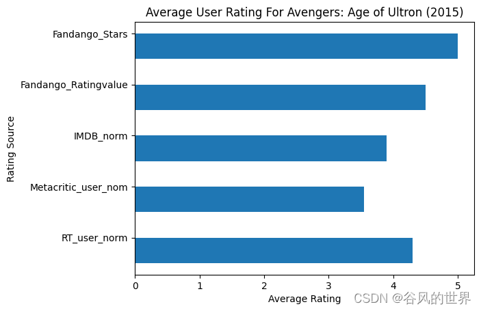
import matplotlib.pyplot as plt
from numpy import arange
num_cols =['RT_user_norm','Metacritic_user_nom','IMDB_norm','Fandango_Ratingvalue','Fandango_Stars']
bar_widths = norm_reviews.loc[0, num_cols].values
bar_positions = arange(5)+0.75
tick_positions =range(1,6)
fig, ax = plt.subplots()
ax.barh(bar_positions, bar_widths,0.5)# 横着的
ax.set_yticks(tick_positions)
ax.set_yticklabels(num_cols)
ax.set_ylabel('Rating Source')
ax.set_xlabel('Average Rating')
ax.set_title('Average User Rating For Avengers: Age of Ultron (2015)')
plt.show()
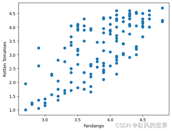
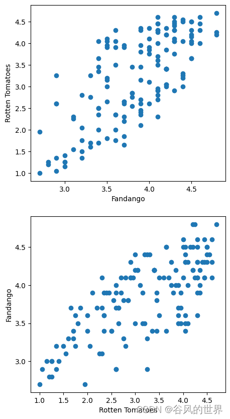
四、散点图
#Let's look at a plot that can help us visualize many points.# 散点图
fig, ax = plt.subplots()
ax.scatter(norm_reviews['Fandango_Ratingvalue'], norm_reviews['RT_user_norm'])
ax.set_xlabel('Fandango')
ax.set_ylabel('Rotten Tomatoes')
plt.show()


 3080
3080

 被折叠的 条评论
为什么被折叠?
被折叠的 条评论
为什么被折叠?
 到【灌水乐园】发言


