


阴影
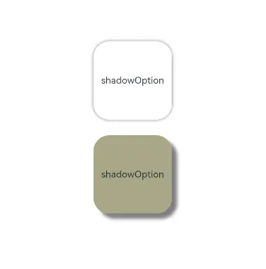
阴影接口 shadow 可以为当前组件添加阴影效果,该接口支持两种类型参数,开发者可配置 ShadowOptions 自定义阴影效果。ShadowOptions模式下,当radius = 0 或者 color 的透明度为0时,无阴影效果。
@Entry
@Component
struct ShadowOptionDemo {
  build() {
    Row() {
      Column() {
        Column() {
          Text('shadowOption').fontSize(12)
        }
        .width(100)
        .aspectRatio(1)
        .margin(10)
        .justifyContent(FlexAlign.Center)
        .backgroundColor(Color.White)
        .borderRadius(20)
        .shadow({ radius: 10, color: Color.Gray })

        Column() {
          Text('shadowOption').fontSize(12)
        }
        .width(100)
        .aspectRatio(1)
        .margin(10)
        .justifyContent(FlexAlign.Center)
        .backgroundColor('#a8a888')
        .borderRadius(20)
        .shadow({ radius: 10, color: Color.Gray, offsetX: 20, offsetY: 20 })
      }
      .width('100%')
      .height('100%')
      .justifyContent(FlexAlign.Center)
    }
    .height('100%')
  }
}
色彩
通过颜色渐变接口,可以设置组件的背景颜色渐变效果,实现在两个或多个指定的颜色之间进行平稳的过渡。
| 接口 | 说明 |
|---|---|
| linearGradient | 为当前组件添加线性渐变的颜色渐变效果。 |
| sweepGradient | 为当前组件添加角度渐变的颜色渐变效果。 |
| radialGradient | 为当前组件添加径向渐变的颜色渐变效果。 |
为组件添加线性渐变效果
@Entry
@Component
struct LinearGradientDemo {
  build() {
    Grid() {
      GridItem() {
        Column() {
          Text('angle: 180')
            .fontSize(15)
        }
        .width(100)
        .height(100)
        .justifyContent(FlexAlign.Center)
        .borderRadius(10)
        .linearGradient({
          // 0点方向顺时针旋转为正向角度,线性渐变起始角度的默认值为180°
          colors: [
            [0xf56c6c, 0.0], // 颜色断点1的颜色和比重,对应组件在180°方向上的起始位置
            [0xffffff, 1.0], // 颜色断点2的颜色和比重,对应组件在180°方向上的终点位置
          ]
        })
      }

      GridItem() {
        Column() {
          Text('angle: 45')
            .fontSize(15)
        }
        .width(100)
        .height(100)
        .justifyContent(FlexAlign.Center)
        .borderRadius(10)
        .linearGradient({
          angle: 45, // 设置颜色渐变起始角度为顺时针方向45°
          colors: [
            [0xf56c6c, 0.0],
            [0xffffff, 1.0],
          ]
        })
      }

      GridItem() {
        Column() {
          Text('r
最低0.47元/天 解锁文章


 扫一扫
扫一扫


 被折叠的 条评论
为什么被折叠?
被折叠的 条评论
为什么被折叠?
 到【灌水乐园】发言


