


 文章介绍了如何仅用两个HTML元素和CSS来构建一个具有层次感的浮动球体效果。主要步骤包括设置大球体的背景渐变、边框半径以及内嵌小球体的渐变、阴影和模糊效果,以此创造出3D视觉的悬浮球。
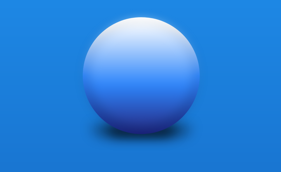
<div class="main-orb">
    <div class="inner-orb"></div>
</div>
就是这样 - 当我说我们只会使用 2 个 HTML 元素时,我不是在开玩笑。这是核心形状(设置为 400x400),它以略小的尺寸 (360x360) 放置在其父级的顶部 - 但在下面的 CSS 部分中有更多内容。.main-orb.inner-orb
CSS的
首先,我们为较大的 orb 元素 () 提供表示 2D 圆所需的默认样式:.main-orb
.main-orb {
    background: linear-gradient(#fff 0%, #eee 10%, #2E86FB 50%, #1A237E 100%);
    border-radius: 9999px;
    height: 400px;
    margin: 4rem auto;
    position: relative; /* This is important for the inner orb element later */
    width: 400px;
}
接下来,我们为球体的投影包括两者和伪元素。:before:afterbox-shadow.main-orb
/* Shared styling for both pseudo elements - Remember DRY */
.main-orb:before, .main-orb:after {
    border-radius: 200px 200px 9999px 9999px;
    bottom: -10px;
    content:'';
    filter: blur(20px);
    height: 40px;
    position: absolute;
    z-index: -1;
}
/* Bigger, lighter shadow */
.main-orb:before {
background: rgba(0,0,0,0.4);
left: 7.5%;
width: 85%;
}/* Smaller, darker shadow */
.main-orb:after {
background: rgba(0,0,0,0.7);
left: 20%;
width: 60%;
}完成主球体后,我们可以继续处理元素,以帮助为我们的 CSS 浮动球带来更多的深度:.inner-orb
.inner-orb {
    background: linear-gradient(#fff 0%, #2E86FB 60%, #283593 100%);
    border-radius: 9999px;
    box-shadow: 0 8px 20px rgba(0,0,0,0.5);
    height: 360px;
    filter: blur(18px);
    left: 20px;
    position: absolute;
    top: 15px;
    width: 360px;
}


 扫一扫
扫一扫


 386
386

 被折叠的 条评论
为什么被折叠?
被折叠的 条评论
为什么被折叠?
 到【灌水乐园】发言


