


 本博客通过Python模拟了从均匀分布中抽取样本并对其sin值进行求和的过程,展示了求和结果的分布情况。使用matplotlib库绘制了求和结果的柱状图,通过大量试验观察到的数据分布接近正态分布。
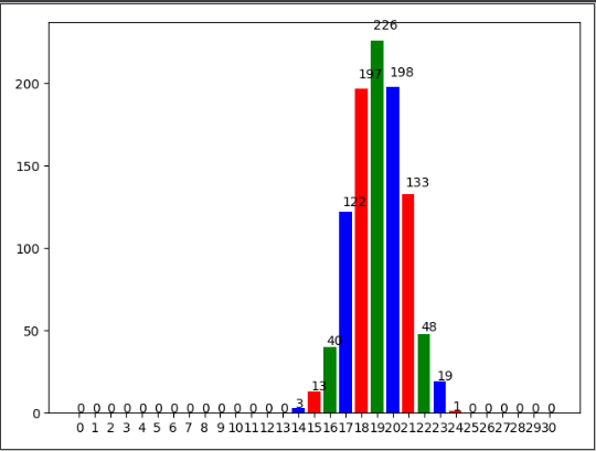
本程序模拟了x~U(0,pi/2)使用y=sin(x)变换后的y进行n次求和后得到的数据s的分布。求和模拟epoch代,并使用matpolib库进行柱状图作图。(本代码中预定义n=30,epoch=1000)
绘图部分使用了https://www.cnblogs.com/zhhfan/p/9971757.html的代码。
话不多说,上代码:
import matplotlib.pyplot as plt
import math
import random as rd
n=30  ##单次试验的样本数量
epoch=1000  ##试验次数
res=[0]*(n+1)
for i in range(epoch):
    average=0
    for j in range(n):
        average+=math.sin(rd.random()*math.pi/2)
    res[round(average)]+=1

# 显示高度
def autolabel(rects):
    for rect in rects:
        height = rect.get_height()
        plt.text(rect.get_x()+rect.get_width()/2.- 0.2, 1.03*height, '%s' % int(height))

name_list = range(0,n+1)
num_list = res
autolabel(plt.bar(range(len(num_list)), num_list, color='rgb', tick_label=name_list))
plt.show()
预期结果:


 785
785

 被折叠的 条评论
为什么被折叠?
被折叠的 条评论
为什么被折叠?
 到【灌水乐园】发言


