


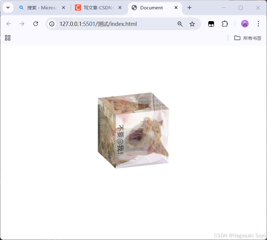
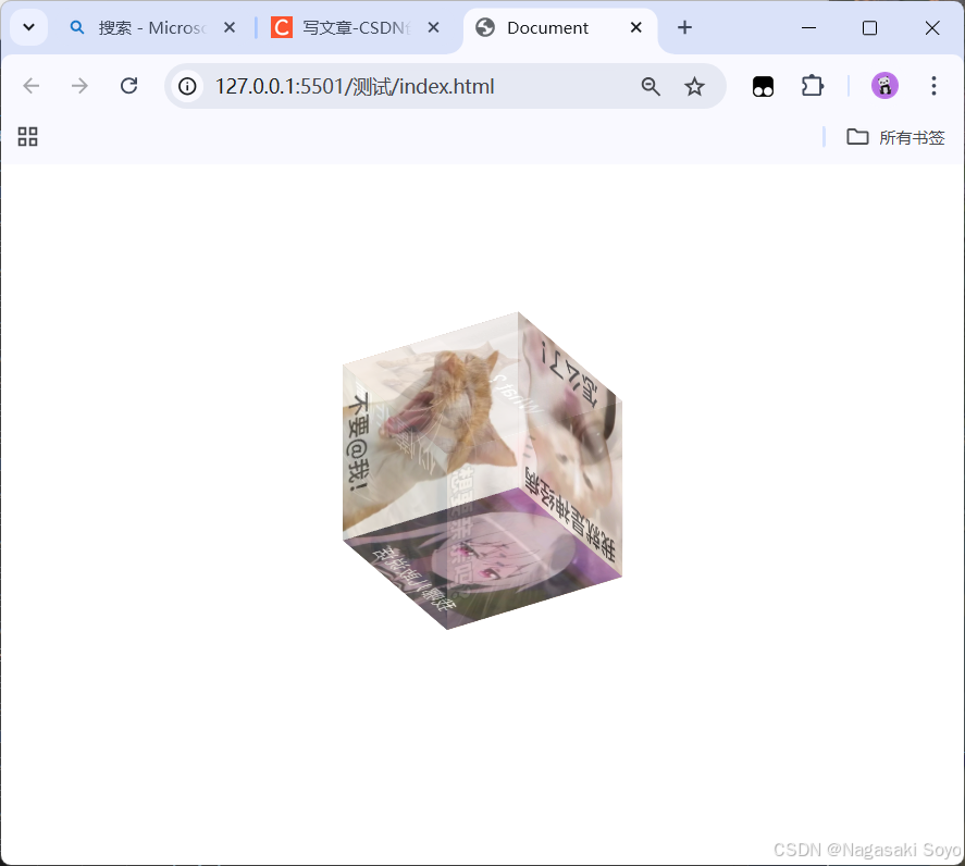
一、效果演示:
二、思路概括:
1.最外面写一个div大盒子。
2.大盒子里面放置六个图片盒子,分别对应立方体的六个面。
3.六个图片盒子里有图片,与图片盒子的大小相等。
4.六个图片盒子分别旋转(ratate)和偏移(translate),拼合成一个立方体。
三、代码实现:
1.使用vscode内置的代码片段快速生成基本结构。(输入英文!,然后回车)
<!DOCTYPE html>
<html lang="en">
<head>
    <meta charset="UTF-8">
    <meta name="viewport" content="width=device-width, initial-scale=1.0">
    <title>Document</title>
</head>
<body>

</body>
</html>
2.body中编写盒子。
<div class="cube">
        <div class="img-box1 img-box">
            <img src="./img/1.jpg" alt="">
        </div>
        <div class="img-box2 img-box">
            <img src="./img/2.jpg" alt="">
        </div>
        <div class="img-box3 img-box">
            <img src="./img/3.jpg" alt="">
        </div>
        <div class="img-box4 img-box">
            <img src="./img/4.jpg" alt="">
        </div>
        <div class="img-box5 img-box">
            <img src="./img/5.jpg" alt="">
        </div>
        <div class="img-box6 img-box">
            <img src="./img/6.jpg" alt="">
        </div>
</div>
3.style标签中为盒子设置基本样式。
.cube{
    width: 200px;
    height: 200px;
    margin: 200px auto;
    /* 开启3D显示,否则不生效 */
    transform-style: preserve-3d;
    /* 让外层盒子偏移一点,方便观察 */
    transform: rotateX(10deg) rotateY(10deg);
}
.cube .img-box{
    width: 200px;
    height: 200px;
    /* 使用绝对定位,使图片盒子重叠到一起 */
    position: absolute;
    /* 为图片设置透明度60% */
    opacity: .6;

}
    .img-box img{
    width: 200px;
    height: 200px;
    /* 使图片填充覆盖 */
    object-fit: cover;
}
4.为每个图片盒子设置样式,使它们拼合成一个立方体。
.img-box1{
    /* x轴2偏移90°,向z轴偏移100px,以下同理 */
    transform: rotateX(90deg) translateZ(100px);
}
.img-box2{
    transform: rotateX(90deg) translateZ(-100px);
}
.img-box3{
    transform: rotateY(90deg) translateZ(100px);
}
.img-box4{
    transform: rotateY(90deg) translateZ(-100px);
}
.img-box5{
    transform: translateZ(100px);
}
.img-box6{
    transform: translateZ(-100px);
}
5.定义关键帧。
/* 定义关键帧 */
@keyframes myRotateAni {
    /* 设置第一帧,x轴旋转0,z轴旋转0 */
    from{
        transform: rotateX(0) rotateZ(0);
    }
    /* 设置最后一帧,x轴旋转360°,z轴旋转360° */
    to{
        transform: rotateX(360deg) rotateZ(360deg);
    }
}
6.添加动画效果。
.cube{
    width: 200px;
    height: 200px;
    margin: 200px auto;
    transform-style: preserve-3d;
    transform: rotateX(10deg) rotateY(10deg);
    /* 设置动画,持续时间10秒,无限循环,曲线为线性 */
    animation: myRotateAni 10s infinite linear;
}
7.所有代码。
<!DOCTYPE html>
<html lang="en">
<head>
    <meta charset="UTF-8">
    <meta name="viewport" content="width=device-width, initial-scale=1.0">
    <title>Document</title>
    <style>
        .cube{
            width: 200px;
            height: 200px;
            margin: 200px auto;
            transform-style: preserve-3d;
            transform: rotateX(10deg) rotateY(10deg);
            /* 设置动画,持续时间10秒,无限循环,曲线为线性 */
            animation: myRotateAni 10s infinite linear;
        }
        .cube .img-box{
            width: 200px;
            height: 200px;
            position: absolute;
            opacity: .6;

        }
        .img-box img{
            width: 200px;
            height: 200px;
            object-fit: cover;
        }
        .img-box1{
        /* x轴2偏移90°,向z轴偏移100px,以下同理 */
        transform: rotateX(90deg) translateZ(100px);
        }
        .img-box2{
            transform: rotateX(90deg) translateZ(-100px);
        }
        .img-box3{
            transform: rotateY(90deg) translateZ(100px);
        }
        .img-box4{
            transform: rotateY(90deg) translateZ(-100px);
        }
        .img-box5{
            transform: translateZ(100px);
        }
        .img-box6{
            transform: translateZ(-100px);
        }
        /* 定义关键帧 */
        @keyframes myRotateAni {
            /* 设置第一帧,x轴旋转0,z轴旋转0 */
            from{
                transform: rotateX(0) rotateZ(0);
            }
            /* 设置最后一帧,x轴旋转360°,z轴旋转360° */
            to{
                transform: rotateX(360deg) rotateZ(360deg);
            }
        }
    </style>
</head>
<body>
    <div class="cube">
        <div class="img-box1 img-box">
            <img src="./img/1.jpg" alt="">
        </div>
        <div class="img-box2 img-box">
            <img src="./img/2.jpg" alt="">
        </div>
        <div class="img-box3 img-box">
            <img src="./img/3.jpg" alt="">
        </div>
        <div class="img-box4 img-box">
            <img src="./img/4.jpg" alt="">
        </div>
        <div class="img-box5 img-box">
            <img src="./img/5.jpg" alt="">
        </div>
        <div class="img-box6 img-box">
            <img src="./img/6.jpg" alt="">
        </div>
    </div>
</body>
</html>


 扫一扫
扫一扫


 869
869

 被折叠的 条评论
为什么被折叠?
被折叠的 条评论
为什么被折叠?
 到【灌水乐园】发言


