


 本文集合了2019年上半年的数据可视化发展亮点,包括最佳数据展示、元素周期表解析、气候变化可视化、性别不平等报道测量、全球卫星影像等。同时介绍了多种数据可视化工具和资源,以及数据故事讲述的方法论。
一、可视化
- 10 significant visualisation developments: January to June 2019 - Visualising Data 2019上半年最佳合集

To mark each mid-year and end of year milestone I try to take a reflective glance over the previous 6 months period in the data visualisation field and compile a collection of some of the most significant developments. These are the main projects, events, new sites, trends, personalities and general observations that have struck me as being important to help further the development of this field.
- The Periodic Table of Elements Issue 关于元素周期表的文章合集

https://www.bloomberg.com/features/2019-periodic-table-elements-issue/#cobalt-nickel-copper-zinc
Matter still matters. On the 150th anniversary of the periodic table, we cover every element.
- Why the Periodic Table of Elements Is More Important Than Ever 为什么元素周期表越来越重要

Mendeleev’s 150-year-old periodic table has become the menu for a world hungry for material benefits.
- Pixelation to represent endangered species counts 像素的多少表示物种的显存数量,图像越模糊越濒危。

https://flowingdata.com/2019/09/30/pixelation-to-represent-endangered-species-counts/
In 2008, the World Wildlife Fund ran a campaign that used pixelation to represent the number of animals left for endangered species. One pixel represents an animal, so an image appears more pixelat…
- How Much Hotter Is Your Hometown Than When You Were Born? 你住的地方比过去热吗?

https://www.nytimes.com/interactive/2018/08/30/climate/how-much-hotter-is-your-hometown.html
See how days at or above 90 degrees Fahrenheit have changed in your lifetime and how much hotter it could get.
- Measuring gender imbalances in reporting on the creative industries 描述性别不平等,设计不错
https://data-viz.nesta.org.uk/measuring-gender-imbalances-reporting-creative-industries/index.html
Percentage of quotes by men and women e explains, he tells, he adds, he recalls, he laughs, he admits, he explained, he sings, he replies, he continues, he has, he asks, he replied, he once, he was, he continued, he insists, he is, he sighs, he remembers, he smiles, he recalled, he asked, he had, he tweeted, he would, he concludes, he shrugs, he declares, he argues, he notes, he grins, he muses, he later, he points, he concedes, he joked, he declared, he admitted, he suggests, he chuckles, he begins, he announces, he jokes, he agrees, he concluded, he began, he claims, he reflects, he observes, he goes, he insisted, he offers, he exclaims, he noted, he confesses, he warns, he enthuses, he will, he nods, he quipped, he went, he complains, he announced, he cries, he shouts, he suggested, he answers, he protests, he thinks, he deadpans, he warned, he sang, he claimed, he observed, he mutters, he complained, he argued, he beams, he remarked, he states, he calls, he snaps, he quips, he whispers, he sighed, he decides, he cried, he recently, he called, he reveals, he drawls, he pauses, he remarks
- Imaging the entire Earth, every day 非常生动的卫星扫描地球拍照的可视化
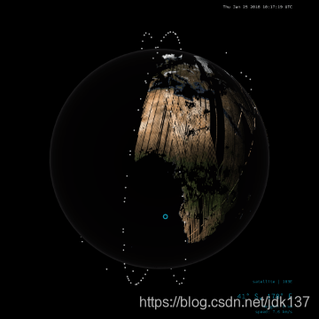
https://nbremer.github.io/planet-globe/
See how the Earth is slowly build up from each of the 600,000 satellite images taken by Planet's satellites in a single day
- If We All Left to “Go Back Where We Came From” 美国人种分布
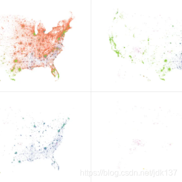
https://flowingdata.com/2018/05/16/go-back-where-you-came-from/
Imagine that those with immigrants in their family tree left the country. Almost everyone, basically.
- What Does Big Tech Know About You? Basically Everything — Cool Infographics 科技公司知道我们多少隐私?
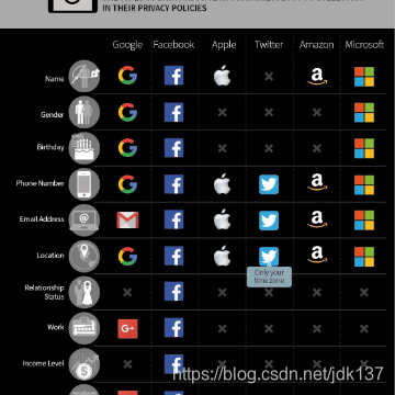
https://coolinfographics.com/blog/2019/10/4/what-does-big-tech-know-about-you-basically-everything
Big tech companies have been spying on us for years. This knowledge isn’t new information, but what could be surprising is exactly to what extent each company does it. Security Baron categories what data six of the biggest tech companies collect from you in The Data Big Companies Have On You inf
- The Museum of Atari, Mario and Electric Childhood Dreams | CNA Lifestyle 红白机游戏
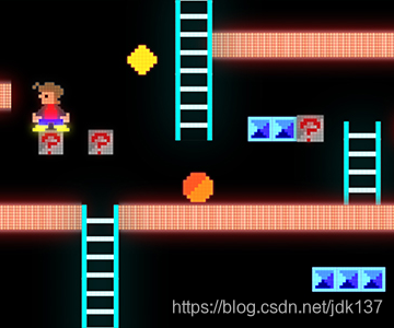
https://infographics.channelnewsasia.com/interactive/cnalifestyle/video-game-museum/index.html
CNA Lifestyle looks at Singapore’s only video game museum, the James Cook University Museum Of Video And Computer Games. We also highlight some of the best movies based on video games as well as a present a timeline of the history of video gaming from the 1970s to the present.
- China Internet Report 中国互联网报告
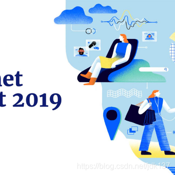
https://www.scmp.com/china-internet-report
100+ page report about China's rapidly evolving tech industy.
- In Space We Trust 苏联航空史
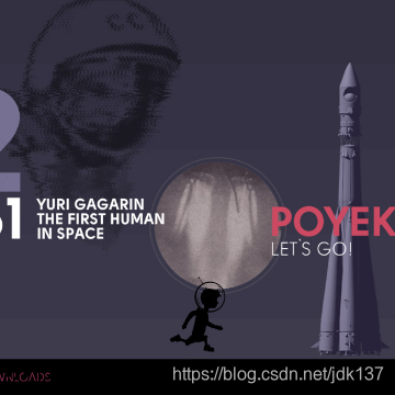
Art project is dedicated to the most important events in the history of space exploration: first spacecraft, flights to other planets and landings on celestial bodies. Supported by Roscosmos.
二、工具
- new year, new tools! — storytelling with data 工具合集
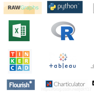
http://www.storytellingwithdata.com/blog/2019/1/24/new-year-new-tools
We saw a wide variety of tools used in the first challenge of 2019: from the familiar to new players on the market and from drag & drop GUI solutions to programming languages. Read on to see the wide array of instruments available for visualizing data and learn from others as they attempt th
- School diversity visualized with moving bubbles REGL.js的示例,10000点的流畅动画。
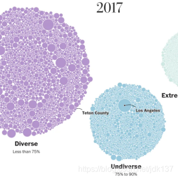
https://flowingdata.com/2019/09/16/school-diversity-visualized-with-moving-bubbles/
The Washington Post visualized 13,000 school districts to show the change in diversity between 1995 and 2017. Each bubble represents a district and the size represents number of students. The bubbl…
- pshihn/rough 粗糙手绘风格图表库
https://github.com/pshihn/rough/
Create graphics with a hand-drawn, sketchy, appearance - pshihn/rough
- timqian/chart.xkcd 另一个粗糙手绘风格图表库
https://github.com/timqian/chart.xkcd
xkcd styled chart lib. Contribute to timqian/chart.xkcd development by creating an account on GitHub.
- pagemap · mini map for web pages · larsjung.de 类似于sublime右侧的网页缩略图工具
mini map for web pages
- Minify Your SVGs - victorzhou.com svg压缩
https://victorzhou.com/blog/minify-svgs/
How I optimize SVGs for this blog and why you probably should, too.
- Zdog · Round, flat, designer-friendly pseudo-3D engine for canvas and SVG 简易的伪3D工具
Round, flat, designer-friendly pseudo-3D engine for canvas and SVG
- Photographs from above, an Overview 卫星地图overview,很漂亮
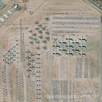
https://flowingdata.com/2019/10/23/photographs-from-above-an-overview/
Overview is an ongoing project that uses a zoomed out view for a new perspective on the world: Seeing the Earth from a great distance has been proven to stimulate awe, increase desire to collaborat…
三、资源,教程
- Nightingale – Medium 可能是最高质量的可视化社区文集
https://medium.com/nightingale
The Journal of the Data Visualization Society.
- Creating a WebGL Earth with three.js 一步步创建一个漂亮的3D地球

http://blog.mastermaps.com/2013/09/creating-webgl-earth-with-threejs.html
This blog post will show you how to create a WebGL Earth with three.js , a great JavaScript library which helps you to go 3D in the browser...
四、方法论
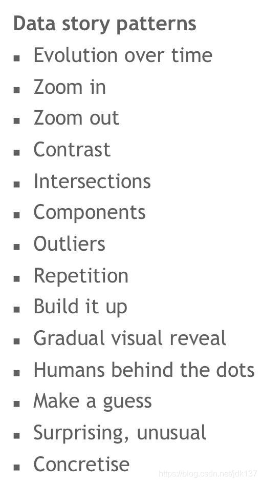
- 14种data story 模式
https://twitter.com/maartenzam/status/1142065792835563520
- 关系网络 | 文献泛读之3:设计更好理解的可视化
https://mp.weixin.qq.com/s/pACWavwMDUCfhk9zSUOCRA
我们需要去反复考量目前的可视化设计是否能够让使用者理解、是否有效
五、思考与其他
- The days are long but the decades are short
https://blog.samaltman.com/the-days-are-long-but-the-decades-are-short
I turned 30 last week and a friend asked me if I'd figured out any life advice in the past decade worth passing on. I'm somewhat hesitant to publish this because I think these lists usually seem...
- 什么是真正的程序员? - 削微寒 - 博客园
https://www.cnblogs.com/xueweihan/p/5220513.html
什么是真正的程序员 这篇文章的原文来自: "A Little Printf Story" 作者仿照《小王子》中的情节,通过小printf遇见的不同类型的程序员,最后悟出什么才是真正
- Mental Models I Find Repeatedly Useful

https://medium.com/@yegg/mental-models-i-find-repeatedly-useful-936f1cc405d
2019 UPDATE: Since this post came out, I co-authored a book about it called Super Thinking: The Big Book of Mental Models. You can order it…


 1131
1131

 被折叠的 条评论
为什么被折叠?
被折叠的 条评论
为什么被折叠?
 到【灌水乐园】发言


