


 本文汇集了2019年精彩的数据可视化作品,包括欧盟区域调整、时尚界肤色分析、全球GDP变化、航天历史、DOOM游戏编程秘密等。同时探讨了超多数人的思考路径,并推荐了高分辨率图片查看工具、远程调试Android设备的方法以及数据可视化博客和资源。
一、可视化
1、Why EU Regions are Redrawing Their Borders 清楚说明了为何有些欧盟某些区域要调整边界。

![]() https://pudding.cool/2019/04/eu-regions/
https://pudding.cool/2019/04/eu-regions/
The EU dedicates a third of its budget to less economically developed regions for investments in infrastructure. Yet when regions improve economically, they no longer qualify for the same amount of funding. As a type of statistical gerrymandering, governors of these regions have redrawn their borders in order to keep the money flowing.
2、Colorism in High Fashion Vogue封面模特的肤色可视化。把事情说得很清楚,交互细节非常赞。

![]() https://pudding.cool/2019/04/vogue/
https://pudding.cool/2019/04/vogue/
We looked at 19 years of covers to find how Vogue represents women of different shades.
3、Caixin Vislab - Data Journalism Awards 财新的2018获奖案例

![]() https://datajournalismawards.org/projects/caixin-vislab-2/
https://datajournalismawards.org/projects/caixin-vislab-2/
In 2018, Caixin VisLab keeps purchasing high level data journalism works, no matter in breaking news, daily pieces, or in longterm projects. 2018 is a big
4、全世界GDP前20名在200多年间的变化和趋势_新浪视频
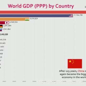
全世界GDP前20名在200多年间的变化和趋势,看到后边也许就明白为何有的国家着急了: -手机新浪网视频频道,sina.cn
5、6月23日,第四届中国数据新闻大赛暨大数据可视化艺术人才培养高峰论坛 在湖北大学召开。其中有一些获奖数据新闻作品不错。
![]() https://mp.weixin.qq.com/s/XedtHp2JFaWl_gipj5J4tg
https://mp.weixin.qq.com/s/XedtHp2JFaWl_gipj5J4tg
6、2019年全球数据新闻奖于当地时间6月14日(北京时间6月15日)在希腊揭晓
![]() https://mp.weixin.qq.com/s/SZP6FkJBzB5KAnpS9l-lcQ
https://mp.weixin.qq.com/s/SZP6FkJBzB5KAnpS9l-lcQ
7、In Space We Trust 航天历史可视化交互
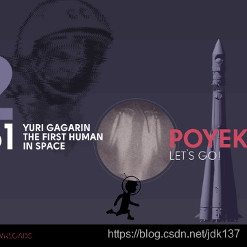
Art project is dedicated to the most important events in the history of space exploration: first spacecraft, flights to other planets and landings on celestial bodies. Supported by Roscosmos.
8、How DOOM fire was done DOOM游戏中的火是怎么编程的

http://fabiensanglard.net/doom_fire_psx/index.html
9、2018最新!【九合一選舉互動地圖】你的鄰居投給誰?選民屬性大解密-天下雜誌
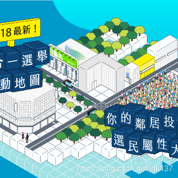
https://web.cw.com.tw/election2018/
10、美轮美奂!你绝对没见过的空中丝路

https://mp.weixin.qq.com/s/AnOw11kovSYPr_MEogFeig
每24小时,就有超过8000架次民航班机执飞 “一带一路”相关国家和地区间的跨国航线。
11、UK Wind Chart UK风向风力可视化
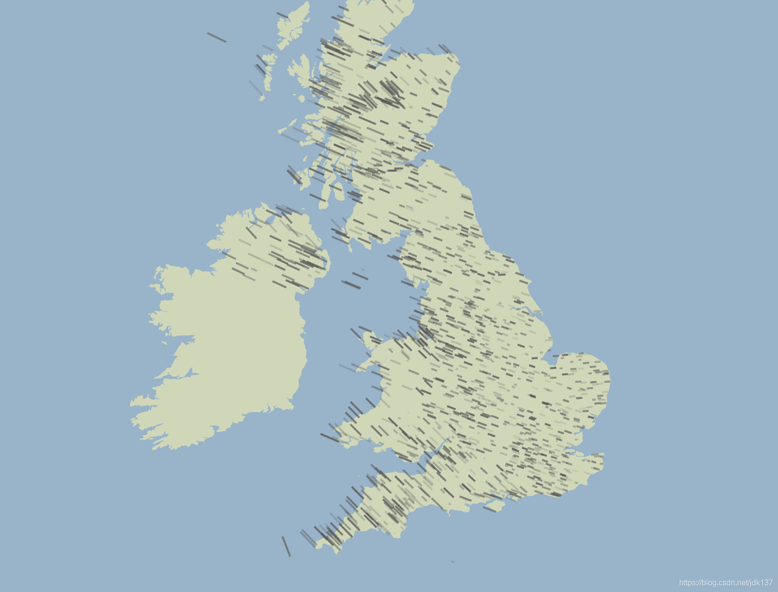
https://charts.animateddata.co.uk/ukwind/
Animated UK Wind Chart This chart shows wind speed and direction in the UK. The more the wind blows, the faster the lines go! The original inspiration came from the beautiful Wind Map by hint.fm. Weather data is from the Met Office's DataPoint service and the UK map was taken from Mike Bostock's mapping tutorial . Although real data, this visualisation is just for demonstration. Built by Peter Cook .
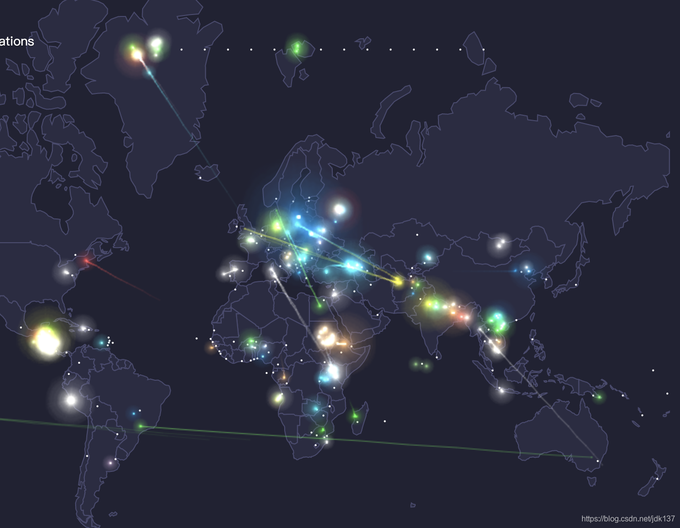
12、World Bank Global Development Sprint 世界地图飞线
二、思考
1、The 2019 Summer Reading List

![]() https://coolinfographics.com/blog/2019/6/4/2019-summer-reading-list
https://coolinfographics.com/blog/2019/6/4/2019-summer-reading-list
2、如何超过大多数人 | | 酷 壳 - CoolShell
https://coolshell.cn/articles/19464.html
当你看到这篇文章的标题,你一定对这篇文章产生了巨大的兴趣,因为你的潜意识在告诉你,这是一本人生的"武林秘籍",而且还是左耳朵写的,一定有干货满满,只要读完,一定可以练就神功并找到超过大多数人的快车道和捷径……然而…… 当你看到我这样开篇时,你一定会觉得我马上就要有个转折,告诉你这是不可能的,一切都需要付出和努力……然而,你错了,这篇文章还真就是一篇"秘籍"
三、工具、教程和资源
1、OpenSeadragon 高分辨率图片缩放查看组件
https://openseadragon.github.io/
2、The Joy of Painting 一种享受
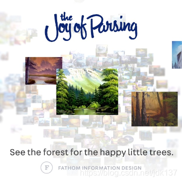
We analyzed the transcripts from all 403 episodes of Bob Ross’ The Joy of Painting using our custom tools to understand large document sets.
3、远程调试 Android 设备网页
http://www.ruanyifeng.com/blog/2019/06/android-remote-debugging.html
4、RimoChan/Librian galgame引擎
https://github.com/RimoChan/Librian
【Librian】簡明強大的 Galgame | Visual Novel 引擎. Contribute to RimoChan/Librian development by creating an account on GitHub.
5、大数据导航 数据收集入口网站
大数据导航,以大数据产业为主,大数据工具为辅,给用户提供一个更加快速找到大数据相关的工具平台。
6、最值得关注的 10 佳数据可视化博客
https://www.tableau.com/zh-cn/learn/articles/best-data-visualization-blogs
最值得关注的 10 佳数据可视化博客 数据可视化曾是一个相对模糊的领域,而今已在商业智能和数据新闻领域中普及开来。您看到的所有信息图,都是数据可视化的实际应用。有许多方式可高效而精美地呈现见解,每天都有大量博客在创建和分析可视化。
7、Devices.css - css绘制的各种设备
https://github.com/picturepan2/devices.css
Modern devices in pure CSS. Contribute to picturepan2/devices.css development by creating an account on GitHub.
8、WarpPrism/AutoPiano 自由钢琴 乐器js库
https://github.com/WarpPrism/AutoPiano
http://crystalworld.gitee.io/qpiano/#/
自由钢琴(AutoPiano)利用HTML5技术开发的在线钢琴应用,致力于为钢琴爱好者、音乐爱好者以及文艺爱好者提供一个优雅、简洁的平台,在学习工作之余可以享受音乐的美好。
9、zhaoolee/ChromeAppHeroes chrome插件汇总介绍
https://github.com/zhaoolee/ChromeAppHeroes
Chrome插件英雄榜, 为优秀的Chrome插件写一本中文说明书, 让Chrome插件英雄们造福人类


 845
845

 被折叠的 条评论
为什么被折叠?
被折叠的 条评论
为什么被折叠?
 到【灌水乐园】发言


