


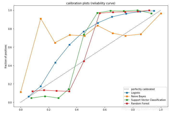
 本文通过使用Python的scikit-learn库,演示了如何对比和校准四种常见分类算法(逻辑回归、朴素贝叶斯、支持向量机、随机森林)的预测概率。通过对大规模数据集的分类任务,展示了不同算法的预测概率与实际结果之间的偏差,并通过校准曲线直观地呈现了这一偏差。
源码和注释:
import numpy as np
np.random.seed(0)
import matplotlib.pyplot as plt
from sklearn import datasets
from sklearn.naive_bayes import GaussianNB
from sklearn.linear_model import LogisticRegression
from sklearn.ensemble import RandomForestClassifier
from sklearn.svm import LinearSVC
from sklearn.calibration import calibration_curve
# 生成用于分类的数据集
# 参数n_informative表示包含分类关键信息的特征数目
# 参数n_redundant表示与n_informative特征强关联的特征,即冗余特征
X, y = datasets.make_classification(n_samples=100000, n_features=20,n_informative=2, n_redundant=2)
# 定义训练样本数目
train_samples = 10
# 使用numpy的切片操作分别截取样本数据和标签数据的前10行作为训练数据,其余的作为测试数据
# pandas不支持切片操作,但可以通过df.loc或者df.iloc间接支持切片
X_train = X[:train_samples]
X_test = X[train_samples:]
y_train = y[:train_samples]
y_test = y[train_samples:]
# 实例化四种分类算法:逻辑回归、朴素贝叶斯、线性支持向量分类器、随机森林
lr = LogisticRegression(solver='lbfgs')
gnb = GaussianNB()
svc = LinearSVC(C=1.0)
rfc = RandomForestClassifier(n_estimators=100)
# subplot2grid和subplots一样用于划分子图
# 这里将整个画图区域分为3行1列,从第1行第1列绘制第一个图,这个图占两行区域
plt.figure(figsize=(10,10))
ax1 = plt.subplot2grid((3,1), (0,0), rowspan=2)
# 从第3行第1列绘制第二个图,这个图使用剩余的默认区域
ax2 = plt.subplot2grid((3,1), (2,0))
# 在第一个图上绘制穿过【0,1】【1,0】两点的线,设置线的样式和标签
ax1.plot([0,1], [0,1], "k:", label="perfectly calibrated")
# 依次迭代四种算法
for clf, name in [(lr, 'Logistic'),
(gnb, 'Naive Bayes'),
(svc, 'Support Vector Classification'),
(rfc, 'Random Forest')]:
clf.fit(X_train, y_train)
# 不是所有分类算法都能输出分类概率,所以要判断算法输出的结果是概率还是决策面,并采取不同的处理过程
if hasattr(clf, "predict_proba"):
# predict_proba函数返回每一个样本属于每一个类别的概率,这里取概率最大的那一个类
prob_pos = clf.predict_proba(X_test)[:, 1]
else:
# decision_function函数返回每一个样本属于每一个类别的置信分数,这个分数是根据样本到分隔超平面的距离计算的
prob_pos = clf.decision_function(X_test)
# 将分数限制在0~1之间,与上面的概率取值范围保持一致,才能同步比较
prob_pos = (prob_pos-prob_pos.min())/(prob_pos.max()-prob_pos.min())
# calibration_curve函数计算校准曲线,体现预测概率与真实分类的差距
# 第一个参数是样本真实分类,第二个参数是样本预测概率,n_bins参数表示把概率从小到大分成几个区间
# 返回的第一个数组是每一个区间中样本为真的比例,第二个数组是每一个区间中样本的平均预测概率
# 当曲线在虚线下方时,表示预测为真>实际为真,当曲线在虚线上方时,表示预测为真<实际为真
fraction_of_positives, mean_predicted_value = calibration_curve(y_test, prob_pos, n_bins=10)
# 在第一个子图上绘制每一个算法的校准曲线,调整子图样式
ax1.plot(mean_predicted_value, fraction_of_positives, "s-", label="%s" % (name, ))
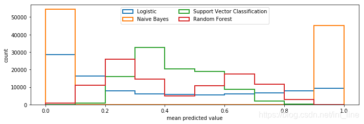
# 在第二个子图上绘制将0~1平均分为10个区间,每一个区间的样本数目
ax2.hist(prob_pos, range=(0,1), bins=10, label=name, histtype="step", lw=2)
# 设置子图的标签、轴刻度范围、legend样例集、使用紧凑的排列,避免子图超出绘图区域不显示
ax1.set_ylabel("fraction of positives")
ax1.set_ylim([-0.05, 1.05])
ax1.legend(loc="lower right")
ax1.set_title('calibration plots (reliability curve)')
ax2.set_xlabel("mean predicted value")
ax2.set_ylabel("count")
ax2.legend(loc="upper center", ncol=2)
plt.tight_layout()
plt.show()
结果:


 3025
3025


 到【灌水乐园】发言


