


 本文介绍了HTML5新增的语义化标签、视频音频标签及表单输入类型等,并详细讲解了CSS3的选择器、盒子模型、过渡效果等新特性。
提示:文章写完后,目录可以自动生成,如何生成可参考右边的帮助文档
PINK老师HTML5+CSS3教程9
前言
提示:这里可以添加本文要记录的大概内容:
https://www.bilibili.com/video/BV14J4114768?p=274&spm_id_from=pageDriver
提示:以下是本篇文章正文内容,下面案例可供参考
一、HTML5新特性
增加一些新的标签、新的表单、新的表单属性 IE9=
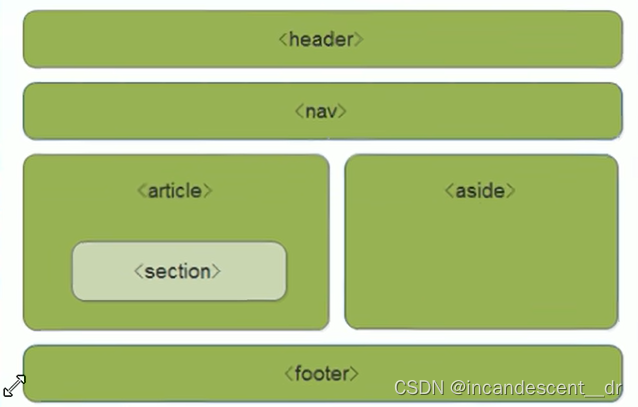
1.新增语义化标签
header 头部标签
nav 导航标签
article 内容标签
section 定义文档某个区域 大号DIV
aside 侧边栏标签
footer 尾部标签
主要针对搜索引擎使用的,可以重复使用,IE9中需要转换为块级元素
<head>
    <meta charset="UTF-8">
    <meta name="viewport" content="width=device-width, initial-scale=1.0">
    <meta http-equiv="X-UA-Compatible" content="ie=edge">
    <title>HTML5新增语义化标签</title>
    <style>
        header, nav {
            height: 120px;
            background-color: pink;
            border-radius: 15px;
            width: 800px;
            margin: 15px auto;
        }
        section {
            width: 500px;
            height: 300px;
            background-color: skyblue;
        }
    </style>
</head>
<body>
    <header>头部标签</header>
    <nav>导航栏标签</nav>
    <section>某个区域</section>
</body>
</html>
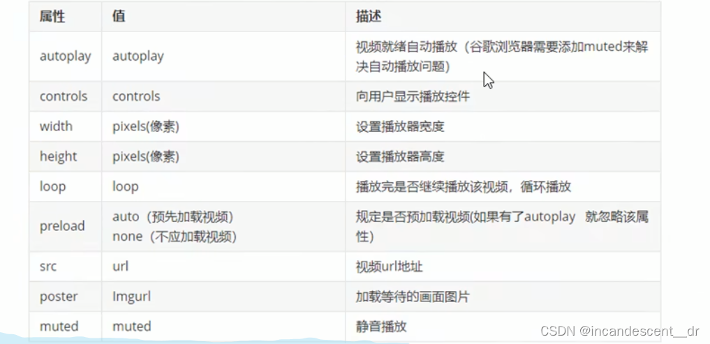
2.新增视频标签
视频 video 尽量使用mp4
video src=“文件地址” controls=“controls”
<!DOCTYPE html>
<html lang="en">
<head>
    <meta charset="UTF-8">
    <meta name="viewport" content="width=device-width, initial-scale=1.0">
    <meta http-equiv="X-UA-Compatible" content="ie=edge">
    <title>HTML5新增视频标签</title>
    <style>
        video {
            width: 100%;
        }
    </style>
</head>
<body>
    <video src="media/mi.mp4" autoplay="autoplay" muted="muted"  loop="loop" poster="media/mi9.jpg"></video>
</body>
</html>
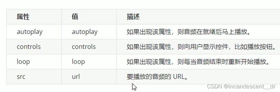
3.新增音频标签
音频 audio MP3
audio src=“文件地址” controls=“controls”
<!DOCTYPE html>
<html lang="en">
<head>
    <meta charset="UTF-8">
    <meta name="viewport" content="width=device-width, initial-scale=1.0">
    <meta http-equiv="X-UA-Compatible" content="ie=edge">
    <title>HTML5新增音频标签</title>
</head>
<body>
    <audio src="media/music.mp3" autoplay="autoplay" controls="controls"></audio>
</body>
</html>
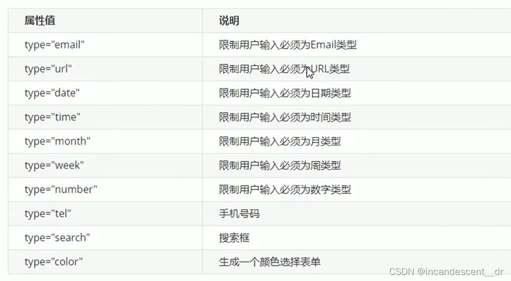
4.新增input标签
<body>
    <!-- 我们验证的时候必须添加form表单域 -->
    <form action="">
        <ul>
            <li>邮箱: <input type="email" /></li>
            <li>网址: <input type="url" /></li>
            <li>日期: <input type="date" /></li>
            <li>时间: <input type="time" /></li>
            <li>数量: <input type="number" /></li>
            <li>手机号码: <input type="tel" /></li>
            <li>搜索: <input type="search" /></li>
            <li>颜色: <input type="color" /></li>
            <!-- 当我们点击提交按钮就可以验证表单了 -->
            <li> <input type="submit" value="提交"></li>
        </ul>
    </form>
</body>
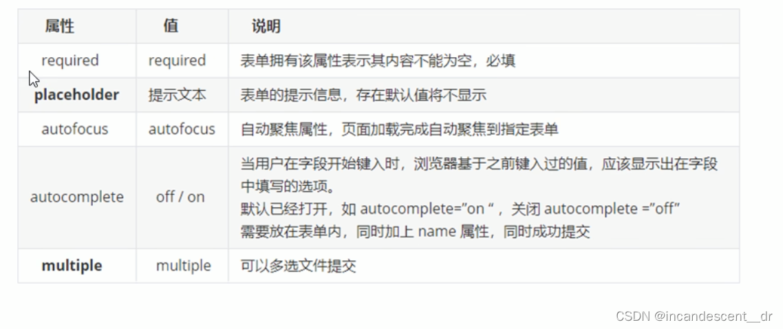
5.新增表单属性
placeholder 默认提示信息
input::placeholder{color:pink}
multiple 多选文件
二、CSS3新特性
1.新增选择器
便捷自由选择目标元素
1.属性选择器 权重10
根据元素特定属性来选择元素,不借助于类或者ID选择器
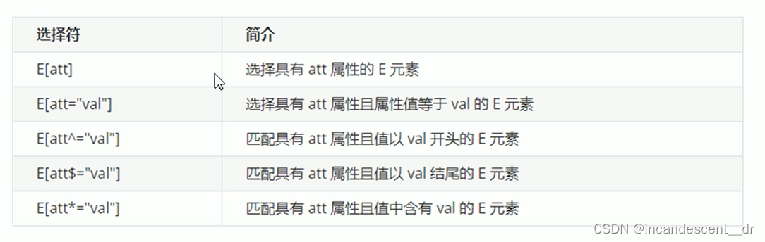
类选择器和属性选择器 伪类选择器 权重都是 10
<head>
    <meta charset="UTF-8">
    <meta name="viewport" content="width=device-width, initial-scale=1.0">
    <meta http-equiv="X-UA-Compatible" content="ie=edge">
    <title>CSS3新增属性选择器</title>
    <style>
        /* 必须是input 但是同时具有 value这个属性 选择这个元素  [] */
        /* input[value] {
            color:pink;
        } */
        /* 只选择 type =text 文本框的input 选取出来 */
        input[type=text] {
            color: pink;
        }
        /* 选择首先是div 然后 具有class属性 并且属性值 必须是 icon开头的这些元素 */
        div[class^=icon] {
            color: red;
        }
        section[class$=data] {
            color: blue;
        }
        div.icon1 {
            color: skyblue;
        }
        /* 类选择器和属性选择器 伪类选择器 权重都是 10 */
    </style>
</head>
<body>
    <!-- 1. 利用属性选择器就可以不用借助于类或者id选择器 -->
    <!-- <input type="text" value="请输入用户名">
    <input type="text"> -->
    <!-- 2. 属性选择器还可以选择属性=值的某些元素 重点务必掌握的 -->
    <input type="text" name="" id="">
    <input type="password" name="" id="">
    <!-- 3. 属性选择器可以选择属性值开头的某些元素 -->
    <div class="icon1">小图标1</div>
    <div class="icon2">小图标2</div>
    <div class="icon3">小图标3</div>
    <div class="icon4">小图标4</div>
    <div>我是打酱油的</div>
    <!-- 4. 属性选择器可以选择属性值结尾的某些元素 -->
    <section class="icon1-data">我是安其拉</section>
    <section class="icon2-data">我是哥斯拉</section>
    <section class="icon3-ico">哪我是谁</section>

</body>
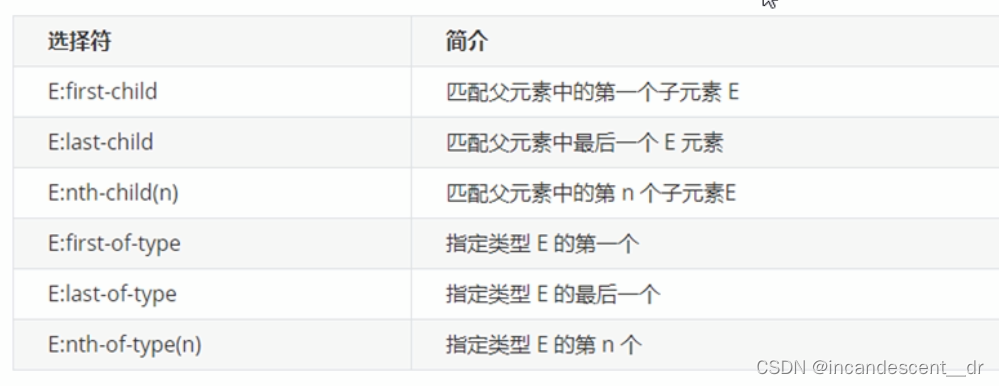
2.结构伪类选择器 权重10
根据文档结构来选择选择器元素
<head>
    <meta charset="UTF-8">
    <meta name="viewport" content="width=device-width, initial-scale=1.0">
    <meta http-equiv="X-UA-Compatible" content="ie=edge">
    <title>CSS3新增结构伪类选择器</title>
    <style>
        /* 1. 选择ul里面的第一个孩子 小li */
        ul li:first-child {
            background-color: pink;
        }
        /* 2. 选择ul里面的最后一个孩子 小li */
        ul li:last-child {
            background-color: pink;
        }
         /* 3. 选择ul里面的第2个孩子 小li */
         ul li:nth-child(2) {
            background-color: skyblue;
        }
        ul li:nth-child(6) {
            background-color: skyblue;
        }
    </style>
</head>
<body>
    <ul>
        <li>我是第1个孩子</li>
        <li>我是第2个孩子</li>
        <li>我是第3个孩子</li>
        <li>我是第4个孩子</li>
        <li>我是第5个孩子</li>
        <li>我是第6个孩子</li>
        <li>我是第7个孩子</li>
        <li>我是第8个孩子</li>
    </ul>
</body>
1. nth-child(n) 选择某个父元素的一个或多个特定子元素
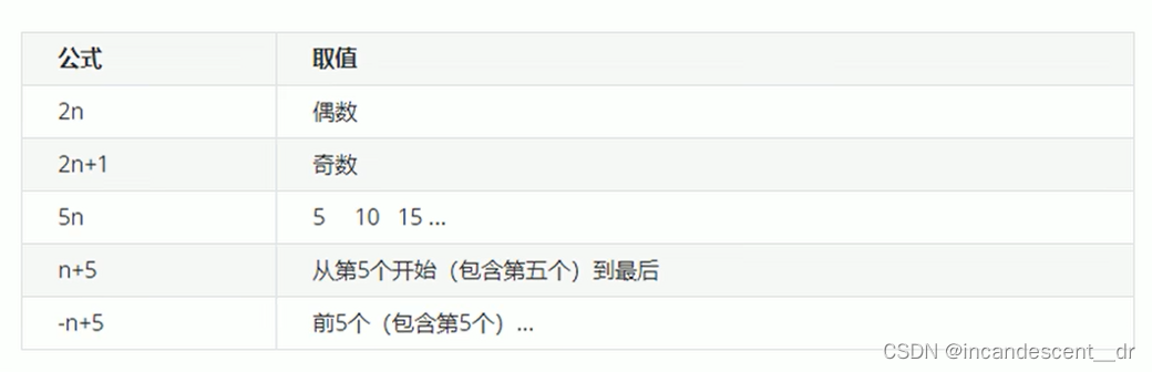
N可以是数字,关键字和公式
数字就是第几个元素
N可以是关键字:even 偶数 odd 奇数
N可以是公式,从0开始计算 例如 n 2n 2n+1 …
2. nth-of-type(n)
与 nth-child(n)区别 nth-child会把所有的盒子都排序号,执行的时候首先看序号,之后回去看前面 eg:div 如果不符合就选不上
nth-of-type把指定元素eg:div的盒子都排序号,之后再去看选第几个
3.伪元素选择器 (重点) 权重 1
利用CSS创建新标签元素、简化HTML结构
::before
::after
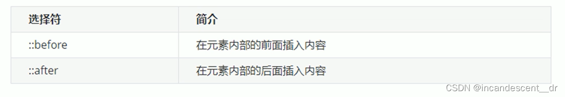
before和after创建一个元素,但是属于行内元素
element::before{}
before 和after必须有content属性
before放父盒子里面的最前面
after放父盒子里面的最后面
和标签选择器一样 权重是1
使用场景:配合字体图标、视频遮罩
<head>
    <meta charset="UTF-8">
    <meta name="viewport" content="width=device-width, initial-scale=1.0">
    <meta http-equiv="X-UA-Compatible" content="ie=edge">
    <title>伪元素选择器使用场景2-仿土豆网显示隐藏遮罩案例</title>
    <style>
        .tudou {
            position: relative;
            width: 444px;
            height: 320px;
            background-color: pink;
            margin: 30px auto;
        }

        .tudou img {
            width: 100%;
            height: 100%;
        }

        .tudou::before {
            content: '';
            /* 隐藏遮罩层 */
            display: none;
            position: absolute;
            top: 0;
            left: 0;
            width: 100%;
            height: 100%;
            background: rgba(0, 0, 0, .4) url(images/arr.png) no-repeat center;
        }

        /* 当我们鼠标经过了 土豆这个盒子,就让里面before遮罩层显示出来 */
        .tudou:hover::before {
            /* 而是显示元素 */
            display: block;
        }
    </style>
</head>

<body>
    <div class="tudou">
        <img src="images/tudou.jpg" alt="">
    </div>
    <div class="tudou">
        <img src="images/tudou.jpg" alt="">
    </div>
    <div class="tudou">
        <img src="images/tudou.jpg" alt="">
    </div>
    <div class="tudou">
        <img src="images/tudou.jpg" alt="">
    </div>
</body>
清除浮动
after伪元素清除浮动\双伪元素清除(额外标签法的升级版本)
通过伪元素选择器生成了一个新的盒子 在最后/最前面和最后面
2.CSS3盒子模型
box-sizing 来指定盒子模型,有两个值content-box 或者border-box
content-box width+border+padding
border-box width 使用padding border 不会撑开
3.图片模糊处理filter
filter 模糊或者颜色偏移
filter:blur(5px) 数值越大越模糊
4.宽度calc函数
width:calc(100% -80px)
括号里面可以加减乘除 + - * /
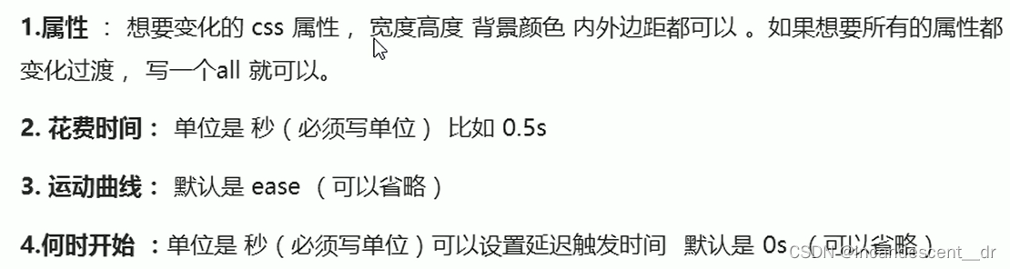
5.过渡属性
transition 不通过JS就能写
谁做过渡给谁加
经常和:hover搭配使用
transition: 要过渡的属性 花费时间 运动曲线 何时开始
代码如下(示例):
<head>
    <meta charset="UTF-8">
    <meta name="viewport" content="width=device-width, initial-scale=1.0">
    <meta http-equiv="X-UA-Compatible" content="ie=edge">
    <title>CSS3 过渡效果</title>
    <style>
        div {
            width: 200px;
            height: 100px;
            background-color: pink;
            /* transition: 变化的属性 花费时间 运动曲线 何时开始; */
            /* transition: width .5s ease 0s, height .5s ease 1s; */
            /* 如果想要写多个属性,利用逗号进行分割 */
            /* transition: width .5s, height .5s; */
            /* 如果想要多个属性都变化,属性写all就可以了 */
            /* transition: height .5s ease 1s; */
            /* 谁做过渡,给谁加 */
            transition: all 0.5s;
        }
        div:hover {
            width: 400px;
            height: 200px;
            background-color: skyblue;
        }
    </style>
</head>
<body>
    <div></div>
</body>
总结
HTML5 新增布局和表单标签
CSS3新增特性


 扫一扫
扫一扫


 1991
1991

 被折叠的 条评论
为什么被折叠?
被折叠的 条评论
为什么被折叠?
 到【灌水乐园】发言


