


1. 非线性图
- 非线性图指的是不遵循线性关系的图表,它们通常用来展示变量间的复杂关系。这些图表可以是曲线、散点图或其他形状,如指数、对数、多项式等,反映了数据点之间的非直线型关联。在数据分析和可视化中,非线性图有助于揭示数据的深层次模式和趋势。
2. 绘制椭圆
2.1 椭圆方程
-
椭圆的一般方程可以表示为 x 2 a 2 + y 2 b 2 = 1 \displaystyle \frac{x^2}{a^2} + \frac{y^2}{b^2} = 1 a2x2+b2y2=1,其中 a a a 和 b b b 分别是椭圆在 x x x 轴和 y y y 轴上的半轴长度。为了在 Plotly 中绘制椭圆,我们可以生成一系列 x x x 和 y y y 的值,然后使用这些值来定义椭圆的轮廓。
-
椭圆的参数方程是一组可以用来描述椭圆上任意一点位置的方程,它们通常以参数 t t t(通常是角度)来表示。对于一个以原点为中心,长半轴为 a a a,短半轴为 b b b 的椭圆,其参数方程如下:
x = a cos ( t ) x = a \cos(t) x=acos(t)
y = b sin ( t ) y = b \sin(t) y=bsin(t) -
其中, t t t 的取值范围是从 0 0 0 到 2 π 2\pi 2π,这样 t t t 就会随着参数方程的运行遍历整个椭圆。
2.2 绘制椭圆
- 创建网页 -
ellipse.html
- 编写网页代码和脚本
<!DOCTYPE html>
<html>
<head>
<meta charset="utf-8">
<title>椭圆演示</title>
<script src="scripts/plotly-basic.min.js"></script>
</head>
<body>
<div id="myPlot" style="width:750px;height:750px;"></div>
<script>
// 定义椭圆的半轴长度
let a = 5; // x轴的半轴长度
let b = 3; // y轴的半轴长度
const tValues = []; // 定义参数t的数组,用于参数化椭圆
const xValues = []; // 定义x值数组
const yValues = []; // 定义y值数组
// 生成椭圆的参数方程值
for (let t = 0; t <= 2 * Math.PI; t += 0.01) {
tValues.push(t); // 将参数t添加到t值数组
xValues.push(a * Math.cos(t)); // 将a * cos(t)值添加到x值数组
yValues.push(b * Math.sin(t)); // 将b * sin(t)值添加到y值数组
}
// 定义数据
const data = [{
x: xValues, // x值数组
y: yValues, // y值数组
type: "scatter", // 模式设置为散点
fill: "toself", // 填充椭圆内部
line: {color: 'rgba(0, 100, 200, 0.5)'} // 椭圆边缘线颜色
}];
// 定义布局
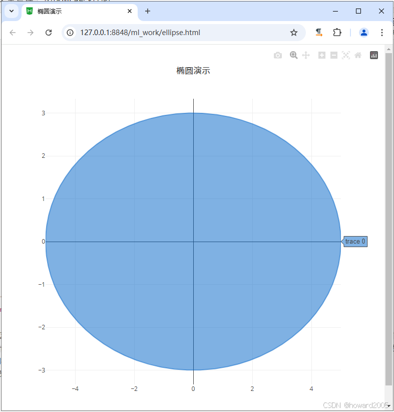
const layout = {
title: "椭圆演示", // 设置图表标题
showlegend: false // 不显示图例
};
// 使用Plotly显示图表
Plotly.newPlot("myPlot", data, layout); // 在id为"myPlot"的元素中绘制椭圆
</script>
</body>
</html>
- 在这段代码中,我们使用参数
t
t
t来生成椭圆的
x
x
x和
y
y
y值,其中
t
t
t的范围是从
0
0
0到
2
π
2\pi
2π。我们使用
Math.cos(t)和Math.sin(t)来计算椭圆的参数方程,并将这些值添加到xValues和yValues数组中。最后,我们使用Plotly.newPlot函数在网页上绘制椭圆。fill: "toself"属性用于填充椭圆的内部,而line属性用于设置椭圆边缘线的颜色。 - 浏览网页,查看效果
3. 绘制阿基米德螺线
3.1 阿基米德螺线的方程
- 阿基米德螺线(Archimedean Spiral)是一种由古希腊数学家阿基米德所描述的螺旋线。
- 极坐标方程: r = a + b θ r = a + b\theta r=a+bθ,其中, r r r是从原点到螺旋线的距离, θ \theta θ是从正x轴开始的角度(以弧度为单位), a a a和 b b b是常数,决定了螺旋线的起始位置和间距。
- 要在网页上使用
Plotly.js绘制阿基米德螺线,需要将极坐标方程转换为直角坐标系下的参数方程。 - 阿基米德螺线的直角坐标系参数方程
x = ( a + b θ ) cos ( θ ) x = (a + b\theta) \cos(\theta) x=(a+bθ)cos(θ)
y = ( a + b θ ) sin ( θ ) y = (a + b\theta) \sin(\theta) y=(a+bθ)sin(θ)
3.2 绘制阿基米德螺线
- 创建网页 -
ellipse.html
- 编写网页代码和脚本
<!DOCTYPE html>
<html>
<head>
<meta charset="utf-8">
<title>阿基米德螺线演示</title>
<script src="https://cdn.plot.ly/plotly-latest.min.js"></script>
</head>
<body>
<div id="myPlot" style="width:600px;height:600px;"></div>
<script>
const a = 0; // 起始常数
const b = 0.1; // 间距常数
const thetaValues = []; // 角度数组
const xValues = []; // x值数组
const yValues = []; // y值数组
// 生成阿基米德螺线的值
for (let theta = 0; theta <= 10; theta += 0.1) {
thetaValues.push(theta); // 将角度添加到角度数组
const r = a + b * theta; // 计算极径
xValues.push(r * Math.cos(theta)); // 计算x值
yValues.push(r * Math.sin(theta)); // 计算y值
}
// 定义数据
const data = [{
x: xValues,
y: yValues,
mode: "lines",
line: {
color: 'blue',
width: 2
}
}];
// 定义布局
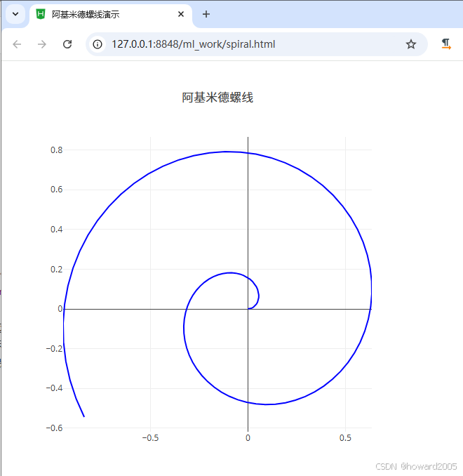
const layout = {
title: "阿基米德螺线",
showlegend: false
};
// 使用Plotly显示图表
Plotly.newPlot("myPlot", data, layout);
</script>
</body>
</html>
- 在这段代码中,我们首先定义了阿基米德螺线的参数
a
a
a和
b
b
b,然后通过循环生成了一系列的角度值
θ
\theta
θ,并计算对应的
x
x
x和
y
y
y值。最后,我们使用
Plotly.newPlot函数在网页上绘制阿基米德螺线。 - 浏览网页,查看效果


 1619
1619

 被折叠的 条评论
为什么被折叠?
被折叠的 条评论
为什么被折叠?
 到【灌水乐园】发言


