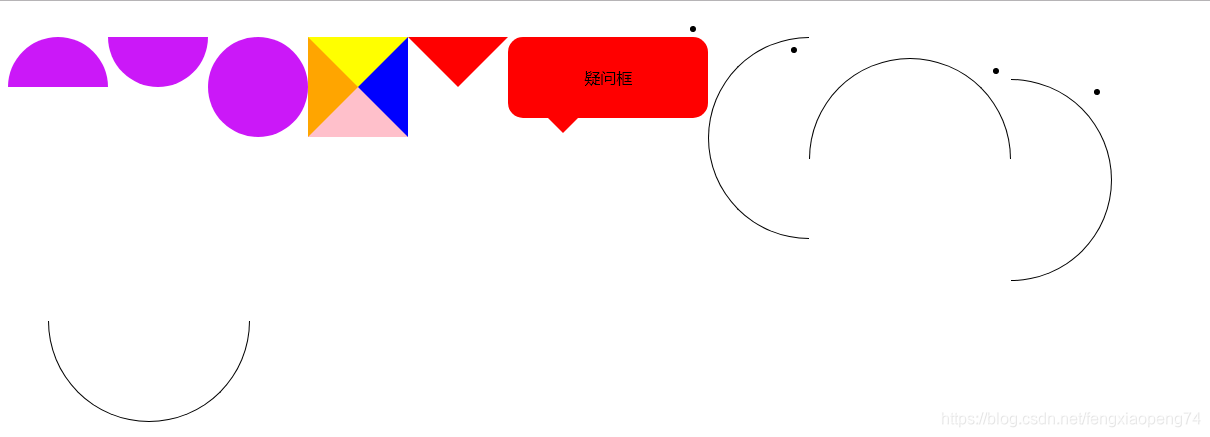
 样式图
样式图
<!DOCTYPE html>
<html lang="en">
<head>
    <meta charset="UTF-8">
    <meta name="viewport" content="width=device-width, initial-scale=1.0">
    <meta http-equiv="X-UA-Compatible" content="ie=edge">
    <title>Document</title>
    <style>
        div{
            margin: 20px 0;
        }
        /* 上半圆 */
        .semi-circle{
        width:100px;
        height:50px;
        background-color:#cb18f8;
        border-radius:50px 50px 0 0; /* 左上、右上、右下、左下 */
        }
        /* 下半圆 */
        .semi-circle2{
        width:100px;
        height:50px;
        background-color:#cb18f8;
        border-radius:0 0 50px 50px; /* 左上、右上、右下、左下 */
        }
        /* 左半圆 */
        .semi-circle3{
        width:50px;
        height:100px;
        background-color:#cb18f8;
        border-radius:50px 0 0 50px; /* 左上、右上、右下、左下 */
        }
        /* 右半圆 */
        .semi-circle4{
        width:50px;
        height:100px;
        background-color:#cb18f8;
        border-radius:0 50px 50px 0; /* 左上、右上、右下、左下 */
        }
        /* 扇形 */
        .sector {
            border-radius: 100px 0 0;
        }
        /* 弧形 */
        .arc{
            border-radius: 100px 0;
            -webkit-transform: rotate(45deg);
            -ms-transform: rotate(45deg);
            -o-transform: rotate(45deg);
            transform: rotate(45deg);
        }
        /* 小三角 */
        .triangle{
            border: 50px solid green;
            width: 0;
            height: 0;
            border-top-color: yellow;
            border-right-color: blue;
            border-bottom-color: pink;
            border-left-color: orange;
        }
        .arrow{
            background: none;   /*为了清除前面div设置的背景颜色*/
            border: 50px solid red;
            width: 0;
            height: 0;
            border-color: red transparent transparent transparent;
        }
        /* 疑问框 */
        .rectangle{
            width: 200px;
            padding: 30px 0;
            text-align: center;
            border-radius: 15px;
            background: red;
            position: relative;
        }
        /*小三角*/
        .rectangle::before{
            content: "";
            width: 0;
            height: 0;
            border: 15px solid red;
            border-color: red transparent transparent transparent;
            position:absolute;
            bottom: -30px;
            left: 40px;
        }
        /* 只要圆形弧线 */
        .circle1 {
            width: 100px;
            height: 200px;
            border: 1px solid black;
            border-radius: 100% 0 0 100%/50%;
            border-right: none;
        }
        .circle2 {
            width: 200px;
            height: 100px;
            border: 1px solid black;
            border-radius: 50% 50% 0 0/100% 100% 0 0;
            border-bottom: none;
        }
        .circle3 {
            width: 100px;
            height: 200px;
            border: 1px solid black;
            border-radius: 0 100% 100% 0/50%;
            border-left: none;
        }
        .circle4 {
            width: 200px;
            height: 100px;
            border: 1px solid black;
            border-radius: 0 0 50% 50%/0 0 100% 100% ;
            border-top: none;
        }
         /* 必填样式 */
        .red::after{
            content:"*";
            position: absolute;
            top: 10px;
            left: 10px;
            font-family: SimSun; /* 这句比较重要,可以让你的标注更明显 */
            font-size: 14px;
            color: #f5222d;
        }
    </style>
</head>
<body>
    <!-- 半圆 -->
    <div class="semi-circle"></div>
    <div class="semi-circle2"></div>
    <div class="semi-circle3"></div>
    <div class="semi-circle4"></div>
    <!-- 扇形 -->
    <div class="sector"></div>
    <!-- 弧形 -->
    <div class="arc"></div>
    <!-- 三角形 -->
    <div class="triangle"></div>
    <div class="arrow"></div>
    <!-- 疑问框 -->
    <div class="rectangle">疑问框</div>
    <!-- 圆形弧线 -->
    <ul>
        <li><div class="circle1"></div></li>
        <li><div class="circle2"></div></li>
        <li><div class="circle3"></div></li>
        <li><div class="circle4"></div></li>
    </ul>
    <!-- 姓名必填 -->
    <div class="red">姓名</div>
</body>
</html>


 本文深入探讨了使用CSS创建各种形状的方法,包括半圆、扇形、弧形、三角形及复杂图形,同时介绍了如何利用CSS属性实现特定效果,如必填字段的标注。


 扫一扫
扫一扫


 24
24


 到【灌水乐园】发言


