 CSS文本展开收起紧跟文案显示实现


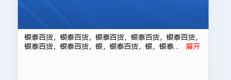
类似图片中的功能,我找了很多案例都不是我想要的,或者出不来效果,看见抖音有这个功能想去看看但是又看不了,本来不想用的js 但是搜了一下说是抖音是做了文字显示超过多少才显示展开收起,所以我就还是使用了js来控制,下面是全部的代码
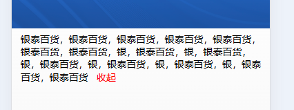
有两种情况一种是紧跟在文案后面,另一种是使用在文案的最右面,切换一下类名btn的样式就可以了
<template>
  <div class="wrap">
    <div :class="textLimitation(value)">
      {{str}}
      <template v-if="str.length > (length - 4)">
        <span class="btn" @click="show = !show"> {{show ? '收起':'展开' }}</span>
      </template>
    </div>
  </div>

</template>

<script>
export default {
  data() {
    return {
      show: false,
      value: '银泰百货,银泰百货,银泰百货,银泰百货,银泰百货,银泰百货,银泰百货,银,银泰百货,银,银泰百货,银,银泰百货,银,银泰百货,银,银泰百货,银,银泰百货,银泰百货',
      str: '',
      length: 50
    }
  },
  mounted() { },
  methods: {
    textLimitation(val) {
      let obj = { 'text': true }

      if (!this.show && val.length > this.length) {
        this.str = val.substring(0, this.length - 4) + '...'
      } else {
        this.str = val
      }
      return obj
    },
  }
}
</script>

<style lang='css' scoped>
.wrap {
  margin-top: 60px;
  width: 100%;
  padding: 0 15px;
  box-sizing: border-box;
}

.text {
  position: relative;
  font-size: 16px;
  transition: 0.5s all;
}
.btn {
  color: red;
  padding-left: 10px;
}
/* .btn {
  color: red;
  float: right;
  clear: both;
} */
</style>
或者我们直接在点击展开收起的时候来控制这样方便我们组件化来管理,点击的时候还可以给父组件传递信息来进行其他的一些操作
<template>
  <div class="wrap">
    <div class="text">
      {{str}}
      <template v-if="str.length > (length - 4)">
        <span class="btn" @click="textLimitation()"> {{show ? '收起':'展开' }}</span>
      </template>
    </div>
  </div>

</template>

<script>
export default {
  data() {
    return {
      show: true,
      value: '银泰百货,银泰百货,银泰百货,银泰百货,银泰百货,银泰百货,银泰百货,银,银泰百货,银,银泰百货,银,银泰百货,银,银泰百货,银,银泰百货,银,银泰百货,银泰百货',
      str: '',
      length: 50
    }
  },
  mounted() {
    this.textLimitation();
  },
  methods: {
    textLimitation() {
      this.show = !this.show

      if (!this.show && this.value.length > this.length) {
        this.str = this.value.substring(0, this.length - 4) + '...'
      } else {
         this.str = this.value
      }
    },
  }
}
</script>

<style lang='css' scoped>
.wrap {
  margin-top: 60px;
  width: 100%;
  padding: 0 15px;
  box-sizing: border-box;
}

.text {
  /*要显示的行数*/
  position: relative;
  font-size: 16px;
  transition: 0.5s all;
}
.btn {
  color: red;
  padding-left: 10px;
}
/* .btn {
  color: red;
  float: right;
  clear: both;
} */
</style>
+++++++++++++++++++++ 进阶版(使用了elementUI的el-tooltip)+++++++++++++++++++++
下面的进行了初步的封装对应的css 和 js的
css:
<template>
  <div class="modelText">
    <template v-if="!show">
      <el-tooltip :disabled="!tooltip" :effect="tooltipSet.effect" :content="content" :placement="tooltipSet.placement" :offset="tooltipSet.offset" popper-class="text-tooltip">
        <div :class="{'textHidden' : num == 1, 'textHiddenNum': num > 1}" :style="num > 1 ? ('-webkit-line-clamp: ' + num) : ''">{{content}}</div>
      </el-tooltip>
    </template>
    <div v-if="show">{{content}}</div>
    <div v-if="!btnHidden" class="textShow" @click="handle">
      <slot name="btn" :scope="{ show: show}">
        {{show ? '收起':'展开'}}
      </slot>
    </div>
  </div>
</template>

<script>
export default {
  name: "modelText1",
  props: {
    content: {
      type: String,
      default: () => {
        return '';
      },
    },
    value: {
      type: Boolean,
      default: false
    },
    num: {
      type: Number,
      default: 1
    },
    tooltip: {
      type: Boolean,
      default: false
    },
    tooltipSet: {
      type: Object,
      default: () => {
        return {
          effect: 'dark',
          placement: 'top-start',
          offset: 0,
        }
      }
    },
    btnHidden: {
      type: Boolean,
      default: false
    },
  },
  watch: {
    value: {
      deep: true,
      immediate: true,
      handler(val) {
        console.log("textShow", val)
        this.show = val;
      },
    },
  },
  data() {
    return {
      show: false
    }
  },
  mounted() { },
  methods: {
    handle(){
      this.show = !this.show;
      this.$emit('input:updated',this.show)
      this.$emit('handle',this.show)
    }
  }
}
</script>

<style lang='css' scoped>
.modelText {
  color: #fff;
}

.textHidden {
  white-space: nowrap;
  text-overflow: ellipsis;
  overflow: hidden;
}

.textHiddenNum {
  display: -webkit-box;
  -webkit-box-orient: vertical;
  -webkit-line-clamp: 1; /** 多行文本溢出...*/
  overflow: hidden;
}
.textShow {
  text-align: right;
  cursor: pointer;
}
</style>
使用方法
 <model-text-1 :content="content"></model-text-1>

// 内容省略时显示提示文本(全部展示)tooltipSet设置tooltip的样式
 <model-text-1 :content="content" :num="2" tooltip :tooltipSet="tooltipSet"></model-text-1>
        <model-highlight :code="codeText1">

<model-text-1 :content="content" :num="2" tooltip>
// 自定义展开收起样式
          <template #btn="{scope}">
            <div class="icon">
              <i v-if="scope.show" class="el-icon-unlock"></i>
              <i v-else class="el-icon-lock"></i>
            </div>
          </template>
 </model-text-1>


//v-model绑定的值   控制展开收起 @handle="handle"点击展开收起事件
 <model-text-1 v-model="textShow" :content="content" :num="2" tooltip @handle="handle">
        </model-text-1>

export default {
  data() {
    return {
      content: "将聚焦智能时代,大数据技术的发展曲线以及大数据与社会各行业相结合的最新实                   践进展。除了主论坛之外 ,主办方还精心策划了数十场专题技术和行业论坛,包括新一代数据库转型、人工智能赋能金融科技、AutoML大数据自动化机器学习技术与系统、大数据时代的因果推断、大数据安全和治理、多模态知识图谱、大数据与AI中台、物流大数据、工业与制造业大数据、数据驱动与城市",
      tooltipSet: {
        effect: "dark",
        placement: "top-start",
      },
      textShow: true,
  },
  methods: {
    handle(val) {
      console.log("点击展开收起按钮的事件返回值", val)
    }
  }
};
js: js换了一种方式和上面的不一样,是根据宽度来计算文字一行能显示多少个字,比上面的要好一些!注意:js通过文字的大小和行高来判断一行显示的文字多少,默认是文字font-size:14;line-height:20,如果实际使用中不一样需要在类名textHidden上添加修改的样式
<template>
  <div class="modelText">
    <template v-if="!show">
      <el-tooltip :disabled="!tooltip" :effect="tooltipSet.effect" :content="content" :placement="tooltipSet.placement" :offset="tooltipSet.offset" popper-class="text-tooltip">
        <div ref="textContainer" class="textHidden">{{text}}
          <span v-if="!btnHidden" class="textShow" @click="handle">
            <slot name="btn" :scope="{ show: show}">
              {{show ? '收起':'展开'}}
            </slot>
          </span>
        </div>
      </el-tooltip>
    </template>
    <div v-if="show">{{content}}
      <span v-if="!btnHidden" class="textShow" @click="handle">
        <slot name="btn" :scope="{ show: show}">
          {{show ? '收起':'展开'}}
        </slot>
      </span>
    </div>

  </div>
</template>

<script>
export default {
  name: "modelText2",
  props: {
    content: {
      type: String,
      default: () => {
        return '';
      },
    },
    value: {
      type: Boolean,
      default: false
    },
    num: {
      type: Number,
      default: 1
    },
    tooltip: {
      type: Boolean,
      default: false
    },
    tooltipSet: {
      type: Object,
      default: () => {
        return {
          effect: 'dark',
          placement: 'top-start',
          offset: 0,
        }
      }
    },
    btnHidden: {
      type: Boolean,
      default: false
    },
  },
  watch: {
    value: {
      deep: true,
      immediate: true,
      handler(val) {
        this.show = val;
      },
    },
    content: {
      deep: true,
      handler(val) {
        this.truncateText()
      },
    },
  },
  data() {
    return {
      text: "",
      show: false,
    }
  },
  mounted() {
    this.truncateText()
  },
  methods: {
    handle() {
      this.show = !this.show;
      this.$emit('input:updated', this.show)
      this.$emit('handle', this.show)
    },
    truncateText() {
      const textContainer = this.$refs.textContainer;
      const width = textContainer.offsetWidth; // 获取容器宽度
      let fontSize = parseInt(window.getComputedStyle(textContainer).fontSize); // 获取字体大小
      fontSize = fontSize ? fontSize : 14
      const charsPerLine = Math.floor(width / fontSize); // 计算每个字符的平均宽度

      const maxLines = this.num; // 最大行数
      let lineHeight = parseInt(window.getComputedStyle(textContainer).lineHeight);
      lineHeight = lineHeight ? lineHeight : 20
      const maxHeight = lineHeight * maxLines;
      textContainer.style.height = `${maxHeight}px`; // 设置容器高度以限制行数

      this.text = ''; // 清空内容,以便重新设置
      let tempText = ''; // 临时变量存储裁剪后的文本
      const maxWidth =  charsPerLine * maxLines; // 最多显示多少文字
      let arr = this.content.split('');
      for (let i = 0; i < arr.length; i++) {
        tempText += arr[i];
        if (tempText.length <= maxWidth) { // 如果未超出高度,继续添加文本
          continue;
        } else { // 如果超出高度,回退最后一个字符并停止
          tempText = tempText.slice(0, -1); // 移除最后一个字符
          break;
        }
      }
      // 如果要显示展开收起按钮
      if (!this.btnHidden) {
        let end = tempText.split('')
        tempText = tempText.slice(0, end.length - 2); // 移除最后一个字符
      }
      this.text = tempText + '...'; // 最终设置裁剪后的文本并添加省略号
    }
  }
}
</script>

<style lang='css' scoped>
.modelText {
  color: #fff;
}

.textShow {
  white-space: nowrap;
  text-align: right;
  cursor: pointer;
}
</style>
使用方法和上面 <model-text-1 :content="content"></model-text-1>一样


 扫一扫
扫一扫


 3691
3691

 被折叠的 条评论
为什么被折叠?
被折叠的 条评论
为什么被折叠?
 到【灌水乐园】发言


