


 本文展示如何使用OpenSpending API获取大学预算数据,并通过D3.js库构建Sankey图进行可视化。以西班牙格拉纳达大学为例,构建了三个层级的Sankey图,从收入来源到支出分配,直观展示了预算流转过程。
This post is cross-posted from the PBS Idea Lab Blog.
OpenSpending has a built-in set of visualizations – bubble charts, treemaps, and tables – which are useful for exploring how data is structured in levels. None of them, however, are really suitable for representing spending flows.
Fortunately, users of the D3.js data visualization library have given us many examples of visualizations suitable for that purpose. The purpose of this tutorial is to show how easily D3.js can be used to visualize spending flows with OpenSpending data.
Introducing D3.js and Sankey diagrams
D3.js is a JavaScript library that creates data-driven documents (hence D3). Data visualizations are constructed with D3 by specifying a meaningful relationship between data and graphical elements. No manual fiddling with lines and boxes is required.
D3.js has a huge and active community of users, and they have built a set of example visualizations. Some of these are incredibly useful for catching the eye with money flows: Sankey diagrams, chord diagrams (or circular networks), and map networks.
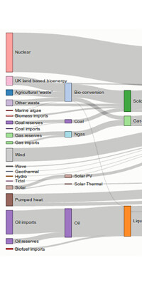 | 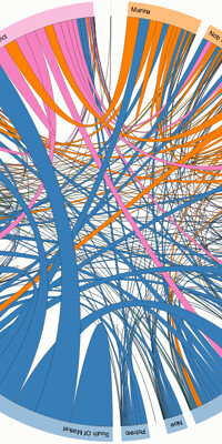 |  |
| Energy and consumption Sankey diagram | Uber Rides by Neighborhood Chord diagram | Flows of refugees Map network |
All of these examples are fully reusable: all you need to do to use them is to replace their underlying data with your own.
In the following example, we will focus on Sankey diagrams, as they can represent more than two levels of flow. Sankey diagrams:
are typically used to visualize energy or material or cost transfers between processes. [...] They are helpful in locating dominant contributions to an overall flow. ( Sankey diagram article on Wikipedia)
The Aggregate API
To get spending data into D3.js, we can use the OpenSpending API, which gives us spending data in a form that can easily be translated into something D3.js understands.
The key API for producing spending data visualizations is the aggregate API, which groups together entries in the dataset, sums up their values, and returns the result as a JSON object.
An aggregate API call looks like this, where “ is the ID of an OpenSpending dataset:
GET /api/2/aggregate?dataset=
If no other parameters are included, all entries in the dataset are put in a single group, and the values of every entry are summed together.
Things get more interesting when we add a drilldown parameter. This specifies a dimension of the data which will be used to split the set of entries. Each possible value of the specified dimension becomes a group of entries with its own subtotal.
Let’s drill down on the programa dimension of the ugr-spending dataset, for example, and look at the shape of the output:
GET /api/2/aggregate?dataset=ugr-spending&drilldown=programa

{
  "drilldown": [
    {
     "amount": 283175993.0,
     "num_entries": 54,
     "programa": {
       "taxonomy": "programa",
       "html_url": "http://openspending.org/ugr-spending/programa/422d",
       "id": 1,
       "name": "422d",
       "label": "Ense\u00f1anzas Universitarias"
     }
   },
   {
     "amount": 64294001.0,
     "num_entries": 52,
     "programa": {
       "taxonomy": "programa",
       "html_url": "http://openspending.org/ugr-spending/programa/321b",
       "id": 2,
       "name": "321b",
       "label": "Estructura y Gesti\u00f3n Universitaria"
      }
    },
    {
      "amount": 47967613.0,
      "num_entries": 27,
      "programa": {
        "taxonomy": "programa",
        "html_url": "http://openspending.org/ugr-spending/programa/541a",
        "id": 3,
        "name": "541a",
        "label": "Investigaci\u00f3n Cient\u00edfica"
     }
   }
 ],
 "summary": {
   "num_drilldowns": 3,
   "pagesize": 10000,
   "cached": true,
   "amount": 395437607.0,
   "pages": 1,
   "currency": {
     "amount": "EUR"
   },
   "num_entries": 133,
   "cache_key": "a3b56dc06b8a869ffa49b0ff063562798b073a3a",
   "page": 1
 }
}
The aggregate API returns an object with two fields, drilldown and summary. The latter contains information about the dataset, and the former is a list of different values of the drilled-down dimension and the sum of the spending values of all dataset entries with that value of the dimension. Each different value is an item in in drilldown, and its sum is its "amount".
We can also split the dataset by combinations of dimensions. This API call gives us a subtotal for each combination of programa and to:
GET /api/2/aggregate?dataset=ugr-spending&drilldown=programa|to
Using the aggregate API to construct D3.js visualizations means writing code to traverse the JSON objects returned by the API and to translate their contents into the form D3.js expects.
Building a Sankey diagram
Time for the full exercise! We will build a D3.js Sankey diagram from OpenSpending API, in the following way:
- Materials: 2013 income and spending budgets for the University of Granada (UGR) at Spain. These datasets are titled
[ugr-income](http://openspending.org/ugr-income)and[ugr-spending](http://openspending.org/)on OpenSpending. - Methods: An R script that gets data from OpenSpending API and transforms it into a D3.js Sankey diagram JSON input file format.
- Results: A presentation page embedding the Sankey diagram, OpenSpending treemaps, and raw data.
The first step is to determine what we want to show in the Sankey diagram. Which relations should be displayed? How many levels of flow are appropriate for a suitable reading of the data? What’s the story that you want to tell?
Relying on the UGR income and spending budgets, we can imagine money flowing from the sources of income to the University and then the University spending this money. Attending to the budgetary structure, we finally choose a three-level Sankey diagram:
- Level 1: Income budget broken down as “articulo” (economic classification) targeting to “Universidad de Granada”.
- Level 2: “Universidad de Granada” targeting the spending budget broken down into “programas de gasto” (functional classification).
- Level 3: “Programas de gasto” broken down into “capítulos de gasto” (economic classification).
Notice that since the total amounts of the income and spending budgets are equal, both sides of the Sankey diagram have the same size.
The second step is being able to get the data. As we explained above, OpenSpending has an API that allows us to retrieve data aggregated by measures and drilled down by dimensions.
Getting the JSON data for the three levels of our Sankey diagram is as easy as follows:
GET http://openspending.org/api/2/aggregate?dataset=ugr-income&drilldown=articulo
GET http://openspending.org/api/2/aggregate?dataset=ugr-spending&drilldown=programa
GET http://openspending.org/api/2/aggregate?dataset=ugr-spending&drilldown=programa|to
This is a partial return for the second call. Notice that the data needed for the Sankey diagram are “labels”, “amounts”, and links between nodes.
{
  "drilldown": [
    {
      "amount": 283175993.0,
      "num_entries": 54,
      "programa": {
        "taxonomy": "programa",
        "html_url": "http://openspending.org/ugr-spending/programa/422d",
        "id": 1,
        "name": "422d",
        "label": "Enseñanzas Universitarias"
      }
    },
  /* Two more drilldown entries here. */
  ],
  "summary": {
    "num_drilldowns": 3,
    "pagesize": 10000,
    "cached": true,
    "amount": 395437607.0,
    "pages": 1,
    "currency": {
      "amount": "EUR"
    },
    "num_entries": 133,
    "cache_key": "a3b56dc06b8a869ffa49b0ff063562798b073a3a",
    "page": 1
  }
}
The third step is to produce the JSON input file format for the D3.js Sankey diagram. It has two components: links and nodes. Nodes are joined with links (i.e. arrows with variable width) and are represented as an array of labels, while the links component refers to an array with three members: source node index, target node index, and value (in this example, amount of money). The indexes in the links component refer to the position of each node at the node’s component. Check the final JSON input file for this UGR example for further details.
So the data for Level 1 has income “articulo” labels as source, a hardcoded “Universidad de Granada” label for target, and amounts as value. Level 2 starts with a “Universidad de Granada” hardcoded label as source, spending “programa” labels as target, and amounts as value. For Level 3, we have spending “programa” labels as source, spending “chapter” labels as target, and amounts as value. The provided R script automates the process of retrieving the data and transforming it into a Sankey diagram JSON input file. The code’s comments clarify how it works.
The fourth and final step is to create a web page to show the Sankey diagram. Fortunately, with a well formatted JSON input file, the official D3.js Sankey diagram example is fully reusable. We simply replace the JSON file with our own and enjoy the results. Some CSS and JavaScript variables can be tuned for controlling the colour palette or the width of the diagram—just check out the D3.js documentation.
Conclusion
We’ve shown how easy it is to take advantage of the aggregation methods of OpenSpending’s API to extend OpenSpending’s default set of visualizations. D3.js is a powerful toolkit that gives us a better comprehension of budgetary data. An out-of-the-box D3.js visualization using OpenSpending as a data warehouse would provide a nifty boost to the OpenSpending project. In the meantime, take a look at Michael Bauer’s openspending-sankey, which makes it rather easy to create D3.js Sankey diagrams for virtually every OpenSpending dataset.
- See more at: http://community.openspending.org/2013/08/d3-sankey/#sthash.pdtNRVwo.dpuf


 2000
2000

 被折叠的 条评论
为什么被折叠?
被折叠的 条评论
为什么被折叠?
 到【灌水乐园】发言


