


要实现 HTML 中间导航条自动吸顶的效果,可以使用 CSS 的 position: fixed 属性。这种方法简单且高效,只需配合 JavaScript 即可实现。
使用 position: fixed 实现吸顶
<!DOCTYPE html>
<html>
	<head>
		<meta charset="utf-8">
		<title></title>
		<script src="https://cdn.bootcss.com/jquery/1.10.1/jquery.js"></script>
	</head>
	<style>
		.header {
			width: 100%;
			height: 100px;
			text-align: center;
			background-color: #f1f1f1;
		}

		.banner {
			width: 100%;
			height: 500px;
			text-align: center;
			background-color: #a7d5ff;
		}

		.mid_header {
			width: 100%;
			height: 100px;
			background-color: #f1f1f1;
			text-align: center;
		}

		.main {
			width: 100%;
			height: 1000px;
			text-align: center;
		}

		/* 默认情况下,隐藏固定导航条 */
		.mid_header2 {
			display: none;
			position: fixed;
			top: 0;
			width: 100%;
			height: 100px;
			background-color: #f1f1f1;
			text-align: center;
			/* 设置背景颜色 */
			z-index: 1000;
			/* 确保导航条在其他内容之上 */
			padding-top: 10px;
		}
		/* 当页面向下滚动时显示固定导航条 */
		.show-on-scroll {
			display: block;
		}
	</style>
	<script>
		window.onscroll = function() {
			var mainNav = document.getElementById("main-nav");
			if (window.pageYOffset > 100+500) { // 100是触发点,可以根据需要调整
	            mainNav.classList.add('mid_header2');
	            mainNav.classList.remove('mid_header');
				mainNav.classList.add("show-on-scroll");
			} else {
	            mainNav.classList.remove('mid_header2');
	            mainNav.classList.add('mid_header');
				mainNav.classList.remove("show-on-scroll");
			}
		};

	</script>
	<body>
		<div class="header">
			这是顶部导航栏
		</div>
		<div class="banner">
			轮播图位置
		</div>
		<div class="mid_header" id="main-nav">
			中间导航栏
		</div>
		<div class="main">
			其他内容
		</div>
	</body>
</html>
解释
position: fixed:使元素在滚动到特定位置时固定在屏幕上。top: 0表示当元素滚动到距离顶部 0 像素时开始固定。z-index: 1000:确保导航条在页面内容之上,避免被其他元素遮挡。
注意事项
position: fixed在较多的浏览器中都支持,这种方法简单且高效,适用于大多数现代浏览器。
效果预览
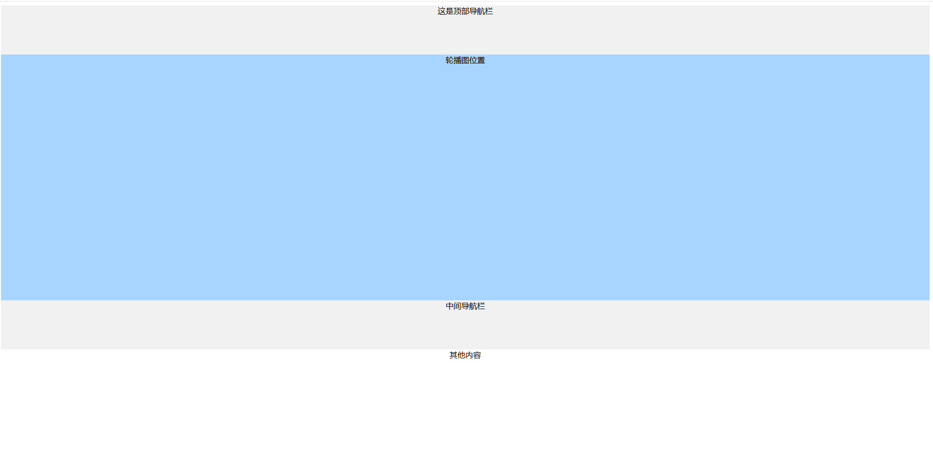
在没滚动之前如上图1所示


 扫一扫
扫一扫


 1409
1409

 被折叠的 条评论
为什么被折叠?
被折叠的 条评论
为什么被折叠?
 到【灌水乐园】发言


