


一、背景透明+ 流动边框效果
使用 clip-path
<body>
    <div class="box">hello</div>
  </body>
  <style>
    @keyframes clippath {
      0%,
      100% {
        clip-path: inset(0 0 95% 0);
      }
      25% {
        clip-path: inset(0 95% 0 0);
      }
      50% {
        clip-path: inset(95% 0 0 0);
      }
      75% {
        clip-path: inset(0 0 0 95%);
      }
    }
    .box {
      width: 100px;
      height: 100px;
      background-color: rgba(0, 0, 0, 0.2);
      text-align: center;
      line-height: 100px;
      position: relative;
      border-radius: 4px;
    }
    .box::after {
      content: "";
      display: block;
      position: absolute;
      top: 0;
      left: 0;
      right: 0;
      bottom: 0;
      border: 1px solid red;
      transition: all 0.5s;
      border-radius: 4px;
      animation: clippath 3s infinite linear;
    }
  </style>
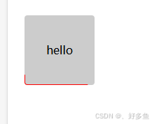
最终效果:边框逆时针动画,且内容部分可设置背景透明
二、背景透明+渐变色边框效果
使用 mask 和mask-composite 实现 ,需注意浏览器兼容问题,新版 谷歌、火狐可使用
<body>
  <div class="box">hello</div>
</body>
<style>
  .box {
    width: 100px;
    height: 100px;
    text-align: center;
    line-height: 100px;
    position: relative;
    border-radius: 4px;
  }
  .box::after {
    content: "";
    display: block;
    width: 100%;
    height: 100%;
    border-radius: 4px;
    background: linear-gradient(180deg, #ffe70b, #bfff7e, #75fb03);
    padding: 3px;
    mask: linear-gradient(#fff 0 100%) content-box, linear-gradient(#fff 0 100%);
    mask-composite: exclude;
    position: absolute;
    top: -3px;
    left: -3px;
  }
</style>
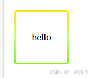
实现效果
三、背景动态
<template>
  <div class="box">hello</div>
</template>

<style>
@keyframes identifier {
  from {
    --angle: 0deg;
  }
  to {
    --angle: 360deg;
  }
}
@property --angle {
  syntax: "<angle>";
  initial-value: 0deg;
  inherits: false;
}
.box {
  width: 100px;
  height: 100px;
  text-align: center;
  line-height: 100px;
  position: relative;
  border-radius: 4px;
  color: red;
  background-color: rgba(0, 0, 0, 0.5);
}
.box::after {
  content: "";
  display: block;
  width: 100%;
  height: 100%;
  border-radius: 4px;
  background-image: conic-gradient(from var(--angle), transparent 60%, #ff0000);
  padding: 3px;
  animation: identifier 2s linear infinite;
  mask: linear-gradient(#fff 0 100%) content-box, linear-gradient(#fff 0 100%);
  mask-composite: exclude;
  position: absolute;
  top: -3px;
  left: -3px;
}
</style>


 扫一扫
扫一扫


 1818
1818

 被折叠的 条评论
为什么被折叠?
被折叠的 条评论
为什么被折叠?
 到【灌水乐园】发言


