


const alarmTypeChartsGet = (data) => {
  const colorOptions = [
    {
      label: '桥涵预警',
      barColor: '#f3cf88',
      color: '#E29500',
      unit: '个',
      prop: 'bridge'
    },
    {
      label: '灌排渠预警',
      barColor: '#DF9FE7',
      color: '#C953D7',
      unit: '条',
      prop: 'canal'
    },
    {
      label: '水源井预警',
      barColor: '#96D4EB',
      color: '#00BAFF',
      unit: '个',
      prop: 'water'
    },
    {
      label: '道路预警',
      barColor: '#CCE797',
      color: '#86C212',
      unit: '条',
      prop: 'road'
    }
  ]
  const series: any = []
  let total = 0
  colorOptions.forEach((i, k) => {
    const item = data.find((j) => j.eventTypeName == i.label)
    total += item.eventCount
    const seriseData = Array.from({ length: 4 }, (_i) => 0)
    seriseData[k] = item.eventCount
    series.push({
      type: 'bar',
      barWidth: '50%',
      data: seriseData,
      coordinateSystem: 'polar',
      stack: 'total',
      itemStyle: {
        borderRadius: [0, '50%', 0, '50%']
      },
      label: {
        show: false
      }
    })
  })
  const option = {
    title: {
      text: total,
      left: 'center',
      top: 'center',
      itemGap: 0,
      textStyle: {
        color: '#19abad',
        fontSize: 24,
        lineHeight: 24,
        height: 20,
        fontWeight: 'bold'
      },
      subtext: '预警总数',
      subtextStyle: {
        color: '#19abad',
        fontSize: 16,
        height: 12,
        lineHeight: 16
      }
    },
    polar: {
      radius: ['30%', '80%'],
      center: ['50%', '50%']
    },
    color: colorOptions.map((i) => i.barColor),
    angleAxis: {
      startAngle: 270,
      endAngle: 0,
      axisLine: {
        show: false
      },
      splitLine: {
        show: false
      },
      axisLabel: {
        show: false
      },
      axisTick: {
        show: false
      }
    },
    radiusAxis: {
      type: 'category',
      data: colorOptions.map((i) => i.label),
      axisLine: {
        show: false
      },
      splitLine: {
        show: false
      },
      axisTick: {
        show: false
      },
      axisLabel: {
        show: true,
        interval: 0,
        formatter: function (params, index) {
          const value = data.find((i) => i.eventTypeName == params).eventCount
          const labelOption: any = colorOptions.find((i) => i.label == params)
          switch (labelOption.prop) {
            case 'road':
              return `{name|${params}}{road|${value}}{unit|${labelOption?.unit}}`
            case 'water':
              return `{name|${params}}{water|${value}}{unit|${labelOption?.unit}}`
            case 'canal':
              return `{name|${params}}{canal|${value}}{unit|${labelOption?.unit}}`
            case 'bridge':
              return `{name|${params}}{bridge|${value}}{unit|${labelOption?.unit}}`
          }
        },
        rich: {
          name: {
            color: '#6D6D6D',
            fontSize: 14,
            fontWeight: 'bold'
          },
          bridge: {
            color: '#E29500',
            fontSize: 16,
            fontWeight: 'bold',
            padding: [0, 8, 0, 8]
          },
          water: {
            color: '#00BAFF',
            fontSize: 16,
            fontWeight: 'bold',
            padding: [0, 8, 0, 8]
          },
          road: {
            color: '#86C212',
            fontSize: 16,
            fontWeight: 'bold',
            padding: [0, 8, 0, 8]
          },
          canal: {
            color: '#C953D7',
            fontSize: 16,
            fontWeight: 'bold',
            padding: [0, 8, 0, 8]
          },
          unit: {
            color: '#6D6D6D',
            fontSize: 12,
            fontWeight: 400
          }
        }
      }
    },
    series
  }
  return option
}
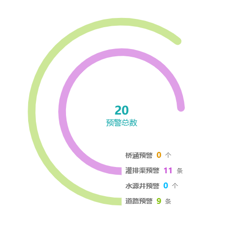
示例图


 扫一扫
扫一扫


 362
362

 被折叠的 条评论
为什么被折叠?
被折叠的 条评论
为什么被折叠?
 到【灌水乐园】发言


