


<!DOCTYPE html>
<html>
<head>
<meta charset="UTF-8">
<title>仪表盘</title>
<style>
.gauge-container {
width: 400px;
height: 300px;
margin: 50px auto;
position: relative;
}
.gauge {
width: 100%;
height: 100%;
position: relative;
}
/* 外圈弧形 */
.gauge-arc {
position: absolute;
width: 100%;
height: 100%;
}
.gauge-arc path {
fill: none;
stroke-width: 10;
}
.gauge-arc .bg-arc {
stroke: #E8EAF6;
}
.gauge-arc .value-arc {
stroke: #3F51B5;
}
/* 指针 */
.gauge-pointer {
position: absolute;
width: 4px;
height: 140px;
background: #2C3E50;
left: 50%;
bottom: 50%;
transform-origin: bottom center;
transform: rotate(-90deg); /* 初始位置指向0刻度 */
transition: transform 1s cubic-bezier(0.4, 0, 0.2, 1);
}
/* 中心点 */
.gauge-center {
position: absolute;
width: 20px;
height: 20px;
background: #2C3E50;
border-radius: 50%;
left: 50%;
top: 50%;
transform: translate(-50%, -50%);
}
/* 刻度 */
.gauge-scale {
position: absolute;
width: 100%;
height: 100%;
}
.scale-mark {
position: absolute;
width: 2px;
height: 10px;
background: #9E9E9E;
left: 50%;
top: 10px;
transform-origin: 50% 140px;
}
.scale-number {
position: absolute;
font-size: 14px;
color: #757575;
transform-origin: center;
font-family: Arial;
}
/* 值显示 */
.gauge-value {
position: absolute;
width: 100%;
text-align: center;
top: 55%;
font-size: 40px;
font-weight: bold;
color: #2C3E50;
}
.gauge-label {
position: absolute;
width: 100%;
text-align: center;
top: 55%;
font-size: 16px;
color: #757575;
}
</style>
</head>
<body>
<div class="gauge-container">
<div class="gauge">
<svg class="gauge-arc" viewBox="0 0 200 200">
<!-- 背景弧 -->
<path class="bg-arc"
d="M20,100 A80,80 0 1,1 180,100" />
<!-- 值弧 -->
<path class="value-arc" id="valueArc"
d="M20,100 A80,80 0 0,1 100,20" />
</svg>
<div class="gauge-scale" id="scale"></div>
<div class="gauge-pointer" id="pointer"></div>
<div class="gauge-center"></div>
<div class="gauge-value" id="value">0</div>
</div>
</div>
<script>
class Gauge {
constructor(options) {
this.value = options.value || 0;
this.min = 0;
this.max = 100;
this.angleRange = 180; // 角度范围
this.startAngle = 180; // 起始角度
this.init();
}
init() {
this.createScale();
this.animateToValue(this.value);
}
createScale() {
const scale = document.getElementById('scale');
const steps = 10; // 每10个单位一个刻度
for (let i = 0; i <= 100; i += steps) {
// 创建刻度线
const mark = document.createElement('div');
mark.className = 'scale-mark';
const angle = this.startAngle - (i / 100 * this.angleRange) - 90;
mark.style.transform = `rotate(${angle}deg)`;
scale.appendChild(mark);
// 创建刻度数字
const number = document.createElement('div');
number.className = 'scale-number';
number.textContent = 100-i;
// 计算数字位置
const radius = 160; // 数字距离中心的距离
const radian = (angle - 90) * Math.PI / 180;
const x = Math.cos(radian) * radius + 200 ;
const y = Math.sin(radian) * radius + 150 ;
number.style.left = `${x}px`;
number.style.top = `${y}px`;
number.style.transform = 'translate(-50%, -50%)';
scale.appendChild(number);
}
}
animateToValue(targetValue) {
const duration = 1500;
const startTime = performance.now();
const startValue = 0;
const animate = (currentTime) => {
const elapsed = currentTime - startTime;
const progress = Math.min(elapsed / duration, 1);
const currentValue = startValue + (targetValue - startValue) * this.easeOutCubic(progress);
this.updateGauge(currentValue);
if (progress < 1) {
requestAnimationFrame(animate);
}
};
requestAnimationFrame(animate);
}
easeOutCubic(x) {
return 1 - Math.pow(1 - x, 3);
}
updateGauge(value) {
// 更新指针 - 修改角度计算方式
const angle = -90 + (value / this.max * this.angleRange);
document.getElementById('pointer').style.transform = `rotate(${angle}deg)`;
// 更新数值
document.getElementById('value').textContent = Math.round(value);
// 更新弧形
const valueArc = document.getElementById('valueArc');
const arcLength = (value / this.max) * this.angleRange;
const endX = 100 + 80 * Math.cos((180 - arcLength) * Math.PI / 180);
const endY = 100 - 80 * Math.sin((180 - arcLength) * Math.PI / 180);
valueArc.setAttribute('d', `M20,100 A80,80 0 0,1 ${endX},${endY}`);
}
}
// 初始化仪表盘
new Gauge({
value: 56
});
</script>
</body>
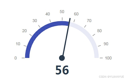
</html>AI效果,遗憾的是指针变化了但不平滑,有老机器感


 扫一扫
扫一扫


 2969
2969

 被折叠的 条评论
为什么被折叠?
被折叠的 条评论
为什么被折叠?
 到【灌水乐园】发言


