


概念理论
-
定位模式
- 常规流
除根元素、浮动元素和绝对定位元素外,其它元素都在常规流之内(in-flow)
而根元素、 浮动和绝对定位的元素会脱离常规流(out of flow)
常规流中的盒子,属于块级格式化上下文或行级格式化上下文 - 浮动
- 绝对定位
- 常规流
-
块级格式化上下文(Block Formatting Context)
- 盒子在容器(包含块)内从上到下一个接一个地放置
- 两个兄弟盒之间的竖直距离由 margin 属性决定
- 同一个 BFC 内垂直 margin 会合并
- 盒子的左外边缘挨着容器(包含块)的左边
-
块级格式化上下文(BFC)的特性如下:
- 但是浮动元素后面的行级盒子会变短以避开浮动元素
- BFC 的高度会包含其内的浮动元素
- BFC 不会和浮动元素重叠
- BFC 可以通过 overflow:hidden 等方法创建
-
BFC的创建可通过如下方法:
- 浮动框
- 绝对定位框
- 非块级的块容器(inline-block)
- overflow属性为非visible的块框
-
那么BFC有哪些主要的作用呢?
- 可以清楚浮动
- 防止发生margin折叠
- 更加方便的进行双栏布局
-
浮动 - Float
- 浮动元素从常规流中脱离,被漂浮在容器(包含块)左边或右边
- 浮动盒会一直漂到其外边缘挨到容器边缘或另外的浮动盒
- 浮动元素不会影响其后面的流内块级盒
- 但是浮动元素后面的行级盒子会变短以避开浮动元素
-
清除浮动 - Clear
- 指定元素哪一边不能与之前的浮动框相邻
- 取值:left | right | both
例子
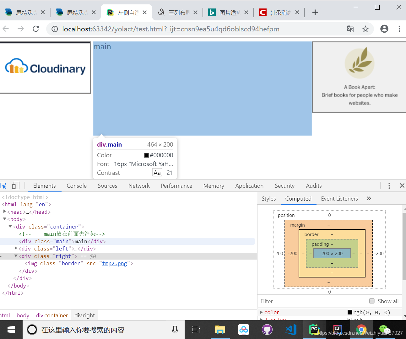
- 三列布局之圣杯布局
这篇blog写的很好,完全能把圣杯布局讲清楚,要仔细的看
<!DOCTYPE html>
<html lang="en">
<head>
    <meta charset="UTF-8">
    <title>左侧自适应右侧固定</title>
    <style>
        .container > div {
            height: 200px;
            float: left;
        }
        .container {
            padding-left: 200px;
            padding-right: 200px;
            overflow: hidden;
        }
        .main {
            width: 100%;
        }
        .left {
            width: 200px;
            margin-left: -100%;
            position: relative;
            right: 200px;
        }
        .right {
            width: 200px;
            margin-left: -200px;
            position: relative;
            left: 200px;
        }
        .border {
            /*border-width: 2px;*/
            /*border-color: gray;*/
            /*border-style: solid;*/
            border: 2px gray solid;
            max-width: 100%;
            max-height: 100%;
        }
    </style>
</head>
<body>
<div class="container">
<!--    main放在前面先渲染-->
    <div class="main">main</div>
    <div class="left"><img class="border" src="tmp.png"></div>
    <div class="right"><img class="border" src="tmp2.png"></div>
</div>
</body>
</html>
-
图片自适应容器大小:max-width:100%和width:100%的区别在于,max-width是相对于img自身的尺寸而言的。意思是图片最大宽度为自身尺寸的宽,在这里就是100px。而width的100%我们上面已经说过了是相对于父级宽度的,所以为了不让图片被放大后失真我们可以设置img的最大宽度为自身尺寸大小,更通俗的讲就是只允许缩小不允许放大img。
具体情况中是选择width:100%还是max-width:100%还是依据个人的需求而定,另外在响应式设计中这个问题稍微会复杂一点。
<!DOCTYPE html>
<html lang="en">
<head>
    <meta charset="UTF-8">
    <title>Murphy Li</title>
    <style>
        .bg {
            background-image: url(bg.png);
            background-repeat: no-repeat;
            background-size: 80% 400px;
            background-position: center;
            text-align: center;
            color: white;
            width: 100%;
            height: 400px;
            padding: 1px;
        }
        .content {
            width: 80%;
            height: 200px;
            margin: 100px auto;
        }
        #me {
            width: 66px;
            height: 66px;
            border-radius: 15px;
        }
        .th1 {
            font-size: 18px;
        }
        .th2 {
            font-size: 14px;
            width: 20%;
        }
        td {
            font-size: 12px;
        }
    </style>
</head>
<body>
<!--放链接-->
<header>
    <div class="bg">
        <div class="content">
            <img id="me" src="me.jpg">
            <p style="font-size: 12px; font-family: Georgia">Murphy Li</p>
            <p style="font-size: 14px; font-family: Georgia">Data Analysis</p>
        </div>
    </div>
</header>
<div style="font-size: 16px; font-family: Georgia; text-align: center">
    <p>follow me on github</p>
    <br>
    <a href="https://github.com/MurphyLee2048"><img src="GitHub.png" width="20px" height="20px"></a>
</div>
<!--个人基本信息、教育信息、实习或项目经验-->
<div style="margin:20px auto; width: 75%; height: 342px; box-shadow: 5px 5px 5px 5px #888888">
    <table style="border-spacing: 30px; text-align: left; font-family: Georgia">
        <tr>
            <th class="th1">
                About
            </th>
            <th class="th1" colspan="2" style="padding: 0 0 0 120px">
                Basic INFO
            </th>
        </tr>
        <tr>
            <td rowspan="5" style="width: 50%; vertical-align: top">
                <p style="font-size: 12px">Hi! I'm Murphy Li. Major in Financial Mathematics, now work in OOCL, I want
                    to become a DA.</p>
            </td>
            <th class="th2">
                AGE:
            </th>
            <td>
                22
            </td>
        </tr>
        <tr>
            <th class="th2">
                EMAIL:
            </th>
            <td>
                murphy.li@oocl.com
            </td>
        </tr>
        <tr>
            <th class="th2">
                PHONE:
            </th>
            <td>
                137xxxx2078
            </td>
        </tr>
        <tr>
            <th class="th2">
                EDUCATION:
            </th>
            <td>
                Undergraduate, BNUZ
            </td>
        </tr>
        <tr>
            <th class="th2">
                MAJOR
            </th>
            <td>
                Financial Mathematics
            </td>
        </tr>
    </table>
</div>
</body>
</html>


 扫一扫
扫一扫


 1万+
1万+

 被折叠的 条评论
为什么被折叠?
被折叠的 条评论
为什么被折叠?
 到【灌水乐园】发言


