


Flutter概要
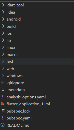
Flutter目录结构
| 文件夹 |
作用 |
| android |
android 平台相关代码 |
| ios |
ios平台相关代码 |
| lib |
flutter相关代码,我们主要编写的代码就在这个文件夹中 |
| test |
用于存放测试的代码 |
| pubspec.yaml |
配置文件,一般存放一些第三方库的依赖 |
Flutter入口文件、入口方法
每一个 flutter 项目的 lib 目录里面都有一个 main.dart 这个文件就是 flutter 的入口文件。
main.dart里面
void main() {
  runApp(const MyApp());
}
其中的 main 方法是 dart 的入口方法。runApp 方法是 flutter 的入口方法。 MyApp 是自定义的一个组件。
单独的内容抽离成的一个组件
在 Flutter 中自定义组件其实就是一个类,这个类需要继承 StatelessWidget/StatefulWidget
前期我们都继承 StatelessWidget。
- StatelessWidget 是无状态组件,状态不可变的 widget
- StatefulWidget 是有状态组件,持有的状态可能在 widget 生命周期改变
MaterialApp和Scaffold装饰APP
MaterialApp 是一个方便的 Widget,它封装了应用程序实现 Material Design 所需要的
一些 Widget。一般作为顶层widget 使用。
常用的属性:
- home(主页)
- title(标题)
- color(颜色)
- theme(主题)
- routes(路由)
class MyApp extends StatelessWidget {
  const MyApp({super.key});

  // This widget is the root of your application.
  @override
  Widget build(BuildContext context) {
    return MaterialApp(
      title: 'Flutter Demo',
      theme: ThemeData(
        // This is the theme of your application.
        //
        // Try running your application with "flutter run". You'll see the
        // application has a blue toolbar. Then, without quitting the app, try
        // changing the primarySwatch below to Colors.green and then invoke
        // "hot reload" (press "r" in the console where you ran "flutter run",
        // or simply save your changes to "hot reload" in a Flutter IDE).
        // Notice that the counter didn't reset back to zero; the application
        // is not restarted.
        primarySwatch: Colors.red,
      ),
      home: const MyHomePage(title: 'Flutter Demo Home Page'),
    );
  }
}
Scaffold 是 Material Design 布局结构的基本实现。此类提供了用于显示 drawer、snackbar和底部 sheet 的API。
Scaffold 有下面几个主要属性:
- appBar - 显示在界面顶部的一个 AppBar。
- body - 当前界面所显示的主要内容 Widget。
- drawer - 抽屉菜单控件。
class _MyHomePageState extends State<MyHomePage> {
  int _counter = 0;

  void _incrementCounter() {
    setState(() {
      // This call to setState tells the Flutter framework that something has
      // changed in this State, which causes it to rerun the build method below
      // so that the display can reflect the updated values. If we changed
      // _counter without calling setState(), then the build method would not be
      // called again, and so nothing would appear to happen.
      _counter++;
    });
  }

  @override
  Widget build(BuildContext context) {
    // This method is rerun every time setState is called, for instance as done
    // by the _incrementCounter method above.
    //
    // The Flutter framework has been optimized to make rerunning build methods
    // fast, so that you can just rebuild anything that needs updating rather
    // than having to individually change instances of widgets.
    return Scaffold(
      appBar: AppBar(
        // Here we take the value from the MyHomePage object that was created by
        // the App.build method, and use it to set our appbar title.
        title: Text(widget.title),
      ),
      body: Center(
        // Center is a layout widget. It takes a single child and positions it
        // in the middle of the parent.
        child: Column(
          // Column is also a layout widget. It takes a list of children and
          // arranges them vertically. By default, it sizes itself to fit its
          // children horizontally, and tries to be as tall as its parent.
          //
          // Invoke "debug painting" (press "p" in the console, choose the
          // "Toggle Debug Paint" action from the Flutter Inspector in Android
          // Studio, or the "Toggle Debug Paint" command in Visual Studio Code)
          // to see the wireframe for each widget.
          //
          // Column has various properties to control how it sizes itself and
          // how it positions its children. Here we use mainAxisAlignment to
          // center the children vertically; the main axis here is the vertical
          // axis because Columns are vertical (the cross axis would be
          // horizontal).
          mainAxisAlignment: MainAxisAlignment.center,
          children: <Widget>[
            const Text(
              'You have pushed the button this many times:',
            ),
            Text(
              '$_counter',
              style: Theme.of(context).textTheme.headlineMedium,
            ),
          ],
        ),
      ),
      floatingActionButton: FloatingActionButton(
        onPressed: _incrementCounter,
        tooltip: 'Increment',
        child: const Icon(Icons.add),
      ), // This trailing comma makes auto-formatting nicer for build methods.
    );
  }
}
各类组件
Flutter Container 组件、Text组件
Flutter Container 组件
| 名称 |
功能 |
| alignment |
topCenter:顶部居中对齐 topLeft:顶部左对齐 topRight:顶部右对齐 center:水平垂直居中对齐 centerLeft:垂直居中水平居左对齐 centerRight:垂直居中水平居右对齐 bottomCenter 底部居中对齐 bottomLeft:底部居左对齐 bottomRight:底部居右对齐 |
| decoration |
decoration: BoxDecoration( color: Colors.blue, border: Border.all( color: Colors.red, width: 2.0, ), borderRadius: BorderRadius.all( Radius.circular(8.0) ) ) |
| margin |
margin 属性是表示 Container 与外部其他 组件的距离。 EdgeInsets.all(20.0), |
| padding |
padding 就是 Container 的内边距,指 Container 边缘与 Child 之间的距离 padding: EdgeInsets.all(10.0) |
| transform |
让 Container 容易进行一些旋转之类 transform: Matrix4.rotationZ(0.2) |
| height |
容器高度 |
| width |
容器宽度 |
| child |
容器子元素 |
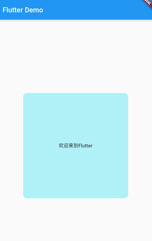
import'package:flutter/material.dart';

 void main(){
  runApp(MyApp());
  }

  // 自定义主键
  class MyApp extends StatelessWidget{
  @override
  Widget build(BuildContext context) {
    return MaterialApp(
      home: Scaffold(
        appBar: AppBar(
          title: Text("Flutter Demo"),
        ),
        body: BodyConent(),
      ),
    );
  }


  }

  // 内容组件
  class BodyConent extends StatelessWidget{
  @override
  Widget build(BuildContext context) {
    return Center(
      child: Container(
      //child 容器元素
      child:Text("欢迎来到Flutter"),
      // 装饰
      // 背景 颜色浅蓝色
      decoration: BoxDecoration(color: Color.fromRGBO(100, 233, 244, 0.5),
      // 圆角
      borderRadius: BorderRadius.all(Radius.circular(10.0))),
      // 对齐方式
      alignment: Alignment.center,
      width: 300.0 ,
      height: 300.0,
      ),
    );

  }

  }
Flutter Text 组件
| 名称 |
功能 |
| textAlign |
文本对齐方式(Center居中、left左对齐、right右对齐、justfy两端对齐) |
| textDirection |
文本方向(ltr从左至右、rtl从右到左) |
| overflow |
文字超出屏幕之后的处理方式(clip裁剪、fade渐隐、ellipsis省略) |
| textScaleFactor |
字体显示倍率 |
| maxLines |
文字显示最大行数 |
| style |
字体的样式设置 |
TextStyle的参数
| 名称 |
功能 |
| decoration |
文字装饰线(none 没有线,lineThrough 删 除线,overline 上划线,underline 下划线) |
| decorationColor |
文字装饰线颜色 |
| decorationStyle |
文字装饰线风格([dashed,dotted]虚线, double 两根线,solid 一根实线,wavy 波浪线) |
| wordSpacing |
单词间隙(如果是负值,会让单词变得更紧 凑 |
| letterSpacing |
字母间隙(如果是负值,会让字母变得更紧 凑) |
| fontStyle |
文字样式(italic 斜体,normal 正常体 |
| fontSize |
文字大小 |
| color |
文字颜色 |
| fontWeight |
字体粗细(bold 粗体,normal 正常体) |
import'package:flutter/material.dart';

 void main(){
  runApp(MyApp());
  }

  // 自定义主键
  class MyApp extends StatelessWidget{
  @override
  Widget build(BuildContext context) {
    return MaterialApp(
      home: Scaffold(
        appBar: AppBar(
          title: Text("Flutter Demo"),
        ),
最低0.47元/天 解锁文章


 扫一扫
扫一扫


 6132
6132

 被折叠的 条评论
为什么被折叠?
被折叠的 条评论
为什么被折叠?
 到【灌水乐园】发言


