


动画效果
语法: 创建动画【关键帧】:@keyframes 调用动画:animation
animation参数值
创建动画
通过 @keyframes(关键帧动画) 规则,您能够创建动画。
2.创建动画的原理是,将一套 CSS 样式逐渐变化为另一套样式。在动画过程中,能够多次改变这套 CSS 样式。
3.以百分比来规定改变发生的时间,或者通过关键词 "from" 和 "to",等价于 0% 和 100%。 0% 是动画的开始时间,100% 动画的结束时间。
4.为了获得最佳的浏览器支持,您应该始终定义 0% 和 100% 选择器。
5.在CSS样式中,用animation属性来应用 @keyframes所定义的动画
案例
案例一:元素平移加颜色渐变
<style>
  .box{
    width: 100px;
    height: 100px;
    background-color: aquamarine;
    animation: dong 2s linear;
  }
  @keyframes dong{
    0%{
      background-color: aquamarine;
      margin-left: 0;
    }
    100%{
      background-color: blueviolet;
      margin-left: 300px;
    }
  }
</style>
<div class='box'>hello world</div>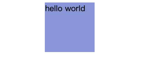
案例二:将元素移动到某个位置,并且停在当前位置
<style>
  .box{
    width: 100px;
    height: 100px;
    background-color: aquamarine;
    animation: dong 2s linear;
    /* 动画执行完毕,停止在最后一个动画的效果 */
    animation-fill-mode: forwards;
  }
  @keyframes dong{
    0%{
      background-color: aquamarine;
      margin-left: 0;
    }
    100%{
      background-color: blueviolet;
      margin-left: 300px;
    }
  }
</style>
<div class='box'>hello world</div>
案例三:元素沿着正方形轨迹移动
<style>
  .box{
    width: 100px;
    height: 100px;
    background-color: aquamarine;
    animation: dong 2s linear;
    /* 动画执行完毕,停止在最后一个动画的效果 */
    animation-fill-mode: forwards;
  }
  @keyframes dong{
    /* 可以省略0%和100%的效果 */
    0%{
      transform: translate(0,0);
    }
    25%{
      transform: translate(300px,0);
    }
    50%{
      transform: translate(300px,300px);
    }
    75%{
      transform: translate(0,300px);
    }
  }
</style>
<div class='box'>hello world</div>
案例四:西游记效果
<!DOCTYPE html>
<html lang="en">
<head>
    <meta charset="UTF-8">
    <meta http-equiv="X-UA-Compatible" content="IE=edge">
    <meta name="viewport" content="width=device-width, initial-scale=1.0">
    <title>Document</title>
    <style>
        {
            padding: 0;
            margin: 0;
        }
        html,body{
            height: 100%;
        }
        .content{
            width: 100%;
            height: 100%;
            background: url('./imgs/10.jpg');
            animation: dong 20s linear infinite;
            position: relative;
        }
        /*背景移动效果 */
        @keyframes dong{
            0%{
                background-position: 0 0;
            }
            100%{
                background-position: 2000px 0;
            }
        }
        .wk{
            width:200px;
            height: 200px;
            position: absolute;
            top: 45%;
            left: 20%;
            background: url('./imgs/1.png') no-repeat 0 0;
            animation: wk 2s steps(8,end) infinite;
        }
        /*悟空移动效果 */
        @keyframes wk{
            0%{
                background-position: 0 0;
            }
            100%{
                background-position: -1600px 0;
            }
        }
        .bj{
            width:200px;
            height: 200px;
            position: absolute;
            top: 45%;
            left: 35%;
            background: url('./imgs/2.png') no-repeat 0 0;
            animation: bj 2s steps(8,end) infinite;
        }
        /*八戒移动效果 */
        @keyframes bj{
            0%{
                background-position: 0 0;
            }
            100%{
                background-position: -1600px 0;
            }
        }
    </style>
</head>
<body>
    <div class="content">
        <div class="wk"></div>
        <div class="bj"></div>
    </div>
</body>
</html>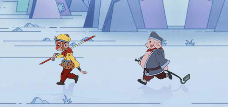
steps 有两个参数 第一个表示分几步执行完 第二个有两个值 start 第一帧是第一步动画结束 end 第一帧是第一步动画开始
案例五:风车效果
<style>
  div{
    width: 1000px;
    height: 500px;
    background-image: url(caodi.png);
    background-size: 1000px 500px
      margin: 100px auto;
    position: relative;
  }
  img:nth-child(1){
    width: 350px;
    height: 350px;
    position: absolute;
    left: 115px;
    top: 60px;
  }
  /*设置第二个风车*/
  img:nth-child(2){
    width: 150px;
    height: 150px;
    position: absolute;
    top: 285px;
    left: 440px;
  }
  /*设置第三个风车*/
  img:nth-child(3){
    width: 250px;
    height: 250px;
    position: absolute;
    top: 190px;
    left: 578px;
  }
  /*key:关键,键;frame:框架;关键帧动画*/
  @keyframes dongHua {
    0%{
      transform: rotate(0deg);
    }100%{
      transform: rotate(360deg);
    }
  }
  img{
    /*动画 合写*/
    animation: dongHua 1s infinite linear;

  }
</style>
<div>
  <img src="fengche.png" alt="这是一张图片:风车">
  <img src="fengche.png" alt="这是第二个风车">
  <img src="fengche.png" alt="这是第三个风车">
</div>
-
Animate插件库
Animate.css内置了很多典型的css3动画,兼容性好使用方便 地址:Redirecting to Animate.css 【4.1.1版本】
演示地址:Animate.css 一款强大的预设css3动画库
下载地址:https://www.jq22.com/demo/Animate201707101048/animate.min.css
使用方式【 3.5.1版本】
第一步:使用link将css文件引入
第二步:选择样式添加 <div class="animated fadeInLeft">从左边进入页面位置 animated 里面定义了动画执行的时间 fadeInLeft 中定义了动画的样式 </div >


 扫一扫
扫一扫


 1万+
1万+

 被折叠的 条评论
为什么被折叠?
被折叠的 条评论
为什么被折叠?
 到【灌水乐园】发言


