


2D效果
平移
语法:translate(X,Y),既可以为正值,也可以为负值(向下、向右为正方向)
注意:尽量不要对元素本身设置当前这个属性,否则图片会一直跳,原因:悬浮时图片的位置发生了改变
案例一:鼠标悬浮向右平移元素
<style>
    div{
        width: 100px;
        height: 100px;
        background-color: antiquewhite;
        transition: all 2s;
    }
    button:hover+div{
        transform: translate(300px,0);
    }
</style>
<button>鼠标悬浮</button>
<div></div>
旋转
语法:transform:rotate(角度) 角度:单位deg 正值:顺时针旋转 负值:逆时针旋转
注意:inline行级元素是不能直接旋转的
案例一:div旋转360度
<style>
    div{
        width: 100px;
        height: 100px;
        background-color: antiquewhite;
        transition: all 2s;
    }
    button:hover+div{
        /* 旋转 */
        transform: rotate(360deg)
    }
</style>
<button>鼠标悬浮</button>
<div></div>
缩放
语法:transform:scale(x,y) x:表示x轴的缩放比例 y:表示y轴的缩放比例 x,y 值分别为原有元素宽高的倍数。 1为不缩放,大于1放大,小于1缩小
当为负值时,将会沿x轴或y轴进行翻转 当括号内两个数相同时,可以只写一个值代替。 如果只想扩大x轴或者y轴,那么属性为scaleX(n)和scaleY(n) transform-origin 影响变换方向。
案例一:鼠标悬浮放大图片
<style>
    img{
        transition: all 2s;
    }
    button:hover+img{
        /* 旋转 */
        transform: scale(0.5);
    }
</style>
<button>鼠标悬浮</button>
<img src="../images/1.jpg" alt="">
案例二:鼠标悬浮放大心形
<style>
    .love {
    position: absolute;
    background-color: rgb(207, 105, 112);
    width: 250px;
    height: 250px;
    /* 元素居中显示 */
    margin: auto;
    top: 0;
    left: 0;
    bottom: 0;
    right: 0;
    transform: rotate(-45deg);
    transition: all 2s;
}
.love::before {
    content: "";
    position: absolute;
    background-color: rgb(207, 105, 112);
    border-radius: 50%;
    width: 250px;
    height: 250px;
    top: -125px;
    left: 0px;
}
.love::after {
    content: "";
    position: absolute;
    background-color: rgb(207, 105, 112);
    border-radius: 50%;
    width: 250px;
    height: 250px;
    left: 125px;
    top: 0px;
}
.love:hover{
    transform:rotate(-45deg) scale(1.3);
}
</style>
<div class="love"></div>
案例三:鼠标悬浮反转图片
<style>
    img{
        width: 400px;
    }
    img:hover{
        transform: scale(-1);
    }
</style>
<img src="../images/0.jpg" alt="">
美团商品悬浮效果:https://www.meituan.com/?&requestCode=c859996d453b438c824cd11631f48604&responseCode=a2643f27b61f422aaa8d2836bb1ab521
倾斜
语法:transform:skew(x-angle,y-angle)
该元素会以横向(X轴)和垂直(Y轴)为参考确定角度; 如果只想沿x轴或者y轴进行倾斜,那么属性为skewX(n)和skewY(n)
旋转中心点
任何一个元素都有一个中心点,默认情况之下,其中心点是居于元素X轴和Y轴的50%处。 在没有transform-origin改变元素原点位置的情况下,CSS变形进行的旋转、缩放,扭曲等操作都是以元素自己中心位置进行变形。 如果实现过渡动画,则变换中心点应该在元素初始CSS
案例一:元素按照左上角的定点旋转
<style>
    img{
        width: 400px;
        /* 过渡效果
/
        transition: all 2s;
*        /*
 旋转中心点 */
        transform-origin: right bottom;
    }
    img:hover{
        transform: rotate(360deg);

    }
</style>
<img src="../images/0.jpg" alt="">
3D效果
透视属性
语法: 给所有的子元素设置: perspective: 1000px;
给元素本身设置 : transform: perspective(300px) rotateY(60deg) ;
定义3D元素的透视效果 (景深或视角),(或者可以理解为: 设置从何处查看一个元素) 值越小,元素离视图越近,透视效果越明显,值越大,越远离视图,透视效果越不明显。
案例一:div沿x轴旋转30度,添加透视属性
<style>
.box{
    width: 100px;
    height: 100px;
    background-color: red;
    margin: 200px auto;
    transform:perspective(300px) rotateX(30deg);
}
</style>
<div class="box"></div>
案例二:让div沿x旋转360度
<style>
.box{
    width: 100px;
    height: 100px;
    background-color: red;
    /* 调用动画 */
    animation: dong 2s infinite;
}
@keyframes dong{
    from{
      /* 添加旋转和透视 */
      /*
      其他浏览器不支持perspective透视属性,一般需要加上-webkit-
      谷歌中虽然支持perspective属性,但是使用的时候必须加px单位;
      -webkit-perspective 可以不用加单位
      */
        transform:perspective(300px) rotateX(0deg);
    }
    100%{
        transform:perspective(300px) rotateX(360deg);
    }
}
</style>
<div class="box"></div>
视效果可以添加给父元素 也可以 添加给子元素
区别在于:
给父元素: 子元素有共同的视角
给子元素,各个子元素有自已的视角
灭点位置
语法:perspective-origin : x轴 y轴;
可以使用的值:left,center,right,length,%;top,center,bottom
perspective-origin:改变视图角度(可理解为视线的方向),影响三维效果呈现。 坐标为当前元素的原点。和perspective结合使用。 可以使用当前元素改变透视元素的视图角度,默认的是x轴和y轴的中心点
<style>
.box{
    position: relative;
    width: 100px;
    height: 100px;
    margin: 50px;
    padding: 10px;
    border: 1px solid #f00;
    perspective: 150px;
    /* 将灭点位置定在左下角 */
    perspective-origin: left bottom;
}
.inner{
    width: 100px;
    height: 100px;
    background-color: yellow;
    transform: rotateX(30deg);
}
</style>
<div class="box">
    <div class="inner"></div>
</div>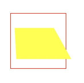
是否为3D模型
语法:transform-style: flat|preserve-3d(preserve-3D | flat 2d效果,默认);
transform-style 属性规定如何在 3D 空间中呈现被嵌套的元素 需要设置在3D变换的父元素中,并且高于任何嵌套的变形元素。 如果你的父元素设置了transform-style值为preserve-3d,就不能为了防止子元素溢
<style>
.div1{
    position: relative;
    height: 200px;
    width: 200px;
    margin: 100px;
    padding:10px;
    border: 1px solid black;
}
.div2{
    padding:50px;
    width: 70px;
    position: absolute;
    border: 1px solid black;
    background-color: red;
    /* 让外层的div沿着y轴逆时针旋转60deg(后) */
    transform:perspective(500px) rotateY(10deg);
    -webkit-transform: perspective(500px) rotateY(10deg);
    /*在 3D 空间中呈现被嵌套的元素 */
    transform-style: preserve-3d;
    -webkit-transform-style: preserve-3d;
}
.div3{
    padding:40px;
    position: absolute;
    border: 1px solid black;
    background-color: yellow;
    /* 让内层的div沿着y轴顺时针转-60deg(前) */
    transform:perspective(500px) rotateY(-60deg);
    -webkit-transform:perspective(500px) rotateY(-60deg);
}
</style>
<div class="div1">
    <div class="div2">hello
        <div class="div3">world</div>
    </div>
</div>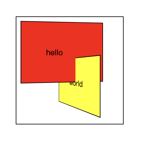
设置变换中心
在3D效果中设置变换中心,2D中也是使用当前属性,3D中可以多设置一个值
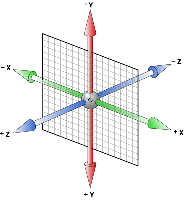
语法:transform-origin : x轴 y轴 z轴;
注意:Z轴只能设置为像素值,不能用关键字和百分比
案例一:鼠标悬浮,div旋转
<style>
    .box {
        /* 给父元素设置透视属性,所有的子元素有公共的视角 */
        perspective: 1000px;
        border: 1px solid black;
        padding: 100px;
        width: 300px;
        height: 300px;
        margin: 100px auto;
        background: gray;
    }
    .box .inner {
        background-color: orange;
        width: 300px;
        height: 300px;
        transition: all 3s;
        /*语法: transform-origin:x,y,z */
        /**
        * transform-origin:center center 0; 默认X轴中心旋转效果 */
        /**
        * transform-origin:top center 0; 沿x轴顶部旋转 */
        /**
        * transform-origin:bottom center 0; 沿X轴底部旋转 */
        /**
        * 使用值 x为任意一个值都是沿x轴顶部旋转;当y轴的值也发生改变时才会移动旋转中心点*/
        transform-origin: 50px 0 0;
    }
    .box:hover .inner {
        /* 3D效果,沿着Y轴旋转360deg */
        transform: rotateX(360deg);
    }
</style>
<div class="box">
    <div class="inner">
    </div>
</div>
不面对屏幕时是否可见
语法:backface-visibility: visible | hidden;
backface-visibility:定义元素在不面对屏幕时是否可见
正反旋转效果
<!DOCTYPE html>
<html>
  <head>
    <meta charset="utf-8">
    <title></title>
    <style type="text/css">
      *{
        margin: 0;
        padding: 0;
      }
      section{
        width: 500px;
        height: 500px;
        background: #ccc;
        margin: 100px auto;
        position: relative;
      }
      div{
        width: 300px;
        height: 300px;
                text-align: center;

        line-height: 300px;
        font-size: 140px;
        color: #fff;
        font-weight: 900;
        position: absolute;
        backface-visibility: hidden;
        transition: 1s;
        }
      div:nth-child(1){
        background: orange;
      }
      div:nth-child(2){
        background: blue;
        transform: rotateY(180deg);
      }
      section:hover div:nth-child(2){
        transform: rotateY(360deg);
      }
      section:hover div:nth-child(1){
        transform: rotateY(180deg);
      }
    </style>
  </head>
  <body>
    <section>
      <div>正</div>
      <div>反</div>
    </section>
  </body>
</html>
<style>
.data2{
    width:100%;
    position:relative;
    overflow:hidden;
}
.data2 .pic2{
    position:absolute;
    top:0;
    left:0;
    z-index:-1;
}
.data2 .row{
    width:185px;
    height:186px;
    float:left;
    margin: 48px;
    position:relative;
    z-index:10;
}
.data2 .row .pic1{width:100%;height:100%; overflow:hidden;}
.data2 .row .pic2{width:100%;height:100%; overflow:hidden;}
.data2 .row .pic2 img{position:absolute;}
.data2 .image_container a .pic1{
    -webkit-transform: rotateX(0deg) rotateY(0deg);
    -webkit-transform-style: preserve-3d;
    backface-visibility: hidden;
    transition: all .4s ease-in-out;
}
.data2 .image_container a:hover .pic1{
    -webkit-transform:rotateY(180deg);
}
.data2 .image_container a .pic2{
    -webkit-transform: rotateY(-180deg);
    -webkit-transform-style: preserve-3d;
    backface-visibility: hidden;
    transition: all .4s ease-in-out;
}
.data2 .image_container a:hover .pic2{
    -webkit-transform:rotateX(0deg) rotateY(0deg);
}
</style>
<div class="data2">
    <div class="image_container row">
      <a>
      <div class="pic1"><img src="index_a.png"></div>
      <div class="pic2"><img src="index_a.png"></div>
      </a>
    </div>
    <div class="image_container row">
      <a>
      <div class="pic1"><img src="index_b.png"></div>
      <div class="pic2"><img src="index_b.png"></div>
      </a>
    </div>
    <div class="image_container row">
      <a>
      <div class="pic1"><img src="index_c.png"></div>
      <div class="pic2"><img src="index_c.png"></div>
      </a>
    </div>
</div>
3D旋转
rotate3d(x,y,z,angle) 3D旋转
x:是一个0到1之间的数值,主要用来描述元素围绕X轴旋转的矢量值;
y:是一个0到1之间的数值,主要用来描述元素围绕Y轴旋转的矢量值;
z:是一个0到1之间的数值,主要用来描述元素围绕Z轴旋转的矢量值;
angle:是一个角度值,主要用来指定元素在3D空间旋转的角度,如果其值为正值,元素顺时针旋转,反之元素逆时针旋转。
rotateX(a)函数功能等同于rotate3d(1,0,0,a)
rotateY(a)函数功能等同于rotate3d(0,1,0,a)
rotateZ(a)函数功能等同于rotate3d(0,0,1,a) a指的是一个旋转角度值
3D缩放
transform: scale3d(x,y,z)
x:x轴的缩放比例,
y:y轴的缩放比例,
z:z轴的缩放比例
案例一:图片立体旋转效果
<style>
img{
  position: absolute;
  width: 150px;
  top: 150px;
  left: 130px;
  }
  .count{
    width: 500px;
    height: 400px;
    margin: 0 auto;
    perspective: 500px;
    transform-style: preserve-3d;
    -webkit-transform-style: preserve-3d;
  }
  .img1{
    transform: rotateY(0deg) translateZ(240px);
    animation: dong1 4s linear infinite;
  }
  @-webkit-keyframes dong1{
    0%{
      transform: rotateY(0deg) translateZ(240px);
    }
    100%{
      transform: rotateY(360deg) translateZ(240px);
    }
  }
  .img2{
    transform: rotateY(40deg)  translateZ(240px);
    animation: dong2 4s linear infinite;
  }
  @-webkit-keyframes dong2{
    0%{
      transform: rotateY(40deg) translateZ(240px);
    }
    100%{
      transform: rotateY(400deg) translateZ(240px);
    }
  }
  .img3{
    transform: rotateY(80deg)  translateZ(240px);
    animation: dong3 4s linear infinite;
  }
  @-webkit-keyframes dong3{
    0%{
      transform: rotateY(80deg) translateZ(240px);
    }
    100%{
      transform: rotateY(440deg) translateZ(240px);
    }
  }
  .img4{
    transform: rotateY(120deg)  translateZ(240px);
    animation: dong4 4s linear infinite;
  }
  @-webkit-keyframes dong4{
    0%{
      transform: rotateY(120deg) translateZ(240px);
    }
    100%{
      transform: rotateY(480deg) translateZ(240px);
    }
  }
  .img5{
    transform: rotateY(160deg)  translateZ(240px);
    animation: dong5 4s linear infinite;
  }
  @-webkit-keyframes dong5{
    0%{
      transform: rotateY(160deg) translateZ(240px);
    }
    100%{
      transform: rotateY(520deg) translateZ(240px);
    }
  }
  .img6{
    transform: rotateY(200deg)  translateZ(240px);
    animation: dong6 4s linear infinite;
  }
  @-webkit-keyframes dong6{
    0%{
      transform: rotateY(200deg) translateZ(240px);
    }
    100%{
      transform: rotateY(560deg) translateZ(240px);
    }
  }
  .img7{
    transform: rotateY(240deg)  translateZ(240px);
    animation: dong7 4s linear infinite;
  }
  @-webkit-keyframes dong7{
    0%{
      transform: rotateY(240deg) translateZ(240px);
    }
    100%{
      transform: rotateY(600deg) translateZ(240px);
    }
  }
  .img8{
    transform: rotateY(280deg)  translateZ(240px);
    animation: dong8 4s linear infinite;
  }
  @-webkit-keyframes dong8{
    0%{
      transform: rotateY(280deg) translateZ(240px);
    }
    100%{
      transform: rotateY(640deg) translateZ(240px);
    }
  }
  .img9{
    transform: rotateY(320deg)  translateZ(240px);
    animation: dong9 4s linear infinite;
  }
  @-webkit-keyframes dong9{
    0%{
      transform: rotateY(320deg) translateZ(240px);
    }
    100%{
      transform: rotateY(680deg) translateZ(240px);
    }
  }
  .count:hover img{
    animation-play-state: paused;
  }
</style>
<div class="count">
  <img src="./images/1.jpg" alt="" class="img1">
  <img src="./images/2.jpg" alt="" class="img2">
  <img src="./images/3.jpg" alt="" class="img3">
  <img src="./images/4.jpg" alt="" class="img4">
  <img src="./images/5.jpg" alt="" class="img5">
  <img src="./images/6.jpg" alt="" class="img6">
  <img src="./images/7.jpg" alt="" class="img7">
  <img src="./images/8.jpg" alt="" class="img8">
  <img src="./images/9.jpg" alt="" class="img9">
</div>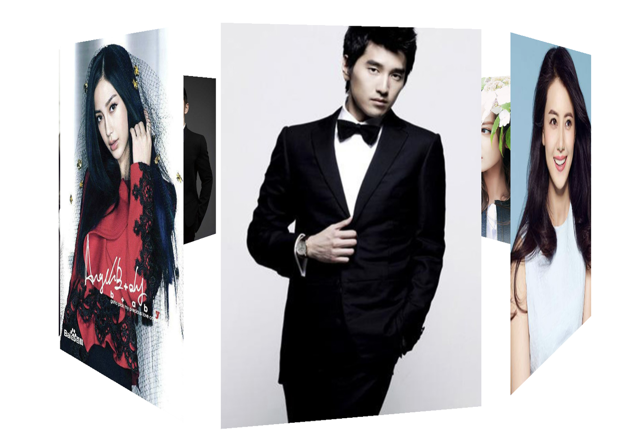
案例二:立方体旋转效果
<style>
  .content{
    width:200px;
    height:200px;
    position: relative;
    margin: 200px auto;
    -webkit-transform-style:preserve-3d;
    -webkit-transform:rotateX(-13deg);
    /* 添加动画是为了能看到立体旋转的效果 */
    -webkit-animation:move 5s linear infinite;
  }
  @-webkit-keyframes move{
    0%{
      -webkit-transform: rotateX(-13deg) rotateY(0deg);
    }
    100%{
      -webkit-transform:rotateX(53deg) rotateY(360deg);
    }
  }
  .content div{
    position: absolute;
    width: 200px;
    height: 200px;
    top: 0;
    left: 0;
  }
  .top{
    background-color: red;
    transform: rotateX(90deg) translateZ(100px);
  }
  .bottom{
    background-color: green;
    transform: rotateX(-90deg)  translateZ(100px);
  }
  .left{
    background-color: yellow;
    transform: rotateY(90deg) translateZ(-100px);
  }
  .right{
    background-color: blue;
    transform: rotateY(-90deg)  translateZ(-100px);
  }
  .before{
    background-color: purple;
    -webkit-transform:translateZ(100px);
  }
  .after{
    background-color: rosybrown;
    -webkit-transform:translateZ(-100px);
  }
</style>
<div class="content">
    <div class="top"></div>
    <div class="bottom"></div>
    <div class="left"></div>
    <div class="right"></div>
    <div class="before"></div>
    <div class="after"></div>
</div>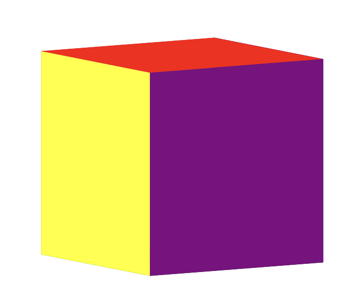
案例三:双层立方体旋转效果
<style>
*{
  margin:0;
  padding:0;
}
body{
  /* background: url(../img/preview.png) ; */
  max-width: 100%;
  min-width: 100%;
  height: 100%;
  background-size: cover;
  background-repeat: no-repeat;
  background-attachment: fixed;
  background-size:100% 100%;
  position: absolute;
  margin-left: auto;
  margin-right: auto;
}
li{
  list-style: none;
}
.box{
  width:200px;
  height:200px;
  /*
  background-size: cover;
  background-repeat: no-repeat;
  background-attachment: fixed;
  */
  /*background-size:100% 100%; */
  position: absolute;
  margin-left: 42%;
  margin-top: 22%;
  -webkit-transform-style:preserve-3d;
  -webkit-transform:rotateX(13deg);
  -webkit-animation:move 5s linear infinite;
}
.minbox{
  width:100px;
  height:100px;
  position: absolute;
  left:50px;
  top:30px;
  -webkit-transform-style:preserve-3d;
}
.minbox li{
  width:100px;
  height:100px;
  position: absolute;
  left:0;
  top:0;
}
.minbox li:nth-child(1){
  background: url(../img/01.png) no-repeat 0 0;
  -webkit-transform:translateZ(50px);
}
.minbox li:nth-child(2){
  background: url(../img/02.png) no-repeat 0 0;
  -webkit-transform:rotateX(180deg) translateZ(50px);
}
.minbox li:nth-child(3){
  background: url(../img/03.png) no-repeat 0 0;
  -webkit-transform:rotateX(-90deg) translateZ(50px);
}
.minbox li:nth-child(4){
  background: url(../img/04.png) no-repeat 0 0;
  -webkit-transform:rotateX(90deg) translateZ(50px);
}
.minbox li:nth-child(5){
  background: url(../img/05.png) no-repeat 0 0;
  -webkit-transform:rotateY(-90deg) translateZ(50px);
}
.minbox li:nth-child(6){
  background: url(../img/06.png) no-repeat 0 0;
  -webkit-transform:rotateY(90deg) translateZ(50px);
}
.maxbox li:nth-child(1){
  background: url(../img/1.png) no-repeat 0 0;
  -webkit-transform:translateZ(50px);
}
.maxbox li:nth-child(2){
  background: url(../img/2.png) no-repeat 0 0;
  -webkit-transform:translateZ(50px);
}
.maxbox li:nth-child(3){
  background: url(../img/3.png) no-repeat 0 0;
  -webkit-transform:rotateX(-90deg) translateZ(50px);
}
.maxbox li:nth-child(4){
  background: url(../img/4.png) no-repeat 0 0;
  -webkit-transform:rotateX(90deg) translateZ(50px);
}
.maxbox li:nth-child(5){
  background: url(../img/5.png) no-repeat 0 0;
  -webkit-transform:rotateY(-90deg) translateZ(50px);
}
.maxbox li:nth-child(6){
  background: url(../img/6.png) no-repeat 0 0;
  -webkit-transform:rotateY(90deg) translateZ(50px);
}
.maxbox{
  width: 800px;
  height: 400px;
  position: absolute;
  left: 0;
  top: -20px;
  -webkit-transform-style: preserve-3d;
}
.maxbox li{
  width: 200px;
  height: 200px;
  background: #fff;
  border:1px solid #ccc;
  position: absolute;
  left: 0;
  top: 0;
  opacity: 0.2;
  -webkit-transition:all 1s ease;
}
.maxbox li:nth-child(1){
  -webkit-transform:translateZ(100px);
}
.maxbox li:nth-child(2){
  -webkit-transform:rotateX(180deg) translateZ(100px);
}
.maxbox li:nth-child(3){
  -webkit-transform:rotateX(-90deg) translateZ(100px);
}
.maxbox li:nth-child(4){
  -webkit-transform:rotateX(90deg) translateZ(100px);
}
.maxbox li:nth-child(5){
  -webkit-transform:rotateY(-90deg) translateZ(100px);
}
.maxbox li:nth-child(6){
  -webkit-transform:rotateY(90deg) translateZ(100px);
}
.box:hover ol li:nth-child(1){
  -webkit-transform:translateZ(300px);
  width: 400px;
  height: 400px;
  opacity: 0.8;
  left: -100px;
  top: -100px;
}
.box:hover ol li:nth-child(2){
  -webkit-transform:rotateX(180deg) translateZ(300px);
  width: 400px;
  height: 400px;
  opacity: 0.8;
  left: -100px;
  top: -100px;
}
.box:hover ol li:nth-child(3){
  -webkit-transform:rotateX(-90deg) translateZ(300px);
  width: 400px;
  height: 400px;
  opacity: 0.8;
  left: -100px;
  top: -100px;
}
.box:hover ol li:nth-child(4){
  -webkit-transform:rotateX(90deg) translateZ(300px);
  width: 400px;
  height: 400px;
  opacity: 0.8;
  left: -100px;
  top: -100px;
}
.box:hover ol li:nth-child(5){
  -webkit-transform:rotateY(-90deg) translateZ(300px);
  width: 400px;
  height: 400px;
  opacity: 0.8;
  left: -100px;
  top: -100px;
}
.box:hover ol li:nth-child(6){
  -webkit-transform:rotateY(90deg) translateZ(300px);
  width: 400px;
  height: 400px;
  opacity: 0.8;
  left: -100px;
  top: -100px;
}
@keyframes move{
  0%{
    -webkit-transform: rotateX(13deg) rotateY(0deg);
  }
  100%{
    -webkit-transform:rotateX(13deg) rotateY(360deg);
  }
}
</style>
<div class="box">
  <ul class="minbox">
    <li></li>
    <li></li>
    <li></li>
    <li></li>
    <li></li>
    <li></li>
  </ul>
  <ol class="maxbox">
    <li></li>
    <li></li>
    <li></li>
    <li></li>
    <li></li>
    <li></li>
  </ol>
</div>-
Animate插件库
Animate.css内置了很多典型的css3动画,兼容性好使用方便 地址:Redirecting to Animate.css
演示地址:Animate.css 一款强大的预设css3动画库
下载地址:https://www.jq22.com/demo/Animate201707101048/animate.min.css
使用方式
第一步:使用link将css文件引入
第二步:选择样式添加 <div class="animated fadeInLeft">从左边进入页面位置 animated 里面定义了动画执行的时间 fadeInLeft 中定义了动画的样式 </div >
<!-- 引入css样式 -->
<link rel="stylesheet" href="https://www.jq22.com/demo/Animate201707101048/animate.min.css">
<!-- 调用css样式 -->
<div class='animated shake'>hello world</div>-
WOW.js插件
效果参考资料:WOW.js演示_dowebok
使用参考资料:WOW.js – 让页面滚动更有趣 - Cuckoo_H - 博客园
-
引入对应的js文件
<script src="./wow.min.js"></script>-
初始化js代码
<script type="text/javascript">
    new WOW().init();
</script>-
给对应的动画添加wow效果
<div class="wow slideInLeft" data-wow-duration="2s" data-wow-iteration="1">hello</div>注意:animated需要修改为wow, data-wow-duration动画执行的时间 data-wow-iteration循环的次数 data-wow-delay="5s" 延迟的时间 data-wow-offset="10" 偏移值
-
总结:CSS3新增属性
CSS3选择器,CSS3实现圆角(border-radius),阴影(box-shadow),对文字加特效(text-shadow),线性渐变(gradient),2D变形(transform),3D效果,animate动画,媒体查询,多栏布局,弹性盒子


 扫一扫
扫一扫


 327
327

 被折叠的 条评论
为什么被折叠?
被折叠的 条评论
为什么被折叠?
 到【灌水乐园】发言


