


<!DOCTYPE html>
<html>
<head>
<meta charset="UTF-8">
<title>梅花旋转特效</title>
<link rel="stylesheet" type="text/css" href="css/万能css.css"/>
<style type="text/css">
body{overflow: hidden;}
.box{width: 300px;
height: 300px;
margin: 300px auto;
background: url(img/8.jpg) no-repeat;
border-radius: 50%;
transition: 1s;
position: relative;
transition: 3s;
}
.box:after{content: "";
display: block;
width: 260px;
height: 260px;
border: 20px solid #FF0000;
border-right-color: #1ad280;
border-bottom-color: #1ad280;
border-radius: 50%;
position: absolute;
top: 0;left: 0;
border-radius: 50%;
transition: 1s;}
.box:hover .show{opacity: 1;
transition: 1s;}
.box:hover:after{
transform: rotate(180deg);
}
.show{width: 300px;
height: 300px;
margin: 300px auto;
background:rgba(250,250,250,0.5);
border-radius: 50%;
position: absolute;
top: -300px;
opacity: 0;
}
.one{font-size: 30px;
text-align: center;
padding-top: 40px;
margin-left: 5px;
}
.two{text-align: center;
font-size:20px ;
width: 150px;
border-bottom: 1px solid black;
padding-bottom: 10px;
margin-left:70px ;
}
.thr{font-size: 10px;
padding-top: 5px;
text-align: center;
width: 150px;
margin-left:70px;
margin-top: 20px;}
</style>
</head>
<body>
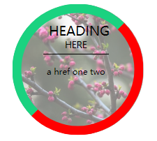
<div class="box">
<div class="show">
<p class="one">HEADING</p>
<p class="two">HERE</p>
<p class="thr">a href one two</p>
</div>
</div>
</body>
</html>


 扫一扫
扫一扫


 436
436

 被折叠的 条评论
为什么被折叠?
被折叠的 条评论
为什么被折叠?
 到【灌水乐园】发言


