


使用python绘制风uv风场的矢量图
本文采取的数据来自于ERA5,ERA5是ECMWF(欧洲中期天气预报中心)对1950年1月至今全球气候的第五代大气再分析数据集,包括水深50m温度,100m温度,10m的u风分量和10m的v风分量风场和流场。
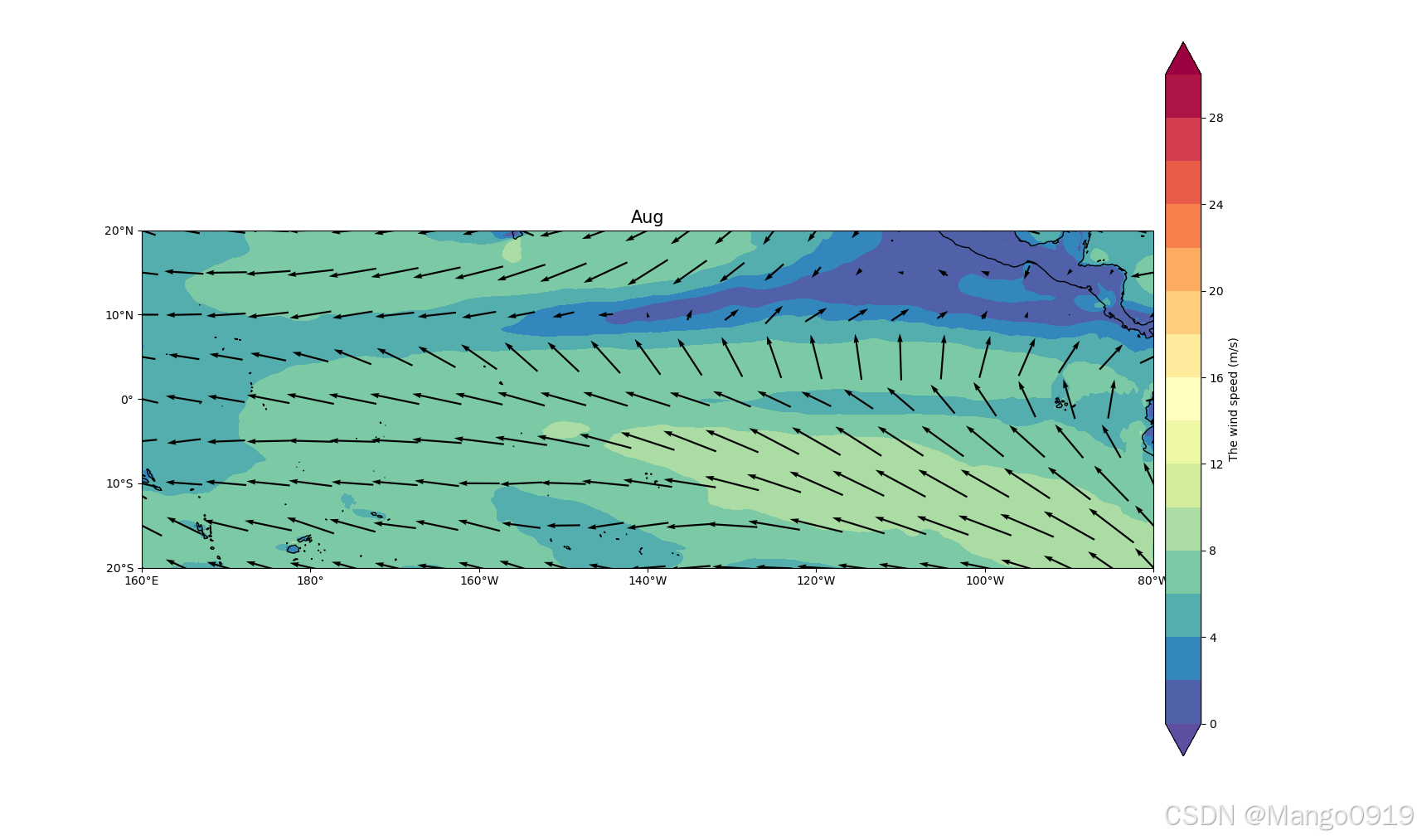
以绘制2022-8的风场图为例
import os
import matplotlib as mpl
import numpy as np
from datetime import datetime
from datetime import timedelta
import xarray as xr
import netCDF4 as nc
import cartopy.crs as ccrs
import cartopy.feature as cfeat
import matplotlib.pyplot as plt
import pandas as pd
from scipy import interpolate
from scipy import ndimage
import common_lib as clib
import pandas
from matplotlib.font_manager import FontProperties
from cartopy.mpl.ticker import LongitudeFormatter,LatitudeFormatter
from cartopy.mpl.gridliner import LONGITUDE_FORMATTER,LATITUDE_FORMATTER


path=r"F:\\\uv10_1940_2022_mon.nc"
data=xr.open_dataset(path).sel(time=slice("2022","2022"))
u=data.u10
v=data.v10
w=np.sqrt(u**2+v**2)
lon=data.longitude.data
lat=data.latitude.data
这里为了方便后续的绘制,我们定义一个函数
def make_map(ax, title,box,xstep,ystep):
    ax.set_extent(box, crs=ccrs.PlateCarree())
    ax.coastlines(scale)
    ax.set_xticks(np.arange(box[0],box[1]+1,xstep),crs=ccrs.PlateCarree())
    ax.set_yticks(np.arange(box[2],box[3]+1,ystep),crs=ccrs.PlateCarree())
    lon_formatter=LongitudeFormatter(zero_direction_label=False)
    lat_formatter = LatitudeFormatter()
    ax.xaxis.set_major_formatter(lon_formatter)
    ax.yaxis.set_major_formatter(lat_formatter)
    ax.set_title(title, fontsize=15, loc='center')
    return ax
然后我们就可以开始调用了
fig=plt.figure(figsize=(25,35))
x,y=np.meshgrid(lon,lat)
box1=[160,280,-20,20]
scale='50m'
xstep, ystep = 20, 10
cmap=plt.get_cmap('Spectral_r')
titl='Aug'

proj=ccrs.PlateCarree(central_longitude=220)
ax=fig.add_axes([0.1,0.1,0.85,0.85],projection=ccrs.PlateCarree(central_longitude=220))

make_map(ax,titl,box1,xstep,ystep)
接下来是最重要的矢量设置,具体的函数运用可以参考使用matplotlib的quiver绘制二维箭头图_ax.quiver-优快云博客,可以根据自己需求改参数
cb=ax.quiver(x[::20,::20],y[::20,::20],u.data[7,:,:][::20,::20],v.data[7,:,:][::20,::20],pivot='mid',width=0.0018,scale=150,transform=ccrs.PlateCarree(),color='k',angles='xy',zorder=1)
最后就是补充一些绘图的代码
cp=ax.ax.add_feature(cfeature.COASTLINE.with_scale('50m'),lw=0.5)

ax.add_feature(cfeature.LAND.with_scale('50m'),facecolor='w', zorder=2)
cp=ax.contourf(lon,lat,w.data[7],zorder=0,transform=ccrs.PlateCarree(),cmap=cmap,levels=np.arange(0,31,2),extend='both')
cbar = fig.colorbar(cp,pad=0.01,label='The wind speed (m/s)')
plt.show()
这样就得到了我们的图
完整代码如下
import os
import matplotlib as mpl
import numpy as np
from datetime import datetime
from datetime import timedelta
import xarray as xr
import netCDF4 as nc
import cartopy.crs as ccrs
import cartopy.feature as cfeat
import matplotlib.pyplot as plt
import pandas as pd
from scipy import interpolate
from scipy import ndimage
import common_lib as clib
import pandas
from matplotlib.font_manager import FontProperties
from cartopy.mpl.ticker import LongitudeFormatter,LatitudeFormatter
from cartopy.mpl.gridliner import LONGITUDE_FORMATTER,LATITUDE_FORMATTER


path=r"E:\\\uv10_1940_2022_mon.nc"
data=xr.open_dataset(path).sel(time=slice("2022","2022"))
u=data.u10
v=data.v10
w=np.sqrt(u**2+v**2)
lon=data.longitude.data
lat=data.latitude.data
def make_map(ax, title,box,xstep,ystep):
    ax.set_extent(box, crs=ccrs.PlateCarree())
    ax.coastlines(scale)
    ax.set_xticks(np.arange(box[0],box[1]+1,xstep),crs=ccrs.PlateCarree())
    ax.set_yticks(np.arange(box[2],box[3]+1,ystep),crs=ccrs.PlateCarree())
    lon_formatter=LongitudeFormatter(zero_direction_label=False)
    lat_formatter = LatitudeFormatter()
    ax.xaxis.set_major_formatter(lon_formatter)
    ax.yaxis.set_major_formatter(lat_formatter)
    ax.set_title(title, fontsize=15, loc='center')
    return ax

fig=plt.figure(figsize=(25,35))
x,y=np.meshgrid(lon,lat)
box1=[160,280,-20,20]
scale='50m'
xstep, ystep = 20, 10
cmap=plt.get_cmap('Spectral_r')
titl='Aug'

proj=ccrs.PlateCarree(central_longitude=220)
ax=fig.add_axes([0.1,0.1,0.85,0.85],projection=ccrs.PlateCarree(central_longitude=220))

make_map(ax,titl,box1,xstep,ystep)
cb=ax.quiver(x[::20,::20],y[::20,::20],u.data[7,:,:][::20,::20],v.data[7,:,:][::20,::20],pivot='mid',
width=0.0018,scale=150,transform=ccrs.PlateCarree(),color='k',angles='xy',zorder=1)

cp=ax.ax.add_feature(cfeature.COASTLINE.with_scale('50m'),lw=0.5)

ax.add_feature(cfeature.LAND.with_scale('50m'),facecolor='w', zorder=2)
cp=ax.contourf(lon,lat,w.data[7],zorder=0,transform=ccrs.PlateCarree(),cmap=cmap,levels=np.arange(0,31,2),extend='both')
cbar = fig.colorbar(cp,pad=0.01,label='The wind speed (m/s)')
plt.show()


 1330
1330

 被折叠的 条评论
为什么被折叠?
被折叠的 条评论
为什么被折叠?
 到【灌水乐园】发言


