


# 改变y轴坐标,以频率作为标度
qplot(x = friend_count,
      y = ..count../sum(..count..),
      data = subset(pf, !is.na(gender)),
      xlab = 'Friend Count',
      ylab = 'Proportion of Users with that friend count',
      binwidth = 10, geom = 'freqpoly', color = gender) +
  scale_x_continuous(lim = c(0, 1000), breaks = seq(0, 1000, 50))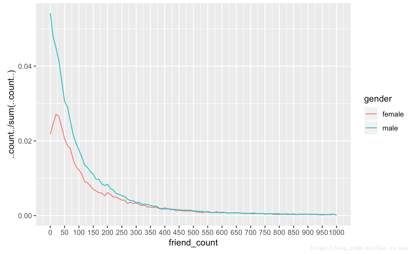
# 改变y轴坐标,以频率作为标度,观察后半部分的图形
qplot(x = friend_count,
      y = ..count../sum(..count..),
      data = subset(pf, !is.na(gender)),
      xlab = 'Friend Count',
      ylab = 'Proportion of Users with that friend count',
      binwidth = 10, geom = 'freqpoly', color = gender) +
  scale_x_continuous(lim = c(400, 1000), breaks = seq(0, 1000, 50))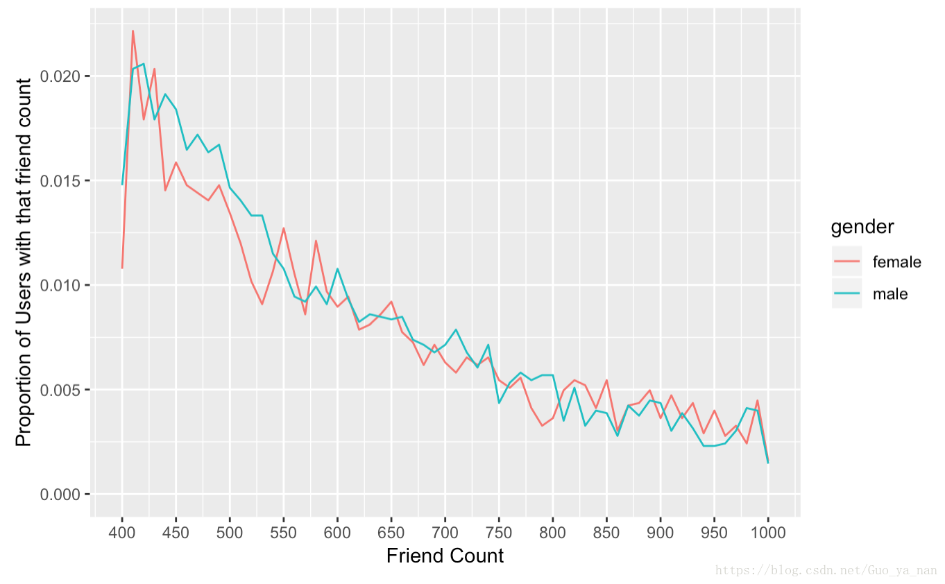
频率多边形,一开始没搞明白。目标是获得 哪个性别的平均好友数更多。
但从频率多边形来看似乎是男性高于女性。
实际上,从频率多边形 能看出 男性在较多的百分比上拥有较低的好友数。
tip:sum(..count..)跨颜色进行总计,因此,显示的百分比是总用户数的百分比。要在每个组内绘制百分比,可以尝试y = ..density…


 287
287

 被折叠的 条评论
为什么被折叠?
被折叠的 条评论
为什么被折叠?
 到【灌水乐园】发言


