


目录
1.2 作为需要画图的数据的输入方式(Types of inputs to plotting functions)
一.用户指南(Usage Guide)
1.1 了解一张图

什么是axe,axis,figure,figure是指画板,axes指画纸,axis是指画纸的边缘,以此类推到上图。
下面用代码解释一下:
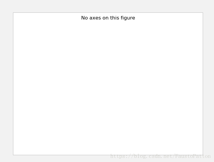
import matplotlib.pyplot as plt
fig=plt.figure()
fig.suptitle('No axes on this figure')
fig,ax_lst=plt.subplots(2,2)
plt.show()
出图:
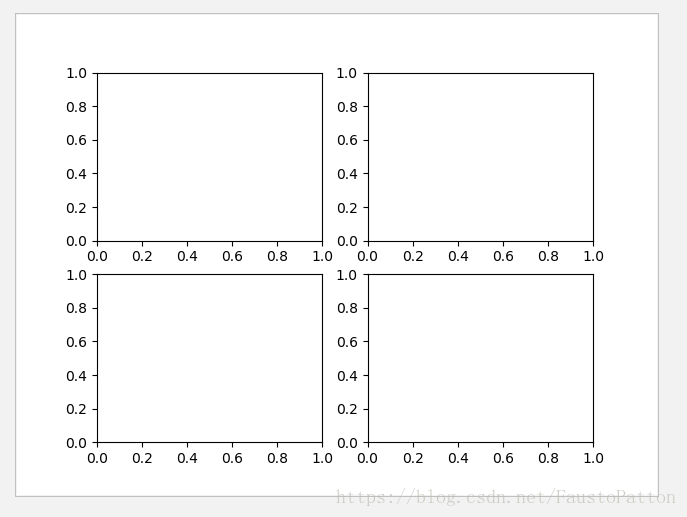
一个figure中可以包含很多axes(第二张图),也可以不包含axes(第一张图),一个axes中包括2个axis(三维图中包含3个axis)
1.2 作为需要画图的数据的输入方式(Types of inputs to plotting functions
)
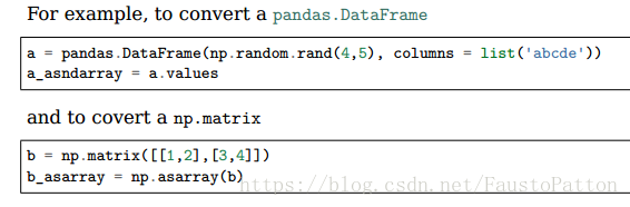
可以使用np.array或者np.ma.masked_array作为输入,也可以用类似array的输入,比如pandas和np.matrix,但是这个可能无法正常工作,所以最好转换成np.array
1.3 matplotlib,pyplot,pylab之间是什么关系(Matplotlib, pyplot and pylab: how are they related?)
matplotlib是一个完整的包,pyplot是其中一个模块,pylab是matplotlib下的一个子包(注:pylab最好不再使用)
import matplotlib.pyplot as plt
import numpy as np

x = np.linspace(0, 2, 100)#在指定的间隔内返回均匀间隔的数字
plt.plot(x, x, label='linear')
plt.plot(x, x**2, label='quadratic')
plt.plot(x, x**3, label='cubic')
plt.xlabel('x label')
plt.ylabel('y label')
plt.title("Simple Plot")
plt.legend()
plt.show()
出图: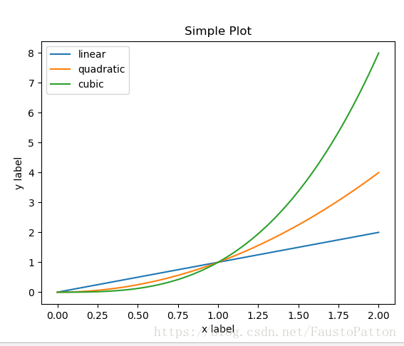
1.4 引论
工业化写代码(用函数,防止重复造轮子),subplot实例
代码:
import matplotlib.pyplot as plt
import numpy as np
def my_plotter(ax, data1, data2, param_dict):
"""
A helper function to make a graph
Parameters
----------
ax : Axes
The axes to draw to
data1 : array
The x data
data2 : array
The y data
param_dict : dict
Dictionary of kwargs to pass to ax.plot
Returns
-------
out : list
list of artists added
"""
out = ax.plot(data1, data2, **param_dict)
return out
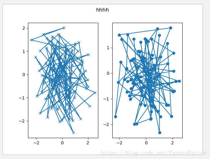
data1, data2, data3, data4 = np.random.randn(4, 100)#具有标准正态分布
fig, (ax1, ax2) = plt.subplots(1, 2)
fig.suptitle("hhhh")
my_plotter(ax1, data1, data2, {'marker': 'x'})
my_plotter(ax2, data3, data4, {'marker': 'o'})
plt.show()出图
1.5 后端
matplotlib中什么是后端?见链接;https://www.cnblogs.com/suntp/p/6519386.html
1.6 交互模式与阻塞模式
什么是交互模式与阻塞模式呢?
在Python Consol命令行中,默认是交互模式。而在python脚本中,matplotlib默认是阻塞模式
其中的区别是:
在交互模式下:
- plt.plot(x)或plt.imshow(x)是直接出图像,不需要plt.show()
- 如果在脚本中使用ion()命令开启了交互模式,没有使用ioff()关闭的话,则图像会一闪而过,并不会常留。要想防止这种情况,需要在plt.show()之前加上ioff()命令。
在阻塞模式下:
- 打开一个窗口以后必须关掉才能打开下一个新的窗口。这种情况下,默认是不能像Matlab一样同时开很多窗口进行对比的。
- plt.plot(x)或plt.imshow(x)是直接出图像,需要plt.show()后才能显示图像
交互模式的例子
import matplotlib.pyplot as plt
import numpy as np

plt.ioff()#关闭交互模式
#plt.ion #打开交互模式
for i in range(3):
    plt.plot(np.random.rand(10))
    plt.show()
二.pyplot教程
2.1 引论
利用pyplot十分迅速
import matplotlib.pyplot as plt
plt.plot([1, 2, 3, 4])
plt.ylabel('some numbers')
plt.show()
出图:
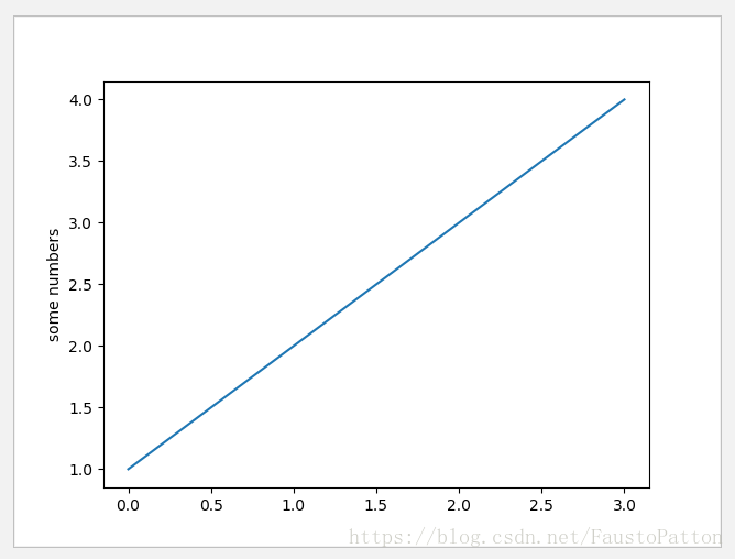
你可能在想为什么x轴的数值是0-3,而y周的数值是1-4,原因是如果你在使用plot函数时只提供一个单独的list,matplotlib直接假定list的值是y轴的值,并自动生成x轴的值,而且python中0为起始编号。以上
另外用两个list来plot
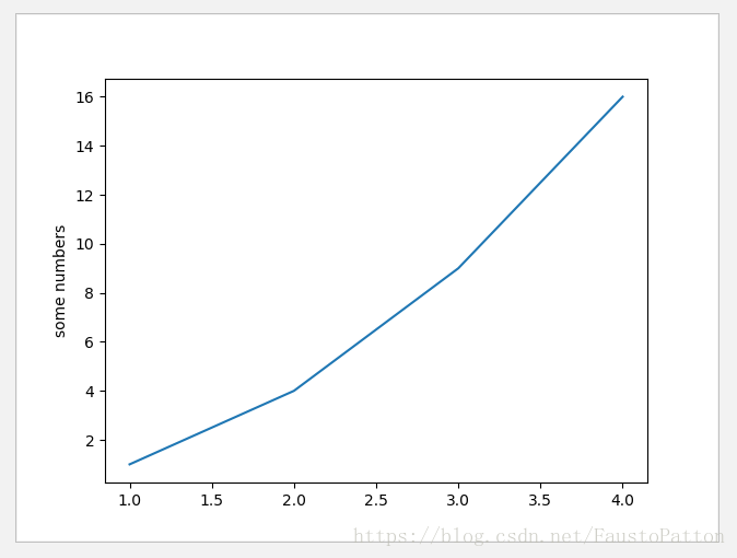
代码:
import matplotlib.pyplot as plt
plt.plot([1, 2, 3, 4], [1, 4, 9, 16])
plt.ylabel('some numbers')
plt.show()
出图:
2.1.1 定制自己的plot风格
代码:
import matplotlib.pyplot as plt
plt.plot([1, 2, 3, 4], [1, 4, 9, 16], 'ro')
plt.axis([0, 6, 0, 20])
plt.show()
出图:
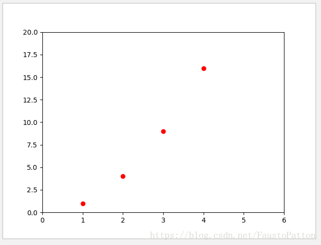
上图中可以发现x轴范围为0-6,y轴范围为0-20,即plt.axis=[xmin, xmax, ymin, ymax]
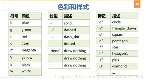
这里的"ro"是指红色圆点,参考如下:
如果你觉得matlibplot只能使用list的话,那就在数值计算中太没有什么用了,通常我们会用到numpy矩阵,下面就秀一下:
使用numpy矩阵plot
import matplotlib.pyplot as plt
import numpy as np
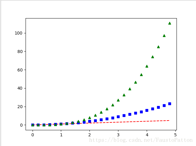
#生产一个间隔为0.2的样本
t=np.arange(0.,5.,0.2)
#利用该数据产生红色虚线,蓝色正方形和绿色三角形的图形
plt.plot(t,t,'r--',t,t**2,'bs',t,t**3,'g^')
plt.show()成图:
使用关键字串plot
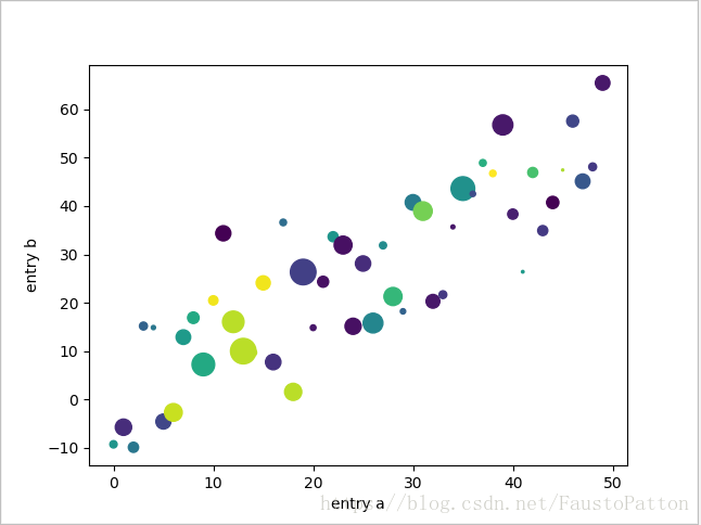
有些时候会遇到一些别的格式的数据,类似json的key-value或者Python字典格式或者numpy.recarray和pandas.DataFrame的数据,那么怎么办呢?代码秀如下:
import matplotlib.pyplot as plt
import numpy as np


data = {'a': np.arange(50),'c': np.random.randint(0, 50, 50),'d': np.random.randn(50)}
data['b'] = data['a'] + 10 * np.random.randn(50)
data['d'] = np.abs(data['d']) * 100
plt.scatter('a', 'b', c='c', s='d', data=data)
plt.xlabel('entry a')
plt.ylabel('entry b')
plt.show()
出图:
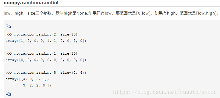
那么,什么是np.random.randint呢?如下:
上面代码中plt.scatter的参数c代表色彩,s代表标量(这里指规格大小),对于plt.scatter有许多许多的参数,可以借鉴这个博客https://blog.youkuaiyun.com/qiu931110/article/details/68130199,也可以继续看我下面的文档中的介绍
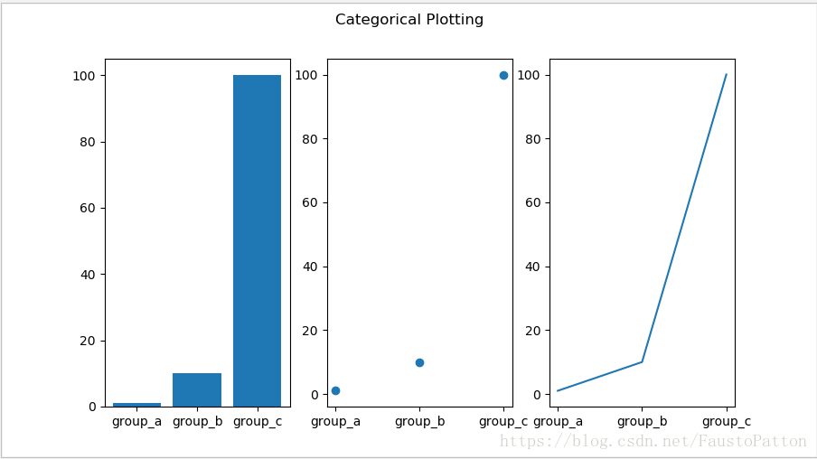
用分类数据plot
import matplotlib.pyplot as plt
import numpy as np
names = ['group_a', 'group_b', 'group_c']
values = [1, 10, 100]
plt.figure(1, figsize=(9, 5))
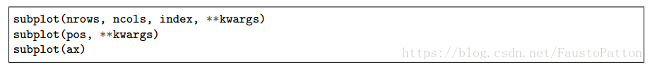
#注意subplot的131,1代表1行,3代表3列,最后的1代表所处的位置
plt.subplot(131)
#柱状图,
plt.bar(names, values)
plt.subplot(132)
#散点图
plt.scatter(names, values)
plt.subplot(133)
#连线
plt.plot(names, values)
plt.suptitle('Categorical Plotting')
plt.show()出图:
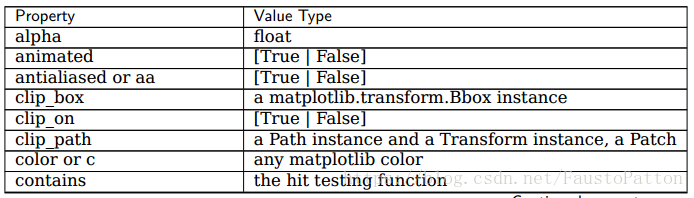
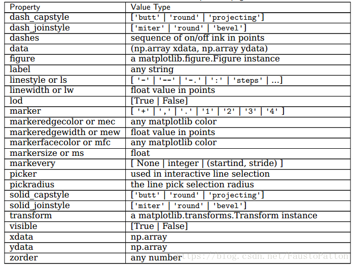
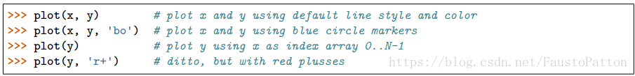
plot画线的各种属性
有很多方式设置属性:
1.使用关键字参数:
plt.plot(x, y, linewidth=2.0)2.使用setter函数
line, = plt.plot(x, y, '-')
line.set_antialiased(False) # turn off antialising
3.使用setp()指令
lines = plt.plot(x1, y1, x2, y2)
# use keyword args
plt.setp(lines, color='r', linewidth=2.0)
# or MATLAB style string value pairs
plt.setp(lines, 'color', 'r', 'linewidth', 2.0)
以下是画2D线的参数
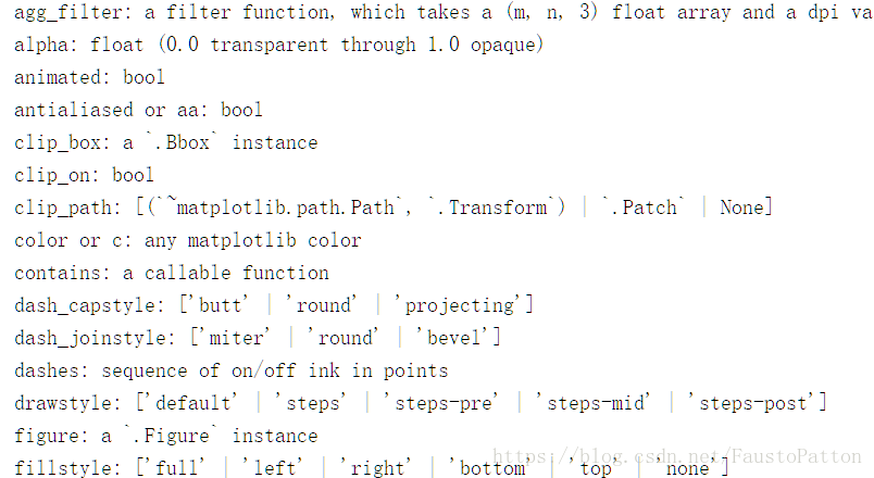
利用setp()函数获得参数(类似于帮助,help),如下:
import matplotlib.pyplot as plt
import numpy as np

lines = plt.plot([1, 2, 3])
plt.setp(lines)
得到:
同时绘制多个figure和axes
import matplotlib.pyplot as plt
import numpy as np

def f(t):
    return np.exp(-t) * np.cos(2*np.pi*t)

t1 = np.arange(0.0, 5.0, 0.1)
t2 = np.arange(0.0, 5.0, 0.02)
plt.figure(1)#绘制一个figure,默认值为1
plt.subplot(211)
plt.plot(t1, f(t1), 'bo', t2, f(t2), 'k')
plt.subplot(212)
plt.plot(t2, np.cos(2*np.pi*t2), 'r--')
plt.show()
成图:
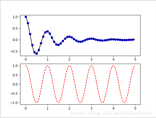
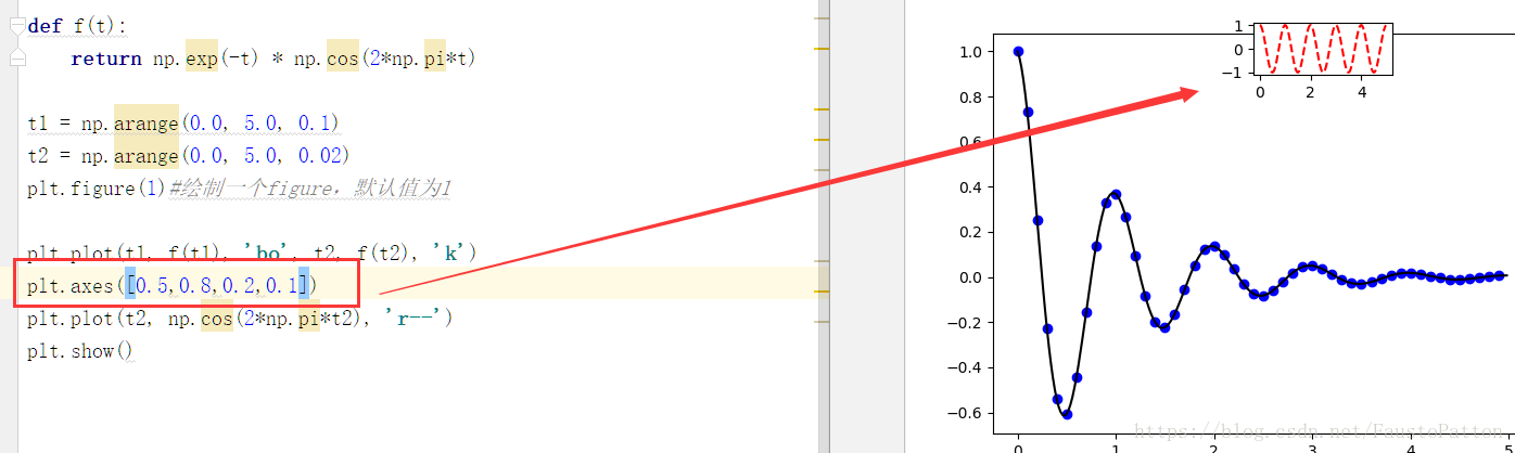
注:axes([left, bottom, width, height])(值为0-1)可以让你放置在你想放的位置,而非固定的subplot格式
clf()用来清除figure,cla()用来清除axes
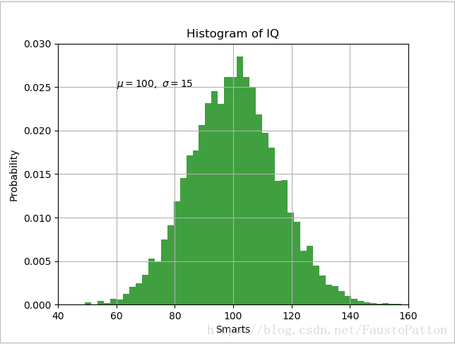
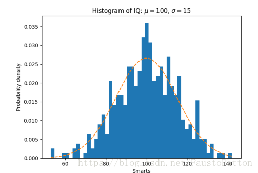
使用text()
text()可以在axes上任意位置输入你想输的text,具有同样功能的有xlabel(),ylabel(),title(),同样也可以用参数来自定义格式,setp()函数获取参数
实例:
import matplotlib.pyplot as plt
import numpy as np

mu, sigma = 100, 15
x = mu + sigma * np.random.randn(10000)
# the histogram of the data
n, bins, patches = plt.hist(x, 50, density=1, facecolor='g', alpha=0.75)
plt.xlabel('Smarts')
plt.ylabel('Probability')
plt.title('Histogram of IQ')
plt.text(60, .025, r'$\mu=100,\ \sigma=15$')
plt.axis([40, 160, 0, 0.03])
plt.grid(True)
plt.show()
出图:
在text中使用数学表达式
例如:
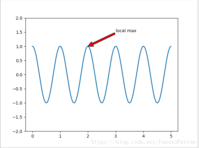
plt.title(r'$\sigma_i=15$')对text进行定位
import matplotlib.pyplot as plt
import numpy as np

ax = plt.subplot(111)
t = np.arange(0.0, 5.0, 0.01)
s = np.cos(2*np.pi*t)
line, = plt.plot(t, s, lw=2)
plt.annotate('local max', xy=(2, 1), xytext=(3, 1.5),
arrowprops=dict(facecolor='red', shrink=1),
)
plt.ylim(-2, 2)
plt.show()
成图:
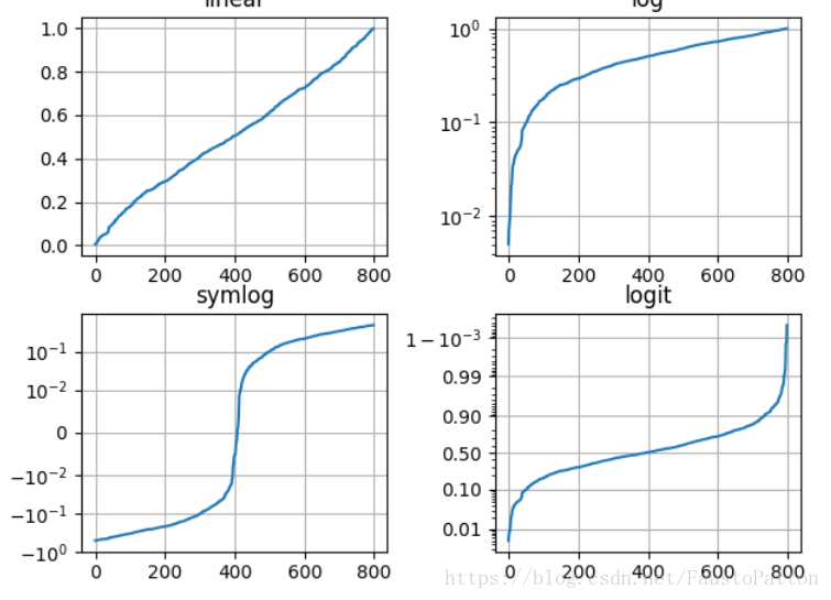
log轴和非线性轴
matplotlib.pyplot不仅包含线性轴,还包括非线性轴和log轴。
import matplotlib.pyplot as plt
import numpy as np
from matplotlib.ticker import NullFormatter # useful for `logit` scale
# Fixing random state for reproducibility
np.random.seed(19680801)
# make up some data in the interval ]0, 1[
y = np.random.normal(loc=0.5, scale=0.4, size=1000)
y = y[(y > 0) & (y < 1)]
y.sort()
x = np.arange(len(y))
# plot with various axes scales
plt.figure(1)
# linear
plt.subplot(221)
plt.plot(x, y)
plt.yscale('linear')
plt.title('linear')
plt.grid(True)
# log
plt.subplot(222)
plt.plot(x, y)
plt.yscale('log')
plt.title('log')
plt.grid(True)
# symmetric log
plt.subplot(223)
plt.plot(x, y - y.mean())
plt.yscale('symlog', linthreshy=0.01)
plt.title('symlog')
plt.grid(True)
# logit
plt.subplot(224)
plt.plot(x, y)
plt.yscale('logit')
plt.title('logit')
plt.grid(True)
plt.show()
# Format the minor tick labels of the y-axis into empty strings with
# `NullFormatter`, to avoid cumbering the axis with too many labels.
plt.gca().yaxis.set_minor_formatter(NullFormatter())
# Adjust the subplot layout, because the logit one may take more space
# than usual, due to y-tick labels like "1 - 10^{-3}"
出图:
2.2 plot的一些示例
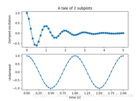
line plot


Multiple subplots in one fgure
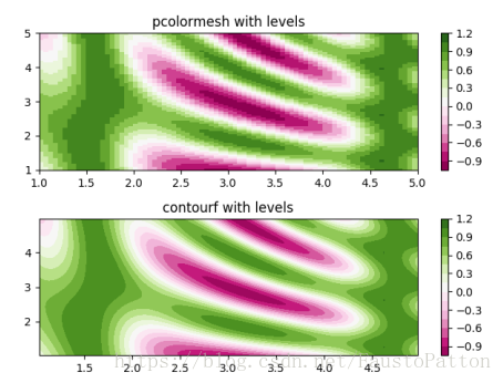
Contouring and pseudocolor

Histograms
使用hist()
Paths
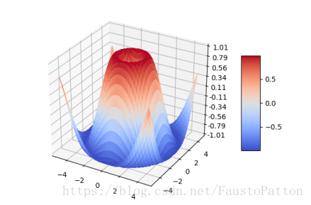
Three-dimensional plotting


 4377
4377

 被折叠的 条评论
为什么被折叠?
被折叠的 条评论
为什么被折叠?
 到【灌水乐园】发言


