


 本文介绍了如何使用Scillus包进行单细胞RNA测序数据分析,从加载原始数据到质量控制、过滤和整合,再到绘制降维图、统计图、热力图,并涉及GO富集和GSEA分析,提供了详细的步骤和参数调整建议。
devtools::install_github("xmc811/Scillus", ref = "development")
画图类的包和函数记得用?看帮助文档里的parameter
- initial step
(1)sample data
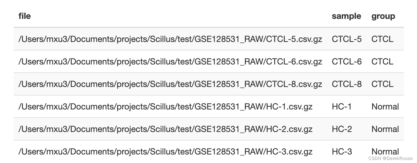
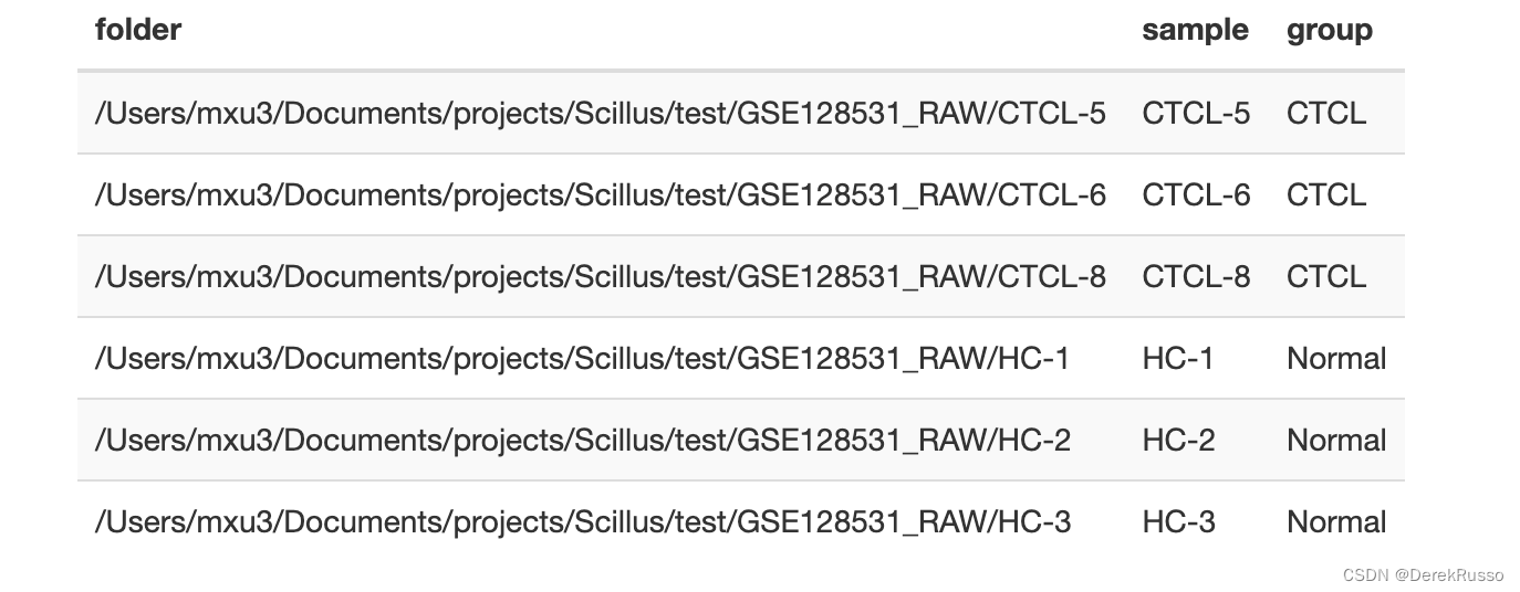
输入格式多样,可以是10x输出的标准三文件,也可以是分群注释好的Seurat object,本次以读入csv.gz为例。
(2)meta data
一般scRNA会有多样品、多组的各自文件,scillus在导入他们的时候会生成对应的多个Seurat object,所以需要对此做一个meta data frame。至少两列,一列sample,一列file or folder。
library(tidyverse)

a <- list.files("your/path/to/sample/data/GSE128531_RAW", full.names = TRUE)
m <- tibble(file = a,
            sample = stringr::str_remove(basename(a), ".csv.gz"),
            group = rep(c("CTCL", "Normal"), each = 3)
或者(如果有sex等其他变量一样可以加进来)
(3)pallate set up
保证前后色调的统一性
pal <- tibble(var = c("sample", "group","seurat_clusters"),
              pal = c("Set2","Set1","Paired"))
- data processing
(1)loading raw data
library(Scillus)
library(tidyverse)
library(Seurat)
library(magrittr)

scRNA <- load_scfile(m)

#结果是一个list,每个object都是seurat object
#自动计算了线粒体基因含量

length(scRNA)
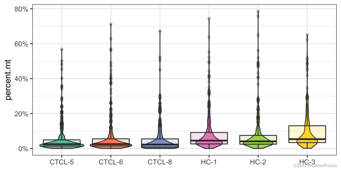
(2)plotting qc metrics
The resulting plot can be further customized (axis.title, theme, etc.) using ggplot grammar.
此外,function中还有三个optional parameter:
1, plot_type:默认是小提琴图和箱线图混合,可以改为“box”"violin""density"
2,group_by:默认是metadata里的sample,可以指定metadata里的其他列,例如group,sex
3,pal_setup:可以有三种输入,一是前面设置好的pal dataframe,二是RColorBrewer palette name,三是manually specified color vector.
plot_qc(scRNA, metrics = "nFeature_RNA")
plot_qc(scRNA, metrics = "percent.mt")
plot_qc(scRNA, metrics = "nCount_RNA")
#注意加号后面的ggplot2语法
plot_qc(scRNA, metrics = "nCount_RNA", plot_type = "density") + scale_x_log10()
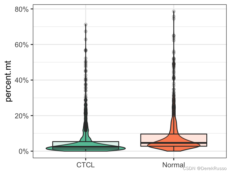
plot_qc(scRNA, metrics = "percent.mt", group_by = "group", pal_setup = "Accent")
plot_qc(scRNA, metrics = "percent.mt", group_by = "group", pal_setup = pal)
plot_qc(scRNA, metrics = "percent.mt", group_by = "group", pal_setup = c("purple","yellow"))
(3)filtering and integration
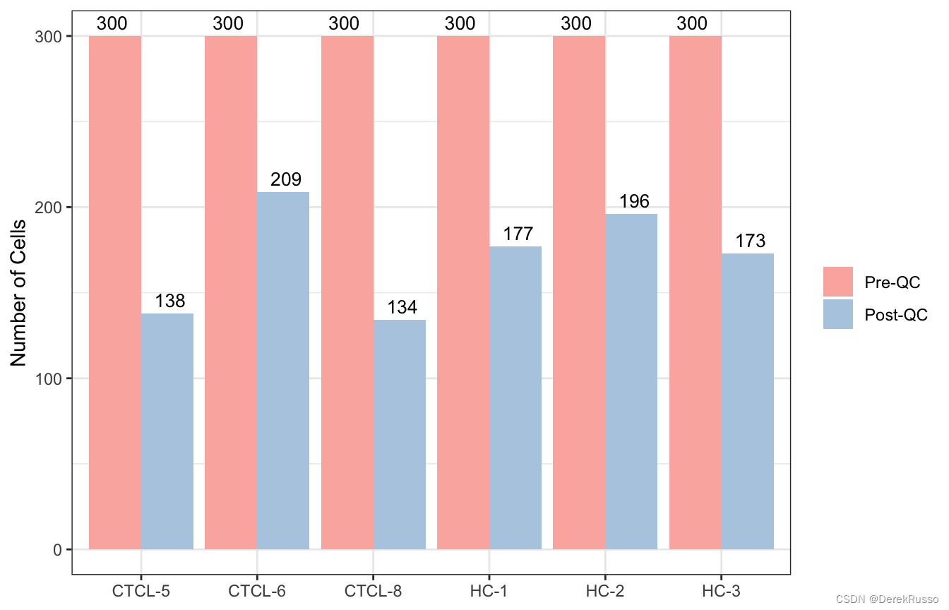
这里的filter函数本质上就是seurat里的subset函数,用于质控,自动会出一个前后对比图。
scRNA_f <- filter_scdata(scRNA, subset = nFeature_RNA > 500 & percent.mt < 10)
结果还是一个list: scRNA_f,list中的每个元素走seurat标准流程(标准化,找高变基因等)可以用他的集成化命令,也可以跳出来走seurat对参数有更多把控。
scRNA_f %<>%
        purrr::map(.f = NormalizeData) %>%
        purrr::map(.f = FindVariableFeatures) %>%
        purrr::map(.f = CellCycleScoring,
                   s.features = cc.genes$s.genes,
                   g2m.features = cc.genes$g2m.genes)
将list中的每个元素整合,可以看出还是跳出来走seurat比较好
scRNA_int <- IntegrateData(anchorset = FindIntegrationAnchors(object.list = scRNA_f, dims = 1:30, k.filter = 50), dims = 1:30)
scRNA_int %<>%
        ScaleData(vars.to.regress = c("nCount_RNA", "percent.mt", "S.Score", "G2M.Score"))

scRNA_int %<>%
        RunPCA(npcs = 50, verbose = TRUE)

scRNA_int %<>%
        RunUMAP(reduction = "pca", dims = 1:20, n.neighbors = 30) %>%
        FindNeighbors(reduction = "pca", dims = 1:20) %>%
        FindClusters(resolution = 0.3)
(4)refactoring
将seurat object里的metadata与自己做的meta data 相符合,便与作图
m %<>%
        mutate(group = factor(group, levels = c("Normal", "CTCL")))

scRNA_int %<>%
        refactor_seurat(metadata = m)
- plotting
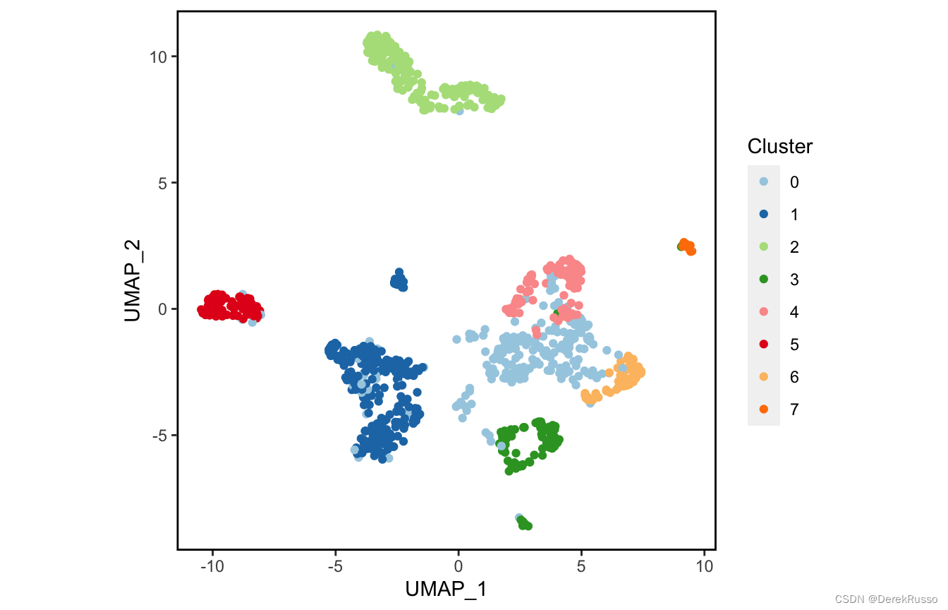
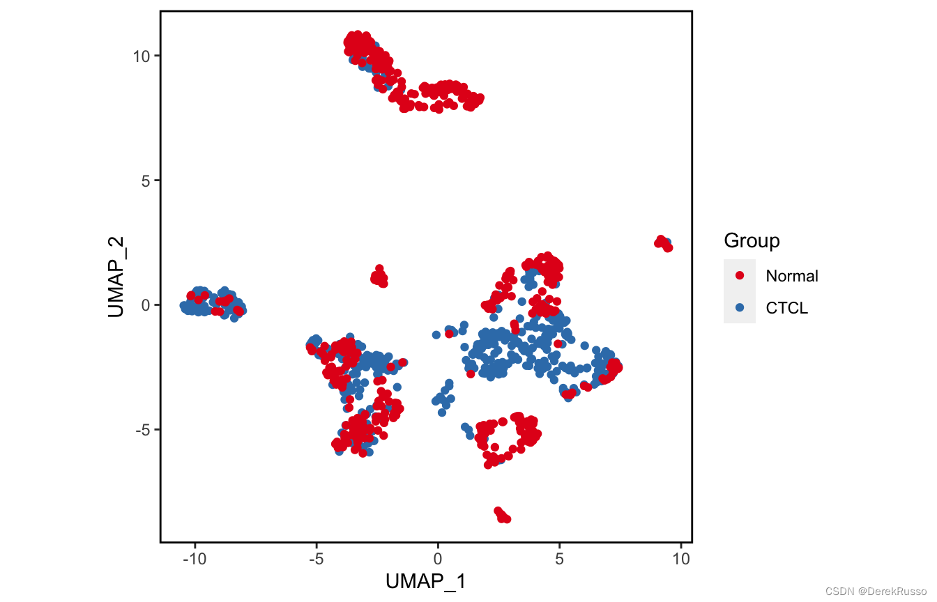
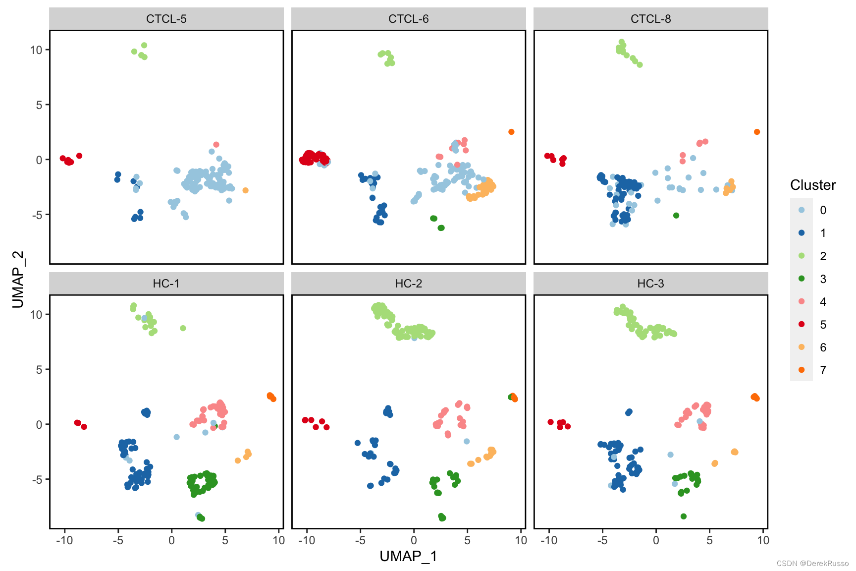
(1)plotting dimension reductions
主要是plot_scdata这个函数,控制画图的有几个parameter:
1,color_by: 默认是以seurat cluster绘图,也可以换成metadata里的任何列,如group,sample等
2,split_by:以什么分开画的意思
3,pal_setup:同前,三种选择
plot_scdata(scRNA_int, pal_setup = pal)
plot_scdata(scRNA_int, color_by = "group", pal_setup = pal)
plot_scdata(scRNA_int, split_by = "sample", pal_setup = pal)
(2)plotting statistics
对sample\cluster的细胞数、比例等进行统计描述
plot_stat函数parameter:
plot_type可以是"group_count", "prop_fill", and "prop_multi"
group_by默认是sample,可以改成group等metadata里的列
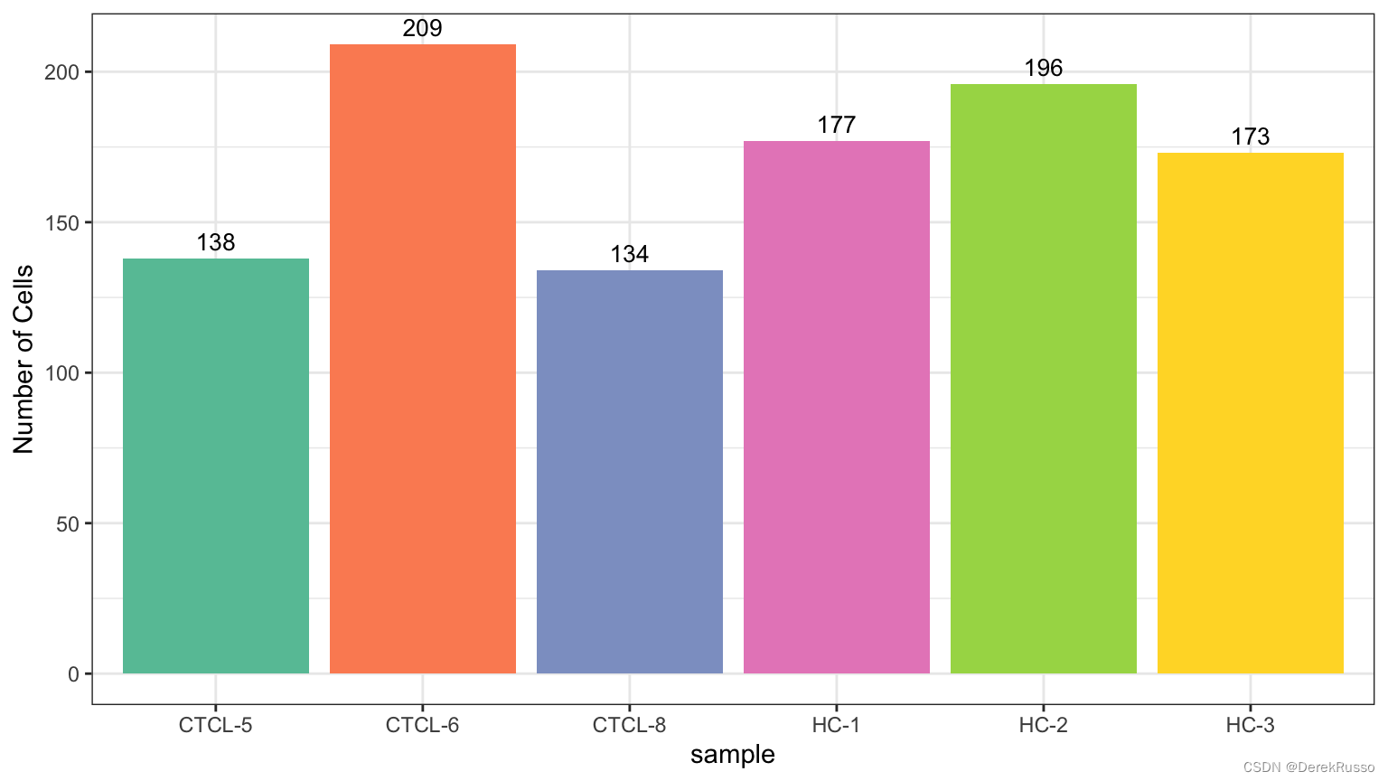
plot_stat(scRNA_int, plot_type = "group_count")
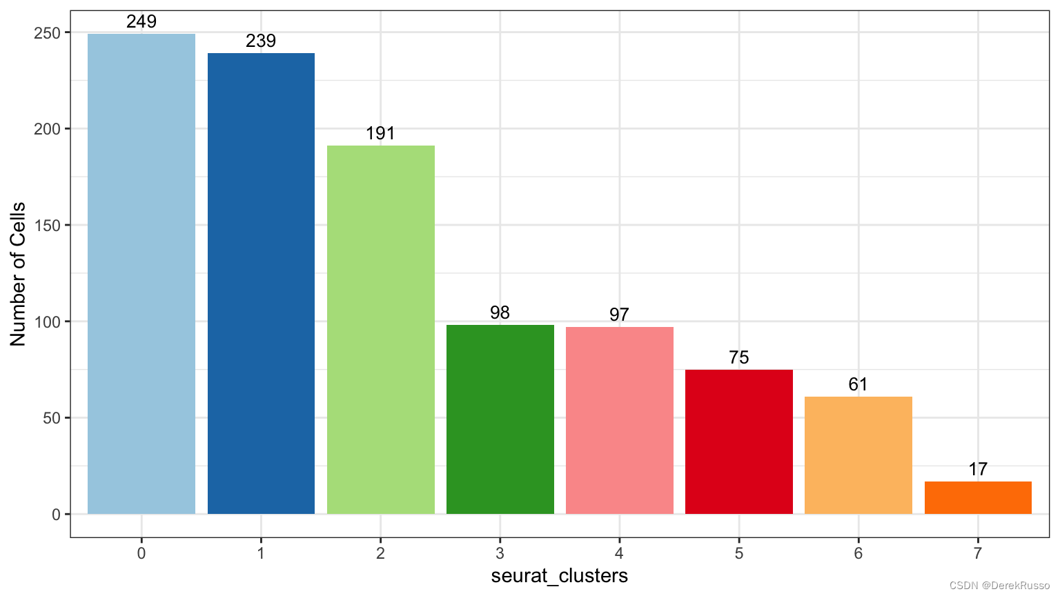
plot_stat(scRNA_int, "group_count", group_by = "seurat_clusters", pal_setup = pal)
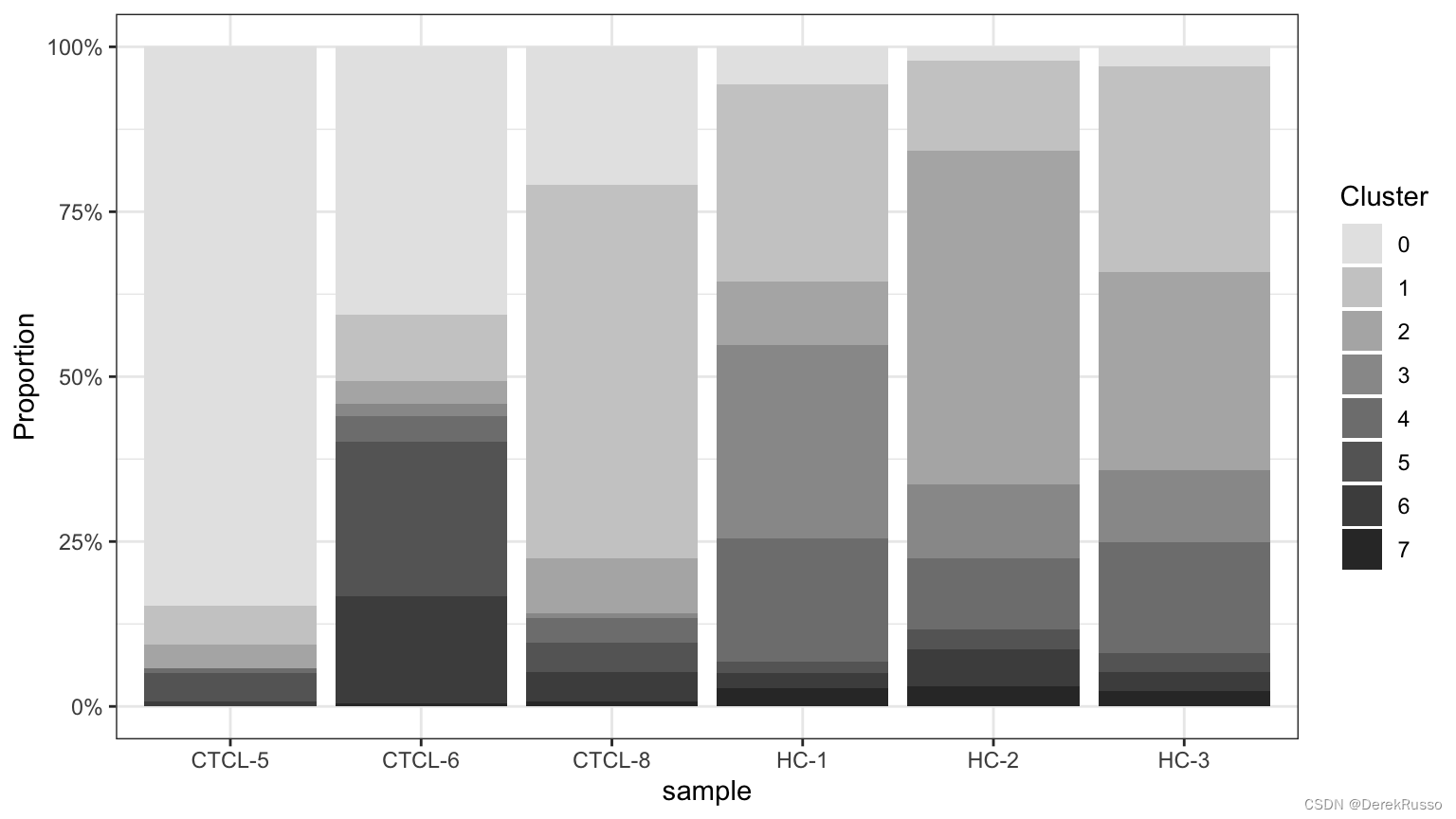
plot_stat(scRNA_int, plot_type = "prop_fill",
          pal_setup = c("grey90","grey80","grey70","grey60","grey50","grey40","grey30","grey20"))
plot_stat(scRNA_int, plot_type = "prop_multi", pal_setup = "Set3")
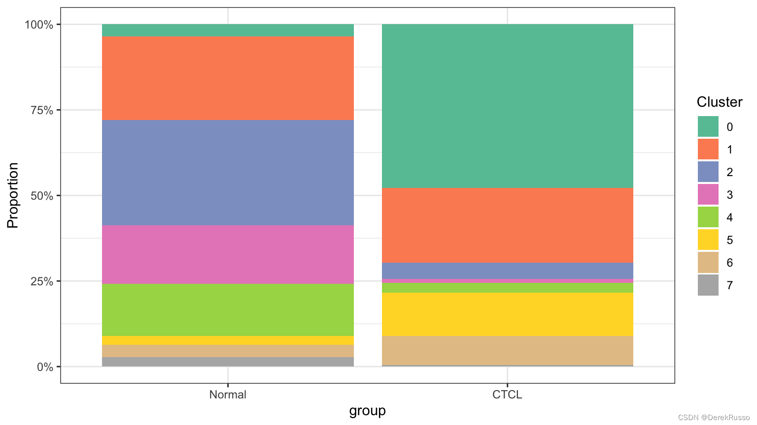
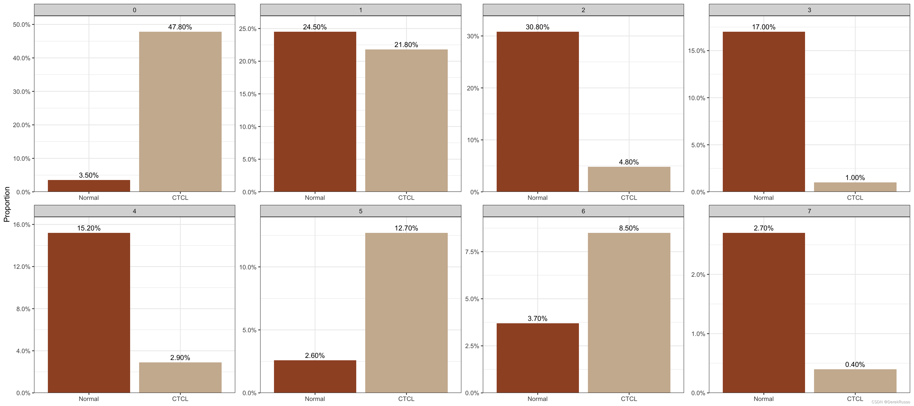
plot_stat(scRNA_int, plot_type = "prop_fill", group_by = "group")
plot_stat(scRNA_int, plot_type = "prop_multi", group_by = "group", pal_setup = c("sienna","bisque3"))
(3)plotting heatmaps
首先要用seurat每个cluster的marker
markers <- FindAllMarkers(scRNA_int, logfc.threshold = 0.1, min.pct = 0, only.pos = T)
plot_heatmap几个参数:
n: number of top genes showed for each cluster
sort_var:列(细胞)以什么顺序分类展示,默认是seurat_clusters
anno_var: 上方的annotation bar展示什么东西
anno_colors
plot_heatmap(dataset = scRNA_int,
              markers = markers,
              sort_var = c("seurat_clusters","sample"),
              anno_var = c("seurat_clusters","sample","percent.mt","S.Score","G2M.Score"),
              anno_colors = list("Set2",                                             # RColorBrewer palette
                                 c("red","orange","yellow","purple","blue","green"), # color vector
                                 "Reds",
                                 c("blue","white","red"),                            # Three-color gradient
                                 "Greens"))
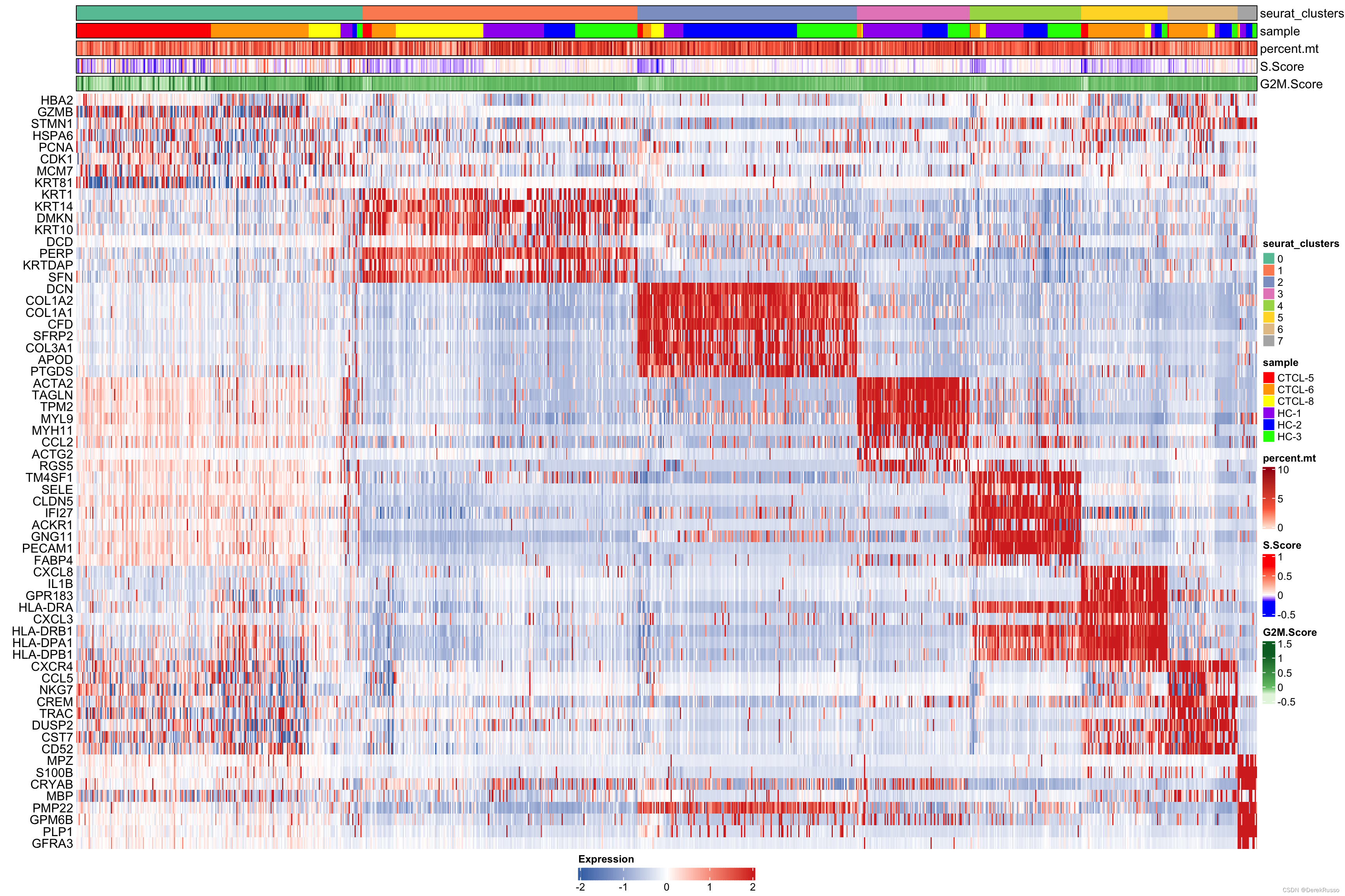
Furthermore, hm_limit and hm_colors are used to specify the color gradient and limits of the main heatmap tiles.
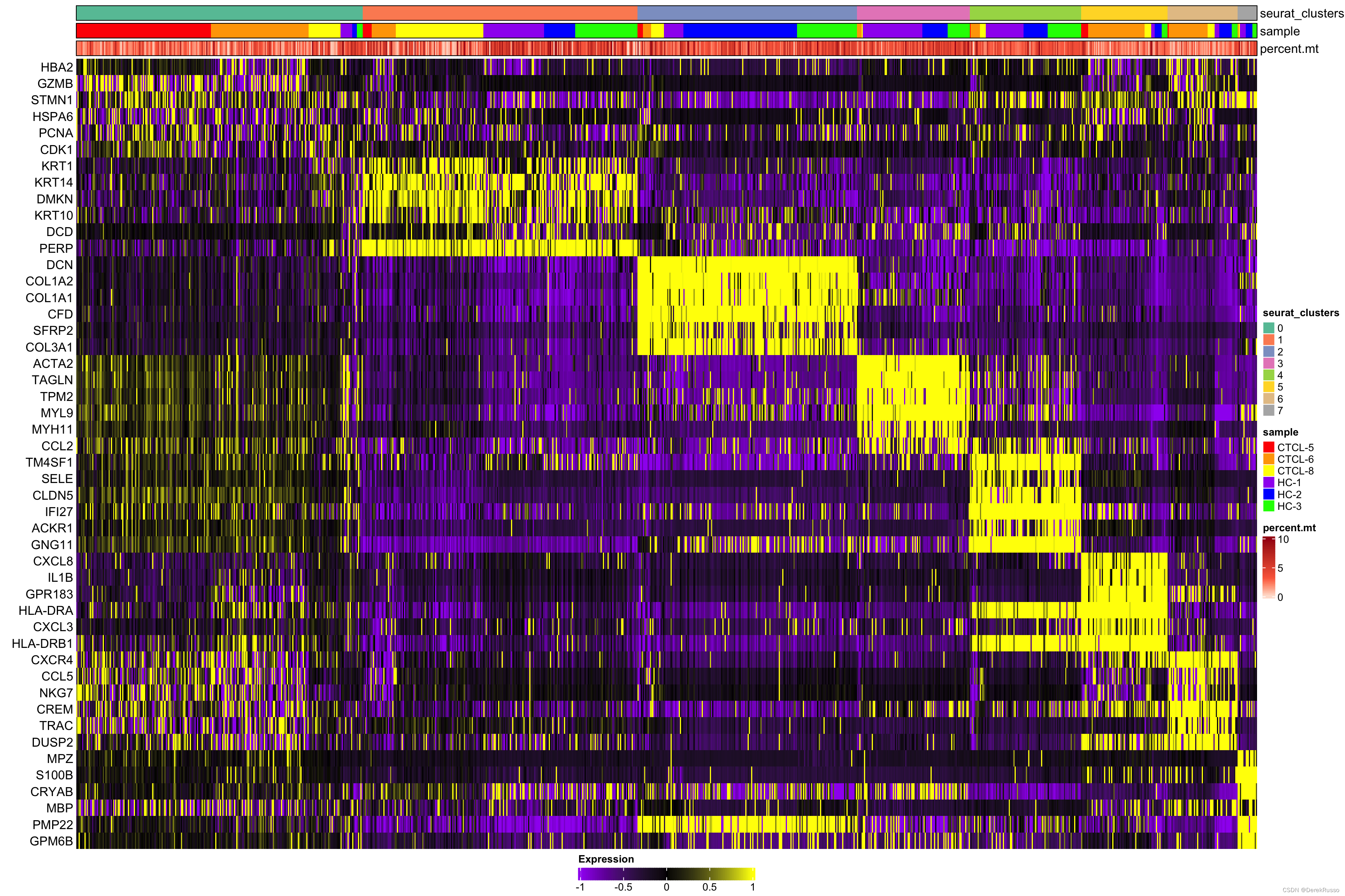
plot_heatmap(dataset = scRNA_int,
             n = 6,
             markers = markers,
             sort_var = c("seurat_clusters","sample"),
             anno_var = c("seurat_clusters","sample","percent.mt"),
             anno_colors = list("Set2",
                                c("red","orange","yellow","purple","blue","green"),
                                "Reds"),
             hm_limit = c(-1,0,1),
             hm_colors = c("purple","black","yellow"))
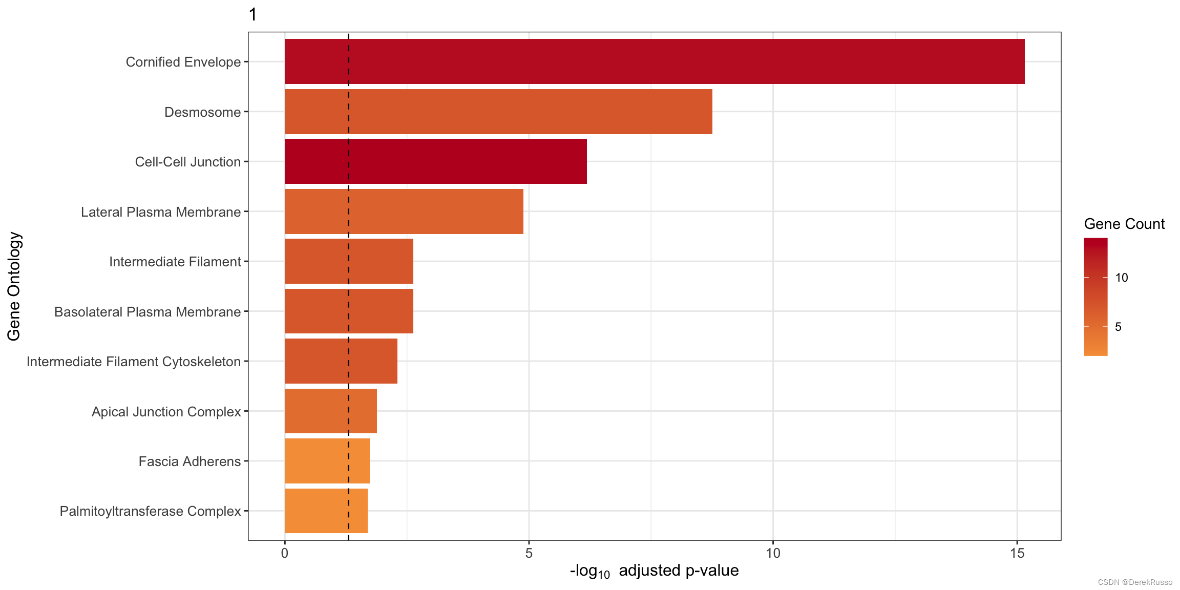
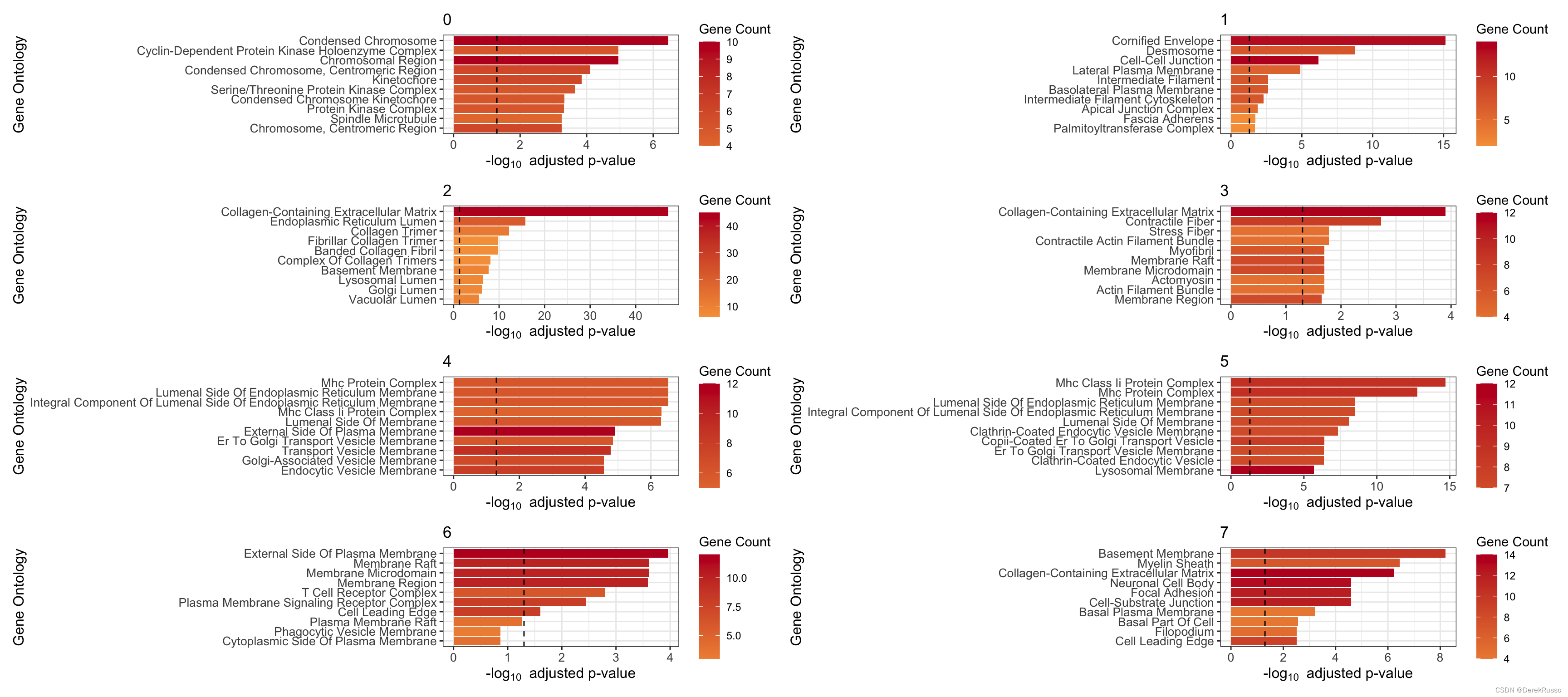
(4) GO enrichment
本质上是clusterProfiler::enrichGO
plot_cluster_go() and plot_all_cluster_go(),前者单个cluster,后者所有
n: 多少基因用于富集,默认100
plot_cluster_go(markers, cluster_name = "1", org = "human", ont = "CC")
plot_all_cluster_go(markers, org = "human", ont = "CC")
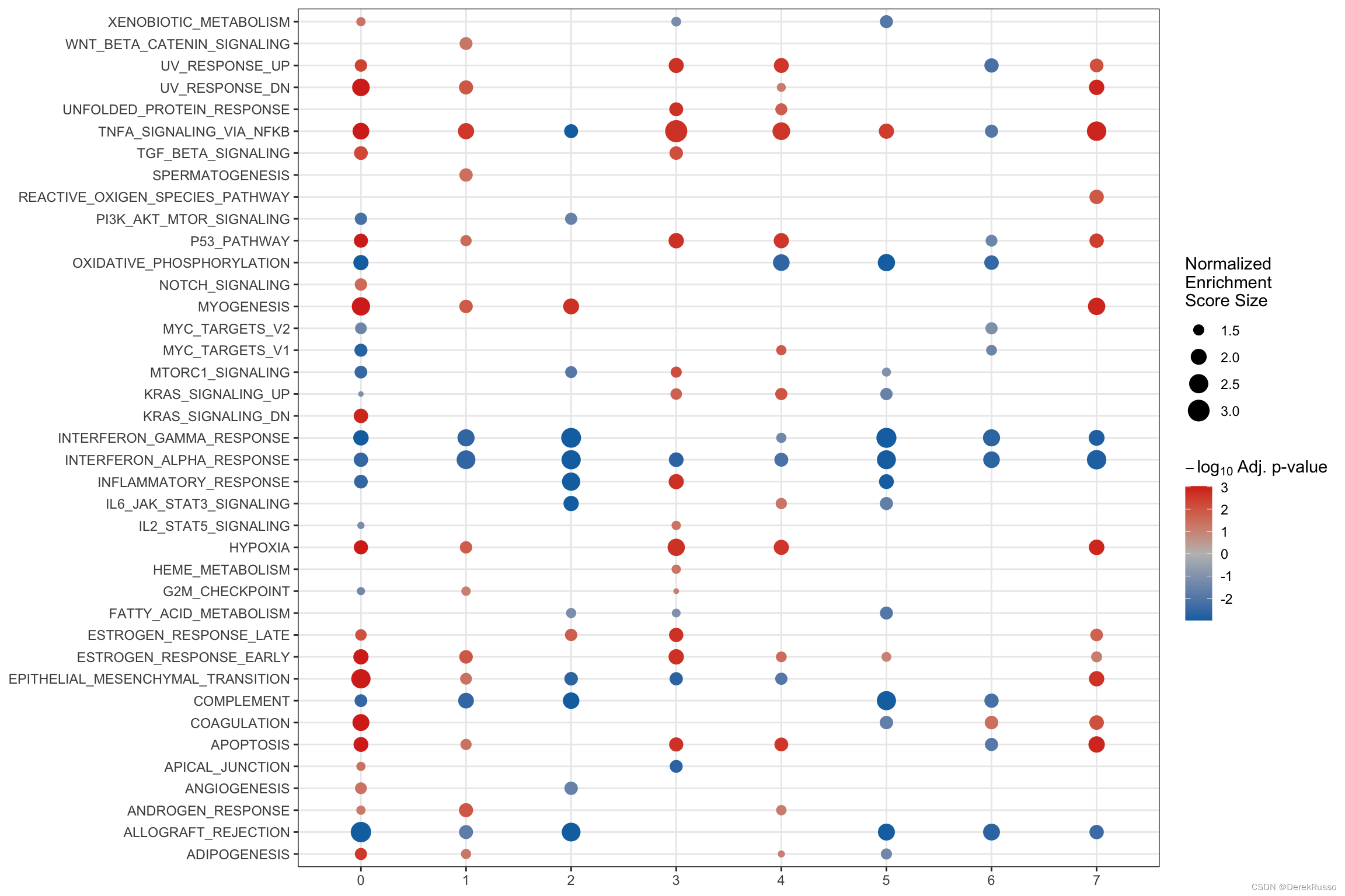
(5) GSEA analysis
find_diff_genes + test_GSEA + plot_GSEA一气呵成
de <- find_diff_genes(dataset = scRNA_int,
                      clusters = as.character(0:7),
                      comparison = c("group", "CTCL", "Normal"),
                      logfc.threshold = 0,   # threshold of 0 is used for GSEA
                      min.cells.group = 1)   # To include clusters with only 1 cell

gsea_res <- test_GSEA(de,
                      pathway = pathways.hallmark)
plot_GSEA(gsea_res, p_cutoff = 0.1, colors = c("#0570b0", "grey", "#d7301f"))
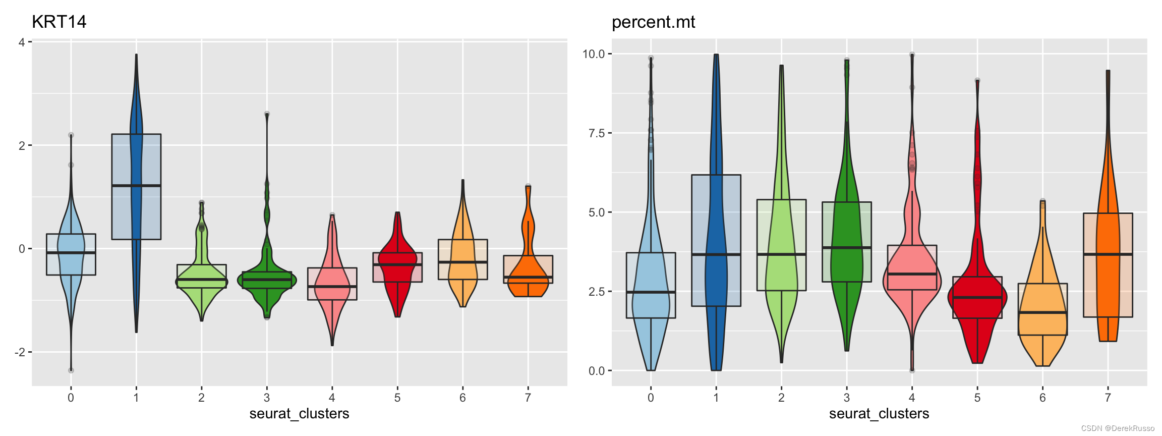
(6) plotting measures
measures是指metadata里的连续性变量或者基因表达量
split_by, group_by, pal_setup同上述
plot_measure(dataset = scRNA_int,
             measures = c("KRT14","percent.mt"),
             group_by = "seurat_clusters",
             pal_setup = pal)
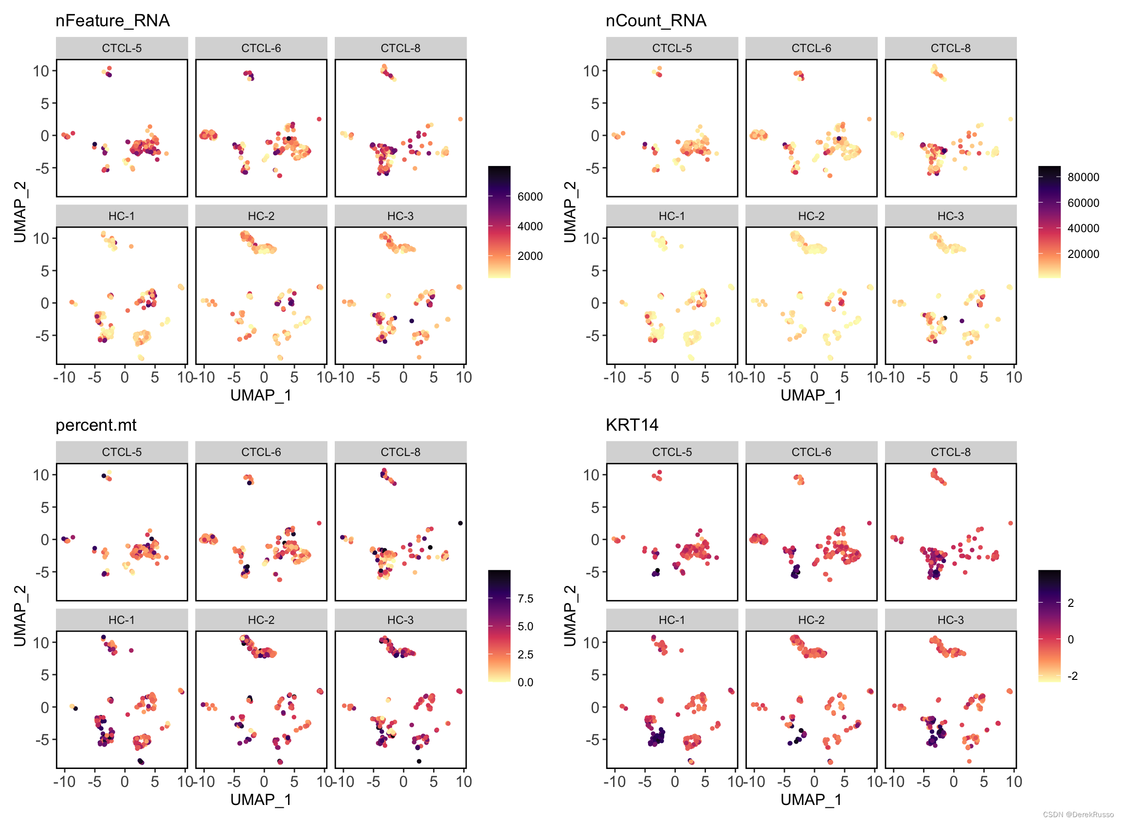
plot_measure_dim(dataset = scRNA_int,
                 measures = c("nFeature_RNA","nCount_RNA","percent.mt","KRT14"))

plot_measure_dim(dataset = scRNA_int,
                 measures = c("nFeature_RNA","nCount_RNA","percent.mt","KRT14"),
                 split_by = "sample")


 被折叠的 条评论
为什么被折叠?
被折叠的 条评论
为什么被折叠?
 到【灌水乐园】发言


