


可自定义设置以下属性:
-
单选框选项数据(options),类型: Option[],默认 []
-
是否禁用(disabled),类型:boolean,默认 false
-
是否垂直排列(vertical),类型:boolean,默认 false;仅当 button: false 时生效
-
当前是否选中(v-model:checked),类型:boolean,默认 false
-
多个单选框之间的间距(gap),类型:number | number[],单位 px,默认 8;垂直排列时为垂直间距;数组间距用于水平排列折行时:[水平间距, 垂直间距];仅当 button: false 时生效
-
是否启用按钮样式(button),类型:boolean,默认 false
-
按钮样式风格(buttonStyle),目前有描边和填色两种风格,类型:'outline' | 'solid',默认 'outline';仅当 button: true 时生效
-
按钮大小(buttonSize),类型:'small' | 'middle' | 'large',默认 'middle';仅当 button: true 时生效
-
当前选中的值(v-model:value),类型:string | number | boolean,默认 undefined
效果如下图:
在线预览
①创建单选框组件Radio.vue
其中引入使用了以下工具函数:
<script setup lang="ts">
import { computed, ref, watchEffect, nextTick } from 'vue'
import { useSlotsExist, useInject } from 'components/utils'
export interface Option {
  label: string // 选项名
  value: string | number | boolean // 选项值
  disabled?: boolean // 是否禁用选项
}
export interface Props {
  options?: Option[] // 单选框选项数据
  disabled?: boolean // 是否禁用
  vertical?: boolean // 是否垂直排列,仅当 button: false 时生效
  checked?: boolean // (v-model) 当前是否选中
  gap?: number | number[] // 多个单选框之间的间距;垂直排列时为垂直间距,单位 px;数组间距用于水平排列折行时:[水平间距, 垂直间距];仅当 button: false 时生效
  button?: boolean // 是否启用按钮样式
  buttonStyle?: 'outline' | 'solid' // 按钮样式风格
  buttonSize?: 'small' | 'middle' | 'large' // 按钮大小;仅当 button: true 时生效
  value?: string | number | boolean // (v-model) 当前选中的值
}
const props = withDefaults(defineProps<Props>(), {
  options: () => [],
  disabled: false,
  vertical: false,
  checked: false,
  gap: 8,
  button: false,
  buttonStyle: 'outline',
  buttonSize: 'middle',
  value: undefined
})
const radioChecked = ref<boolean>(false)
const optionsCheckedValue = ref<string | number | boolean>()
const wave = ref<boolean>(false)
const { colorPalettes } = useInject('Radio') // 主题色注入
const emits = defineEmits(['update:checked', 'update:value', 'change'])
const slotsExist = useSlotsExist(['default'])
// 选项总数
const optionsAmount = computed(() => {
  return props.options.length
})
const gapValue = computed(() => {
  if (!props.button) {
    if (!props.vertical && Array.isArray(props.gap)) {
      return `${props.gap[1]}px ${props.gap[0]}px`
    }
    return `${props.gap}px`
  } else {
    return 0
  }
})
watchEffect(() => {
  radioChecked.value = props.checked
})
watchEffect(() => {
  optionsCheckedValue.value = props.value
})
function checkDisabled(disabled: boolean | undefined): boolean {
  if (disabled === undefined) {
    return props.disabled
  } else {
    return disabled
  }
}
function onClick(value: string | number | boolean): void {
  if (value !== optionsCheckedValue.value) {
    startWave()
    optionsCheckedValue.value = value
    emits('update:value', value)
    emits('change', value)
  }
}
function onChecked(): void {
  if (!radioChecked.value) {
    startWave()
    radioChecked.value = true
    emits('update:checked', true)
    emits('change', true)
  }
}
function startWave(): void {
  if (wave.value) {
    wave.value = false
    nextTick(() => {
      wave.value = true
    })
  } else {
    wave.value = true
  }
}
function onWaveEnd(): void {
  wave.value = false
}
</script>
<template>
  <div
    v-if="optionsAmount"
    class="m-radio"
    :class="{ 'radio-vertical': !button && vertical }"
    :style="`
      --radio-gap: ${gapValue};
      --radio-primary-color: ${colorPalettes[5]};
    `"
    v-bind="$attrs"
  >
    <template v-if="!button">
      <div
        class="radio-wrap"
        :class="{ 'radio-disabled': checkDisabled(option.disabled) }"
        v-for="(option, index) in options"
        :key="index"
        @click="checkDisabled(option.disabled) ? () => false : onClick(option.value)"
      >
        <span class="radio-handle" :class="{ 'radio-checked': optionsCheckedValue === option.value }">
          <span
            v-if="!checkDisabled(option.disabled)"
            class="radio-wave"
            :class="{ 'wave-active': wave && optionsCheckedValue === option.value }"
            @animationend="onWaveEnd"
          ></span>
        </span>
        <span class="radio-label">
          <slot :option="option" :label="option.label" :index="index">{{ option.label }}</slot>
        </span>
      </div>
    </template>
    <template v-else>
      <div
        tabindex="0"
        class="radio-button-wrap"
        :class="{
          'radio-button-checked': optionsCheckedValue === option.value,
          'radio-button-disabled': checkDisabled(option.disabled),
          'radio-button-solid': buttonStyle === 'solid',
          'radio-button-small': buttonSize === 'small',
          'radio-button-large': buttonSize === 'large'
        }"
        v-for="(option, index) in options"
        :key="index"
        @click="checkDisabled(option.disabled) ? () => false : onClick(option.value)"
      >
        <span class="radio-label">
          <slot :option="option" :label="option.label" :index="index">{{ option.label }}</slot>
        </span>
        <span
          v-if="!checkDisabled(option.disabled)"
          class="radio-wave"
          :class="{ 'wave-active': wave && optionsCheckedValue === option.value }"
          @animationend="onWaveEnd"
        ></span>
      </div>
    </template>
  </div>
  <template v-else>
    <div
      v-if="!button"
      class="radio-wrap"
      :class="{ 'radio-disabled': disabled }"
      :style="`--radio-primary-color: ${colorPalettes[5]};`"
      @click="disabled ? () => false : onChecked()"
      v-bind="$attrs"
    >
      <span class="radio-handle" :class="{ 'radio-checked': radioChecked }">
        <span
          v-if="!disabled"
          class="radio-wave"
          :class="{ 'wave-active': wave && radioChecked }"
          @animationend="onWaveEnd"
        ></span>
      </span>
      <span v-if="slotsExist.default" class="radio-label">
        <slot></slot>
      </span>
    </div>
    <div
      v-else
      tabindex="0"
      class="radio-button-wrap radio-button-single"
      :class="{
        'radio-button-checked': radioChecked,
        'radio-button-disabled': disabled,
        'radio-button-solid': buttonStyle === 'solid',
        'radio-button-small': buttonSize === 'small',
        'radio-button-large': buttonSize === 'large'
      }"
      :style="`--radio-primary-color: ${colorPalettes[5]};`"
      @click="disabled ? () => false : onChecked()"
      v-bind="$attrs"
    >
      <span class="radio-label">
        <slot></slot>
      </span>
      <span
        v-if="!disabled"
        class="radio-wave"
        :class="{ 'wave-active': wave && radioChecked }"
        @animationend="onWaveEnd"
      ></span>
    </div>
  </template>
</template>
<style lang="less" scoped>
.m-radio {
  display: inline-flex;
  flex-wrap: wrap;
  gap: var(--radio-gap);
}
.radio-vertical {
  flex-direction: column;
  flex-wrap: nowrap;
}
.radio-wrap {
  display: inline-flex;
  align-items: baseline;
  cursor: pointer;
  color: rgba(0, 0, 0, 0.88);
  font-size: 14px;
  line-height: 1.5714285714285714;
  &:not(.radio-disabled):hover {
    .radio-handle {
      border-color: var(--radio-primary-color);
    }
  }
  .radio-handle {
    /*
      如果所有项目的flex-shrink属性都为1,当空间不足时,都将等比例缩小
      如果一个项目的flex-shrink属性为0,其他项目都为1,则空间不足时,前者不缩小。
    */
    flex-shrink: 0; // 默认 1.即空间不足时,项目将缩小
    align-self: center;
    position: relative;
    width: 16px;
    height: 16px;
    background: transparent;
    border: 1px solid #d9d9d9;
    border-radius: 50%;
    transition: all 0.3s;
    &::after {
      box-sizing: border-box;
      position: absolute;
      top: 50%;
      left: 50%;
      display: block;
      width: 16px;
      height: 16px;
      margin-top: -8px;
      margin-left: -8px;
      background-color: #fff;
      border-top: 0;
      border-left: 0;
      border-radius: 16px;
      transform: scale(0);
      opacity: 0;
      transition: all 0.3s cubic-bezier(0.78, 0.14, 0.15, 0.86);
      content: '';
    }
  }
  .radio-checked {
    border-color: var(--radio-primary-color);
    background-color: var(--radio-primary-color);
    &::after {
      transform: scale(0.375);
      opacity: 1;
      transition: all 0.3s cubic-bezier(0.78, 0.14, 0.15, 0.86);
    }
  }
  .radio-label {
    word-break: break-all;
    padding: 0 8px;
    line-height: 1.5714285714285714;
  }
}
.radio-disabled {
  color: rgba(0, 0, 0, 0.25);
  cursor: not-allowed;
  .radio-handle {
    background-color: rgba(0, 0, 0, 0.04);
    border-color: #d9d9d9;
    cursor: not-allowed;
    &::after {
      transform: scale(0.5);
      background-color: rgba(0, 0, 0, 0.25);
    }
  }
}
.radio-button-wrap {
  position: relative;
  height: 32px;
  padding-inline: 15px;
  line-height: 30px;
  background: #ffffff;
  border: 1px solid #d9d9d9;
  border-top-width: 1px;
  border-left-width: 0;
  border-right-width: 1px;
  cursor: pointer;
  outline: none;
  transition:
    all 0.2s,
    box-shadow 0.2s cubic-bezier(0.4, 0, 0.2, 1);
  &:first-child {
    border-left: 1px solid #d9d9d9;
    border-start-start-radius: 6px;
    border-end-start-radius: 6px;
  }
  &:not(:first-child):not(.radio-button-single)::before {
    position: absolute;
    top: -1px;
    left: -1px;
    display: block;
    width: 1px;
    height: 100%;
    padding-block: 1px;
    box-sizing: content-box;
    background-color: #d9d9d9;
    transition: background-color 0.3s;
    content: '';
  }
  &:last-child {
    border-start-end-radius: 6px;
    border-end-end-radius: 6px;
  }
  &:not(.radio-button-disabled):hover {
    color: var(--radio-primary-color);
  }
}
.radio-button-single {
  border-left: 1px solid #d9d9d9;
  border-radius: 6px;
}
.radio-button-wrap.radio-button-checked:not(.radio-button-disabled) {
  z-index: 1;
  color: var(--radio-primary-color);
  background-color: #ffffff;
  border-color: var(--radio-primary-color);
  &::before {
    background-color: var(--radio-primary-color);
  }
}
.radio-button-disabled {
  color: rgba(0, 0, 0, 0.25);
  background-color: rgba(0, 0, 0, 0.04);
  border-color: #d9d9d9;
  cursor: not-allowed;
}
.radio-button-disabled.radio-button-checked {
  background-color: rgba(0, 0, 0, 0.15);
}
.radio-button-solid.radio-button-checked:not(.radio-button-disabled) {
  color: #fff;
  background-color: var(--radio-primary-color);
  border-color: var(--radio-primary-color);
  &:hover {
    color: #fff;
  }
}
.radio-button-small {
  &.radio-button-wrap {
    height: 24px;
    padding-inline: 7px;
    line-height: 22px;
    &:first-child {
      border-start-start-radius: 4px;
      border-end-start-radius: 4px;
    }
    &:last-child {
      border-start-end-radius: 4px;
      border-end-end-radius: 4px;
    }
  }
  &.radio-button-single {
    border-radius: 4px;
  }
}
.radio-button-large {
  &.radio-button-wrap {
    height: 40px;
    font-size: 16px;
    line-height: 38px;
    &:first-child {
      border-start-start-radius: 8px;
      border-end-start-radius: 8px;
    }
    &:last-child {
      border-start-end-radius: 8px;
      border-end-end-radius: 8px;
    }
  }
  &.radio-button-single {
    border-radius: 8px;
  }
}
.radio-wave {
  position: absolute;
  pointer-events: none;
  top: 0;
  right: 0;
  bottom: 0;
  left: 0;
  animation-iteration-count: 1;
  animation-duration: 0.6s;
  animation-timing-function: cubic-bezier(0, 0, 0.2, 1), cubic-bezier(0, 0, 0.2, 1);
  border-radius: inherit;
}
.wave-active {
  z-index: 1;
  animation-name: waveSpread, waveOpacity;
  @keyframes waveSpread {
    from {
      box-shadow: 0 0 0.5px 0 var(--radio-primary-color);
    }
    to {
      box-shadow: 0 0 0.5px 5px var(--radio-primary-color);
    }
  }
  @keyframes waveOpacity {
    from {
      opacity: 0.6;
    }
    to {
      opacity: 0;
    }
  }
}
</style>
②在要使用的页面引入:
其中引入使用了以下组件:
<script setup lang="ts">
import Radio from './Radio.vue'
import { ref, watchEffect } from 'vue'
import type { RadioProps, RadioOption } from 'vue-amazing-ui'
const options = ref<RadioOption[]>([
{
label: '北京市',
value: 1
},
{
label: '纽约市',
value: 2
},
{
label: '布宜诺斯艾利斯',
value: 3
},
{
label: '伊斯坦布尔',
value: 4
},
{
label: '拜占庭',
value: 5
},
{
label: '君士坦丁堡',
value: 6
}
])
const optionsDisabled = ref<RadioOption[]>([
{
label: '北京市',
value: 1
},
{
label: '纽约市',
value: 2,
disabled: true
},
{
label: '布宜诺斯艾利斯',
value: 3
},
{
label: '伊斯坦布尔',
value: 4
},
{
label: '拜占庭',
value: 5
},
{
label: '君士坦丁堡',
value: 6
}
])
const sizeOptions = [
{
label: 'small',
value: 'small'
},
{
label: 'middle',
value: 'middle'
},
{
label: 'large',
value: 'large'
}
]
const checked = ref<RadioProps['checked']>(false)
const value = ref<RadioProps['value']>(2)
const buttonSize = ref<RadioProps['buttonSize']>('middle')
watchEffect(() => {
console.log('checked', checked.value)
})
watchEffect(() => {
console.log('value', value.value)
})
const horizontalGap = ref(16)
const verticalGap = ref(8)
function onChange(value: string | number | boolean) {
console.log('change', value)
}
</script>
<template>
<div>
<h1>{{ $route.name }} {{ $route.meta.title }}</h1>
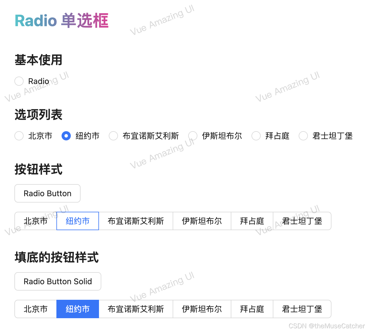
<h2 class="mt30 mb10">基本使用</h2>
<Radio v-model:checked="checked" @change="onChange">Radio</Radio>
<h2 class="mt30 mb10">选项列表</h2>
<Radio :options="options" v-model:value="value" @change="onChange" />
<h2 class="mt30 mb10">按钮样式</h2>
<Space vertical>
<Radio v-model:checked="checked" button>Radio Button</Radio>
<Radio :options="options" v-model:value="value" button />
</Space>
<h2 class="mt30 mb10">填底的按钮样式</h2>
<Space vertical>
<Radio v-model:checked="checked" button button-style="solid">Radio Button Solid</Radio>
<Radio :options="options" v-model:value="value" button button-style="solid" />
</Space>
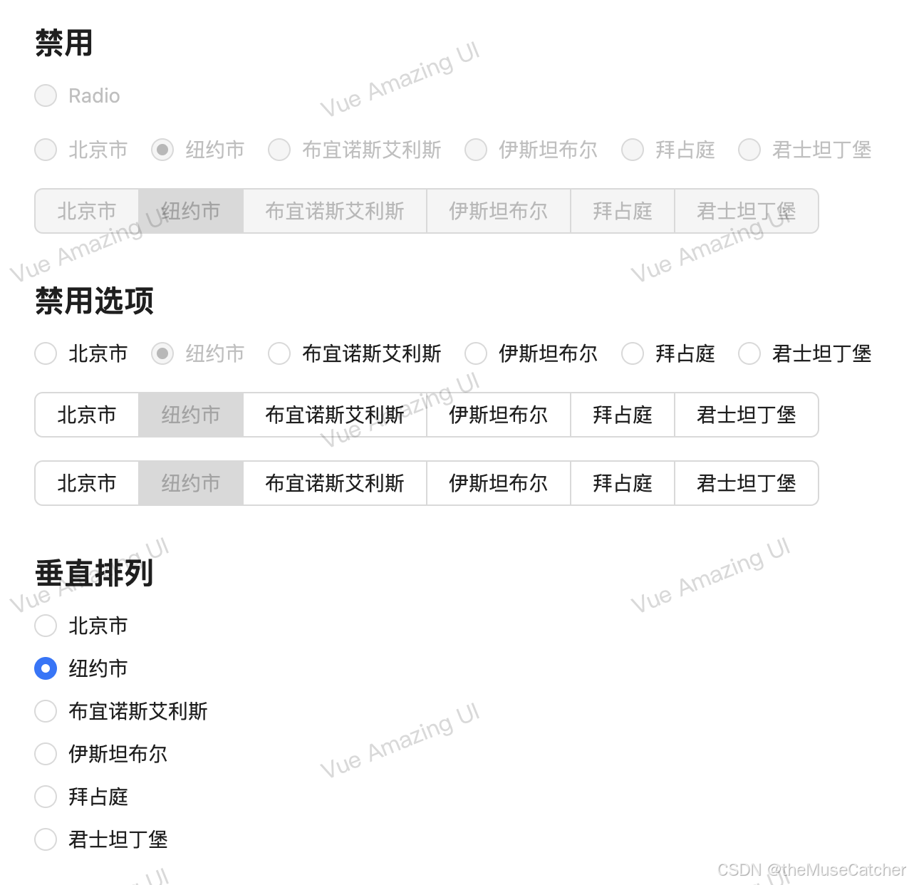
<h2 class="mt30 mb10">禁用</h2>
<Space vertical>
<Radio v-model:checked="checked" disabled>Radio</Radio>
<Radio :options="options" v-model:value="value" disabled />
<Radio :options="options" v-model:value="value" button disabled />
</Space>
<h2 class="mt30 mb10">禁用选项</h2>
<Space vertical>
<Radio :options="optionsDisabled" v-model:value="value" />
<Radio :options="optionsDisabled" v-model:value="value" button />
<Radio :options="optionsDisabled" v-model:value="value" button button-style="solid" />
</Space>
<h2 class="mt30 mb10">垂直排列</h2>
<Radio vertical :options="options" v-model:value="value" />
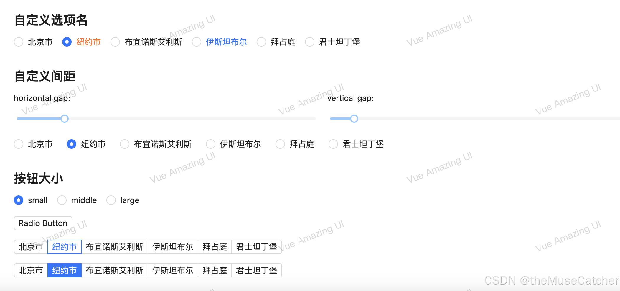
<h2 class="mt30 mb10">自定义选项名</h2>
<Radio :options="options" v-model:value="value">
<template #default="{ option, label, index }">
<span v-if="index === 1" style="color: #ff6900">{{ label }}</span>
<span v-if="index === 3" style="color: #1677ff">{{ option.label }}</span>
</template>
</Radio>
<h2 class="mt30 mb10">自定义间距</h2>
<Flex vertical>
<Row :gutter="24">
<Col :span="12">
<Flex gap="small" vertical> horizontal gap: <Slider v-model:value="horizontalGap" /> </Flex>
</Col>
<Col :span="12">
<Flex gap="small" vertical> vertical gap: <Slider v-model:value="verticalGap" /> </Flex>
</Col>
</Row>
<Radio :gap="[horizontalGap, verticalGap]" :options="options" v-model:value="value" />
</Flex>
<h2 class="mt30 mb10">按钮大小</h2>
<Space vertical>
<Radio :options="sizeOptions" v-model:value="buttonSize" />
<Radio v-model:checked="checked" button :button-size="buttonSize">Radio Button</Radio>
<Radio :options="options" v-model:value="value" button :button-size="buttonSize" />
<Radio :options="options" v-model:value="value" button button-style="solid" :button-size="buttonSize" />
</Space>
</div>
</template>


 扫一扫
扫一扫


 1583
1583

 被折叠的 条评论
为什么被折叠?
被折叠的 条评论
为什么被折叠?
 到【灌水乐园】发言


