


往期鸿蒙5.0全套实战文章必看:(文中附带全栈鸿蒙5.0学习资料)
ExceptionPrompt
异常提示,适用于有异常需要提示异常内容的情况。
说明
该组件从API Version 11开始支持。后续版本如有新增内容,则采用上角标单独标记该内容的起始版本。
导入模块
import { ExceptionPrompt, PromptOptions, MarginType } from '@kit.ArkUI'子组件
无
属性
不支持通用属性
ExceptionPrompt
ExceptionPrompt({ options: PromptOptions, onTipClick?: ()=>void, onActionTextClick?: ()=>void })
装饰器类型:@Component
元服务API: 从API version 12开始,该接口支持在元服务中使用。
系统能力: SystemCapability.ArkUI.ArkUI.Full
参数:
| 名称 | 参数类型 | 必填 | 装饰器类型 | 说明 |
|---|---|---|---|---|
| options | PromptOptions | 是 | @Prop | 指定当前异常提示的配置信息。 |
| onTipClick | ()=>void | 否 | - | 点击左侧提示文本的回调函数。 |
| onActionTextClick | ()=>void | 否 | - | 点击右侧图标按钮的回调函数。 |
PromptOptions
PromptOptions定义options的类型。
元服务API: 从API version 12开始,该接口支持在元服务中使用。
系统能力: SystemCapability.ArkUI.ArkUI.Full
| 名称 | 类型 | 必填 | 说明 |
|---|---|---|---|
| icon | ResourceStr | 否 | 指定当前异常提示的异常图标式样。 |
| tip | ResourceStr | 否 | 指定当前异常提示的文字提示内容。 支持默认内置四种状态文字资源如下: 1.无网络状态:显示网络未连接:引用ohos_network_not_connected。 2.网络差状态:显示网络连接不稳定,请点击重试:引用ohos_network_connected_unstable。 3.连不上服务器状态:显示无法连接到服务器,请点击重试:引用ohos_unstable_connect_server。 4.有网但是获取不到内容状态:显示无法获取位置,请点击重试:引用ohos_custom_network_tips_left。 |
| marginType | MarginType | 是 | 指定当前异常提示的边距样式 。 |
| actionText | ResourceStr | 否 | 指定当前异常提示的右侧图标按钮的文字内容。 |
| marginTop | Dimension | 是 | 指定当前异常提示的距离顶部的位置。 |
| isShown | boolean | 否 | 指定当前异常提示的显隐状态。 true:显示状态。 false:隐藏状态。 |
MarginType
MarginType定义marginType的类型。
元服务API: 从API version 12开始,该接口支持在元服务中使用。
系统能力: SystemCapability.ArkUI.ArkUI.Full
| 名称 | 值 | 说明 |
|---|---|---|
| DEFAULT_MARGIN | 0 | 默认边距: 边距1:引用ohos_id_card_margin_start。 边距2:引用ohos_id_card_margin_end。 |
| FIT_MARGIN | 1 | 可适配边距: 边距1:引用ohos_id_max_padding_start。 边距2:引用ohos_id_max_padding_end。 |
事件
支持通用事件
示例
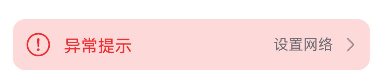
示例1(设置异常提示)
该示例展示了如何设置异常提示的异常图标、异常提示的文字、边距样式和右侧图标按钮的文字内容。
import { ExceptionPrompt, PromptOptions, MarginType } from '@kit.ArkUI'

@Entry
@Component
struct Index {
  @State options: PromptOptions = {
    icon: $r('sys.media.ohos_ic_public_fail'),
    tip: '异常提示',
    marginType: MarginType.DEFAULT_MARGIN,
    actionText: '设置网络',
    marginTop: 80,
    isShown: true,
  }

  build() {
    Column() {
      ExceptionPrompt({
        options: this.options,
        onTipClick: () => {
          // 单击左侧的文本切换到连接状态
        },
        onActionTextClick: () => {
          // 点击“设置网络”按钮,打开设置网络弹窗界面
        },
      })
    }
  }
}
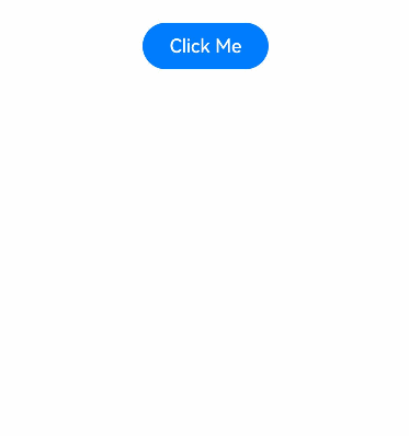
示例2(设置弹窗类型的异常提示)
该示例使用自定义弹窗设置弹窗类型的异常提示。
import { ExceptionPrompt, PromptOptions, MarginType } from '@kit.ArkUI'

@CustomDialog
struct CustomDialogExample {
  @Link textValue: string;
  @Link inputValue: string;
  @State options: PromptOptions = {
    icon: $r('sys.media.ohos_ic_public_fail'),
    tip: '异常提示!',
    marginType: MarginType.DEFAULT_MARGIN,
    actionText: '设置',
    marginTop: 5,
    isShown: true,
  };
  cancel: () => void = () => {
  };
  confirm: () => void = () => {
  };
  controller: CustomDialogController;

  // 若尝试在CustomDialog中传入多个其他的Controller,以实现在CustomDialog中打开另一个或另一些CustomDialog,
  // 那么此处需要将指向自己的controller放在最后
  build() {
    Column() {
      ExceptionPrompt({
        options: this.options,
      })
      TextInput({ placeholder: '', text: this.textValue }).margin({ top: 70 }).height(60).width('90%')
        .onChange((value: string) => {
          this.textValue = value;
        })
      Text('Whether to change a text?').fontSize(16).margin({ bottom: 10 })
      Flex({ justifyContent: FlexAlign.SpaceAround }) {
        Button('cancel')
          .onClick(() => {
            this.controller.close();
            this.cancel();
          }).backgroundColor(0xffffff).fontColor(Color.Black)
        Button('confirm')
          .onClick(() => {
            this.inputValue = this.textValue;
            this.controller.close();
            this.confirm();
          }).backgroundColor(0xffffff).fontColor(Color.Red)
      }.margin({ bottom: 10 })
    }
  }
}

@Entry
@Component
struct Index1 {
  @State ButtonText: string = '';
  @State MAP_HEIGHT: string = '30%';
  @State duration: number = 2500;
  @State tips: string = '';
  @State actionText: string = '';
  controller: TextInputController = new TextInputController();
  cancel: () => void = () => {
  };
  confirm: () => void = () => {
  };
  @State options: PromptOptions = {
    icon: $r('sys.media.ohos_ic_public_fail'),
    tip: '',
    marginType: MarginType.DEFAULT_MARGIN,
    actionText: '',
    marginTop: 80,
    isShown: true,
  }
  @State textValue: string = '';
  @State inputValue: string = 'click me';
  dialogController: CustomDialogController | undefined = new CustomDialogController({
    builder: CustomDialogExample({
      cancel: this.onCancel,
      confirm: this.onAccept,
      textValue: $textValue,
      inputValue: $inputValue,
    }),
    cancel: this.existApp,
    autoCancel: true,
    alignment: DialogAlignment.Bottom,
    offset: { dx: 0, dy: -20 },
    gridCount: 4,
    customStyle: false,
  })

  aboutToDisappear() {
    this.dialogController = undefined; // 将dialogController置空
  }

  onCancel() {
    console.info('Callback when the first button is clicked');
  }

  onAccept() {
    console.info('Callback when the second button is clicked');
  }

  existApp() {
    console.info('Click the callback in the blank area');
  }

  build() {
    Column() {
      Button('Click Me')
        .width('30%')
        .margin({ top: 420 })
        .zIndex(999)
        .onClick(() => {
          if (this.dialogController != undefined) {
            this.dialogController.open();
          }
        })
    }
    .height('100%')
    .width('100%')
  }
}


 扫一扫
扫一扫


 被折叠的 条评论
为什么被折叠?
被折叠的 条评论
为什么被折叠?
 到【灌水乐园】发言


