


往期鸿蒙5.0全套实战文章必看:(文中附带全栈鸿蒙5.0学习资料)
DataPanel
数据面板组件,用于将多个数据占比情况使用占比图进行展示。
说明
该组件从API Version 7开始支持。后续版本如有新增内容,则采用上角标单独标记该内容的起始版本。
子组件
无
接口
DataPanel(options: DataPanelOptions)
卡片能力: 从API version 9开始,该接口支持在ArkTS卡片中使用。
元服务API: 从API version 11开始,该接口支持在元服务中使用。
系统能力: SystemCapability.ArkUI.ArkUI.Full
参数:
| 参数名 | 类型 | 必填 | 说明 |
|---|---|---|---|
| options | DataPanelOptions | 是 | 数据面板组件参数。 |
DataPanelOptions对象说明
卡片能力: 从API version 9开始,该接口支持在ArkTS卡片中使用。
元服务API: 从API version 11开始,该接口支持在元服务中使用。
系统能力: SystemCapability.ArkUI.ArkUI.Full
| 名称 | 类型 | 必填 | 说明 |
|---|---|---|---|
| values | number[] | 是 | 数据值列表,最多包含9个数据,大于9个数据则取前9个数据。若数据值小于0则置为0。 |
| max | number | 否 | - max大于0,表示数据的最大值。 - max小于等于0,max等于value数组各项的和,按比例显示。 默认值:100 |
| type8+ | DataPanelType | 否 | 数据面板的类型(不支持动态修改)。 默认值:DataPanelType.Circle |
DataPanelType8+枚举说明
卡片能力: 从API version 9开始,该接口支持在ArkTS卡片中使用。
元服务API: 从API version 11开始,该接口支持在元服务中使用。
系统能力: SystemCapability.ArkUI.ArkUI.Full
| 名称 | 描述 |
|---|---|
| Line | 线型数据面板。 |
| Circle | 环形数据面板。 |
属性
除支持通用属性外,还支持以下属性:
closeEffect
closeEffect(value: boolean)
设置关闭数据占比图表旋转动效和投影效果。若未设置trackShadow属性,则该属性控制投影效果的开关,开启投影的效果为投影的默认效果。若设置trackShadow属性,则由trackShadow属性值控制投影效果的开关。
卡片能力: 从API version 9开始,该接口支持在ArkTS卡片中使用。
元服务API: 从API version 11开始,该接口支持在元服务中使用。
系统能力: SystemCapability.ArkUI.ArkUI.Full
参数:
| 参数名 | 类型 | 必填 | 说明 |
|---|---|---|---|
| value | boolean | 是 | 关闭数据占比图表旋转动效和投影效果。 默认值:false |
valueColors10+
valueColors(value: Array<ResourceColor | LinearGradient>)
设置各数据段颜色。
元服务API: 从API version 11开始,该接口支持在元服务中使用。
系统能力: SystemCapability.ArkUI.ArkUI.Full
参数:
| 参数名 | 类型 | 必填 | 说明 |
|---|---|---|---|
| value | Array<ResourceColor | LinearGradient> | 是 | 各数据段颜色,ResourceColor为纯色,LinearGradient为渐变色。 |
trackBackgroundColor10+
trackBackgroundColor(value: ResourceColor)
设置底板颜色。
元服务API: 从API version 11开始,该接口支持在元服务中使用。
系统能力: SystemCapability.ArkUI.ArkUI.Full
参数:
| 参数名 | 类型 | 必填 | 说明 |
|---|---|---|---|
| value | ResourceColor | 是 | 底板颜色。 默认值:'#08182431',格式为十六进制ARGB值,前俩位代表透明度。 |
strokeWidth10+
strokeWidth(value: Length)
设置圆环粗细。数据面板的类型为DataPanelType.Line时该属性不生效。
元服务API: 从API version 11开始,该接口支持在元服务中使用。
系统能力: SystemCapability.ArkUI.ArkUI.Full
参数:
| 参数名 | 类型 | 必填 | 说明 |
|---|---|---|---|
| value | Length | 是 | 圆环粗细。 默认值:24 单位:vp 说明: 设置小于0的值时,按默认值显示。 请合理设置圆环粗细,当value大于圆环半径时,圆环粗细会自动设置为圆环半径的12%。当value过大时,圆环可能会消失。 |
trackShadow10+
trackShadow(value: DataPanelShadowOptions)
设置投影样式。
元服务API: 从API version 11开始,该接口支持在元服务中使用。
系统能力: SystemCapability.ArkUI.ArkUI.Full
参数:
| 参数名 | 类型 | 必填 | 说明 |
|---|---|---|---|
| value | DataPanelShadowOptions | 是 | 投影样式。 说明: 设置null为不开启投影。 |
contentModifier12+
contentModifier(modifier: ContentModifier<DataPanelConfiguration>)
定制DataPanel内容区的方法。
元服务API: 从API version 12开始,该接口支持在元服务中使用。
系统能力: SystemCapability.ArkUI.ArkUI.Full
参数:
| 参数名 | 类型 | 必填 | 说明 |
|---|---|---|---|
| modifier | ContentModifier<DataPanelConfiguration> | 是 | 在DataPanel组件上,定制内容区的方法。 modifier: 内容修改器,开发者需要自定义class实现ContentModifier接口。 |
DataPanelShadowOptions10+对象说明
DataPanelShadowOptions继承自MultiShadowOptions,具有MultiShadowOptions的全部属性。
元服务API: 从API version 11开始,该接口支持在元服务中使用。
系统能力: SystemCapability.ArkUI.ArkUI.Full
| 名称 | 类型 | 必填 | 说明 |
|---|---|---|---|
| colors | Array<ResourceColor | LinearGradient> | 否 | 各数据段投影的颜色。 默认值:与valueColors值相同 说明: 若设置的投影颜色的个数少于数据段个数时,则显示的投影颜色的个数和设置的投影颜色个数一致。 若设置的投影颜色的个数多于数据段个数时,则显示的投影颜色的个数和数据段个数一致。 |
LinearGradient10+对象说明
线性渐变颜色描述。
constructor(colorStops: ColorStop[])
元服务API: 从API version 11开始,该接口支持在元服务中使用。
| 名称 | 参数类型 | 必填 | 描述 |
|---|---|---|---|
| colorStops | ColorStop[] | 是 | 存储渐变颜色和渐变点。 |
ColorStop10+
颜色断点类型,用于描述渐进色颜色断点。
元服务API: 从API version 11开始,该接口支持在元服务中使用。
系统能力: SystemCapability.ArkUI.ArkUI.Full
| 名称 | 类型 | 必填 | 说明 |
|---|---|---|---|
| color | ResourceColor | 是 | 颜色值。 |
| offset | Length | 是 | 渐变色断点(0~1之间的比例值,若数据值小于0则置为0,若数据值大于1则置为1)。 说明: 若传入字符串类型且内容为数字,则转换为对应的数值。 例如'10vp'转换为10,'10%'转换为0.1。 |
DataPanelConfiguration12+对象说明
开发者需要自定义class实现ContentModifier接口。
元服务API: 从API version 12开始,该接口支持在元服务中使用。
系统能力: SystemCapability.ArkUI.ArkUI.Full
| 名称 | 类型 | 必填 | 说明 |
|---|---|---|---|
| values | number[] | 是 | 当前DataPanel的数据值,最大长度为9。 |
| maxValue | number | 是 | DataPanel显示的最大值。 默认值:100。 |
示例
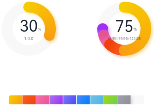
示例1(设置数据面板类型)
该示例通过type属性,实现了设置数据面板的类型的功能。
// xxx.ets
@Entry
@Component
struct DataPanelExample {
  public valueArr: number[] = [10, 10, 10, 10, 10, 10, 10, 10, 10]

  build() {
    Column({ space: 5 }) {
      Row() {
        Stack() {
          // 单段环形数据面板
          DataPanel({ values: [30], max: 100, type: DataPanelType.Circle }).width(168).height(168)
          Column() {
            Text('30').fontSize(35).fontColor('#182431')
            Text('1.0.0').fontSize(9.33).lineHeight(12.83).fontWeight(500).opacity(0.6)
          }

          Text('%')
            .fontSize(9.33)
            .lineHeight(12.83)
            .fontWeight(500)
            .opacity(0.6)
            .position({ x: 104.42, y: 78.17 })
        }.margin({ right: 44 })

        // 多段环形数据面板
        Stack() {
          DataPanel({ values: [50, 12, 8, 5], max: 100, type: DataPanelType.Circle }).width(168).height(168)
          Column() {
            Text('75').fontSize(35).fontColor('#182431')
            Text('已使用98GB/128GB').fontSize(8.17).lineHeight(11.08).fontWeight(500).opacity(0.6)
          }

          Text('%')
            .fontSize(9.33)
            .lineHeight(12.83)
            .fontWeight(500)
            .opacity(0.6)
            .position({ x: 104.42, y: 78.17 })
        }
      }.margin({ bottom: 59 })

      // 线形数据面板
      DataPanel({ values: this.valueArr, max: 100, type: DataPanelType.Line }).width(300).height(20)
    }.width('100%').margin({ top: 5 })
  }
}
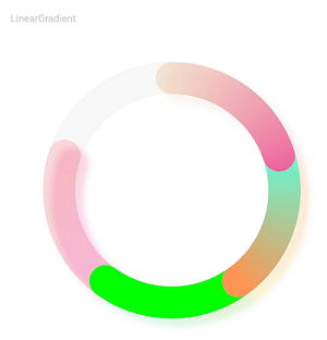
示例2(设置渐变色和阴影)
该示例通过valueColors和trackShadow接口设置LinearGradient颜色,实现了设置渐变色效果和阴影效果。
// xxx.ets
@Entry
@Component
struct LinearGradientDataPanelExample {
  public values1: number[] = [20, 20, 20, 20]
  public color1: LinearGradient =
    new LinearGradient([{ color: "#65EEC9A3", offset: 0 }, { color: "#FFEF629F", offset: 1 }])
  public color2: LinearGradient =
    new LinearGradient([{ color: "#FF67F9D4", offset: 0 }, { color: "#FFFF9554", offset: 1 }])
  public colorShadow1: LinearGradient =
    new LinearGradient([{ color: "#65EEC9A3", offset: 0 }, { color: "#65EF629F", offset: 1 }])
  public colorShadow2: LinearGradient =
    new LinearGradient([{ color: "#65e26709", offset: 0 }, { color: "#65efbd08", offset: 1 }])
  public colorShadow3: LinearGradient =
    new LinearGradient([{ color: "#6572B513", offset: 0 }, { color: "#6508efa6", offset: 1 }])
  public colorShadow4: LinearGradient =
    new LinearGradient([{ color: "#65ed08f5", offset: 0 }, { color: "#65ef0849", offset: 1 }])
  @State color3: string = '#00FF00'
  @State color4: string = '#20FF0000'
  @State bgColor: string = '#08182431'
  @State offsetX: number = 15
  @State offsetY: number = 15
  @State radius: number = 5
  @State colorArray: Array<LinearGradient | ResourceColor> = [this.color1, this.color2, this.color3, this.color4]
  @State shadowColorArray: Array<LinearGradient | ResourceColor> =
    [this.colorShadow1, this.colorShadow2, this.colorShadow3, this.colorShadow4]

  build() {
    Column({ space: 5 }) {
      Text('LinearGradient')
        .fontSize(9)
        .fontColor(0xCCCCCC)
        .textAlign(TextAlign.Start)
        .width('100%')
        .margin({ top: 20, left: 20 })
      DataPanel({ values: this.values1, max: 100, type: DataPanelType.Circle })
        .width(300)
        .height(300)
        .valueColors(this.colorArray)
        .trackShadow({
          radius: this.radius,
          colors: this.shadowColorArray,
          offsetX: this.offsetX,
          offsetY: this.offsetY
        })
        .strokeWidth(30)
        .trackBackgroundColor(this.bgColor)
    }.width('100%').margin({ top: 5 })
  }
}
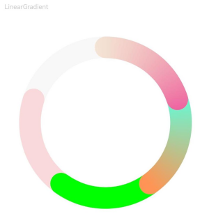
示例3(设置关闭动画和阴影)
该示例通过closeEffect接口,实现了关闭数据面板动画和阴影的功能。
// xxx.ets
@Entry
@Component
struct LinearGradientDataPanelExample {
  public values1: number[] = [20, 20, 20, 20]
  public color1: LinearGradient =
    new LinearGradient([{ color: "#65EEC9A3", offset: 0 }, { color: "#FFEF629F", offset: 1 }])
  public color2: LinearGradient =
    new LinearGradient([{ color: "#FF67F9D4", offset: 0 }, { color: "#FFFF9554", offset: 1 }])
  public colorShadow1: LinearGradient =
    new LinearGradient([{ color: "#65EEC9A3", offset: 0 }, { color: "#65EF629F", offset: 1 }])
  public colorShadow2: LinearGradient =
    new LinearGradient([{ color: "#65e26709", offset: 0 }, { color: "#65efbd08", offset: 1 }])
  public colorShadow3: LinearGradient =
    new LinearGradient([{ color: "#6572B513", offset: 0 }, { color: "#6508efa6", offset: 1 }])
  public colorShadow4: LinearGradient =
    new LinearGradient([{ color: "#65ed08f5", offset: 0 }, { color: "#65ef0849", offset: 1 }])
  @State color3: string = '#00FF00'
  @State color4: string = '#20FF0000'
  @State bgColor: string = '#08182431'
  @State offsetX: number = 15
  @State offsetY: number = 15
  @State radius: number = 5
  @State colorArray: Array<LinearGradient | ResourceColor> = [this.color1, this.color2, this.color3, this.color4]
  @State shadowColorArray: Array<LinearGradient | ResourceColor> =
    [this.colorShadow1, this.colorShadow2, this.colorShadow3, this.colorShadow4]

  build() {
    Column({ space: 5 }) {
      Text('LinearGradient')
        .fontSize(9)
        .fontColor(0xCCCCCC)
        .textAlign(TextAlign.Start)
        .width('100%')
        .margin({ top: 20, left: 20 })
      DataPanel({ values: this.values1, max: 100, type: DataPanelType.Circle })
        .width(300)
        .height(300)
        .valueColors(this.colorArray)
        .strokeWidth(30)
        .closeEffect(true)
        .trackBackgroundColor(this.bgColor)
    }.width('100%').margin({ top: 5 })
  }
}
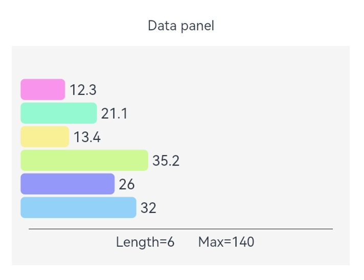
示例4(设置定制内容区)
该示例通过contentModifier接口,实现了定制数据面板内容区的功能。
// xxx.ets
@Builder
function buildDataPanel(config: DataPanelConfiguration) {
  Column() {
    Column() {
      ForEach(config.values, (item: number, index: number) => {
        ChildItem({ item: item, index: index, max: config.maxValue })
      }, (item: string) => item)
    }.padding(10)

    Column() {
      Line().width("100%").backgroundColor("#ff373737").margin({ bottom: 5 })
    }.padding({ left: 20, right: 20 })

    Row() {
      Text('Length=' + config.values.length + '    ').margin({ left: 10 }).align(Alignment.Start)
      Text('Max=' + config.maxValue).margin({ left: 10 }).align(Alignment.Start)
    }
  }
}

class DataPanelBuilder implements ContentModifier<DataPanelConfiguration> {
  constructor() {
  }

  applyContent(): WrappedBuilder<[DataPanelConfiguration]> {
    return wrapBuilder(buildDataPanel)
  }
}

@Entry
@Component
struct Index {
  build() {
    Column() {
      Text("Data panel").margin({ top: 12 });
      Row() {
        DataPanel({ values: [12.3, 21.1, 13.4, 35.2, 26.0, 32.0], max: 140, type: DataPanelType.Circle })
          .width(400)
          .height(260)
          .constraintSize({ maxWidth: "100%" })
          .padding({ top: 10 })
          .contentModifier(new DataPanelBuilder())
      }.margin(15).backgroundColor("#fff5f5f5")
    }
  }
}

@Component
struct ChildItem {
  @Prop item: number;
  @Prop index: number;
  @Prop max: number;
  public color1: string = "#65ff00dd"
  public color2: string = "#6500ff99"
  public color3: string = "#65ffe600"
  public color4: string = "#6595ff00"
  public color5: string = "#65000dff"
  public color6: string = "#650099ff"
  public colorArray: Array<string> = [this.color1, this.color2, this.color3, this.color4, this.color5, this.color6]

  build() {
    RelativeContainer() {
      Row() {
        Rect()
          .height(25)
          .width(this.item * 600 / this.max)
          .foregroundColor(this.colorArray[this.index])
          .radius(5)
          .align(Alignment.Start)
        Text(" " + this.item)
          .fontSize(17)
      }
    }.height(28)
  }
}


 扫一扫
扫一扫


 608
608

 被折叠的 条评论
为什么被折叠?
被折叠的 条评论
为什么被折叠?
 到【灌水乐园】发言


