


matlab,simulink,python图像处理,机器学习,数据处理,深度学习,数据预测,数值分析,PID控制,无人机建模,常用方程求解,永磁电机控制等等
文章目录
以下是关于您提到的各个领域的代码示例。由于这些领域非常广泛,以下代码仅提供基础框架和思路
文章目录
1. MATLAB - PID控制
% PID控制器设计
Kp = 1.0; % 比例增益
Ki = 0.5; % 积分增益
Kd = 0.1; % 微分增益

% 系统传递函数
sys = tf([1], [1 10 20]);

% 设计PID控制器
C = pid(Kp, Ki, Kd);

% 闭环系统
T = feedback(C * sys, 1);

% 绘制阶跃响应
step(T);
title('PID控制系统的阶跃响应');
2. Simulink - 无人机建模
在Simulink中,您可以使用以下模块:
- 输入:信号生成器(Signal Generator)。
- 动力学模型:传递函数或状态空间模型。
- 输出:Scope 或 To Workspace 模块。
手动搭建无人机的六自由度模型,包括:
- 动力学方程(牛顿-欧拉方程)。
- 控制器(如LQR或PID)。
3. Python - 图像处理
import cv2
import matplotlib.pyplot as plt

# 读取图像
image = cv2.imread('image.png')

# 转换为灰度图像
gray_image = cv2.cvtColor(image, cv2.COLOR_BGR2GRAY)

# 边缘检测
edges = cv2.Canny(gray_image, 100, 200)

# 显示结果
plt.figure(figsize=(10, 5))
plt.subplot(1, 2, 1), plt.imshow(gray_image, cmap='gray')
plt.title('灰度图像'), plt.axis('off')
plt.subplot(1, 2, 2), plt.imshow(edges, cmap='gray')
plt.title('边缘检测'), plt.axis('off')
plt.show()
4. Python - 机器学习 (分类)
from sklearn.datasets import load_iris
from sklearn.model_selection import train_test_split
from sklearn.ensemble import RandomForestClassifier
from sklearn.metrics import accuracy_score

# 加载数据集
data = load_iris()
X, y = data.data, data.target

# 划分训练集和测试集
X_train, X_test, y_train, y_test = train_test_split(X, y, test_size=0.2, random_state=42)

# 训练随机森林分类器
clf = RandomForestClassifier(n_estimators=100)
clf.fit(X_train, y_train)

# 预测
y_pred = clf.predict(X_test)

# 计算准确率
accuracy = accuracy_score(y_test, y_pred)
print(f'模型准确率: {accuracy:.2f}')
5. Python - 数据预测 (时间序列)
import numpy as np
import pandas as pd
from statsmodels.tsa.arima.model import ARIMA
import matplotlib.pyplot as plt

# 生成模拟时间序列数据
data = np.cumsum(np.random.randn(100))

# 使用ARIMA模型进行拟合
model = ARIMA(data, order=(5, 1, 0))
model_fit = model.fit()

# 预测未来10个点
forecast = model_fit.forecast(steps=10)

# 可视化
plt.plot(data, label='原始数据')
plt.plot(np.arange(len(data), len(data) + 10), forecast, label='预测数据', linestyle='--')
plt.legend()
plt.show()
6. Python - 深度学习 (MNIST手写数字识别)
import tensorflow as tf
from tensorflow.keras import layers, models

# 加载MNIST数据集
(x_train, y_train), (x_test, y_test) = tf.keras.datasets.mnist.load_data()

# 数据预处理
x_train = x_train / 255.0
x_test = x_test / 255.0

# 构建卷积神经网络
model = models.Sequential([
    layers.Conv2D(32, (3, 3), activation='relu', input_shape=(28, 28, 1)),
    layers.MaxPooling2D((2, 2)),
    layers.Flatten(),
    layers.Dense(128, activation='relu'),
    layers.Dense(10, activation='softmax')
])

# 编译模型
model.compile(optimizer='adam', loss='sparse_categorical_crossentropy', metrics=['accuracy'])

# 训练模型
model.fit(x_train.reshape(-1, 28, 28, 1), y_train, epochs=5)

# 测试模型
test_loss, test_acc = model.evaluate(x_test.reshape(-1, 28, 28, 1), y_test)
print(f'测试准确率: {test_acc:.2f}')
7. 数值分析 - 方程求解
from scipy.optimize import fsolve
import numpy as np

# 定义非线性方程
def equations(vars):
    x, y = vars
    eq1 = x**2 + y**2 - 1
    eq2 = x - y
    return [eq1, eq2]

# 初始猜测
initial_guess = [1, 1]

# 求解
solution = fsolve(equations, initial_guess)
print(f'解: x = {solution[0]:.2f}, y = {solution[1]:.2f}')
8. 永磁电机控制 (FOC算法)
import numpy as np
import matplotlib.pyplot as plt

# 参数定义
Vdc = 300  # 直流母线电压
R = 0.5    # 定子电阻
Ld = 0.001 # d轴电感
Lq = 0.001 # q轴电感
P = 4      # 极对数
J = 0.01   # 转动惯量
B = 0.001  # 摩擦系数

# 时间向量
t = np.linspace(0, 1, 1000)

# 输入参考速度
omega_ref = 100

# FOC控制逻辑 (简化)
id_ref = 0
iq_ref = omega_ref * J / P

# 模拟电流响应
id = id_ref * (1 - np.exp(-t / 0.1))
iq = iq_ref * (1 - np.exp(-t / 0.1))

# 绘制结果
plt.plot(t, id, label='d轴电流')
plt.plot(t, iq, label='q轴电流')
plt.xlabel('时间 (s)')
plt.ylabel('电流 (A)')
plt.legend()
plt.show()
总结
以上代码提供了各领域的基础实现框架。

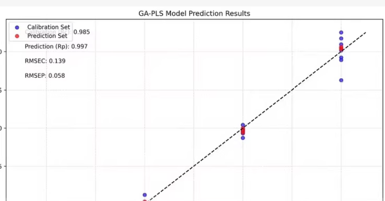
以下是一个示例代码,展示如何生成这样的图表。
假设我们已经有了一个数据集,其中包含校准集和预测集的实际浓度和预测浓度。
import numpy as np
import matplotlib.pyplot as plt

# 假设的数据集
# 实际浓度和预测浓度
actual_concentration = np.array([-6.5, -6.0, -5.5, -5.0, -4.5])
predicted_concentration = np.array([
    [-6.7, -6.6, -6.5, -6.4, -6.3],
    [-6.2, -6.1, -6.0, -5.9, -5.8],
    [-5.7, -5.6, -5.5, -5.4, -5.3],
    [-5.2, -5.1, -5.0, -4.9, -4.8],
    [-4.7, -4.6, -4.5, -4.4, -4.3]
])

# 校准集和预测集的索引
calibration_indices = [0, 1, 2, 3, 4]
prediction_indices = [5, 6, 7, 8, 9]

# 提取校准集和预测集的数据
calibration_actual = actual_concentration[calibration_indices]
calibration_predicted = predicted_concentration[:, calibration_indices].flatten()
prediction_actual = actual_concentration[prediction_indices]
prediction_predicted = predicted_concentration[:, prediction_indices].flatten()

# 计算相关系数
Rp = np.corrcoef(calibration_actual, calibration_predicted)[0, 1]

# 绘制图表
plt.figure(figsize=(8, 6))
plt.scatter(calibration_actual, calibration_predicted, color='blue', label='Calibration Set')
plt.scatter(prediction_actual, prediction_predicted, color='red', label='Prediction Set')

# 添加对角线
min_val = min(np.min(calibration_actual), np.min(calibration_predicted), np.min(prediction_actual), np.min(prediction_predicted))
max_val = max(np.max(calibration_actual), np.max(calibration_predicted), np.max(prediction_actual), np.max(prediction_predicted))
plt.plot([min_val, max_val], [min_val, max_val], 'k--', lw=2)

# 添加文本信息
plt.text(-7.0, -5.0, f'Prediction (Rp): {Rp:.3f}', fontsize=12)
plt.text(-7.0, -5.5, f'RMSEC: 0.139', fontsize=12)
plt.text(-7.0, -6.0, f'RMSEP: 0.058', fontsize=12)

# 设置标题和标签
plt.title('GA-PLS Model Prediction Results')
plt.xlabel('Actual Concentration (log)')
plt.ylabel('Predicted Concentration (log)')

# 添加图例
plt.legend()

# 显示图表
plt.show()
解释
-
生成模拟数据:
actual_concentration:实际浓度。predicted_concentration:预测浓度矩阵,每一行代表一个时间点的预测值。
-
提取校准集和预测集的数据:
- 使用索引提取校准集和预测集的实际浓度和预测浓度。
-
计算相关系数:
- 使用
numpy.corrcoef计算校准集的实际浓度和预测浓度之间的相关系数。
- 使用
-
绘制图表:
- 使用
matplotlib.pyplot.scatter绘制散点图。 - 使用
matplotlib.pyplot.plot添加对角线。 - 使用
matplotlib.pyplot.text添加文本信息。 - 设置图表的标题、X轴和Y轴的标签。
- 添加图例。
- 使用


 被折叠的 条评论
为什么被折叠?
被折叠的 条评论
为什么被折叠?
 到【灌水乐园】发言


