


Matlab代码程序,信号处理,图像处理,
画图,数据处理,数字信号处理,雷达,降噪,
小波变换,电气工程及其自动化,
电力电子仿真,数电,模电,电路,电工学
建模,仿真,通信原理,matlab程序设计,
代码编写,代码报错,调试,代码解读, matlab编程,方程求解,矩阵运算,matlab数据拟合
Python,R语言,matlab,信号与系统,模电电数,通信原理,控制理论,数字信号处理,传输线,信息论等等
文章目录
您需要的代码涉及多个领域和主题,以下是一些示例代码片段,涵盖信号处理、图像处理、小波变换、数字信号处理、矩阵运算等内容。
1. 信号处理 - 滤波器设计与应用
% 设计一个低通滤波器并应用于信号
fs = 1000; % 采样频率
fc = 50;   % 截止频率
[b, a] = butter(4, fc/(fs/2)); % 4阶巴特沃斯低通滤波器

t = 0:1/fs:1; % 时间向量
f1 = 10; f2 = 100; % 信号频率
signal = sin(2*pi*f1*t) + 0.5*sin(2*pi*f2*t); % 合成信号

filtered_signal = filter(b, a, signal); % 应用滤波器

% 绘图
figure;
subplot(3,1,1);
plot(t, signal);
title('原始信号');
subplot(3,1,2);
plot(t, filtered_signal);
title('滤波后的信号');
subplot(3,1,3);
plot(linspace(0, fs, length(signal)), abs(fft(signal)));
title('频谱分析');
2. 图像处理 - 边缘检测
% 读取图像并进行边缘检测
img = imread('cameraman.tif'); % 读取图像
gray_img = rgb2gray(img); % 转为灰度图像

% 使用Canny边缘检测
edges = edge(gray_img, 'Canny');

% 显示结果
figure;
subplot(1,2,1);
imshow(gray_img);
title('原始图像');
subplot(1,2,2);
imshow(edges);
title('边缘检测结果');
3. 小波变换 - 降噪
% 小波变换降噪
load noisdopp; % 加载带噪声信号
signal = noisdopp;

% 小波分解
[c, l] = wavedec(signal, 5, 'db4'); % 5层分解,使用db4小波

% 阈值降噪
threshold = wthrmngr('dw1ddeno', 'sqtwologu', c, l);
denoised_c = wthresh(c, 's', threshold);

% 重构信号
denoised_signal = waverec(denoised_c, l, 'db4');

% 绘图
figure;
subplot(2,1,1);
plot(signal);
title('原始信号');
subplot(2,1,2);
plot(denoised_signal);
title('降噪后的信号');
4. 矩阵运算 - 矩阵求逆与特征值
% 定义一个矩阵
A = [4, 2; 1, 3];

% 计算逆矩阵
inv_A = inv(A);

% 计算特征值和特征向量
[eig_vec, eig_val] = eig(A);

disp('逆矩阵:');
disp(inv_A);
disp('特征值:');
disp(diag(eig_val));
disp('特征向量:');
disp(eig_vec);
5. 电力电子仿真 - PWM生成
% 生成PWM信号
fs = 1000; % 采样频率
f_pwm = 50; % PWM频率
t = 0:1/fs:0.1; % 时间向量
duty_cycle = 0.6; % 占空比

pwm_signal = square(2*pi*f_pwm*t, duty_cycle*100); % 生成PWM信号
pwm_signal(pwm_signal < 0) = 0; % 将负值置为0

% 绘图
figure;
plot(t, pwm_signal);
title('PWM信号');
xlabel('时间 (s)');
ylabel('幅值');
6. 数据拟合 - 多项式拟合
% 数据拟合
x = 0:0.1:2*pi;
y = sin(x) + 0.1*randn(size(x)); % 添加噪声

% 多项式拟合
p = polyfit(x, y, 3); % 3次多项式拟合
y_fit = polyval(p, x);

% 绘图
figure;
plot(x, y, 'o');
hold on;
plot(x, y_fit, '-r');
title('数据拟合');
legend('原始数据', '拟合曲线');
7. 通信原理 - QAM调制与解调
% QAM调制与解调
M = 16; % 16-QAM
data = randi([0 M-1], 1000, 1); % 随机数据
modulated_signal = qammod(data, M); % QAM调制

% 添加噪声
rx_signal = awgn(modulated_signal, 20, 'measured'); % 添加AWGN噪声

% 解调
demodulated_data = qamdemod(rx_signal, M);

% 显示误码率
[num_errors, ber] = biterr(data, demodulated_data);
disp(['误码率: ', num2str(ber)]);
8. Python实现 - FFT(快速傅里叶变换)
import numpy as np
import matplotlib.pyplot as plt

# 生成信号
fs = 1000  # 采样频率
t = np.linspace(0, 1, fs)
f1, f2 = 50, 120  # 信号频率
signal = np.sin(2 * np.pi * f1 * t) + 0.5 * np.sin(2 * np.pi * f2 * t)

# 快速傅里叶变换
fft_result = np.fft.fft(signal)
freqs = np.fft.fftfreq(len(signal), 1/fs)

# 绘图
plt.figure()
plt.subplot(2, 1, 1)
plt.plot(t, signal)
plt.title("时域信号")
plt.subplot(2, 1, 2)
plt.plot(freqs[:len(freqs)//2], np.abs(fft_result)[:len(fft_result)//2])
plt.title("频域信号")
plt.show()
以上代码覆盖了多个领域,您可以根据需求选择使用。
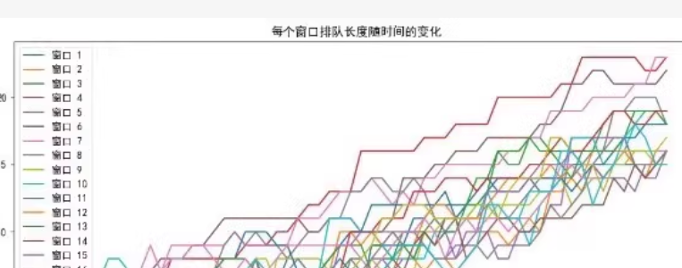
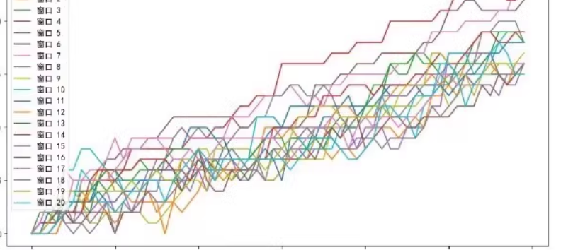
要生成类似于您提供的图表,我们可以使用Python的Matplotlib库来绘制每个窗口排队长度随时间的变化。以下是一个示例代码,假设我们已经有了一个数据集,其中包含每个窗口在不同时间点的排队长度。
首先,我们需要生成或加载这样的数据集。这里我将创建一个模拟的数据集,并使用Matplotlib进行绘图。
import matplotlib.pyplot as plt
import numpy as np

# 生成模拟数据
num_windows = 16
time_points = 100
queue_lengths = np.random.randint(0, 50, (num_windows, time_points))

# 时间向量
time = np.arange(time_points)

# 创建图表
plt.figure(figsize=(12, 8))
for i in range(num_windows):
    plt.plot(time, queue_lengths[i], label=f'窗口 {i+1}')

# 设置图表标题和标签
plt.title('每个窗口排队长度随时间的变化')
plt.xlabel('时间')
plt.ylabel('排队长度')

# 添加图例
plt.legend()

# 显示图表
plt.show()
解释
-
生成模拟数据:
num_windows:窗口的数量。time_points:时间点的数量。queue_lengths:一个二维数组,每一行代表一个窗口在不同时间点的排队长度。
-
创建图表:
- 使用
matplotlib.pyplot模块创建图表。 - 循环遍历每个窗口的排队长度数据,并使用
plt.plot绘制每条曲线。 - 设置图表的标题、X轴和Y轴的标签。
- 添加图例以区分不同的窗口。
- 使用
-
显示图表:
- 使用
plt.show()显示生成的图表。
- 使用


 被折叠的 条评论
为什么被折叠?
被折叠的 条评论
为什么被折叠?
 到【灌水乐园】发言


