


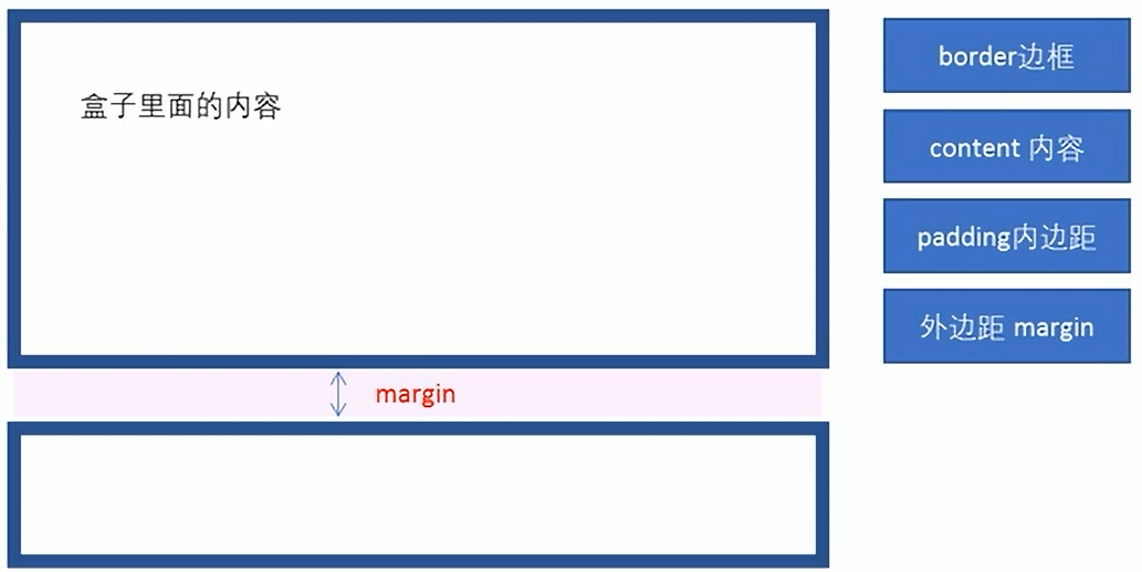
1.盒子模型
页面布局三大核心:盒子模型、浮动和定位。
盒子模型:边框、外边距、内边距和实际内容
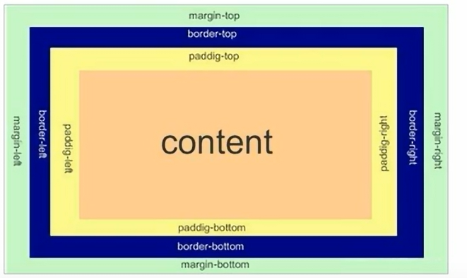
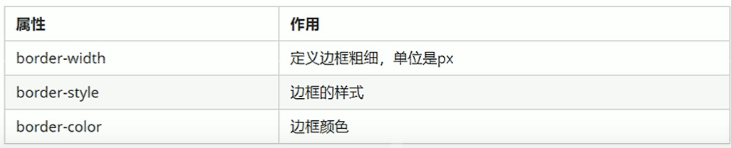
1)边框
语法:border:border-width || border-style || border-color
border-style:solid:实线边框、dashed 虚线边框、dotted点线边框
边框复合写法:border: 3px solid blue 没有顺序
边框分开写:border-top: 3px solid blue; border-bottom、border-left、border-right
2)表格的细线边框
border-collapse属性控制浏览器绘制表格边框的方式。它控制相邻单元格的边框。
语法:
/*(合并);*/
border-collapse:collapse;
3)边框会影响盒子的实际大小
盒子大小200*200,加边框10px时,盒子实际大小为220*220px。
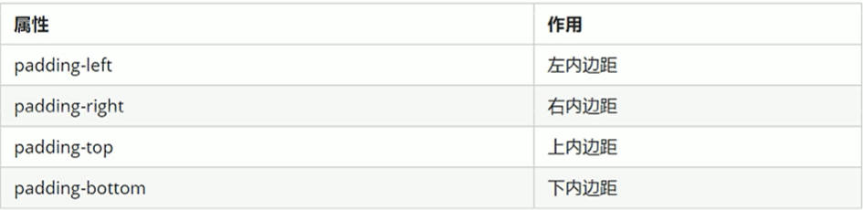
4)内边距
padding属性用于设置内边距,即边框与内容之间的距离。
内容距左边框20px:
padding-left:20px;
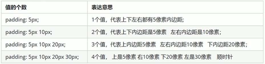
注意:当盒子指定padding值后,内容和边框有了距离,添加了内边距;如果盒子本身已经有了高度和宽度,则padding会影响盒子实际大小,如果没有指定,则不会撑开盒子。
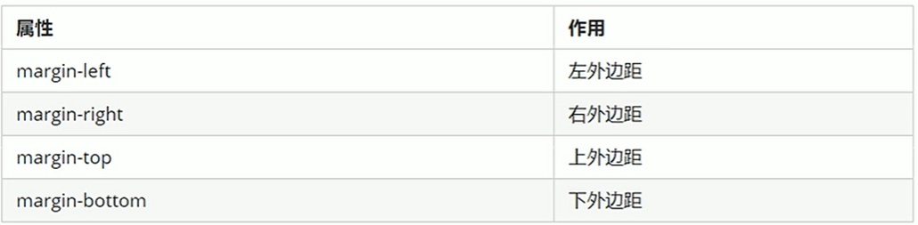
5)外边距
margin属性用于设置外边距,即控制盒子和盒子之间的距离。
(1)块级盒子居中
外边距可以让块级盒子水平居中,但是必须满足:盒子必须指定了宽度;盒子左右的外边距都设置为auto。
常见写法:
margin-left:auto;margin-right:auto;
margin:auto;
margin:0 auto;
注意:行内元素或者行内块元素水平居中给其父元素添加text-align:center即可。
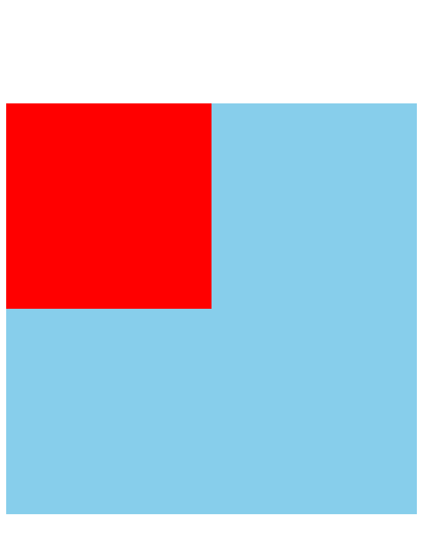
(2)嵌套块元素垂直外边距的塌陷
对于两个嵌套关系(父子关系)的块元素,父元素有上外边距同时子元素也有上外边距,此时父元素会塌陷较大的外边距值。
如下:
<style>
        .father {
            width: 400px;
            height: 400px;
            background-color: skyblue;
            margin-top: 50px;
        }

        .son {
            width: 200px;
            height: 200px;
            background-color: red;
        }
    </style>
<body>
    <div class="father">
        <div class="son">

        </div>
    </div>
</body>
若想要子盒子上边框距父盒子上边框有一段距离时,会形成塌陷。
解决方案:1.可以为父元素定义上边框;2.为父元素定义上内边距;3.为父元素添加overflow:hidden。
    <style>
        .father {
            width: 400px;
            height: 400px;
            background-color: skyblue;
            margin-top: 50px;
            border:1px solid transparent;

        }
        .son {
            width: 200px;
            height: 200px;
            background-color: red;
            margin-top: 100px;
        }
    </style>
<style>
        .father {
            width: 400px;
            height: 400px;
            background-color: skyblue;
            margin-top: 50px;
            padding: 1px;

        }

        .son {
            width: 200px;
            height: 200px;
            background-color: red;
            margin-top: 100px;
        }
    </style>
<style>
        .father {
            width: 400px;
            height: 400px;
            background-color: skyblue;
            margin-top: 50px;
            overflow: hidden
        }

        .son {
            width: 200px;
            height: 200px;
            background-color: red;
            margin-top: 100px;
        }
    </style>
6)清除内外边距
网页元素很多都带默认的内外边距。
语法:
* {
margin:0;
padding:0;
}
注意:行内元素为了照顾兼容性,尽量只设置左右内外边距,不要设置上下内外边距。但是转换为块级和行内块元素就可以了。
2.综合案例
新知识:list-style: none; 去掉li前面的项目符号(小圆点)
<style>
        * {
            margin: 0;
            padding: 0;
        }


        li {
            list-style: none;
        }


        .box {
            width: 248px;
            height: 163px;
            border: 1px solid #ccc;
            margin: 100px auto;
        }


        .box h3 {
            height: 32px;
            border-bottom: 1px dotted #ccc;
            font-size: 14px;
            font-weight: 400;
            line-height: 32px;
            padding-left: 15px;
        }

        .box ul li a {
            font-size: 12px;
            color: #666;
            text-decoration: none;
        }

        .box ul li a:hover {
            text-decoration: underline;
        }

        .box ul li {
            height: 23px;
            line-height: 23px;
            padding-left: 20px;
        }

        .box ul {
            margin-top: 7px;
        }
<body>
    <div class="box">
        <h3>品优购快报</h3>
        <ul>
            <li><a href="#">【特惠】爆款耳机5折秒!</a></li>
            <li><a href="#">【特惠】母亲节,健康好礼低至5折!</a></li>
            <li><a href="#">【特惠】爆款耳机5折秒!</a></li>
            <li><a href="#">【特惠】9.9元洗100张照片!</a></li>
            <li><a href="#">【特惠】长虹智能空调立省1000</a></li>
        </ul>
    </div>
</body>
3.圆角边框
CSS3新增圆角边框样式。
border-radius属性用于设置元素的外边框圆角。
语法:border-radius:length;
参数值可以是数值、百分比。
如果想搞一个圆角矩形,那么参数设置成高度的一半就可以了。当然,也可以分别设置两个、三个、四个值。
border-radius: 10px 20px 30px 40px;
分开写:
border-top-left-radius: 10px;
border-top-right-radius: 20px;
border-bottom-right-radius: 30px;
border-bottom-left-radius: 40px;
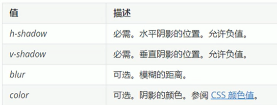
4.盒子阴影(重点、CSS3新增)
语法:box-shadow: h-shadow v-shadow blur spread color inset;
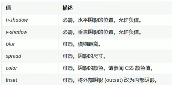
注意:默认是外阴影(outset),但是写inset可以,不可以写outset这个单词,否则导致盒子阴影无效。盒子阴影不占用空间,不会影响其他盒子排列。
文字阴影(了解)
语法:text-shadow: h-shadow v-shadow blur color;
5.CSS浮动
传统网页的布局:标准流、浮动、定位。实际开发中,一个页面基本都包含了这三种布局方式。
网页布局第一准则:多个块级元素纵向排列找标准流,多个块级元素横向排列找浮动。
网页布局第二准则:先设置盒子大小,再设置盒子位置。
1)浮动
浮动最典型应用:可以让多个块级元素一行内排列显示。
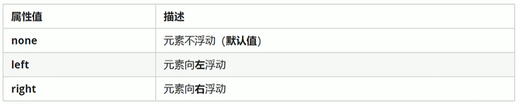
float属性用于创建浮动框,将其移动到一边,直到左边缘或右边缘触及包含块或另一个浮动框的边缘。
语法:选择器{float:属性值;}
<style>
        * {
            margin: 0;
            padding: 0;
        }

        .left,
        .right {
            float: left;
            width: 200px;
            height: 200px;
            background-color: skyblue;

        }
    </style>
<body>
    <div class="left">我是左盒子</div>
    <div class="right">我是右盒子</div>
</body>
2)浮动特性(重难点)
(1)浮动元素会脱离标准流(脱标):脱离标准普通流的控制(浮)移动到指定位置(动)(俗称脱标);浮动的盒子不再保留原先的位置。
<style>
        * {
            margin: 0;
            padding: 0;
        }

        .left {
            float: left;
            width: 200px;
            height: 200px;
            background-color: skyblue;

        }

        .right {
            /* float: left; */
            width: 300px;
            height: 300px;
            background-color: pink;

        }
    </style>
<body>
    <div class="left">我是左盒子</div>
    <div class="right">我是右盒子</div>
</body>
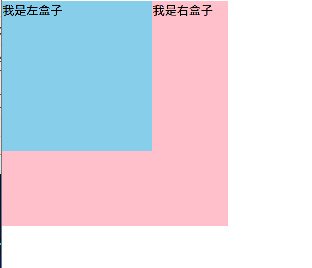
左盒子加了浮动,此时左盒子不再保留原先的位置,蓝色盒子迎面扑来,粉色盒子就在蓝色盒子下面,如上图的效果。
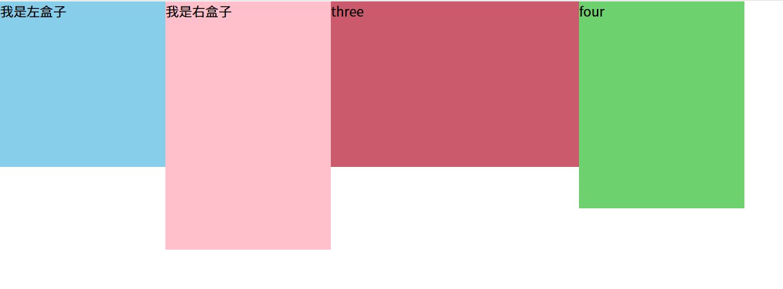
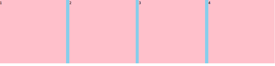
(2)浮动元素会一行内显示且沿着元素顶端对齐:如果多个盒子都设置了浮动,则它们会按照属性值一行内显示并且顶端对齐排列。
注意:浮动的元素是互相贴靠在一起的(不会有缝隙),如果父级宽度装不下这些浮动的盒子,多出的盒子会另起一行对齐。
<style>
        * {
            margin: 0;
            padding: 0;
        }

        .one {
            float: left;
            width: 200px;
            height: 200px;
            background-color: skyblue;

        }

        .two {
            float: left;
            width: 200px;
            height: 300px;
            background-color: pink;

        }

        .three {
            float: left;
            width: 300px;
            height: 200px;
            background-color: rgb(204, 90, 109);

        }

        .four {
            float: left;
            width: 200px;
            height: 250px;
            background-color: rgb(109, 209, 109);

        }
    </style>
<body>
    <div class="one">我是左盒子</div>
    <div class="two">我是右盒子</div>
    <div class="three">three</div>
    <div class="four">four</div>

</body>
效果如图:
(3)浮动的元素具有行内块元素的特性:任何元素都可以添加浮动,不管是行内元素还是块级元素,添加浮动后都具有行内块元素的特性。(如果行内元素有了浮动,那么不需要再转换就可以直接给宽度和高度;如果块级元素没有设置宽度,默认和父级一样宽,但是设置了浮动之后大小就由内容来决定;浮动的盒子中间是没有缝隙的。行内元素同理)
3)浮动元素经常和标准流父级搭配使用
约束浮动元素位置,策略:先用标准流的父元素排列上下位置,之后内部子元素采取浮动排列左右位置,符合网页布局第一准则。
4)浮动布局练习
练习一
<style>
        * {
            margin: 0;
            padding: 0;
        }

        li {
            list-style: none;
        }

        .box {
            width: 1226px;
            height: 285px;
            background-color: skyblue;
            margin: 0 auto;
        }

        .box li {
            float: left;
            width: 296px;
            height: 285px;
            background-color: pink;
            margin-right: 14px;
        }

        #four {
            margin-right: 0;
        }
    </style>
<body>
    <ul class="box">
        <li>1</li>
        <li>2</li>
        <li>3</li>
        <li id="four">4</li>
    </ul>
</body>
第四个盒子由于margin-right,大盒子装不下,会自动换行,此时只需将第四个盒子的margin-right清0即可,注意权重问题
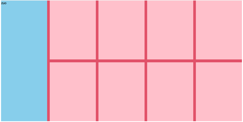
练习二
    <style>
        * {
            margin: 0;
            padding: 0;
        }

        li {
            list-style: none;
        }


        .box {
            width: 1226px;
            height: 615px;
            background-color: red;
            margin: 0 auto;
        }

        .left {
            float: left;
            width: 234px;
            height: 615px;
            background-color: skyblue;
        }

        .right {
            float: left;
            width: 992px;
            height: 615px;
            background-color: rgb(225, 81, 105);
        }

        .right>div {
            float: left;
            width: 234px;
            height: 300px;
            background-color: pink;
            margin-left: 14px;
            margin-bottom: 14px;
        }
    </style>
<body>
    <div class="box">
        <div class="left">zuo</div>
        <div class="right">
            <div></div>
            <div></div>
            <div></div>
            <div></div>
            <div></div>
            <div></div>
            <div></div>
            <div></div>
        </div>
    </div>
</body>
浮动布局注意点:
1、浮动元素经常和标准流父级搭配使用:先用标准流的父元素排列上下位置,之后内部子元素采取浮动排列左右位置。
2、一个元素浮动了,理论上其余的兄弟元素也要浮动:一个盒子里面有多个子盒子,如果其中一个盒子浮动了,那么其他兄弟也应该浮动,以防止引起问题。浮动的盒子只会影响浮动盒子后面的标准流,不会影响前面的标准流。
<style>
        * {
            margin: 0;
            padding: 0;
        }
        .box {
            width: 900px;
            height: 500px;
            background-color: gray;
        }

        .one {
            width: 200px;
            height: 100px;
            background-color: skyblue;
        }

        .two {
            float: left;
            width: 250px;
            height: 150px;
            background-color: pink;
        }

        .three {
            width: 300px;
            height: 200px;
            background-color: greenyellow;
        }
    </style>
<body>
    <div class="box">
        <div class="one"></div>
        <div class="two"></div>
        <div class="three"></div>
    </div>

</body>
三个盒子,第一个盒子不浮动,第二个盒子浮动,第一个盒子不浮动,则第一个盒子是标准流,则效果如图:
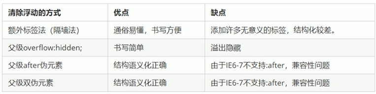
5)清除浮动
为什么要清除浮动?因为父级盒子在很多情况下不方便给高度(产品可能很多);如果不给父盒子高度,由于子盒子浮动不占位置,最后父盒子高度会变成0,会影响后面的标准流的盒子。
清除浮动的本质:清除浮动元素造成的影响。 如果父盒子本身有高度,那么不需要清除浮动
清除浮动之后,父级会根据浮动的子盒子自动检测高度,父级有了高度就不会影响后面的标准流了。
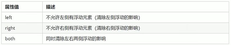
语法:选择器{ clear:属性值; }
清除浮动的策略是:闭合浮动。只让浮动在父盒子内部影响,不影响父盒子外面的其他盒子。
(1)额外标签法(隔墙法)
在浮动元素末尾添加一个空的标签。eg:<div style=" clear:both"></div>,或者其他标签。(结构化较差)
<style>
        * {
            margin: 0;
            padding: 0;
        }

        .box {
            width: 900px;
            background-color: gray;
            margin: 0, auto;
        }

        .one {
            float: left;
            width: 200px;
            height: 100px;
            background-color: skyblue;
        }

        .two {
            float: left;
            width: 250px;
            height: 150px;
            background-color: pink;
        }

        .three {
            height: 200px;
            background-color: greenyellow;
        }


         .clear {
            clear: both;
        }
    </style>
<body>
    <div class="box">
        <div class="one"></div>
        <div class="two"></div>
        <!-- 这个新增的盒子要求必须是块级元素,不能是行内元素 -->
        <div class="clear"></div>
    </div>
    <div class="three"></div>
</body>
(2)父级添加overflow属性
可以给父级添加overflow属性,将其属性值设置为hidden、auto或scroll。
<style>
        * {
            margin: 0;
            padding: 0;
        }

        .box {
            overflow: hidden;
            width: 900px;
            background-color: gray;
            margin: 0, auto;
        }

        .one {
            float: left;
            width: 200px;
            height: 100px;
            background-color: skyblue;
        }

        .two {
            float: left;
            width: 250px;
            height: 150px;
            background-color: pink;
        }

        .three {
            height: 200px;
            background-color: greenyellow;
        }

        /*
         .clear {
            clear: both;
        }  */
    </style>
<body>
    <div class="box">
        <div class="one"></div>
        <div class="two"></div>
        <!-- 这个新增的盒子要求必须是块级元素,不能是行内元素 -->
        <!-- <div class="clear"></div> -->
    </div>
    <div class="three"></div>
</body>
(3)父级添加after伪元素
:after(伪元素)方式是额外标签法的升级版。也是给父元素添加。
  .clearfix:after {
            content: "";
            display: block;
            height: 0;
            clear: both;
            visibility: hidden;
        }

        .clearfix {/* IE6、7专有 */
            *zoom: 1;
        }
<body>
    <div class="box clearfix">
        <div class="one"></div>
        <div class="two"></div>
    </div>
    <div class="three"></div>
</body>
(4)父级添加双伪元素
也是给父级元素添加。
		.clearfix:after,
        .clearfix:before {
            content: "";
            display: table;
        }

        .clearfix:after {
            clear: both;
        }

        .clearfix {/* IE6、7专有 */
            *zoom: 1;
        }
<body>
    <div class="box clearfix">
        <div class="one"></div>
        <div class="two"></div>
    </div>
    <div class="three"></div>
</body>
(5)总结
为什么清除浮动:父级没高度;子盒子浮动了;影响下面布局。


 扫一扫
扫一扫


 1万+
1万+

 被折叠的 条评论
为什么被折叠?
被折叠的 条评论
为什么被折叠?
 到【灌水乐园】发言


