


 本文介绍了Seaborn库在数据可视化中的应用,包括设置图表风格、颜色主题,以及创建各种类型图表如分布图、联合图、回归分析图和分类属性图等。通过实例展示了如何调整参数以定制美观且信息丰富的数据可视化作品。
Seaborn 可视化库
import seaborn as sns
import numpy as np
import matplotlib as mpl
import matplotlib.pyplot as plt
%matplotlib inline
风格设置
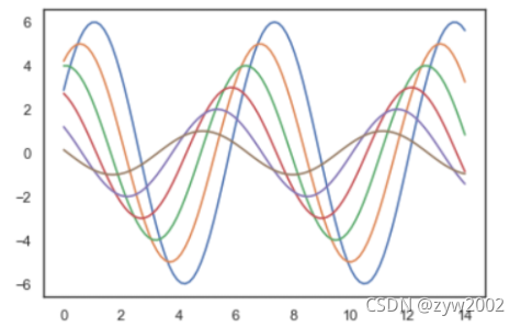
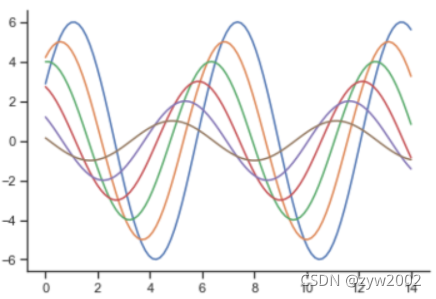
def sinplot(flip=1):
x = np.linspace(0, 14, 100)
for i in range(1, 7):
plt.plot(x, np.sin(x + i * .5) * (7 - i) * flip)
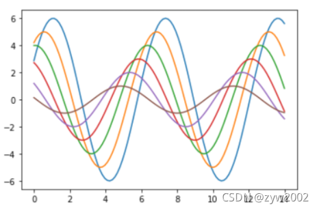
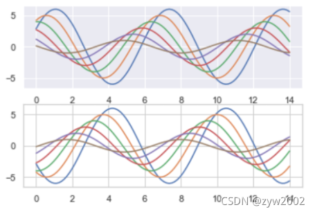
sinplot()
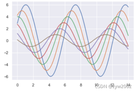
sns.set()
sinplot()
五种主题风格
- darkgrid
- whitegrid
- dark
- white
- ticks
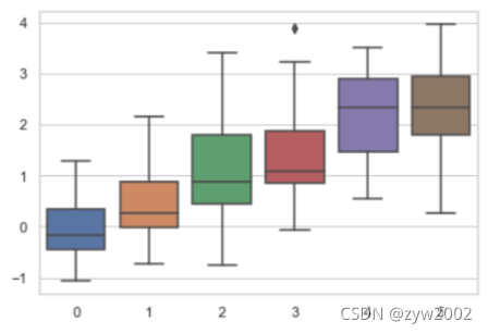
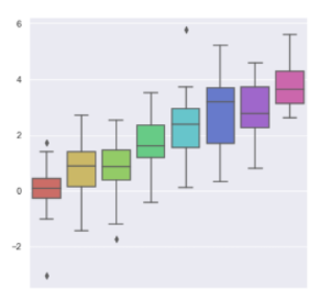
sns.set_style("whitegrid")
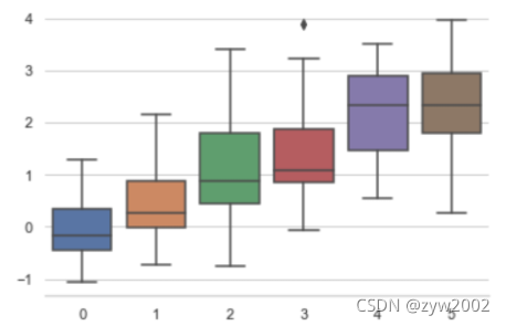
data = np.random.normal(size=(20, 6)) + np.arange(6) / 2
sns.boxplot(data=data)
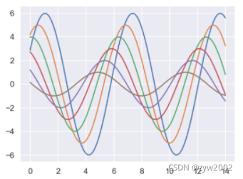
sns.set_style("dark")
sinplot()
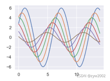
sns.set_style("white")
sinplot()
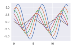
sinplot()
sns.despine()
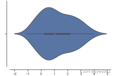
sns.violinplot(data)
sns.despine(offset=10)
sns.set_style("whitegrid")
sns.boxplot(data=data, palette="deep")
sns.despine(left=True)
with sns.axes_style("darkgrid"):
    plt.subplot(211)
    sinplot()
plt.subplot(212)
sinplot(-1)
sns.set()
sns.set_context("paper")
plt.figure(figsize=(8, 6))
sinplot()
sns.set_context("poster")
plt.figure(figsize=(8, 6))
sinplot()
sns.set_context("notebook", font_scale=1.5, rc={"lines.linewidth": 2.5})
sinplot()
颜色设置
import numpy as np
import seaborn as sns
import matplotlib.pyplot as plt
%matplotlib inline
sns.set(rc={"figure.figsize": (6, 6)})
调色板
- color_palette()能传入任何Matplotlib所支持的颜色
- color_palette()不写参数则默认颜色
- set_palette()设置所有图的颜色
current_palette = sns.color_palette()
sns.palplot(current_palette)
6个默认的颜色循环主题: deep, muted, pastel, bright, dark, colorblind

圆形画板
当你有六个以上的分类要区分时,最简单的方法就是在一个圆形的颜色空间中画出均匀间隔的颜色(这样的色调会保持亮度和饱和度不变)。这是大多数的当他们需要使用比当前默认颜色循环中设置的颜色更多时的默认方案。
最常用的方法是使用hls的颜色空间,这是RGB值的一个简单转换。
sns.palplot(sns.color_palette("hls", 8))

data = np.random.normal(size=(20, 8)) + np.arange(8) / 2
sns.boxplot(data=data,palette=sns.color_palette("hls", 8))
hls_palette()函数来控制颜色的亮度和饱和
- l-亮度 lightness
- s-饱和 saturation
sns.palplot(sns.hls_palette(8, l=.7, s=.9))

sns.palplot(sns.color_palette("Paired",8))

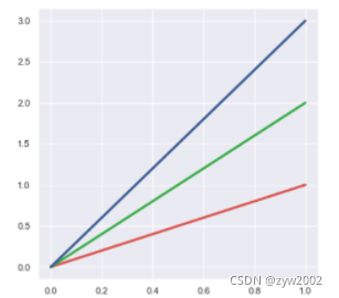
使用xkcd颜色来命名颜色
xkcd包含了一套众包努力的针对随机RGB色的命名。产生了954个可以随时通过xdcd_rgb字典中调用的命名颜色。
plt.plot([0, 1], [0, 1], sns.xkcd_rgb["pale red"], lw=3)
plt.plot([0, 1], [0, 2], sns.xkcd_rgb["medium green"], lw=3)
plt.plot([0, 1], [0, 3], sns.xkcd_rgb["denim blue"], lw=3)
colors = ["windows blue", "amber", "greyish", "faded green", "dusty purple"]
sns.palplot(sns.xkcd_palette(colors))

连续色板
色彩随数据变换,比如数据越来越重要则颜色越来越深
sns.palplot(sns.color_palette("Blues"))
如果想要翻转渐变,可以在面板名称中添加一个_r后缀
sns.palplot(sns.color_palette("BuGn_r"))

cubehelix_palette()调色版
色调线性变换
sns.palplot(sns.color_palette("cubehelix", 8))

sns.palplot(sns.cubehelix_palette(8, start=.5, rot=-.75))

sns.palplot(sns.cubehelix_palette(8, start=.75, rot=-.150))

light_palette() 和dark_palette()调用定制连续调色板
sns.palplot(sns.light_palette("green"))
sns.palplot(sns.dark_palette("purple"))
sns.palplot(sns.light_palette("navy", reverse=True))

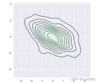
x, y = np.random.multivariate_normal([0, 0], [[1, -.5], [-.5, 1]], size=300).T
pal = sns.dark_palette("green", as_cmap=True)
sns.kdeplot(x, y, cmap=pal)
sns.palplot(sns.light_palette((210, 90, 60), input="husl"))

单变量分析绘图
%matplotlib inline
import numpy as np
import pandas as pd
from scipy import stats, integrate
import matplotlib.pyplot as plt

import seaborn as sns
sns.set(color_codes=True)
np.random.seed(sum(map(ord, "distributions")))
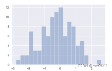
x = np.random.normal(size=100)
sns.distplot(x,kde=False)
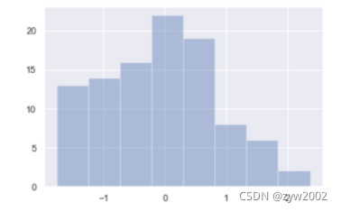
sns.distplot(x, bins=20, kde=False)
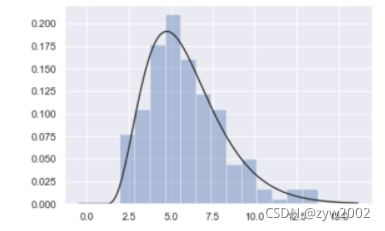
x = np.random.gamma(6, size=200)
sns.distplot(x, kde=False, fit=stats.gamma)
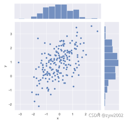
mean, cov = [0, 1], [(1, .5), (.5, 1)]
data = np.random.multivariate_normal(mean, cov, 200)
df = pd.DataFrame(data, columns=["x", "y"])

sns.jointplot(x="x", y="y", data=df);
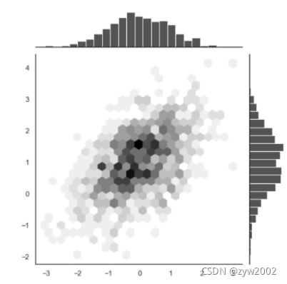
x, y = np.random.multivariate_normal(mean, cov, 1000).T
with sns.axes_style("white"):
    sns.jointplot(x=x, y=y, kind="hex", color="k")
回归分析图
%matplotlib inline
import numpy as np
import pandas as pd
import matplotlib as mpl
import matplotlib.pyplot as plt
import seaborn as sns
sns.set(color_codes=True)
np.random.seed(sum(map(ord, "regression")))
tips = sns.load_dataset("tips")
tips.head()
'''
	total_bill tip	sex	 smoker	day	time	size
0	16.99	1.01	Female	No	Sun	Dinner	2
1	10.34	1.66	Male	No	Sun	Dinner	3
2	21.01	3.50	Male	No	Sun	Dinner	3
3	23.68	3.31	Male	No	Sun	Dinner	2
4	24.59	3.61	Female	No	Sun	Dinner	4
'''
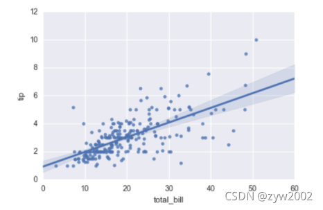
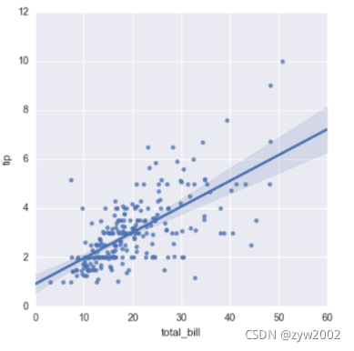
regplot()和lmplot()都可以绘制回归关系,推荐regplot()
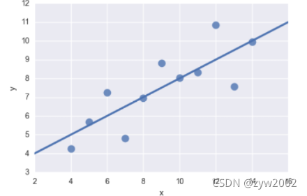
sns.regplot(x="total_bill", y="tip", data=tips)
sns.lmplot(x="total_bill", y="tip", data=tips);
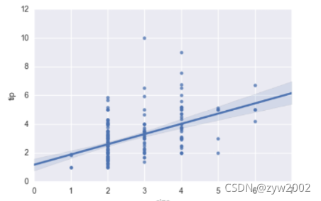
sns.regplot(data=tips,x="size",y="tip")
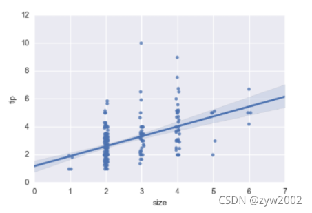
sns.regplot(x="size", y="tip", data=tips, x_jitter=.05)
anscombe = sns.load_dataset("anscombe")
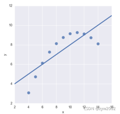
sns.regplot(x="x", y="y", data=anscombe.query("dataset == 'I'"),
ci=None, scatter_kws={"s": 100})
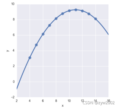
sns.lmplot(x="x", y="y", data=anscombe.query("dataset == 'II'"),
           ci=None, scatter_kws={"s": 80})
sns.lmplot(x="x", y="y", data=anscombe.query("dataset == 'II'"),
           order=2, ci=None, scatter_kws={"s": 80});
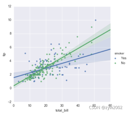
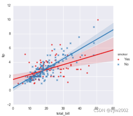
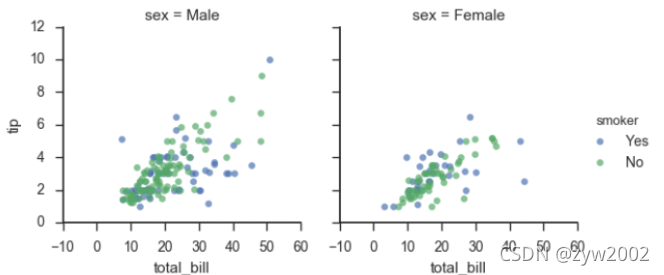
sns.lmplot(x="total_bill", y="tip", hue="smoker", data=tips);
sns.lmplot(x="total_bill", y="tip", hue="smoker", data=tips,
           markers=["o", "x"], palette="Set1");
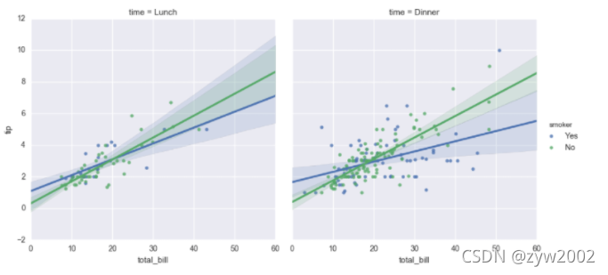
sns.lmplot(x="total_bill", y="tip", hue="smoker", col="time", data=tips);
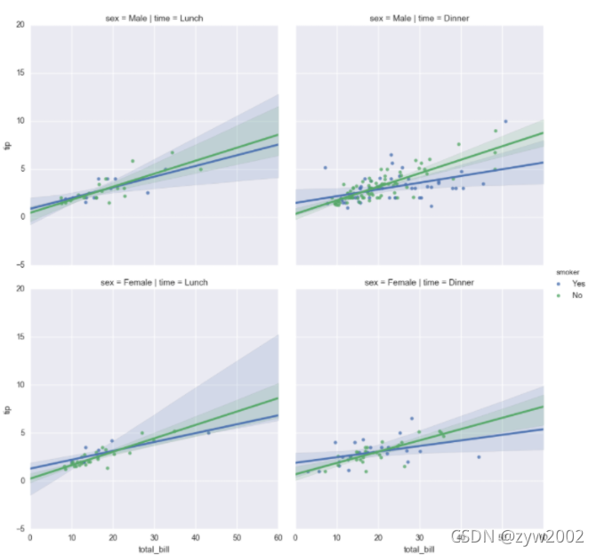
sns.lmplot(x="total_bill", y="tip", hue="smoker",
           col="time", row="sex", data=tips);
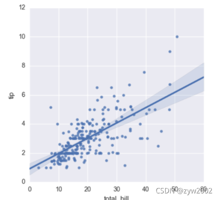
f, ax = plt.subplots(figsize=(5, 5))
sns.regplot(x="total_bill", y="tip", data=tips, ax=ax);
col_wrap:“Wrap” the column variable at this width, so that the column facets span multiple rows
size :Height (in inches) of each facet
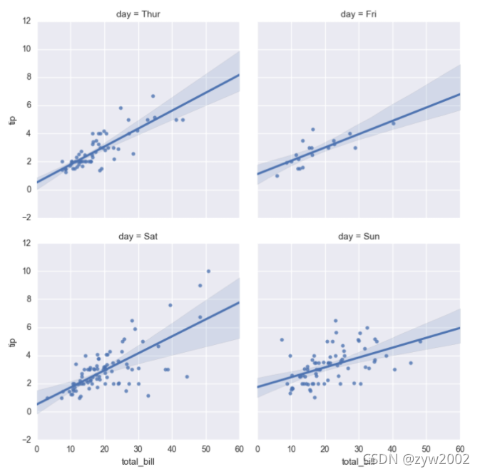
sns.lmplot(x="total_bill", y="tip", col="day", data=tips,
           col_wrap=2, size=4);
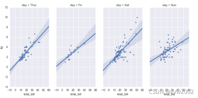
sns.lmplot(x="total_bill", y="tip", col="day", data=tips,
           aspect=.8);
分类属性图
%matplotlib inline
import numpy as np
import pandas as pd
import matplotlib as mpl
import matplotlib.pyplot as plt
import seaborn as sns
sns.set(style="whitegrid", color_codes=True)

np.random.seed(sum(map(ord, "categorical")))
titanic = sns.load_dataset("titanic")
tips = sns.load_dataset("tips")
iris = sns.load_dataset("iris")

sns.stripplot(x="day", y="total_bill", data=tips);
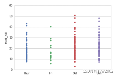
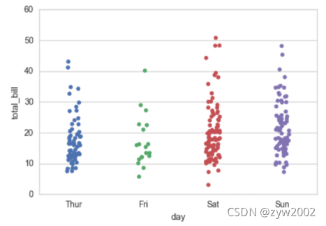
sns.stripplot(x="day", y="total_bill", data=tips, jitter=True)
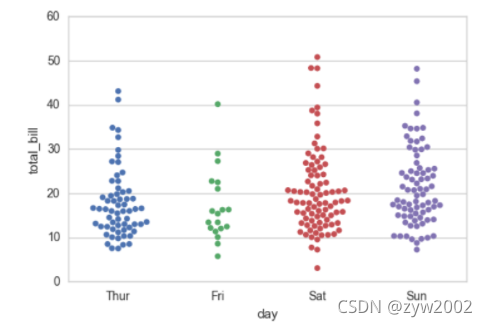
sns.swarmplot(x="day", y="total_bill", data=tips)
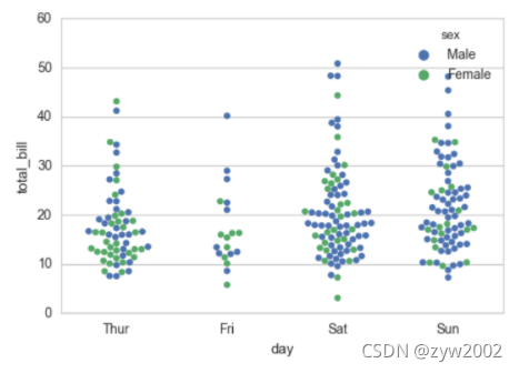
sns.swarmplot(x="day", y="total_bill", hue="sex",data=tips)
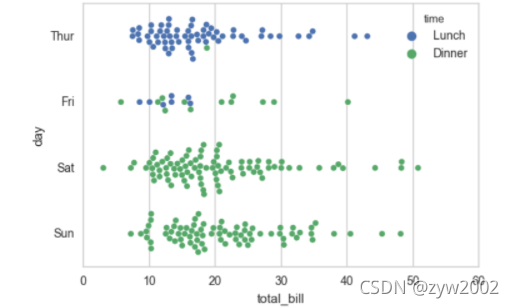
sns.swarmplot(x="total_bill", y="day", hue="time", data=tips);
盒图
- IQR即统计学概念四分位距,第一/四分位与第三/四分位之间的距离
- N = 1.5IQR 如果一个值>Q3+N或 < Q1-N,则为离群点
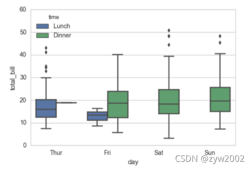
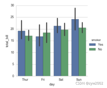
sns.boxplot(x="day", y="total_bill", hue="time", data=tips);
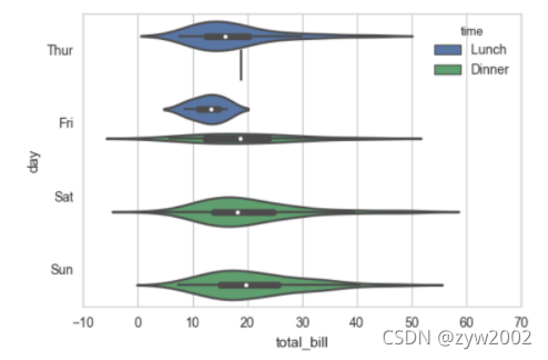
sns.violinplot(x="total_bill", y="day", hue="time", data=tips);
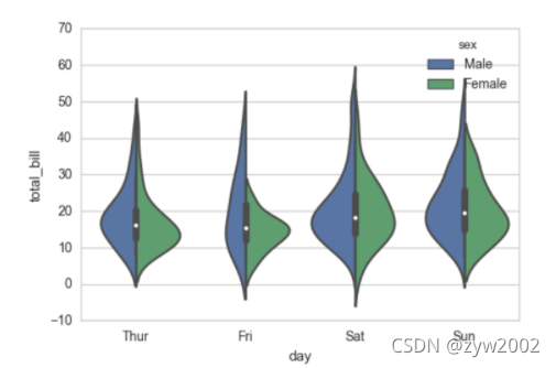
sns.violinplot(x="day", y="total_bill", hue="sex", data=tips, split=True);
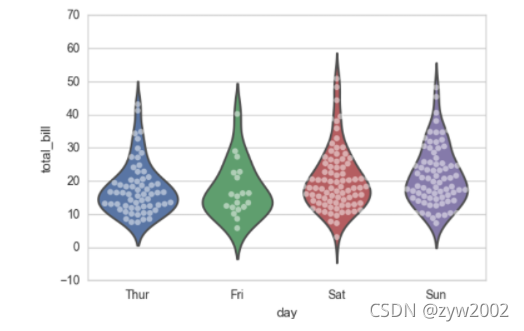
sns.violinplot(x="day", y="total_bill", data=tips, inner=None)
sns.swarmplot(x="day", y="total_bill", data=tips, color="w", alpha=.5)
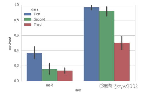
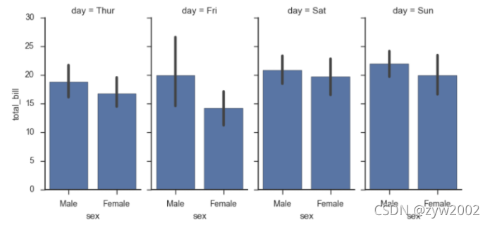
sns.barplot(x="sex", y="survived", hue="class", data=titanic);
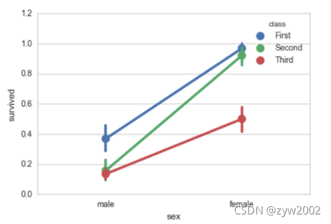
sns.pointplot(x="sex", y="survived", hue="class", data=titanic);
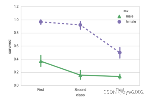
sns.pointplot(x="class", y="survived", hue="sex", data=titanic,
              palette={"male": "g", "female": "m"},
              markers=["^", "o"], linestyles=["-", "--"]);
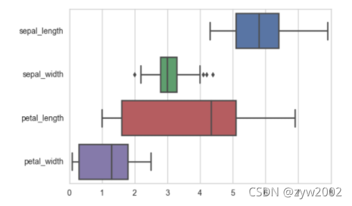
sns.boxplot(data=iris,orient="h");
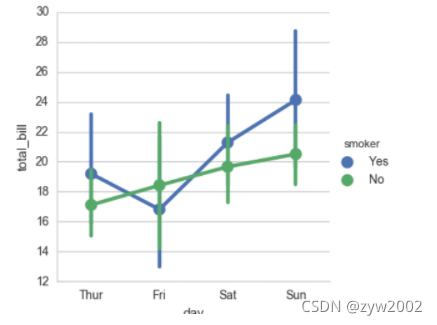
sns.factorplot(x="day", y="total_bill", hue="smoker", data=tips)
sns.factorplot(x="day", y="total_bill", hue="smoker", data=tips, kind="bar")
sns.factorplot(x="day", y="total_bill", hue="smoker",
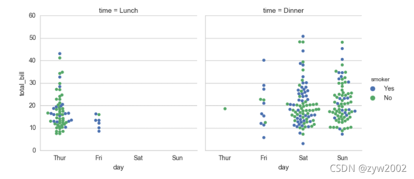
col="time", data=tips, kind="swarm")
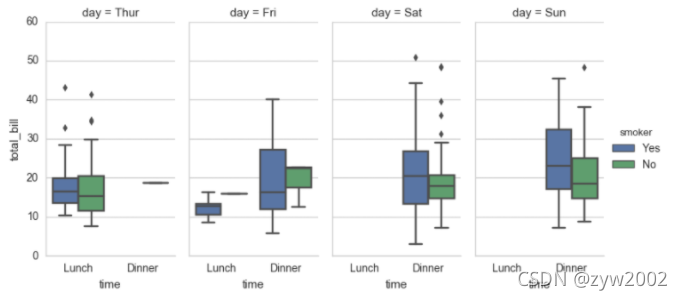
sns.factorplot(x="time", y="total_bill", hue="smoker",
               col="day", data=tips, kind="box", size=4, aspect=.5)
seaborn.factorplot(x=None, y=None, hue=None, data=None, row=None, col=None, col_wrap=None, estimator=, ci=95, n_boot=1000, units=None, order=None, hue_order=None, row_order=None, col_order=None, kind=‘point’, size=4, aspect=1, orient=None, color=None, palette=None, legend=True, legend_out=True, sharex=True, sharey=True, margin_titles=False, facet_kws=None, **kwargs)
Parameters:
- x,y,hue 数据集变量 变量名
- date 数据集 数据集名
- row,col 更多分类变量进行平铺显示 变量名
- col_wrap 每行的最高平铺数 整数
- estimator 在每个分类中进行矢量到标量的映射 矢量
- ci 置信区间 浮点数或None
- n_boot 计算置信区间时使用的引导迭代次数 整数
- units 采样单元的标识符,用于执行多级引导和重复测量设计 数据变量或向量数据
- order, hue_order 对应排序列表 字符串列表
- row_order, col_order 对应排序列表 字符串列表
- kind : 可选:point 默认, bar 柱形图, count 频次, box 箱体, violin 提琴, strip 散点,swarm 分散点 size 每个面的高度(英寸) 标量 aspect 纵横比 标量 orient 方向 “v”/“h” color 颜色 matplotlib颜色 palette 调色板 seaborn颜色色板或字典 legend hue的信息面板 True/False legend_out 是否扩展图形,并将信息框绘制在中心右边 True/False share{x,y} 共享轴线 True/False
Facegrid
%matplotlib inline
import numpy as np
import pandas as pd
import seaborn as sns
from scipy import stats
import matplotlib as mpl
import matplotlib.pyplot as plt

sns.set(style="ticks")
np.random.seed(sum(map(ord, "axis_grids")))

tips = sns.load_dataset("tips")
tips.head()
'''
  total_bill tip	sex	 smoker	day	time	size
0	16.99	1.01	Female	No	Sun	Dinner	2
1	10.34	1.66	Male	No	Sun	Dinner	3
2	21.01	3.50	Male	No	Sun	Dinner	3
3	23.68	3.31	Male	No	Sun	Dinner	2
4	24.59	3.61	Female	No	Sun	Dinner	4
'''
g = sns.FacetGrid(tips, col="time")
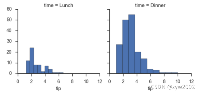
g.map(plt.hist, "tip");
g = sns.FacetGrid(tips, col="sex", hue="smoker")
g.map(plt.scatter, "total_bill", "tip", alpha=.7)
g.add_legend();
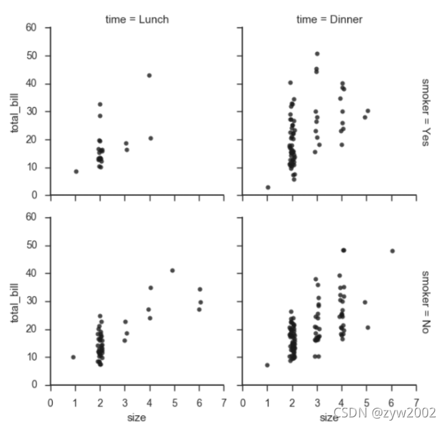
g = sns.FacetGrid(tips, row="smoker", col="time", margin_titles=True)
g.map(sns.regplot, "size", "total_bill", color=".1", fit_reg=False, x_jitter=.1);

g = sns.FacetGrid(tips, col="day", size=4, aspect=.5)
g.map(sns.barplot, "sex", "total_bill");
from pandas import Categorical
ordered_days = tips.day.value_counts().index
print (ordered_days)
ordered_days = Categorical(['Thur', 'Fri', 'Sat', 'Sun'])
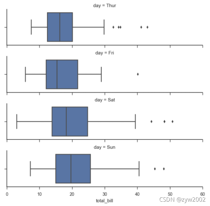
g = sns.FacetGrid(tips, row="day", row_order=ordered_days,
size=1.7, aspect=4,)
g.map(sns.boxplot, "total_bill");
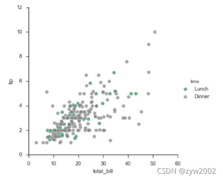
pal = dict(Lunch="seagreen", Dinner="gray")
g = sns.FacetGrid(tips, hue="time", palette=pal, size=5)
g.map(plt.scatter, "total_bill", "tip", s=50, alpha=.7, linewidth=.5, edgecolor="white")
g.add_legend();
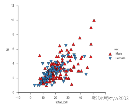
g = sns.FacetGrid(tips, hue="sex", palette="Set1", size=5, hue_kws={"marker": ["^", "v"]})
g.map(plt.scatter, "total_bill", "tip", s=100, linewidth=.5, edgecolor="white")
g.add_legend();
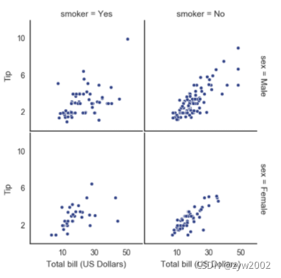
with sns.axes_style("white"):
    g = sns.FacetGrid(tips, row="sex", col="smoker", margin_titles=True, size=2.5)
g.map(plt.scatter, "total_bill", "tip", color="#334488", edgecolor="white", lw=.5);
g.set_axis_labels("Total bill (US Dollars)", "Tip");
g.set(xticks=[10, 30, 50], yticks=[2, 6, 10]);
g.fig.subplots_adjust(wspace=.02, hspace=.02);
'''g.fig.subplots_adjust(left  = 0.125,right = 0.5,bottom = 0.1,top = 0.9, wspace=.02, hspace=.02)'''
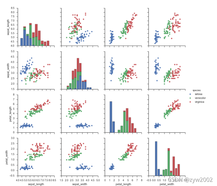
iris = sns.load_dataset("iris")
g = sns.PairGrid(iris)
g.map(plt.scatter);
g = sns.PairGrid(iris)
g.map_diag(plt.hist)
g.map_offdiag(plt.scatter);
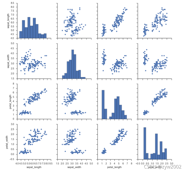
g = sns.PairGrid(iris, hue="species")
g.map_diag(plt.hist)
g.map_offdiag(plt.scatter)
g.add_legend();
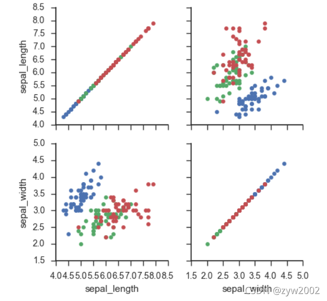
g = sns.PairGrid(iris, vars=["sepal_length", "sepal_width"], hue="species")
g.map(plt.scatter);
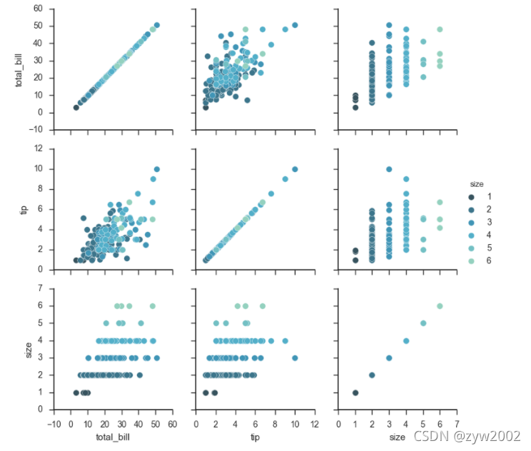
g = sns.PairGrid(tips, hue="size", palette="GnBu_d")
g.map(plt.scatter, s=50, edgecolor="white")
g.add_legend();
Heapmap
%matplotlib inline
import matplotlib.pyplot as plt
import numpy as np;
np.random.seed(0)
import seaborn as sns;
sns.set()
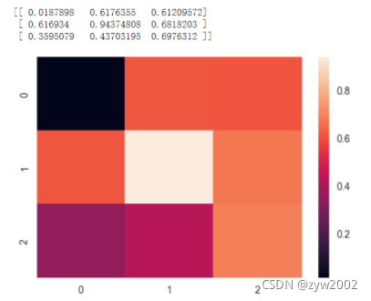
uniform_data = np.random.rand(3, 3)
print (uniform_data)
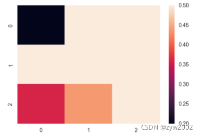
heatmap = sns.heatmap(uniform_data)
ax = sns.heatmap(uniform_data, vmin=0.2, vmax=0.5)
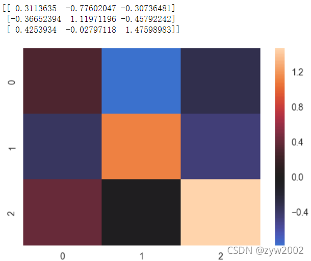
normal_data = np.random.randn(3, 3)
print (normal_data)
ax = sns.heatmap(normal_data, center=0)
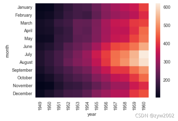
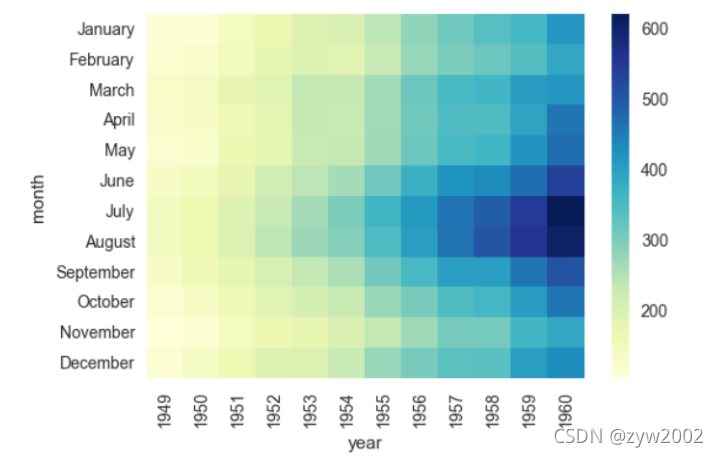
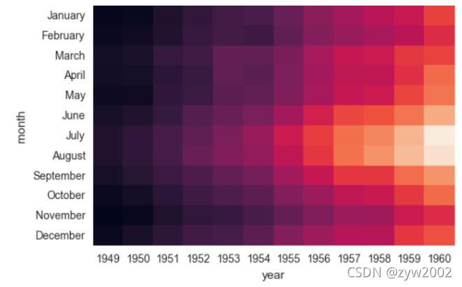
flights = sns.load_dataset("flights")
flights.head()
'''
	year	month		passengers
0	1949	January		112
1	1949	February	118
2	1949	March		132
3	1949	April		129
4	1949	May			121
'''
flights = flights.pivot("month", "year", "passengers")
ax = sns.heatmap(flights)
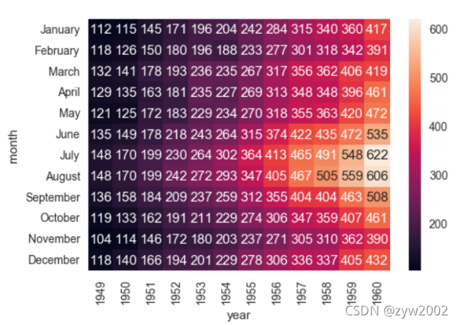
ax = sns.heatmap(flights, annot=True,fmt="d")
ax = sns.heatmap(flights, linewidths=.5)
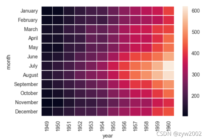
ax = sns.heatmap(flights, cmap="YlGnBu")
ax = sns.heatmap(flights, cbar=False)


 1869
1869

 被折叠的 条评论
为什么被折叠?
被折叠的 条评论
为什么被折叠?
 到【灌水乐园】发言


