


代码:
<!DOCTYPE html>
<html lang="en">
<head>
    <meta charset="UTF-8">
    <meta name="viewport" content="width=device-width, initial-scale=1.0">
    <title>银河系</title>
    <link rel="stylesheet" href="./css/xingxing.css">
</head>
<body>
    <div class="black1  clearfix">
        <!-- 太阳 -->
        <div class="sun"></div>
        <!-- 水星 -->
        <div class="s1"></div>
        <!-- 水星轨道 -->
        <div class="s11"></div>
        <!-- 金星 -->
        <div class="s2"></div>
        <!-- 金星轨道 -->
        <div class="s22"></div>
        <!-- 地球 -->
        <div class="s3"></div>
        <!-- 地球轨道 -->
        <div class="s33"></div>
        <!-- 火星 -->
        <div class="s4"></div>
        <!-- 火星轨道 -->
        <div class="s44"></div>
        <!-- 木星 -->
        <div class="s5"></div>
        <!-- 木星轨道 -->
        <div class="s55"></div>
        <!-- 土星 -->
        <div class="s6"></div>
        <!--土星轨道  -->
        <div class="s66"></div>
        <!-- 海王星 -->
        <div class="s7"></div>
        <!-- 海王星轨道 -->
        <div class="s77"></div>
        <!-- 冥王星 -->
        <div class="s8"></div>
        <!-- 冥王星轨道 -->
        <div class="s88"></div>

    </div>

</body>
</html>
CSS代码:
.black1{
    width: 800px;
    height: 800px;
    background-color: #000000;
    margin: 0 auto;
    position: relative;
}
.clearfix{
    content:"";
    display: table;
    clear: both;
}
.sun{
    width: 100px;
    height: 100px;
    background-color: red;
    /* margin-left: 350px;
    margin-top: 350px; */
    position: absolute;
    left: 350px;
    top: 350px;
    box-shadow:10px 10px 10px orangered,-10px 10px 10px orangered,-10px -10px 10px orangered,10px -10px 10px orangered;
    border-radius: 50%;
}
.s1{
    width: 10px;
    height: 10px;
    left: 324px;
    top: 395px;
    border-radius: 50%;
    position: absolute;
    background-color: #5abaff;
    transform-origin: 75px 5px;
    animation:run 1.5s linear infinite;
}
.s11{
    width: 140px;
    height: 140px;
    border: 2px dashed grey;
    border-radius: 50%;
    position: absolute;
    left:329px;
    top: 329px;
}

.s2{
    width: 20px;
    height: 20px;
    left: 304px;
    top: 390px;
    border-radius: 50%;
    position: absolute;
    background-color: #ffff00;
    transform-origin: 95.5px 10px;
    animation:run 3.84s linear infinite;
}

.s22{
    width: 170px;
    height: 170px;
    border: 2px dashed grey;
    border-radius: 50%;
    position: absolute;
    left:314px;
    top: 314px;
}

.s3{
    width: 15px;
    height: 15px;
    left: 281.5px;
    top: 392.5px;
    border-radius: 50%;
    position: absolute;
    background-color: #006eff;
    transform-origin: 118.5px 7.5px;
    animation:run 6.25s linear infinite;
}

.s33{
    width: 220px;
    height: 220px;
    border: 2px dashed grey;
    border-radius: 50%;
    position: absolute;
    left:289px;
    top: 289px;
}

.s4{
    width: 12px;
    height: 12px;
    left: 268px;
    top: 394px;
    border-radius: 50%;
    position: absolute;
    background-color: #ff0000;
    transform-origin: 131px 6px;
    animation:run 11.75s linear infinite;
}

.s44{
    width: 250px;
    height: 250px;
    border: 2px dashed grey;
    border-radius: 50%;
    position: absolute;
    left:274px;
    top: 274px;
}

.s5{
    width: 60px;
    height: 60px;
    left: 184px;
    top: 370px;
    border-radius: 50%;
    position: absolute;
    background-color: #747474;
    transform-origin: 215px 30px;
    animation:run 74.04s linear infinite;
}

.s55{
    width: 370px;
    height: 370px;
    border: 2px dashed grey;
    border-radius: 50%;
    position: absolute;
    left:214px;
    top: 214px;
}
.s6{
    width: 50px;
    height: 50px;
    left: 139px;
    top: 375px;
    border-radius: 50%;
    position: absolute;
    background-color: #00fff7;
    transform-origin: 260px 25px;
    animation:run 183.92s linear infinite;
}

.s66{
    width: 470px;
    height: 470px;
    border: 2px dashed grey;
    border-radius: 50%;
    position: absolute;
    left:164px;
    top: 164px;
}

.s7{
    width: 50px;
    height: 50px;
    left: 89px;
    top: 375px;
    border-radius: 50%;
    position: absolute;
    background-color: #0008ff;
    transform-origin: 310px 25px;
    animation:run 524.46s linear infinite;
}

.s77{
    width: 570px;
    height: 570px;
    border: 2px dashed grey;
    border-radius: 50%;
    position: absolute;
    left:114px;
    top: 114px;
}

.s8{
    width: 30px;
    height: 30px;
    left: 4px;
    top: 385px;
    border-radius: 50%;
    position: absolute;
    background-color: #00524f;
    transform-origin: 395px 15px;
    animation:run 1028.76s linear infinite;
}

.s88{
    width: 760px;
    height: 760px;
    border: 2px dashed grey;
    border-radius: 50%;
    position: absolute;
    left:19px;
    top: 19px;
}
@keyframes run {
    /* 0%{
        transform: rotate(0deg);
    } */

    100%{
        transform:rotate(-360deg);
    }

}
代码说明:
transform-origin:圆心偏移量。
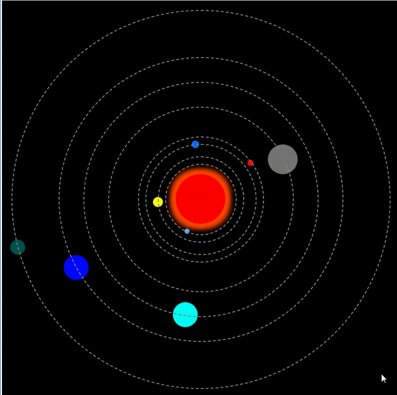
结果展示:


 扫一扫
扫一扫


 1601
1601

 被折叠的 条评论
为什么被折叠?
被折叠的 条评论
为什么被折叠?
 到【灌水乐园】发言


