 Matplotlib绘图详解


 本文详细介绍了使用Matplotlib进行数据可视化的多种技巧,包括线型图、柱状图、直方图、散布图等的绘制方法,以及如何调整图表样式、添加注释和保存图表。
目录
绘图和可视化回归 第八章
import matplotlib.pyplot as plt
import numpy as np
from numpy.random import randn
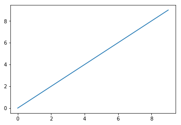
plt.plot(np.arange(10))
plt.show()
Figure和Subplot
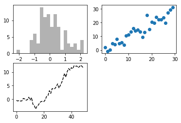
fig=plt.figure()
ax1=fig.add_subplot(2,2,1)
ax2=fig.add_subplot(2,2,2)
ax3=fig.add_subplot(2,2,3)
plt.plot(np.random.randn(50).cumsum(),'k--')
[<matplotlib.lines.Line2D at 0x218cbf11ac8>]
_=ax1.hist(np.random.randn(100),bins=20,color='k',alpha=0.3)
ax2.scatter(np.arange(30),np.arange(30)+3*np.random.randn(30))
plt.show()
fig,axes=plt.subplots(2,3)
axes
array([[<matplotlib.axes._subplots.AxesSubplot object at 0x00000218CAB83198>,
        <matplotlib.axes._subplots.AxesSubplot object at 0x00000218CBD430B8>,
        <matplotlib.axes._subplots.AxesSubplot object at 0x00000218CAAB00F0>],
       [<matplotlib.axes._subplots.AxesSubplot object at 0x00000218CBD1E358>,
        <matplotlib.axes._subplots.AxesSubplot object at 0x00000218CBCA96D8>,
        <matplotlib.axes._subplots.AxesSubplot object at 0x00000218CC0934A8>]], dtype=object)
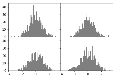
调整subplot周围的间距
# subplots_adjust(left=None,bottom=None,right=None,top=None,wpace=None,hspace=None)
fig,axes=plt.subplots(2,2,sharex=True,sharey=True)
for i in range(2):
    for j in range(2):
        axes[i,j].hist(np.random.randn(500),bins=50,color='k',alpha=0.5)

plt.subplots_adjust(wspace=0,hspace=0)
plt.show()
颜色、标记和线型
ax.plot(x,y,'g--')
ax.plot(x,y,linestyle='--',color='g')
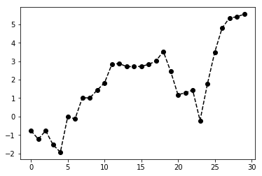
plt.plot(np.random.randn(30).cumsum(),'ko--')
plt.show()
#还可以写成更明确的方式
plt.plot(np.random.randn(30).cumsum(),color='k',linestyle='dashed',marker='o')
[<matplotlib.lines.Line2D at 0x156662aff98>]
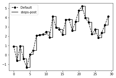
#在线形图中,非实际数据点默认是按线型方式插值的。可以通过drawstyle选项修改
data=np.random.randn(30).cumsum()
plt.plot(data,'ko--',label='Default')
[<matplotlib.lines.Line2D at 0x1566754bf60>]
plt.plot(data,'k-',drawstyle='steps-post',label='steps-post')
plt.legend(loc='best')
plt.show()
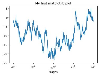
刻度、标签和图例
设置标题、轴标签、刻度以及刻度标签
fig=plt.figure()
ax=fig.add_subplot(1,1,1)
ax.plot(randn(1000).cumsum())
[<matplotlib.lines.Line2D at 0x15667734400>]
#要修改X轴的刻度,最简单的办法就是使用set_xticks和set_xticklabels
ticks=ax.set_xticks([0,250,500,750,1000])
labels=ax.set_xticklabels(['one','two','three','four','five'],rotation=30,fontsize='small')
ax.set_xlabel('Stages')
ax.set_title('My first matplotlib plot')
plt.show()
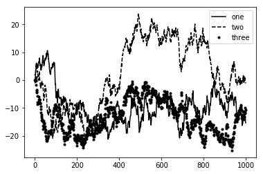
添加图例
fig=plt.figure()
ax=fig.add_subplot(1,1,1)
ax.plot(randn(1000).cumsum(),'k',label='one')
ax.plot(randn(1000).cumsum(),'k--',label='two')
ax.plot(randn(1000).cumsum(),'k.',label='three')
ax.legend(loc='best')
plt.show()
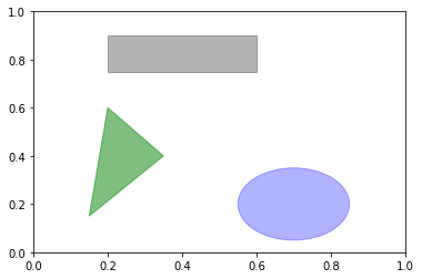
注解以及在Subplot上绘图
#text可以将文本绘制在图表的指定坐标(x,y)
ax.text(x,y,'Hello world',family='monospace',fontsize=10)
#在图表中添加一个图形,需要创建一个块对象shp,然后通过ax.add_patch(shp)将其添加到subplot中
fig=plt.figure()
ax=fig.add_subplot(1,1,1)
rect=plt.Rectangle((0.2,0.75),0.4,0.15,color='k',alpha=0.3)
circ=plt.Circle((0.7,0.2),0.15,color='b',alpha=0.3)
pgon=plt.Polygon([[0.15,0.15],[0.35,0.4],[0.2,0.6]],color='g',alpha=0.5)
ax.add_patch(rect)
ax.add_patch(circ)
ax.add_patch(pgon)
plt.show()
将图标保存到文件
plt.savefig('figpath.png',dpi=400,bbox_inches='tight')
#savefig并非一定要写入磁盘,也可以写入任何文件型的对象,比如StringIO
from io import StringIO
plt.savefig(buffer)
plot_data=buffer.getvaule()
#这对在Web上提供动态生成的图片是很实用的
matplotlib配置
#将全局的图形默认大小设置为10x10
plt.rc('figure',figsize=(10,10))
#将配置写成字典
font_opinions={'family':'monospace','weight':'bold','size':'samll'}
plt.rc('font',**font_options)
pandas中的绘图函数
提醒,关于这部分内容参考最新的pandas在线文档是最好的学习方式
线型图
#Series和DataFrame都有一个用于生成各类图表的plot方法,默认情况下,它们所生成的是线型图
from pandas import Series,DataFrame
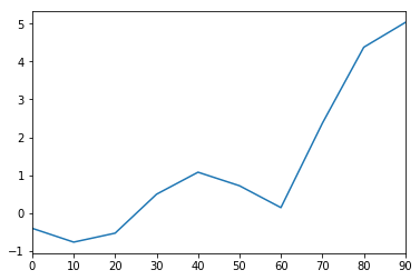
s=Series(randn(10).cumsum(),index=np.arange(0,100,10))
s.plot()
plt.show()
#该Series的索引值会被传给matplotlib,并用以绘制X轴。可以通过use_index=False禁用。X轴的刻度和界限可以通过xticks和xlim选项进行调节
#Y轴就用yticks和ylim
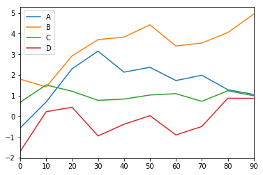
#pandas的大部分糊涂方法都有一个可选的ax参数,它可以是一个matplotlib的subplot对象,能使你在网络布局中更为灵活地处理subplot的位置
#DataFrame的plot方法会在一个subplot中为各列绘制一条线,并自动创建图例
df=DataFrame(randn(10,4).cumsum(0),columns=['A','B','C','D'],index=np.arange(0,100,10))
df.plot()
plt.show()
柱状图
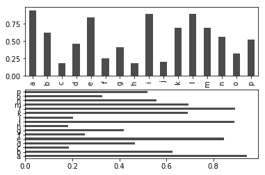
在生成线型图的代码中加上kind=‘bar’(垂直柱状图)或kind=’barh’(水平柱状图)即可生成柱状图,这时,Series和DataFrame的索引会被用作X(bar)或Y(barh)刻度
fig,axes=plt.subplots(2,1)
data=Series(np.random.rand(16),index=list('abcdefghijklmnop'))
data.plot(kind='bar',ax=axes[0],color='k',alpha=0.7)
data.plot(kind='barh',ax=axes[1],color='k',alpha=0.7)
plt.show()
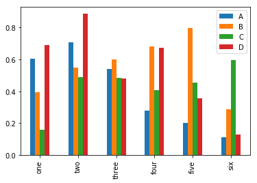
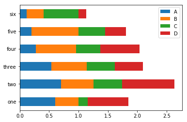
#对于DataFrame,柱状图会将每一行的值分为一组
df=DataFrame(np.random.rand(6,4),index=['one','two','three','four','five','six'],columns=['A','B','C','D'])
df
| A | B | C | D | |
|---|---|---|---|---|
| one | 0.605969 | 0.392503 | 0.159506 | 0.689187 |
| two | 0.706356 | 0.548750 | 0.489465 | 0.886399 |
| three | 0.539584 | 0.598980 | 0.482615 | 0.478261 |
| four | 0.277114 | 0.683394 | 0.407497 | 0.671090 |
| five | 0.201349 | 0.797898 | 0.454740 | 0.355270 |
| six | 0.113781 | 0.288068 | 0.597394 | 0.130346 |
df.plot(kind='bar')
plt.show()
df.plot(kind='barh',stacked=True)
plt.show()
#柱状图还有一个非常不错的用户:利用value_counts图形化显示Series中各值出现频率,比如s.value_counts().plot(kind='bar')
#小栗子
import pandas as pd
tips=pd.read_csv('ch08/tips.csv')
party_counts=pd.crosstab(tips.day,tips['size'])#如果通过tips.size,取到的是一整列的和
party_counts
| size | 1 | 2 | 3 | 4 | 5 | 6 |
|---|---|---|---|---|---|---|
| day | ||||||
| Fri | 1 | 16 | 1 | 1 | 0 | 0 |
| Sat | 2 | 53 | 18 | 13 | 1 | 0 |
| Sun | 0 | 39 | 15 | 18 | 3 | 1 |
| Thur | 1 | 48 | 4 | 5 | 1 | 3 |
party_counts=party_counts.ix[:,2:5]
#然后进行规格化,使得各行的和为1(必须转成浮点数)
party_pcts=party_counts.div(party_counts.sum(1).astype(float),axis=0)
party_pcts
| size | 2 | 3 | 4 | 5 |
|---|---|---|---|---|
| day | ||||
| Fri | 0.888889 | 0.055556 | 0.055556 | 0.000000 |
| Sat | 0.623529 | 0.211765 | 0.152941 | 0.011765 |
| Sun | 0.520000 | 0.200000 | 0.240000 | 0.040000 |
| Thur | 0.827586 | 0.068966 | 0.086207 | 0.017241 |
party_pcts.plot(kind='bar',stacked=True)
plt.show()
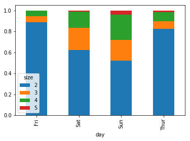
#通过该数据集可以看出,聚会规模则周末会变大
直方图和密度图
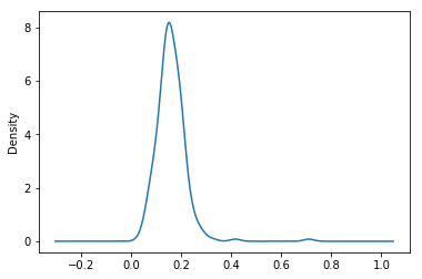
tips['tip_pct']=tips['tip']/tips['total_bill']
tips['tip_pct'].hist(bins=50)
plt.show()

#密度图 kind='kde'
tips['tip_pct'].plot(kind='kde')
plt.show()
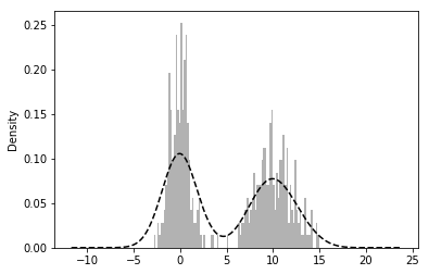
#接下来看一个由两个不同的标准正态分布组成的双峰分布
comp1=np.random.normal(0,1,size=200)#N(0,1)
comp2=np.random.normal(10,2,size=200)# (10,4)
values=Series(np.concatenate([comp1,comp2]))
values.hist(bins=100,alpha=0.3,color='k',normed=True)
values.plot(kind='kde',style='k--')
plt.show()
散布图
scatterplot观察两个一维数组序列之间关系的有效手段
macro=pd.read_csv('ch08/macrodata.csv')
data=macro[['cpi','m1','tbilrate','unemp']]
#选择其中几列,计算对数差
trans_data=np.log(data).diff().dropna()
trans_data[-5:]
| cpi | m1 | tbilrate | unemp | |
|---|---|---|---|---|
| 198 | -0.007904 | 0.045361 | -0.396881 | 0.105361 |
| 199 | -0.021979 | 0.066753 | -2.277267 | 0.139762 |
| 200 | 0.002340 | 0.010286 | 0.606136 | 0.160343 |
| 201 | 0.008419 | 0.037461 | -0.200671 | 0.127339 |
| 202 | 0.008894 | 0.012202 | -0.405465 | 0.042560 |
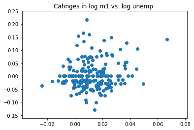
plt.scatter(trans_data['m1'],trans_data['unemp'])
plt.title('Cahnges in log %s vs. log %s '%('m1','unemp'))
plt.show()
pd.scatter_matrix(trans_data,diagonal='kde',alpha=0.3)
plt.show()
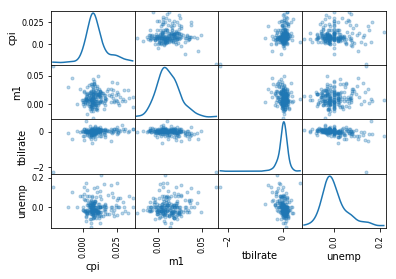
[外链图片转存失败,源站可能有防盗链机制,建议将图片保存下来直接上传(img-kt1cFQRl-1611151888881)(output_47_0.png)]
绘制地图:图形化显示海地地震危机数据
import pandas as pd
data=pd.read_csv('ch08/Haiti.csv')
data.head()
| Serial | INCIDENT TITLE | INCIDENT DATE | LOCATION | DESCRIPTION | CATEGORY | LATITUDE | LONGITUDE | APPROVED | VERIFIED | |
|---|---|---|---|---|---|---|---|---|---|---|
| 0 | 4052 | * URGENT * Type O blood donations needed in #J... | 05/07/2010 17:26 | Jacmel, Haiti | Birthing Clinic in Jacmel #Haiti urgently need... | 1. Urgences | Emergency, 3. Public Health, | 18.233333 | -72.533333 | YES | NO |
| 1 | 4051 | Food-Aid sent to Fondwa, Haiti | 28/06/2010 23:06 | fondwa | Please help food-aid.org deliver more food to ... | 1. Urgences | Emergency, 2. Urgences logistiqu... | 50.226029 | 5.729886 | NO | NO |
| 2 | 4050 | how haiti is right now and how it was during t... | 24/06/2010 16:21 | centrie | i feel so bad for you i know i am supposed to ... | 2. Urgences logistiques | Vital Lines, 8. Autr... | 22.278381 | 114.174287 | NO | NO |
| 3 | 4049 | Lost person | 20/06/2010 21:59 | Genoca | We are family members of Juan Antonio Zuniga O... | 1. Urgences | Emergency, | 44.407062 | 8.933989 | NO | NO |
| 4 | 4042 | Citi Soleil school | 18/05/2010 16:26 | Citi Soleil, Haiti | We are working with Haitian (NGO) -The Christi... | 1. Urgences | Emergency, | 18.571084 | -72.334671 | YES | NO |
data[['INCIDENT DATE','LATITUDE','LONGITUDE']][:10]
| INCIDENT DATE | LATITUDE | LONGITUDE | |
|---|---|---|---|
| 0 | 05/07/2010 17:26 | 18.233333 | -72.533333 |
| 1 | 28/06/2010 23:06 | 50.226029 | 5.729886 |
| 2 | 24/06/2010 16:21 | 22.278381 | 114.174287 |
| 3 | 20/06/2010 21:59 | 44.407062 | 8.933989 |
| 4 | 18/05/2010 16:26 | 18.571084 | -72.334671 |
| 5 | 26/04/2010 13:14 | 18.593707 | -72.310079 |
| 6 | 26/04/2010 14:19 | 18.482800 | -73.638800 |
| 7 | 26/04/2010 14:27 | 18.415000 | -73.195000 |
| 8 | 15/03/2010 10:58 | 18.517443 | -72.236841 |
| 9 | 15/03/2010 11:00 | 18.547790 | -72.410010 |
#CATEGORY字段含有一组以逗号分隔的代码,这些代码表示消息的类型
data['CATEGORY'][:6]
0          1. Urgences | Emergency, 3. Public Health,
1    1. Urgences | Emergency, 2. Urgences logistiqu...
2    2. Urgences logistiques | Vital Lines, 8. Autr...
3                            1. Urgences | Emergency,
4                            1. Urgences | Emergency,
5                       5e. Communication lines down,
Name: CATEGORY, dtype: object
data.describe()
| Serial | LATITUDE | LONGITUDE | |
|---|---|---|---|
| count | 3593.000000 | 3593.000000 | 3593.000000 |
| mean | 2080.277484 | 18.611495 | -72.322680 |
| std | 1171.100360 | 0.738572 | 3.650776 |
| min | 4.000000 | 18.041313 | -74.452757 |
| 25% | 1074.000000 | 18.524070 | -72.417500 |
| 50% | 2163.000000 | 18.539269 | -72.335000 |
| 75% | 3088.000000 | 18.561820 | -72.293570 |
| max | 4052.000000 | 50.226029 | 114.174287 |
#清除错误位置信息并移除缺失分类信息
data=data[(data.LATITUDE>18)&(data.LATITUDE<20)&(data.LONGITUDE>-75)
&(data.LONGITUDE<-70)&(data.CATEGORY.notnull())]
def to_cat_list(catstr):
    stripped=(x.strip() for x in catstr.split(','))
    return [x for x in stripped if x]
def get_all_categories(cat_series):
    cat_sets=(set(to_cat_list(x)) for x in cat_series)
    return sorted(set.union(*cat_sets))
def get_english(cat):
    code,names=cat.split('.')
    if '|' in names:
        names=names.split('|')[1]
    return code,names.strip()
get_english('2.  Urgences logistique |Vital Lines')
('2', 'Vital Lines')
#做一个将编码跟名称映射起来的字典,我们用编码进行分析
all_cats=get_all_categories(data.CATEGORY)
#生成器表达式
english_mapping=dict(get_english(x) for x in all_cats)
english_mapping['2a']
'Food Shortage'
english_mapping['6c']
'Earthquake and aftershocks'
#抽取出唯一的分类编码,构造一个权零DataFrame
from pandas import DataFrame
def get_code(seq):
    return [x.split('.')[0] for x in seq if x]
all_codes=get_code(all_cats)
code_index=pd.Index(np.unique(all_codes))
dummy_frame=DataFrame(np.zeros((len(data),len(code_index))),index=data.index,columns=code_index)
dummy_frame.head()
| 1 | 1a | 1b | 1c | 1d | 2 | 2a | 2b | 2c | 2d | ... | 7c | 7d | 7g | 7h | 8 | 8a | 8c | 8d | 8e | 8f | |
|---|---|---|---|---|---|---|---|---|---|---|---|---|---|---|---|---|---|---|---|---|---|
| 0 | 0.0 | 0.0 | 0.0 | 0.0 | 0.0 | 0.0 | 0.0 | 0.0 | 0.0 | 0.0 | ... | 0.0 | 0.0 | 0.0 | 0.0 | 0.0 | 0.0 | 0.0 | 0.0 | 0.0 | 0.0 |
| 4 | 0.0 | 0.0 | 0.0 | 0.0 | 0.0 | 0.0 | 0.0 | 0.0 | 0.0 | 0.0 | ... | 0.0 | 0.0 | 0.0 | 0.0 | 0.0 | 0.0 | 0.0 | 0.0 | 0.0 | 0.0 |
| 5 | 0.0 | 0.0 | 0.0 | 0.0 | 0.0 | 0.0 | 0.0 | 0.0 | 0.0 | 0.0 | ... | 0.0 | 0.0 | 0.0 | 0.0 | 0.0 | 0.0 | 0.0 | 0.0 | 0.0 | 0.0 |
| 6 | 0.0 | 0.0 | 0.0 | 0.0 | 0.0 | 0.0 | 0.0 | 0.0 | 0.0 | 0.0 | ... | 0.0 | 0.0 | 0.0 | 0.0 | 0.0 | 0.0 | 0.0 | 0.0 | 0.0 | 0.0 |
| 7 | 0.0 | 0.0 | 0.0 | 0.0 | 0.0 | 0.0 | 0.0 | 0.0 | 0.0 | 0.0 | ... | 0.0 | 0.0 | 0.0 | 0.0 | 0.0 | 0.0 | 0.0 | 0.0 | 0.0 | 0.0 |
5 rows × 45 columns
#将各行中适当的项设置为1,然后再与data进行连接
for row,cat in zip(data.index,data.CATEGORY):
    codes=get_code(to_cat_list(cat))
    dummy_frame.ix[row][codes]=1
data=data.join(dummy_frame.add_prefix('category_'))
data.head()
| Serial | INCIDENT TITLE | INCIDENT DATE | LOCATION | DESCRIPTION | CATEGORY | LATITUDE | LONGITUDE | APPROVED | VERIFIED | ... | category_7c | category_7d | category_7g | category_7h | category_8 | category_8a | category_8c | category_8d | category_8e | category_8f | |
|---|---|---|---|---|---|---|---|---|---|---|---|---|---|---|---|---|---|---|---|---|---|
| 0 | 4052 | * URGENT * Type O blood donations needed in #J... | 05/07/2010 17:26 | Jacmel, Haiti | Birthing Clinic in Jacmel #Haiti urgently need... | 1. Urgences | Emergency, 3. Public Health, | 18.233333 | -72.533333 | YES | NO | ... | 0.0 | 0.0 | 0.0 | 0.0 | 0.0 | 0.0 | 0.0 | 0.0 | 0.0 | 0.0 |
| 4 | 4042 | Citi Soleil school | 18/05/2010 16:26 | Citi Soleil, Haiti | We are working with Haitian (NGO) -The Christi... | 1. Urgences | Emergency, | 18.571084 | -72.334671 | YES | NO | ... | 0.0 | 0.0 | 0.0 | 0.0 | 0.0 | 0.0 | 0.0 | 0.0 | 0.0 | 0.0 |
| 5 | 4041 | Radio Commerce in Sarthe | 26/04/2010 13:14 | Radio Commerce Shelter, Sarthe | i'm Louinel from Sarthe. I'd to know what can ... | 5e. Communication lines down, | 18.593707 | -72.310079 | YES | NO | ... | 0.0 | 0.0 | 0.0 | 0.0 | 0.0 | 0.0 | 0.0 | 0.0 | 0.0 | 0.0 |
| 6 | 4040 | Contaminated water in Baraderes. | 26/04/2010 14:19 | Marc near Baraderes | How do we treat water in areas without Pipe?\t... | 4. Menaces | Security Threats, 4e. Assainissem... | 18.482800 | -73.638800 | YES | NO | ... | 0.0 | 0.0 | 0.0 | 0.0 | 0.0 | 0.0 | 0.0 | 0.0 | 0.0 | 0.0 |
| 7 | 4039 | Violence at "arcahaie bas Saint-Ard" | 26/04/2010 14:27 | unable to find "arcahaie bas Saint-Ard&qu... | Goodnight at (arcahaie bas Saint-Ard) 2 young ... | 4. Menaces | Security Threats, | 18.415000 | -73.195000 | YES | NO | ... | 0.0 | 0.0 | 0.0 | 0.0 | 0.0 | 0.0 | 0.0 | 0.0 | 0.0 | 0.0 |
5 rows × 55 columns
from mpl_toolkits.basemap import Basemap
def basic_haiti_map(ax=None,lllat=17.25,urlat=20.25,lllon=-75.0,urlon=-71.0):
    #创建极球面投影Basemap实例
    m=Basemap(ax=ax,projection='stere',lon_0=(urlon+lllon)/2,
              lat_0=(urlat+lllat)/2,llcrnrlat=lllat,
              urcrnrlat=urlat,llcrnrlon=lllon,urcrnrlon=urlon,resolution='f')
    #绘制海岸线,州界、国界以及地图边界
    m.drawcoastlines()
    m.drawstates()
    m.drawcounties()
    return m
#对于每一个分类,在数据集中找到对应的坐标,并在适当的subplot中绘制一个Basemap,转换坐标,然后通过Basemap的plot方法绘制点
fig,axes=plt.subplots(nrows=2,ncols=2,figsize=(12,10))
fig.subplots_adjust(hspace=0.05,wspace=0.05)
to_plot=['2a','1','3c','7a']
lllat=17.25
urlat=20.25
lllon=-75
urlon=-71
for code,ax in zip(to_plot,axes.flat):
    m=basic_haiti_map(ax,lllat=lllat,urlat=urlat,lllon=lllon,urlon=urlon)
    cat_data=data[data['category_%s' % code]==1]
    #计算地图的投影坐标
    x,y=m(list(cat_data.LONGITUDE),list(cat_data.LATITUDE))
    m.plot(x,y,'k.',alpha=0.5)
    ax.set_title('%s:%s' % (code,english_mapping[code]))
plt.show()
最后的地图由于软件原因没有显示出来,读者可以参考原书的相关章节


 3473
3473


 到【灌水乐园】发言


