


前言
大家好。之前给大家分享关于pandas的实战教程、python可视化教程,干货满满:
如果你想要系统和深入地了解学习pandas的语法和python可视化技巧,可以查看上面的文章。如果对你有帮助,还请关注下面公众号点赞关注转发~
之前给大家分享Pandas+PtitPrince: 小小“云雨图”可视化,轻松拿捏!,今天给大家分享瀑布图可视化技巧, 专门用于展示某数据在一系列变化后累积效果趋势的图表。本文提供对应的python可视化代码,轻松实现瀑布图可视化,小白也能快速实现,干货满满。如果对你有帮助,还请点赞关注转发~
本文涉及python各个库版本信息如下:
# !pip install mpl_font==1.1.0 import pandas as pd from matplotlib import pyplot as plt import mpl_font.noto import numpy as np import os import matplotlib as mpl import matplotlib.pyplot as plt import matplotlib.ticker as tick import seaborn as sns from matplotlib.ticker import FuncFormatter import warnings warnings.filterwarnings("ignore") # 完全屏蔽所有警告 %matplotlib inline print("matplotlib: ", mpl.__version__ ) # matplotlib: 3.7.5 print("pandas: ", pd.__version__) # pandas: 2.2.0 print("seaborn: ", sns.__version__) # seaborn: 0.12.2
本文目录
-
什么是瀑布图,一般用来干什么?
-
使用matplotlib库来绘制瀑布图
-
编写瀑布图的python函数
-
瀑布图精美可视化展示
-
参考文档
-
z先生说
什么是瀑布图,一般用来干什么?
瀑布图(Waterfall Chart)是一种专门用于表现数据在一系列变化后累积效果的图表类型,它通过一连串的垂直条形来可视化数据随时间或其他顺序变量的变化过程,尤其强调从一个初始值到最终值之间每个阶段对总体数值的贡献或影响。这种图表因其形态类似瀑布流水逐级递进或退减而得名。瀑布图的具体用处如下:
-
追踪变化过程:非常适合展示某个总量如何被不同的部分(如收入、支出、成本、利润等)逐步累加或减少的过程,从而清晰地看出哪些环节对总量产生了正向或负向的影响。
-
财务分析:在财务报表分析中广泛应用,比如展示一家公司在一段时间内净利润的变化情况,依次列出销售收入、成本、税金、运营费用和其他收支项,以揭示最终盈利是如何形成的。
-
项目管理:在项目管理领域,可用于追踪预算执行情况,说明项目的初期预算、各项花费、追加投入以及可能地节约款项,进而体现整个项目预算的执行轨迹。
在视觉上,瀑布图的每个“台阶”(柱形)代表一个数据点,通常会用桥接线(connector lines)把连续的柱形连接起来,以便用户更容易地跟踪累积值的演变过程。正值柱形向上延伸,负值柱形向下延伸,使得整个图形呈现出“瀑布”式的上升或下降效果。
使用matplotlib库来绘制瀑布图
编写瀑布图的python函数
def waterfall_chart(pf, col_name, ax=None,Title="", x_lab="", y_lab="", formatting = "{:,.1f}", green_color='#29EA38', red_color='#FB3C62', blue_color='#24CAFF', other_label='other', net_label='net', rotation_value = 30): #define format formatter def money(x, pos): 'The two args are the value and tick position' return formatting.format(x) formatter = FuncFormatter(money) if ax: fig = ax.get_figure() else: fig, ax = plt.subplots() ax.yaxis.set_major_formatter(formatter) #Store data and create a blank series to use for the waterfall trans = pf.copy() blank = trans[col_name].cumsum().shift(1).fillna(0) trans['positive'] = trans[col_name] > 0 #Get the net total number for the final element in the waterfall total = trans.sum()[col_name] trans.loc[net_label]= total blank.loc[net_label] = total #The steps graphically show the levels as well as used for label placement step = blank.reset_index(drop=True).repeat(3).shift(-1) step[1::3] = np.nan #When plotting the last element, we want to show the full bar, #Set the blank to 0 blank.loc[net_label] = 0 #define bar colors for net bar trans.loc[trans['positive'] > 1, 'positive'] = 99 trans.loc[trans['positive'] < 0, 'positive'] = 99 trans.loc[(trans['positive'] > 0) & (trans['positive'] < 1), 'positive'] = 99 trans['color'] = trans['positive'] trans.loc[trans['positive'] == 1, 'color'] = green_color trans.loc[trans['positive'] == 0, 'color'] = red_color trans.loc[trans['positive'] == 99, 'color'] = blue_color my_colors = list(trans.color) #Plot and label my_plot = ax.bar(range(0,len(trans.index)), blank, width=0.5, color='white') ax.bar(range(0,len(trans.index)), trans[col_name], width=0.6, bottom=blank, color=my_colors) #axis labels ax.set_xlabel(x_lab) ax.set_ylabel(y_lab) #Get the y-axis position for the labels y_height = trans[col_name].cumsum().shift(1).fillna(0) temp = list(trans[col_name]) # create dynamic chart range for i in range(len(temp)): if (i > 0) & (i < (len(temp) - 1)): temp[i] = temp[i] + temp[i-1] trans['temp'] = temp plot_max = trans['temp'].max() plot_min = trans['temp'].min() #Make sure the plot doesn't accidentally focus only on the changes in the data if all(i >= 0 for i in temp): plot_min = 0 if all(i < 0 for i in temp): plot_max = 0 if abs(plot_max) >= abs(plot_min): maxmax = abs(plot_max) else: maxmax = abs(plot_min) pos_offset = maxmax / 40 plot_offset = maxmax / 15 ## needs to me cumulative sum dynamic #Start label loop loop = 0 for index, row in trans.iterrows(): # For the last item in the list, we don't want to double count if loop == trans.shape[0] - 1: y = y_height[loop] if row[col_name] > 0: y += (pos_offset*3) else: y -= (pos_offset*5) color = blue_color else: y = y_height[loop] + row[col_name] # Determine if we want a neg or pos offset if row[col_name] > 0: y += (pos_offset* 3) color = green_color else: y -= (pos_offset* 5) color = red_color ax.annotate(formatting.format(row[col_name]),(loop,y),ha="center", color = color, fontsize=9) loop += 1 #Scale up the y axis so there is room for the labels ax.set_ylim(plot_min-round(3.6*plot_offset, 7),plot_max+round(3.6*plot_offset, 7)) #Rotate the labels ticks = ax.set_xticks(range(0,len(trans))) ax.set_xticklabels(trans.index, rotation=rotation_value) #add zero line and title ax.axhline(0, color='black', linewidth = 0.6, linestyle="dashed") ax.set_title(Title) ax.spines["top"].set_visible(False) ax.spines["right"].set_visible(False) plt.tight_layout() return ax
瀑布图精美可视化展示
index = ['初始值','1月份','2月份','3月份','4月份','5月份'] b = [10,-30,-7.5,-25,95,-7] pf= pd.DataFrame(data={'A' : b},index=index) pf['B'] = [20,10,-40,30,20,-10] import mpl_font.noto fig,axes = plt.subplots(2,1, figsize=(8,6), dpi=144) ax = axes[0] ax = waterfall_chart(pf,col_name='A', ax=ax, formatting='{:,.2f}', rotation_value=0, net_label='最终值', Title='瀑布图可视化展示', x_lab='月份', y_lab='产量' ) ax = axes[1] ax = waterfall_chart(pf,col_name='B', ax=ax, formatting='{:,.2f}', rotation_value=0, net_label='最终值', Title='瀑布图可视化展示', x_lab='月份', y_lab='产量', green_color='#4BC0E7', red_color='#A07AED', blue_color='#C04BE7', ) plt.show()
可视化展示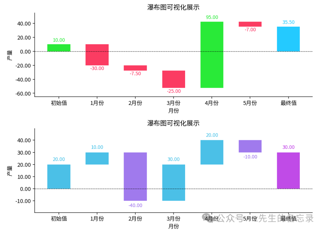
点击下方安全链接前往获取
👉Python实战案例👈
光学理论是没用的,要学会跟着一起敲,要动手实操,才能将自己的所学运用到实际当中去,这时候可以搞点实战案例来学习。


👉Python书籍和视频合集👈
观看零基础学习视频,看视频学习是最快捷也是最有效果的方式,跟着视频中老师的思路,从基础到深入,还是很容易入门的。

👉Python副业创收路线👈
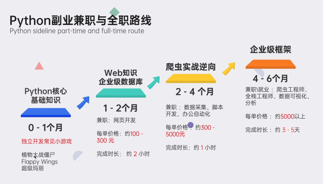
这些资料都是非常不错的,朋友们如果有需要《Python学习路线&学习资料》,点击下方安全链接前往获取
本文转自网络,如有侵权,请联系删除。


 759
759

 被折叠的 条评论
为什么被折叠?
被折叠的 条评论
为什么被折叠?
 到【灌水乐园】发言


