


 本文介绍了一种封装Matplotlib的方法,以简化折线图、柱状图及组合图的绘制过程,并展示了如何快速添加数据标签和其他图表元素。
最近使用matplotlib中折线图和柱状图比较多,但是每次都要添加数据标签和坐标轴等等很麻烦,所以加工封装了一下matplotlib,方便调用。
效果展示
一、带数据标签和标记的折线图
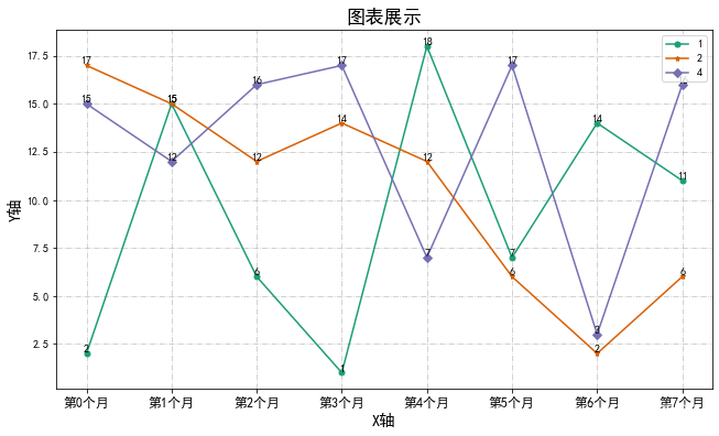
多条折线
m.plots(lines=[value1,value2,value3],labels=['1','2','4'],xlabel='X轴',ylabel='Y轴',xticks=[f'第{

     t}个月' for t in range(8)])
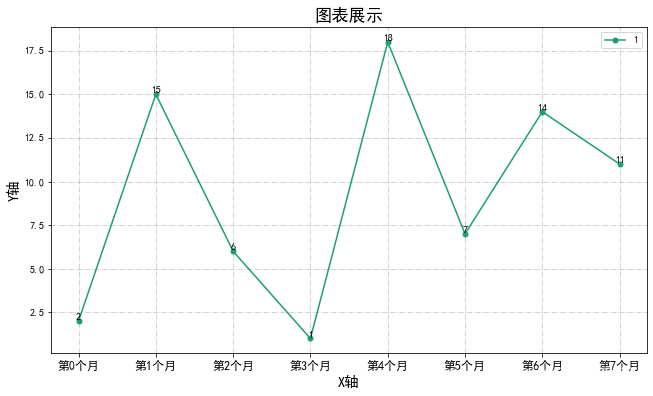
单个折线
m.plots(lines=value1,labels='1',only_one_plot=True,xlabel='X轴',ylabel='Y轴',xticks=[f'第{

     t}个月' for t in range(8)])
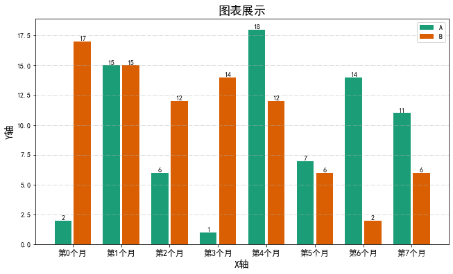
二、带数据标签的柱状图
m.bars([value1,value2],['A','B'],num_of_bar=2,xlabel='X轴',ylabel='Y轴',xticks=[f'第{

     t}个月' for t in range(8)])
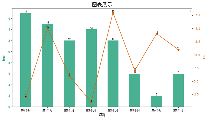
三、折线和柱状组合图
项目代码
class Mat_plus:
    plt.rcParams['font.sans-serif'] = ['SimHei']  # 步骤一(替换sans-serif字体)
    plt.rcParams['axes.unicode_minus'] = False  # 步骤二(解决坐标轴负数的负号显示问题)
    def __init__(self, title, figsize=(32 / 3, 6), colors=cm.Dark2,round_num = 3):
        '''
        title:图表标题
        figsize:图表大小
        colors:配色方案
        round_num:标签小数点个数
        '''
        self.figsize = figsize
        self.colors = colors
        self.title = title
        self.round_num = round_num
    #         pass
    def bars(self, bars, labels = None, only_one_bar=True, xlabel=None, ylabel=None, xticks=None):
        '''
        bars:list 多个或一个柱状图
        labels:和bar对应的标签
        only_one_bar:是否只有一个bar
        xlabel:x轴标签
        ylabel:y轴标签
        xticks:x轴标注
        '''
        plt.figure(figsize=self.figsize)
        if only_one_bar == True:
            x = np.arange(len(bars))
            plt.bar(x, bars,color = self.colors(0),label =labels,width=0.6)
            for i in x:
                plt.text(i,bars[i],round(bars[i],self.round_num),va = 'bottom',ha = 'center')
            plt.grid(ls='-.', alpha=0.7)
        else:
            max_index = np.array([len(i) for i in bars]).max()
            x = np.arange(max_index)
            adjust_dict = {

   2:([-0.2,0.2]<
最低0.47元/天 解锁文章


 331
331

 被折叠的 条评论
为什么被折叠?
被折叠的 条评论
为什么被折叠?
 到【灌水乐园】发言


