


 本文介绍了HTML卡片样式的创建过程,详细探讨了CSS3的box-shadow属性,包括前两个参数的阴影效果,第三个参数的模糊距离,第四个参数的阴影扩展,以及如何设置阴影颜色和实现圆角效果。同时,还提到了将图片置于卡片上方,文字置于下方的布局技巧。
参考:
https://www.runoob.com/cssref/css3-pr-box-shadow.html

先看前两个参数的效果:
<!DOCTYPE html>
<html lang="en">
<head>
    <meta charset="UTF-8">
    <title>卡片效果</title>

    <style type="text/css">
        #card{
			width: 150px;
			height: 200px;
			box-shadow: 10px 10px ;
            font-size: 40px;
			text-align: center;
			background-color: #aaa;
		}
    </style>
</head>

<body>
    <div id="card">
		卡片
    </div>
</body>

</html>
再看第三个参数:
    <style type="text/css">
        #card{
			width: 150px;
			height: 200px;
			box-shadow: 10px 10px 10px;
            font-size: 40px;
			text-align: center;
			background-color: #aaa;
		}
    </style>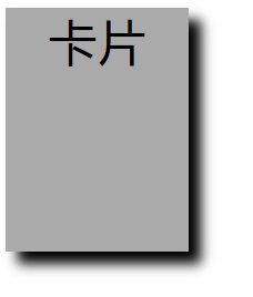
再看第四个参数:
box-shadow: 10px 10px 10px 10px;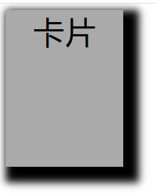
第五个参数 ,颜色:
box-shadow: 10px 10px 10px 10px #f00;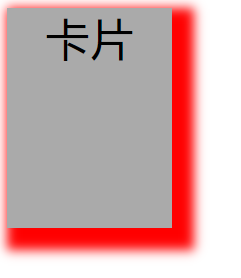
改成白色:
    <style type="text/css">
        #card{
			position:absolute;
			left:50%;
			top:50%;
			width: 150px;
			height: 200px;
			box-shadow: 0 4px 8px 0 #aaa;
            font-size: 40px;
			text-align: center;
			background-color: #fff;
		}
</style> 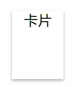
加上圆角:
    <style type="text/css">
        #card{
			position:absolute;
			left:50%;
			top:50%;
			width: 150px;
			height: 200px;
			box-shadow: 0 4px 8px 0 #aaa;
            font-size: 40px;
			text-align: center;
			background-color: #fff;
			border-radius: 5%;
		}
    </style>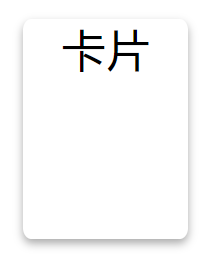
上图片 下文字:
<!DOCTYPE html>
<html lang="en">
<head>
    <meta charset="UTF-8">
    <title>卡片效果</title>

    <style type="text/css">
        #card{
			position:absolute;
			left:50%;
			top:50%;
			width: 150px;
			height: 200px;
			box-shadow: 0 4px 8px 0 #aaa;
            font-size: 40px;
			text-align: center;
			background-color: #fff;
			border-radius: 3%;
		}

		#imgdemo {
			width: 90%;
            padding: 5px;
		}

        #cardtext{
            padding: 2%;
            font-size: 10px;
        }
    </style>
</head>

<body>
    <div id="card">
		<img id="imgdemo" src="https://ss1.baidu.com/9vo3dSag_xI4khGko9WTAnF6hhy/zhidao/pic/item/a9d3fd1f4134970ac9cd9f4e97cad1c8a7865d11.jpg"/>
		<div id="cardtext" >
            <p> Norway</p>
        </div>
    </div>
</body>

</html>


 扫一扫
扫一扫


 1011
1011

 被折叠的 条评论
为什么被折叠?
被折叠的 条评论
为什么被折叠?
 到【灌水乐园】发言


