


1、新建画布
1、tm,新建固定xy轴带网格空白画布还困扰我挺久的,网上资源比较乱,该实现代码整理如下:
import glob
import random
import matplotlib.pyplot as plt

def plt_point(x,y):
  plt.xlim(0,3840) #x坐标轴范围-10~10
  plt.ylim(0,2160)
  #第一个参数为标记文本,第二个参数为标记对象的坐标,第三个参数为标记位置
  #plt.annotate('', xy=(2,2), xytext=(500,500))
  plt.grid()#网格线显示
  plt.savefig('point.jpg')
  plt.show()
plt_point(x,y)
效果:

2、 绘制符号
2、在固定坐标画点、画“#”符号
import matplotlib.pyplot as plt
#生成点(750,1450)
x = 750
y = 1450
plt.xlim(0, 3840) # x坐标轴范围-10~10
plt.ylim(0, 2160)
#生成“#”
# 第一个参数为标记文本,第二个参数为标记对象的坐标,第三个参数为标记位置
plt.annotate('#', color="green",xy=(3, 3), xytext=(1000, 300))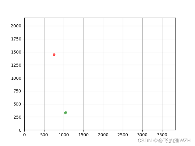
plt.scatter(x,y,s=100, c='r', marker='.', alpha=0.65)
plt.grid() # 网格线显示
plt.savefig('point.jpg')
效果:

3、sin函数
3、画正弦函数(s = sin2pit,并用红色箭头标记(2.25,1)取最大值
import numpy as np
import matplotlib.pyplot as plt

fig, ax = plt.subplots()

# 绘制一个正弦曲线
t = np.arange(0.0, 5.0, 0.01)
s = np.sin(2*np.pi*t)
line, = ax.plot(t, s,color="green", lw=2)

# 绘制一个红色,两端缩进的箭头
ax.annotate('local max', xy=(2.25, 1), xytext=(3, 1.5),
            xycoords='data',
            arrowprops=dict(facecolor='red', shrink=0.05)
            )
#y轴坐标范围
ax.set_ylim(-3, 3)
结果:

annotate()用法参考博主:
添加链接描述
4、sigmoid激活函数
4、画固定函数(Sigmoid激活函数为例,并与3函数合并效果),并用特殊符号、字母标记
代码:
import math
import numpy as np
import matplotlib.pyplot as plt
x = np.arange(-8,8)
a=np.array(x)
#---------Sigmoid-------------------
y1=1/(1+math.e**(-x))
#----------Deriv.Sigmoid------------------
y2=math.e**(-x)/((1+math.e**(-x))**2)
#---------sin函数t只取(0.5.0)---
t = np.arange(0.0, 5.0, 0.01)
#s = np.sin(2*np.pi*t)
s = np.sin(t)

plt.xlim(-9,9)
ax = plt.gca()                                            # get current axis 获得坐标轴对象
ax.spines['right'].set_color('none')
ax.spines['top'].set_color('none')         # 将右边 上边的两条边颜色设置为空 其实就相当于抹掉这两条边
ax.xaxis.set_ticks_position('bottom')
ax.yaxis.set_ticks_position('left')          # 指定下边的边作为 x 轴   指定左边的边为 y 轴
ax.spines['bottom'].set_position(('data', 0))   #指定 data  设置的bottom(也就是指定的x轴)绑定到y轴的0这个点上
ax.spines['left'].set_position(('data', 0))
ax.annotate('local intersect', xy=(-2.5, 0.1), xytext=(-5.0, 0.6),
            xycoords='data',
            arrowprops=dict(facecolor='yellow', shrink=0.1)
            )
plt.plot(x,y1,label='Sigmoid',linestyle="-", color="blue")#label为标签
plt.plot(x,y2,label='Deriv.Sigmoid',linestyle="--", color="red")#l
ax.annotate('local max', xy=(1.57, 1), xytext=(2, 0.5),
            xycoords='data',
            arrowprops=dict(facecolor='red', shrink=0.05)
            )
plt.plot(t,s,label='sin',linestyle="--", color="green")#l
#plt.legend(loc=0,ncol=2)
plt.legend(['Sigmoid','Deriv.Sigmoid','sin'])

plt.savefig('plot_test.png', dpi=500) #指定分辨率


plt.show()
效果:

5、relu激活函数
5、relu激活函数
fig =  plt.figure(figsize=(6,4))
ax = fig.add_subplot(111)
x = np.arange(-10,10)
y = np.where(x<0,0,x) # 小于0输出0,大于0输出y
plt.xlim(-11,11)
plt.ylim(-11,11)

ax = plt.gca() # 获得当前axis坐标轴对象
ax.spines['right'].set_color('none') # 去除右边界线
ax.spines['top'].set_color('none') # 去除上边界线

ax.xaxis.set_ticks_position('bottom') # 指定下边的边作为x轴
ax.yaxis.set_ticks_position('left') # 指定左边的边为y轴

ax.spines['bottom'].set_position(('data',0)) # 指定data 设置的bottom(也就是指定的x轴)绑定到y轴的0这个点上
ax.spines['left'].set_position(('data',0))  # 指定y轴绑定到x轴的0这个点上
ax.annotate('local inflection point', xy=(0, 0), xytext=(-4, 5),
            xycoords='data',
            arrowprops=dict(facecolor='black', shrink=0.05),# 箭头线为黑色,两端缩进5%
            horizontalalignment='left',# 注释文本的左端和低端对齐到指定位置
            verticalalignment='bottom',

            )
plt.plot(x,y,label = 'ReLU',linestyle='-',color='darkviolet')
plt.legend(['ReLU'])
plt.savefig('relu.png')

plt.show()
结果:

6、Tanh激活函数图像
6、画Tanh激活函数图像
import numpy as np
import matplotlib.pyplot as plt
import math
import numpy as np

#------绘制Tanh激活函数图像代码-------
x = np.arange(-10,10)
a = np.array(x)
y = (math.e**(x) - math.e**(-x)) / (math.e**(x) + math.e**(-x))

plt.xlim(-11,11)
ax = plt.gca()
ax.spines['right'].set_color('none')
ax.spines['top'].set_color('none')

ax.xaxis.set_ticks_position('bottom')
ax.yaxis.set_ticks_position('left')

ax.spines['bottom'].set_position(('data',0))
ax.spines['left'].set_position(('data',0))
plt.plot(x,y,label='Tanh',linestyle='-',color='green')
plt.legend(['Tanh'])
plt.savefig('Tanh.png',dpi=500) # 指定分辨率
plt.show()
结果:


 被折叠的 条评论
为什么被折叠?
被折叠的 条评论
为什么被折叠?
 到【灌水乐园】发言


