


 本文详细介绍Python绘图库Matplotlib及Seaborn的实用绘图技巧,包括bar图、曲线图、散点图、热图等各类图表绘制方法,以及如何调整坐标轴、添加网格线、自定义背景和拟合函数,适用于数据可视化需求。
目录
4.Python绘图库Matplotlib.pyplot之网格线设置(plt.grid())
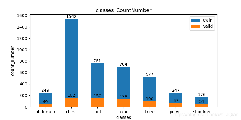
1、隔段的bar绘图
import os
from matplotlib import pyplot as plt

def num_count(input_path):
    body_name=['abdomen','chest','hand','knee','foot','pelvis','shoulder']
    body_num=[249,1542,704,527,761,247,176]

    # for f in os.listdir(input_path):
    #     dcm_path = os.path.join(input_path, f)
    #     #print(f)
    #     body_name.append(f)
    #
    #     num=0
    #     for file in os.listdir(dcm_path):
    #         pic_path = os.path.join(input_path, file)
    #         #print(pic_path)
    #         num+=1
    #     print("%s sum_num=%d "%(f,num))
    #     body_num.append(num)

    bar_width = 0.3
    valid_num=[49,162,138,100,150,67,54]
    fig = plt.figure(figsize=(8, 4))
    plt.title("classes_CountNumber")
    plt.xlabel("classes")
    plt.ylabel("count_number")
    plt.bar(body_name, body_num,width=0.5, label="train",align='center')

    plt.bar(body_name , valid_num, width=0.5, label="valid", align="center")
    # 添加数据标签
    for a, b in zip(body_name, body_num):
        plt.text(a, b + 0.05, '%.0f' % b, ha='center', va='bottom', fontsize=10)
    for a, b in zip(body_name, valid_num):
        plt.text(a, b + 0.05, '%.0f' % b, ha='center', va='bottom', fontsize=10)

    # 添加图例
    plt.legend()
    plt.savefig("class_number.png")
    plt.show()

if __name__ == "__main__":

    input_path = r"F:\image_gen/"
    num_count(input_path)
展示如下:
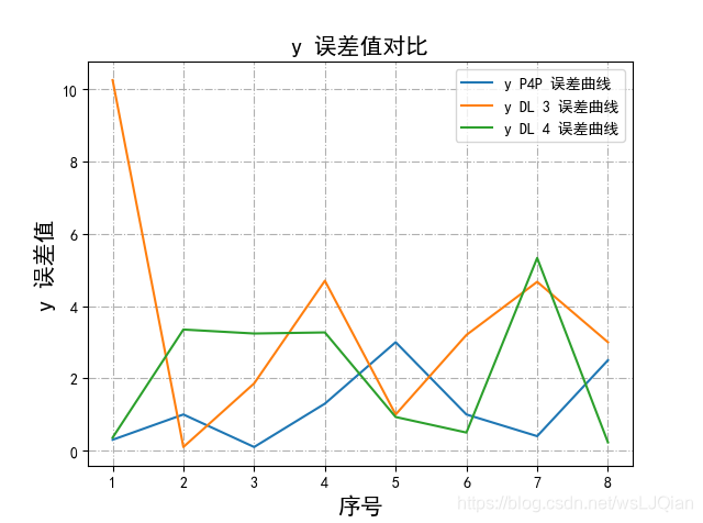
2、显示中文字符的曲线绘制
import matplotlib.pyplot as plt

plt.rcParams['font.sans-serif']=['SimHei','Times New Roman'] # 用来正常显示中文标签
plt.rcParams['axes.unicode_minus']=False

x1=range(1,9)
y1=[0.3, 1, 0.1, 1.3, 3, 1, 0.4, 2.5]

x2=range(1,9)
y2=[10.25, 0.1, 1.86, 4.7, 1, 3.2, 4.67, 3]

x3=range(1,9)
y3=[0.36, 3.35, 3.24, 3.27, 0.93, 0.5, 5.33, 0.23]


#plt.plot(x1,y1,label='x truth line',linewidth=3,color='r',marker='o', markerfacecolor='blue',markersize=12)
plt.plot(x1,y1,label='y P4P 误差曲线')
plt.plot(x2,y2,label='y DL 3 误差曲线')
plt.plot(x3,y3,label='y DL 4 误差曲线')

plt.xlabel('序号',fontsize=15)
plt.ylabel('y 误差值',fontsize=15)
plt.title('y 误差值对比',fontsize=15)
plt.legend()
plt.show()
展示如下:

技能添加:python画图x轴文字斜着:
plt.xticks(rotation=70) # 倾斜70度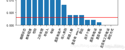
参考:python画图x轴文字斜着_mohana48833985的博客-优快云博客_python柱状图横坐标文字倾斜
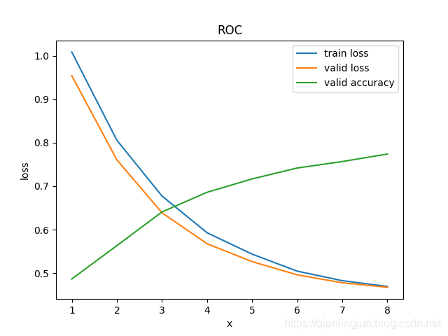
3、需要注意的内容
注意新绘制图的时候,加上plt.figure(),否则会出现如下的错误
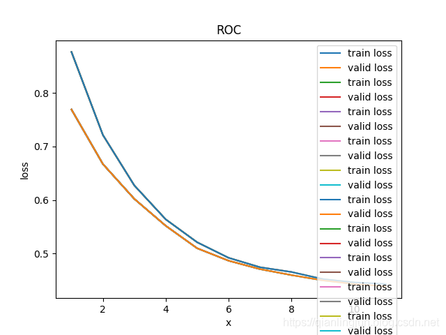
加上plt.figure()之后,完整代码如下(两个图在一起的,前面有,就不赘述了,相信你明白)
def draw_png(list_x,list_y,name):
    plt.figure()
    plt.plot(list_x, list_y, label=name)

    plt.xlabel("epoch")
    plt.ylabel(name)
    # plt.title("ROC")
    plt.legend(loc="upper right")
    plt.savefig(r"./records/" + name + ".png")
结果就正常了,如下
import numpy as np
import matplotlib.pyplot as plt

doctor_means = (0.914,0.86,0.832,0.884,0.886,0.953)
ai_means = (0.924,0.884,0.908,0.93,0.935,0.953)

ind = np.arange(len(doctor_means))  # the x locations for the groups
width = 0.15  # the width of the bars

fig, ax = plt.subplots(figsize=(10, 8))
rects1 = ax.bar(ind - width / 2, doctor_means, width, color='SkyBlue', label='doctor')
rects2 = ax.bar(ind + width / 2, ai_means, width, color='IndianRed', label='doctor+AI')

# 为每个条形图添加数值标签
for x1,y1 in enumerate(doctor_means):
    plt.text(x1-0.1, y1, y1,ha='center',fontsize=10)
for x2,y2 in enumerate(ai_means):
    plt.text(x2+0.1, y2, y2,ha='center',fontsize=10)

# Add some text for labels, title and custom x-axis tick labels, etc.
ax.set_xlabel('evaluation_idex')
ax.set_title('Radiologists vs Radiologists+AI')
plt.xticks(ind, ('A_Accuracy','A_Sensitivity','B_Accuracy', 'B_Sensitivity','C_Accuracy', 'C_Sensitivity'))
ax.legend()
#plt.xticks(rotation=20)
ax.autoscale(tight=True)
plt.ylim(0, 1.05)
plt.show()
4、Python绘图库Matplotlib.pyplot之网格线设置(plt.grid())
import matplotlib.pyplot as plt

plt.rcParams['font.sans-serif'] = ['SimHei', 'Times New Roman']  # 用来正常显示中文标签
plt.rcParams['axes.unicode_minus'] = False

x1 = range(1, 9)
y1 = [0.3, 1, 0.1, 1.3, 3, 1, 0.4, 2.5]

x2 = range(1, 9)
y2 = [10.25, 0.1, 1.86, 4.7, 1, 3.2, 4.67, 3]

x3 = range(1, 9)
y3 = [0.36, 3.35, 3.24, 3.27, 0.93, 0.5, 5.33, 0.23]

# plt.plot(x1,y1,label='x truth line',linewidth=3,color='r',marker='o', markerfacecolor='blue',markersize=12)
plt.plot(x1, y1, label='y P4P 误差曲线')
plt.plot(x2, y2, label='y DL 3 误差曲线')
plt.plot(x3, y3, label='y DL 4 误差曲线')

plt.xlabel('序号', fontsize=15)
plt.ylabel('y 误差值', fontsize=15)
plt.title('y 误差值对比', fontsize=15)
plt.legend()
#################################
plt.grid(linestyle='-.')
#################################
plt.show()
展示如下:
参考文章:https://blog.youkuaiyun.com/weixin_41789707/article/details/81035997
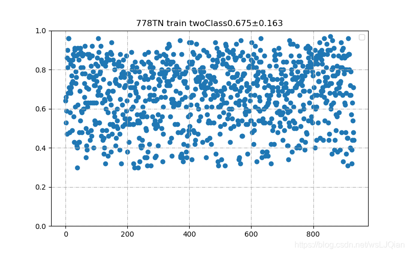
5、绘制散点分布图
# 绘制散点图
import numpy as np
import matplotlib.pyplot as plt
import csv

list_score = []
csvfile = r'F:\stage2_DR_TB\778_class_score.csv'

with open(csvfile, 'r', encoding='gbk') as f:
    # TODO
    # 使用csv.DictReader读取文件中的信息
    reader = csv.DictReader(f)
    for rows in reader:
        classes = rows['class']
        score = rows['score']
        print(classes, score)
        if classes == "0":
            list_score.append(round(float(score), 2))
x=[]
for i in range(len(list_score)):
    x.append(i)
y = list_score
print(x)
print(y)

plt.figure(figsize=(8, 5))
plt.ylim(0, 1)
plt.scatter(x, y)
plt.title("778TN train twoClass"+str(arr_mean)+"±"+str(arr_std))
# 添加图例
plt.legend()
plt.grid(linestyle='-.')

plt.show()
展示如下:
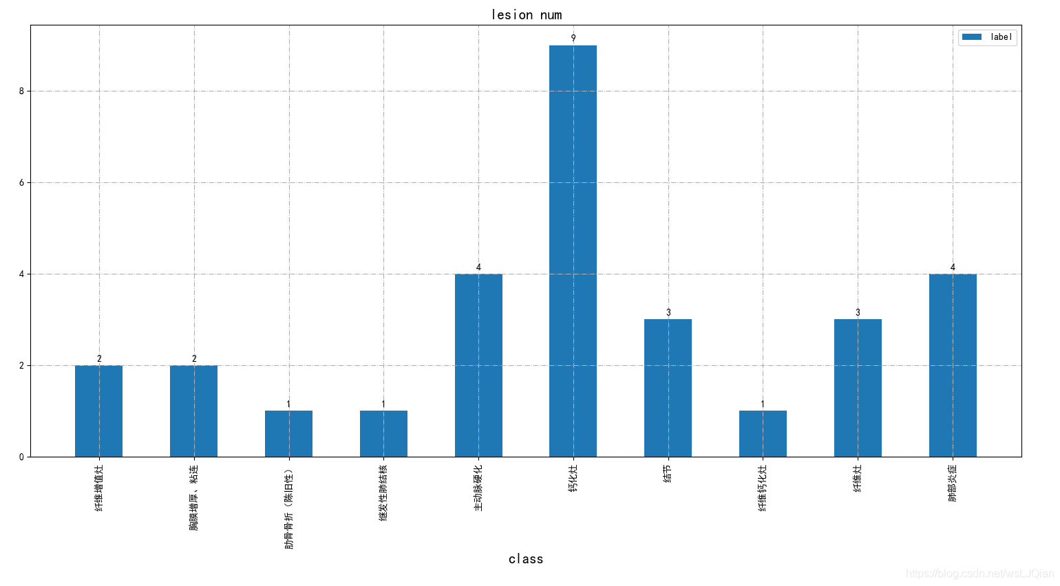
6、调整图像和坐标轴大小与位置
    fig = plt.figure(figsize=(16, 9))
    fig.subplots_adjust(left=0.05, right=0.95, bottom=0.25, top=0.95, wspace=0.05, hspace=0.05)
    plt.bar(x_list, y_list, width=0.5, label="label", align='center')
    for a, b in zip(x_list, y_list):
        plt.text(a, b + 0.05, '%.0f' % b, ha='center', va='bottom', fontsize=10)
    print(len(x_list))
    print(x_list)
    plt.xlabel('class', fontsize=15)
    plt.xticks(rotation=90)  # 倾斜70度
    plt.title('lesion num', fontsize=15)
    plt.legend()
    plt.grid(linestyle='-.')
    #plt.savefig("loss.png")
    plt.show()
展示如下:
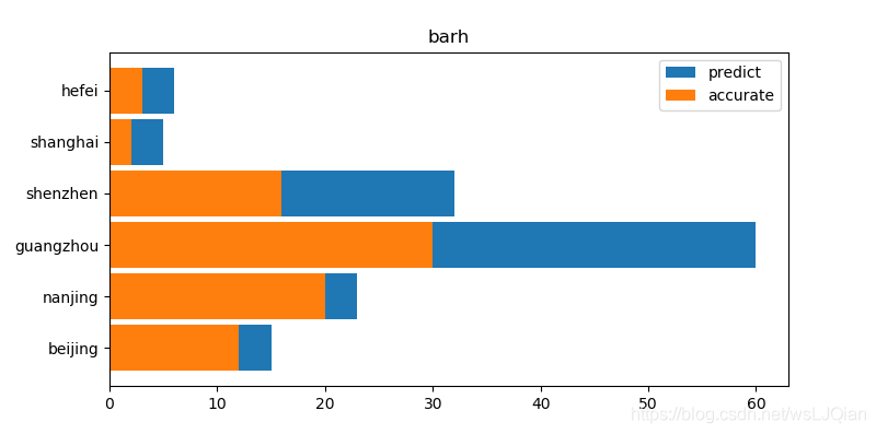
7、barh绘制横状图
import matplotlib.pyplot as plt

plt.figure(figsize=(8, 4))

x_list=['beijing','nanjing','guangzhou','shenzhen','shanghai','hefei']
y1_list=[15,23,60,32,5,6]
y2_list=[12,20,30,16,2,3]
plt.barh(x_list, y1_list, label='predict',height=0.9)
plt.barh(x_list, y2_list, label='accurate',height=0.9)
plt.legend()
plt.title("barh")
plt.show()
展示如下:
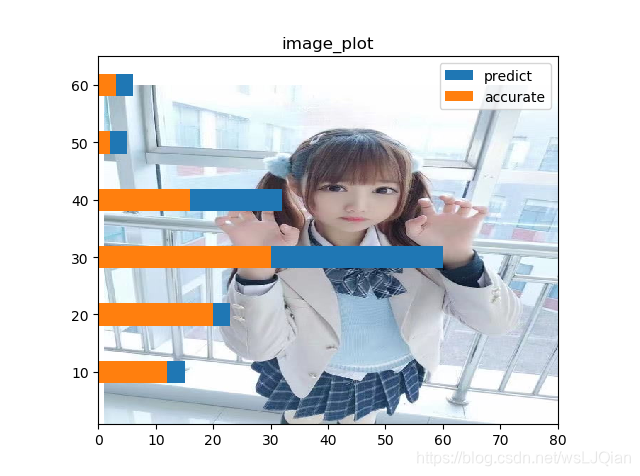
8、给坐标系添加“自定义背景”
import matplotlib.pyplot as plt

img = plt.imread(r"E:\temp\image\image.jpg")
fig, ax = plt.subplots()
ax.imshow(img, extent=[1, 80, 1, 60])

x_list=[10,20,30,40,50,60]
y1_list=[15,23,60,32,5,6]
y2_list=[12,20,30,16,2,3]
plt.barh(x_list, y1_list, label='predict',height=3.9)
plt.barh(x_list, y2_list, label='accurate',height=3.9)

plt.legend()
plt.title("image_plot")
plt.show()
展示如下:
9、拟合散点函数
原始曲线是这样的,我要把其中实线部分给用函数拟合出来
其中,提取了部分坐标点,如下所示:
list_pts_x = [0, 1,  1.5, 2,  2.5, 3, 3.5,  4,
              5,  5.5, 6, 6.5, 7,  7.5, 8, 8.5, 9,
              9.5, 10, 10.5, 11, 11.5,
              12, 12.5, 13, 13.5, 14,
              15, 16, 17, 18, 19]
list_pts_y = [0, 45, 65, 80, 90, 100, 110, 115,
              130, 150, 160, 180, 205, 240, 270, 300, 350,
              400, 450, 500, 560, 640,
              700, 780,  850, 900, 950,
              980, 992, 998, 999, 1000]
下面,就采用np.polyfit, 对散点进行函数拟合,如下代码:
import numpy as np
import matplotlib.pyplot as plt

list_pts_x = [0, 1,  1.5, 2,  2.5, 3, 3.5,  4,
              5,  5.5, 6, 6.5, 7,  7.5, 8, 8.5, 9,
              9.5, 10, 10.5, 11, 11.5,
              12, 12.5, 13, 13.5, 14,
              15, 16, 17, 18, 19]
list_pts_y = [0, 45, 65, 80, 90, 100, 110, 115,
              130, 150, 160, 180, 205, 240, 270, 300, 350,
              400, 450, 500, 560, 640,
              700, 780,  850, 900, 950,
              980, 992, 998, 999, 1000]

z5 = np.polyfit(np.array(list_pts_x), np.array(list_pts_y),  5)  # 用6次多项式拟合
a5, a4, a3, a2, a1, c1 = z5
print(z5)

z6 = np.polyfit(np.array(list_pts_x), np.array(list_pts_y),  6)  # 用6次多项式拟合
b6, b5, b4, b3, b2, b1, c2 = z6
print(z6)


plt.scatter(list_pts_x, list_pts_y, color='black', label="原始数据")
plt.title("拟合曲线图")
plt.rcParams['font.sans-serif'] = ['SimHei']  # 用来正常显示中文标签
plt.rcParams['axes.unicode_minus'] = False  # 用来正常显示负号

x = np.linspace(0, 20)#x取值范围
plt.plot(x, a5*x**5+a4*x**4+a3*x**3+a2*x**2+a1*x+c1, label='5阶拟合曲线图')#以x为取值范围标定横坐标
plt.plot(x, b6*x**6+b5*x**5+b4*x**4+b3*x**3+b2*x**2+b1*x+c2, label='6阶拟合曲线图')#以x为取值范围标定横坐标

plt.legend(loc=2)
plt.show()
这里分别展示了5次多项式和6次多项式拟合的结果,如下所示:

发现6次多项式整体会比较好,只在最后阶段,有一些偏离。
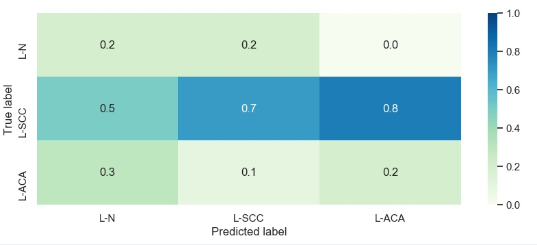
10、seaborn绘制热图
import seaborn as sns
import matplotlib.pyplot as plt
import pandas as pd
sns.set()

f, (ax1, ax2) = plt.subplots(figsize=(10, 8), nrows=2)
x_tick=['L-N',	'L-SCC',	'L-ACA']
y_tick=['L-N',	'L-SCC',	'L-ACA']

X = [[0.2, 0.5, 0.3],
      [0.2, 0.7, 0.1],
      [0, 0.8, 0.2]]
print(X)
data={}
for i in range(3):
    data[x_tick[i]] = X[i]
pd_data = pd.DataFrame(data, index=x_tick, columns=y_tick)
print(pd_data)

sns.heatmap(pd_data, annot=True, vmin=0, vmax=1, cmap = 'GnBu', fmt ='.3')

ax2.set_xlabel('Predicted label')
ax2.set_ylabel('True label')

f.savefig('sns_heatmap_confusion_matrix.jpg', bbox_inches='tight')
显示图像:
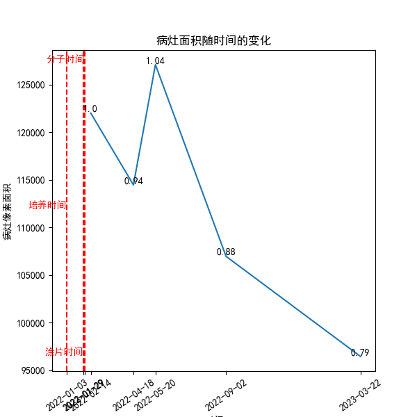
11、绘制随着时间变化的折线
需要用python绘制柱状图,反应随着日期的发展,病灶体积的变化。其中横轴是时间轴,单位是月,纵轴是对应日期测试的病灶体积,单位是立方厘米。重要的一点就是横轴要反应时间的变化。请用python代码,完成我上面要求绘制的柱状图。
def mat_plot(dates, volumes, check_data):
    dates_new = dates+check_data
    volumes = volumes+[0, 0, 0]
    print(dates_new)
    print(volumes)

    plt.figure(figsize=(6, 6))
    # 模拟数据
    # dates = ['2023-1-01', '2023-03-02', '2023-8-03', '2024-01-04']
    # volumes = [10, 15, 12, 17]

    # 将日期转换为 datetime 对象
    dates = [datetime.strptime(date, '%Y-%m-%d') for date in dates_new]

    # 计算日期间隔
    gaps = [(dates[i + 1] - dates[i]).days // 1 if i < len(dates) - 1 else 0 for i in range(len(dates))]

    # 将日期转换为数字
    x_values = []
    current_value = 0
    for i in range(len(dates)):
        x_values.append(current_value)
        current_value += gaps[i] + 1

        print(dates[i], current_value)

    # 绘制柱状图
    print(x_values, volumes)
    plt.plot(x_values[:-3], volumes[:-3])
    if volumes[0]!=0:
        increase_list = [round(volumes[i]/volumes[0], 2) for i in range(len(volumes))]
        for a, b, incre in zip(x_values, volumes, increase_list):
            plt.text(a, b + 0.05, incre, ha='center', va='bottom', fontsize=10)

    # 在特定位置绘制竖直的红色线
    plt.axvline(x=x_values[-1], color='r', linestyle='--')
    plt.text(x_values[-1], max(volumes[:-3]), '分子时间', ha='right', va='bottom', color='r')

    plt.axvline(x=x_values[-2], color='r', linestyle='--')
    plt.text(x_values[-2], int(min(volumes[:-3]) + (max(volumes[:-3])-min(volumes[:-3]))/2), '培养时间', ha='right', va='bottom', color='r')

    plt.axvline(x=x_values[-3], color='r', linestyle='--')
    plt.text(x_values[-3], min(volumes[:-3]), '涂片时间', ha='right', va='bottom', color='r')

    plt.xticks(x_values, [date.strftime('%Y-%m-%d') for date in dates], rotation=35)  # 设置 x 轴刻度为日期
    plt.xlabel('时间')
    plt.ylabel('病灶像素面积')
    plt.title('病灶面积随时间的变化')

    # 显示图形
    # plt.show()
其中,输入数据如下:
dates_new = ['2022-01-28', '2022-03-01', '2022-1-3', '2022-1-3', '2022-1-29']
volumes = [68985.0, 33972.0, 0, 0, 0]
绘制出的图像如下(类似的):
12、总结
本文就python中经常采用了绘图方式进行了汇总介绍,相信如果你也需要这样的数据展示形式,应该是可以直接学习和借鉴的。
最后,如果您觉得本篇文章对你有帮助,欢迎点赞,让更多人看到,这是对我继续写下去的鼓励。如果能再点击下方的红包打赏,给博主来一杯咖啡,那就太好了。


 到【灌水乐园】发言


