


引言
通过CSS,我们可以轻松实现文字颜色的渐变效果
方法一:使用background-clip
这种方法通过设置文字的背景为渐变色,并使用background-clip属性将背景裁剪到文字上,然后设置文字颜色为透明,从而实现文字颜色渐变的效果。
示例代码
.gradient-text {
font-size: 30px;
font-weight: bold;
background: linear-gradient(to right, red, orange, yellow, green, blue, indigo, violet);
background-clip: text;
color: transparent;
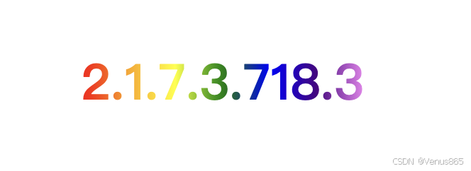
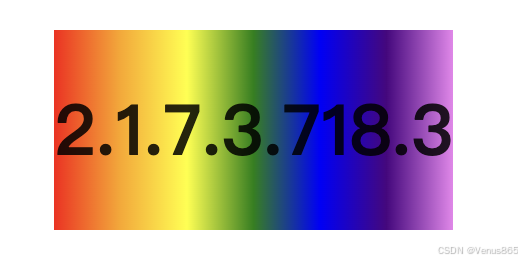
}效果如下,图1添加了background-clip和color属性,图2为没添加的
解释
-
background: linear-gradient(to right, red, orange, yellow, green, blue, indigo);设置背景为从红色到绿色再到蓝色的线性渐变。 -
background-clip: text;:将背景裁剪到文字上。 -
color: transparent;:设置文字颜色为透明,以显示背景的渐变色。
方法二:使用SVG
SVG(可缩放矢量图形)本身支持渐变填充,可以直接在SVG中定义渐变并应用到文字上。
<!DOCTYPE html>
<html lang="en">
<head>
    <meta charset="UTF-8">
    <meta name="viewport" content="width=device-width, initial-scale=1.0">
    <title>SVG Gradient Text</title>
</head>
<body>
    <svg height="100" width="500">
        <defs>
            <linearGradient id="grad1" x1="0%" y1="0%" x2="100%" y2="0%">
                <stop offset="0%" style="stop-color:red;stop-opacity:1" />
                <stop offset="100%" style="stop-color:blue;stop-opacity:1" />
            </linearGradient>
        </defs>
        <text fill="url(#grad1)" font-size="60" font-family="Verdana" x="0" y="70">Gradient Text</text>
    </svg>
</body>
</html>
解释
-
在
<defs>标签中定义了一个线性渐变grad1。 -
使用
<text>标签创建文字,并通过fill="url(#grad1)"将渐变应用到文字上。
拓展
可结合path-clip样式和css动画,添加更炫酷更有趣的展示效果,如
.gradient-text {
      font-size: 30px;
      font-weight: 600;
      background: linear-gradient(to right, red, orange, yellow, green, blue, indigo, violet);
      background-clip: text;
      color: transparent;
      clip-path: circle(0% at 50% 50%);
      animation: clip 5s linear infinite;
}

@keyframes clip {
  0% {
    clip-path: circle(0% at 50% 50%);
  }
  50% {
    clip-path: circle(30% at 50% 50%);
  }
  100% {
    clip-path: circle(100% at 50% 50%);
  }
}


 扫一扫
扫一扫


 777
777

 被折叠的 条评论
为什么被折叠?
被折叠的 条评论
为什么被折叠?
 到【灌水乐园】发言


