matplotlib基础语法
import matplotlib.pyplot as plt
import numpy as np

x = np.linspace(-10,10,100)
x
array([-10.        ,  -9.7979798 ,  -9.5959596 ,  -9.39393939,
        -9.19191919,  -8.98989899,  -8.78787879,  -8.58585859,
        -8.38383838,  -8.18181818,  -7.97979798,  -7.77777778,
        -7.57575758,  -7.37373737,  -7.17171717,  -6.96969697,
        -6.76767677,  -6.56565657,  -6.36363636,  -6.16161616,
        -5.95959596,  -5.75757576,  -5.55555556,  -5.35353535,
        -5.15151515,  -4.94949495,  -4.74747475,  -4.54545455,
        -4.34343434,  -4.14141414,  -3.93939394,  -3.73737374,
        -3.53535354,  -3.33333333,  -3.13131313,  -2.92929293,
        -2.72727273,  -2.52525253,  -2.32323232,  -2.12121212,
        -1.91919192,  -1.71717172,  -1.51515152,  -1.31313131,
        -1.11111111,  -0.90909091,  -0.70707071,  -0.50505051,
        -0.3030303 ,  -0.1010101 ,   0.1010101 ,   0.3030303 ,
         0.50505051,   0.70707071,   0.90909091,   1.11111111,
         1.31313131,   1.51515152,   1.71717172,   1.91919192,
         2.12121212,   2.32323232,   2.52525253,   2.72727273,
         2.92929293,   3.13131313,   3.33333333,   3.53535354,
         3.73737374,   3.93939394,   4.14141414,   4.34343434,
         4.54545455,   4.74747475,   4.94949495,   5.15151515,
         5.35353535,   5.55555556,   5.75757576,   5.95959596,
         6.16161616,   6.36363636,   6.56565657,   6.76767677,
         6.96969697,   7.17171717,   7.37373737,   7.57575758,
         7.77777778,   7.97979798,   8.18181818,   8.38383838,
         8.58585859,   8.78787879,   8.98989899,   9.19191919,
         9.39393939,   9.5959596 ,   9.7979798 ,  10.        ])
1.绘制连续曲线
y=x**2
y
array([1.00000000e+02, 9.60004081e+01, 9.20824406e+01, 8.82460973e+01,
       8.44913784e+01, 8.08182838e+01, 7.72268136e+01, 7.37169677e+01,
       7.02887460e+01, 6.69421488e+01, 6.36771758e+01, 6.04938272e+01,
       5.73921028e+01, 5.43720029e+01, 5.14335272e+01, 4.85766758e+01,
       4.58014488e+01, 4.31078461e+01, 4.04958678e+01, 3.79655137e+01,
       3.55167840e+01, 3.31496786e+01, 3.08641975e+01, 2.86603408e+01,
       2.65381084e+01, 2.44975003e+01, 2.25385165e+01, 2.06611570e+01,
       1.88654219e+01, 1.71513111e+01, 1.55188246e+01, 1.39679625e+01,
       1.24987246e+01, 1.11111111e+01, 9.80512193e+00, 8.58075707e+00,
       7.43801653e+00, 6.37690032e+00, 5.39740843e+00, 4.49954086e+00,
       3.68329762e+00, 2.94867871e+00, 2.29568411e+00, 1.72431385e+00,
       1.23456790e+00, 8.26446281e-01, 4.99948985e-01, 2.55076013e-01,
       9.18273646e-02, 1.02030405e-02, 1.02030405e-02, 9.18273646e-02,
       2.55076013e-01, 4.99948985e-01, 8.26446281e-01, 1.23456790e+00,
       1.72431385e+00, 2.29568411e+00, 2.94867871e+00, 3.68329762e+00,
       4.49954086e+00, 5.39740843e+00, 6.37690032e+00, 7.43801653e+00,
       8.58075707e+00, 9.80512193e+00, 1.11111111e+01, 1.24987246e+01,
       1.39679625e+01, 1.55188246e+01, 1.71513111e+01, 1.88654219e+01,
       2.06611570e+01, 2.25385165e+01, 2.44975003e+01, 2.65381084e+01,
       2.86603408e+01, 3.08641975e+01, 3.31496786e+01, 3.55167840e+01,
       3.79655137e+01, 4.04958678e+01, 4.31078461e+01, 4.58014488e+01,
       4.85766758e+01, 5.14335272e+01, 5.43720029e+01, 5.73921028e+01,
       6.04938272e+01, 6.36771758e+01, 6.69421488e+01, 7.02887460e+01,
       7.37169677e+01, 7.72268136e+01, 8.08182838e+01, 8.44913784e+01,
       8.82460973e+01, 9.20824406e+01, 9.60004081e+01, 1.00000000e+02])
plt.plot(x,y)
plt.show()

x = np.linspace(0,10,100)

y1 = np.sin(x)
y2 = np.cos(x)

plt.plot(x,y1)
plt.plot(x,y2)
plt.show()

plt.plot(x,y1,color = 'pink',linestyle=":")
plt.plot(x,y2)
plt.xlim(-1,12)
plt.ylim(-2,2)
plt.show()

plt.plot(x,y1,color = 'pink',linestyle=":")
plt.plot(x,y2)
plt.axis([-5,15,-2,2])
plt.show()

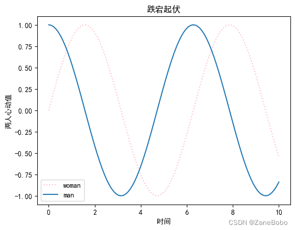
import matplotlib.pyplot as plt
plt.rcParams['font.sans-serif']=['SimHei']
plt.rcParams['axes.unicode_minus']=False
plt.plot(x,y1,color = 'pink',linestyle=":",label="woman")
plt.plot(x,y2,label="man")
plt.xlabel("时间")
plt.ylabel("两人心动值")
plt.legend()
plt.title("跌宕起伏")
plt.show()
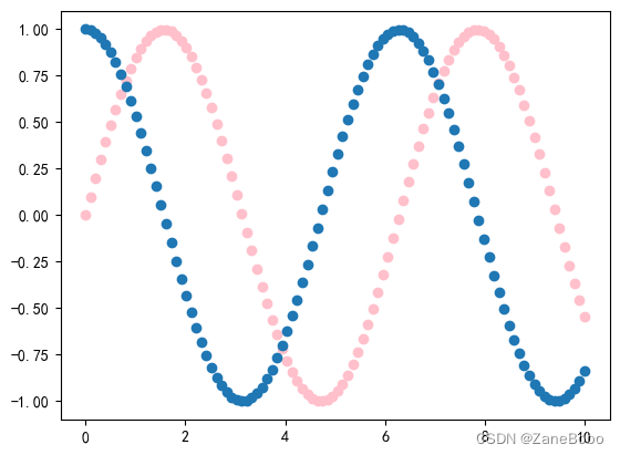
2.绘制离散曲线(用于x和y都是特征的情况,可以看到特征样本的分布)
plt.scatter(x,y1,color = 'pink')
plt.scatter(x,y2)
plt.show()
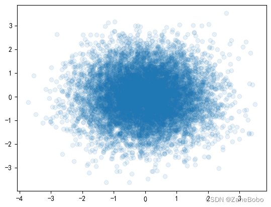
x = np.random.normal(0,1,10000)
y = np.random.normal(0,1,10000)
plt.scatter(x,y,alpha=0.1)
plt.show()


 被折叠的 条评论
为什么被折叠?
被折叠的 条评论
为什么被折叠?
 到【灌水乐园】发言


