


父级边框塌陷
<!DOCTYPE html>
<html lang="en">
<head>
    <meta charset="UTF-8">
    <title>浮动</title>
    <link href="css/style.css" rel="stylesheet" type="text/css">
</head>
<body>
<div id="father">
    <div class="layer1"><img src="images/11..png"></div>
    <div class="layer2"><img src="images/冰洁的aj笑死.jpg"></div>
    <div class="layer3"><img src="images/家里人来看我.jpg"></div>
    <div class="layer4">浮动的盒子可以向左浮动,也可以向右浮动,直到它的外边缘碰到包含框或另一个浮动盒子为止</div>
    <div class="clear"></div>
</div>
</body>
</html>
div{
margin:10px;
padding:5px;
}
#father{
border:1px #000 solid;
/*height:1000px;*/
/*overflow: hidden;*/
/*在父级元素中增加一个overflow 因为这个div没有设置宽和高,所以直接就是取决于子元素*/
}
/*添加一个伪类 after*/
#father:after{
content:'';
display: block;
clear:both;
}
.layer1{
border:1px #F00 dashed;
display: inline-block;
float: left;
}
.layer2{
border:1px #00F dashed;
display: inline-block;
float: left;
}
.layer3{
border:1px #060 dashed;
display: inline-block;
float: right;
}
/*clear right 右侧不允许有浮动元素
clear left 左侧不允许有浮动元素
clear both 两侧不允许有浮动元素
*/
.layer4{
border:1px #666 dashed;
font-size: 12px;
line-height:23px;
display:inline-block;
float: right;
}
/*.clear{*/
/* clear:both;*/
/* margin:0;*/
/* padding:0;*/
/*}*/定位
1 相对定位
<!DOCTYPE html>
<html lang="en">
<head>
    <meta charset="UTF-8">
    <title>Title</title>
  <style>
    #box{
      width:300px;
      height:300px;
      padding:10px;
      border:2px solid red;
    }
    a{
      width:100px;
      text-decoration: none;
      height:100px;
      background-color: #ef7de8;
      line-height: 100px;
      text-align: center;
      display: block;
    }
    a:hover{
      background-color: #5656fc;
    }
    .a2{
      position:relative;
      left:200px;
      bottom:100px;
    }
    .a4{
      position:relative;
      left:200px;
      bottom:100px;
    }
    .a5{
      position:relative;
      left:100px;
      bottom:300px;
    }
  </style>
</head>
<body>
<div id="box">
  <a class="a1" href="#">链接1</a>
  <a class="a2" href="#">链接2</a>
  <a class="a3" href="#">链接3</a>
  <a class="a4" href="#">链接4</a>
  <a class="a5" href="#">链接5</a>
</div>
</body>
</html> 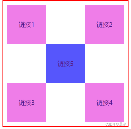
2 绝对定位
<!DOCTYPE html>
<html lang="en">
<head>
  <meta charset="UTF-8">
  <title>Title</title>
  <style>
    body{
      padding:20px;
    }
    div{
      margin: 10px;
      padding:5px;
      font-size:12px;
      line-height: 25px;
    }
    #father{
      border:1px solid #666;
      padding:0;
      /*假设父级元素存在定位,我们通常会相对于父级元素进行偏移*/
      position:relative;
    }
    #first{
      background-color: #a13d30;
      border:1px dashed #C850C0;
    }
    #second{
      background-color: #255099;
      border:1px dashed blue;
      /*没有父级元素定位的前提下,相对于浏览器定位
      相对于父级或者浏览器的位置进行偏移,绝对定位的话,它不在标准文档流中,原来的位置不会被保留
      */
      position:absolute;
      right:0px;
    }
    #third{
      background-color: #1c6699;
      border:1px dashed green;
    }
  </style>
</head>
<body>
<div id="father">
  <div id="first">第一个盒子</div>
  <div id="second">第二个盒子</div>
  <div id="third">第三个盒子</div>
</div>
</body>
</html>
<!DOCTYPE html>
<html lang="en">
<head>
<meta charset="UTF-8">
<title>Title</title>
<style>
body{
height:1000px;
}
div:nth-of-type(1){
width:100px;
height:100px;
background: red;
position: absolute;
right:0;
bottom:0;
}
div:nth-of-type(2){
width:50px;
height:50px;
background: blue;
/*固定定位*/
position: fixed;
right:0;
bottom:0;
}
</style>
</head>
<body>
<div>div1</div>
<div>div2</div>
</body>
</html> 
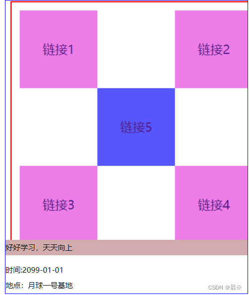
3 z-index
<!DOCTYPE html>
<html lang="en">
<head>
    <meta charset="UTF-8">
    <title>Title</title>
  <link rel="stylesheet" href="css/style.css">
</head>
<body>
<div id="content">
  <ul>
    <li><img src="images/1.png"></li>
    <li class="tipTest">好好学习,天天向上</li>
    <li class="tipBg"></li>
    <li>时间:2099-01-01</li>
    <li>地点:月球一号基地</li>
  </ul>
</div>
</body>
</html>
#content{
width:390px;
padding:0px;
margin:0px;
overflow:hidden;
font-size: 12px;
line-height: 25px;
border:1px solid blue;
}
ul , li{
margin:0px;
padding:0px;
list-style:none; /*去圆点*/
}
#content ul{
position: relative;
}
.tipTest,.tipBg{
position: absolute;
width:390px;
top:385px;
height: 25px;
background: #d2acac;
}
.tipTest{
z-index: 999;
}
.tipBg{
background: #FF0000;
/*透明*/
opacity: 0.5;
}


 扫一扫
扫一扫


 被折叠的 条评论
为什么被折叠?
被折叠的 条评论
为什么被折叠?
 到【灌水乐园】发言


