


1.盒子模型
普通盒子模型: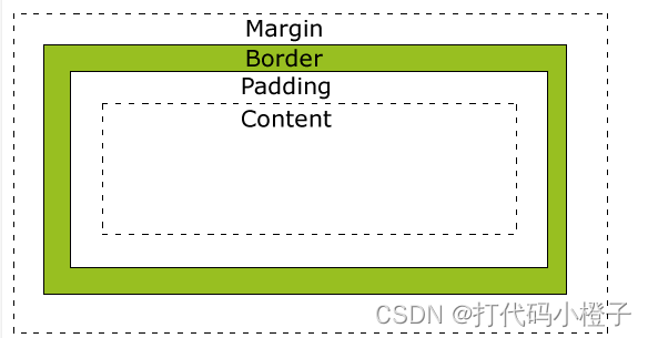
低版本IE盒子模型:根据 W3C 的规范,元素内容占据的空间是由 width 属性设置的,而内容周围的 padding 和 border 值是另外计算的。不幸的是,IE5.X 和 6 在怪异模式中使用自己的非标准模型。这些浏览器的 width 属性不是内容的宽度,而是内容、内边距和边框的宽度的总和。
2.css选择器
- !important > 行内样式 > id选择器 > class类选择器 > 标签和伪元素> 通配选择器
每种选择器的实例
<!DOCTYPE html>
<html lang="en">

<head>
    <meta charset="UTF-8">
    <meta http-equiv="X-UA-Compatible" content="IE=edge">
    <meta name="viewport" content="width=device-width, initial-scale=1.0">
    <title>Document</title>
    <style>
        * {
            background-color: green;
        }

        div {
            background-color: antiquewhite;
        }

        #id {
            width: 200px;
            height: 200px;
            background-color: red;
        }

        .class {
            background-color: aqua !important;
        }

        #father:first-child {
            background-color: black;
        }
    </style>
</head>

<body>
    <div id="father">
        <!-- !important > 行内样式 > id选择器 > class类选择器 > 标签和伪元素> 通配选择器 -->
        <div id="id" class="class" style="background-color: blueviolet;"></div>
    </div>
</body>

</html>
3.CSS选择器中的单冒号和双冒号:
<!DOCTYPE html>
<html lang="en">

<head>
    <meta charset="UTF-8">
    <meta http-equiv="X-UA-Compatible" content="IE=edge">
    <meta name="viewport" content="width=device-width, initial-scale=1.0">
    <title>Document</title>
    <style>
        #test {
            width: 400px;
            height: 400px;
            background-color: aqua;
            transition: all 1s;
        }

        #test:hover {
            width: 800px;
            height: 800px;
        }

        #test::after {
            content: "111";
            display: block;
            width: 200px;
            height: 200px;
            background-color: blue;
        }
        #test::before {
            content: "222";
            display: block;
            width: 200px;
            height: 200px;
            background-color: rgb(255, 0, 221);
        }
    </style>
</head>

<body>
    <div id="test"></div>
    <script>
    </script>
</body>

</html>
css3中,单冒号就是伪类,双冒号就是伪元素。
4.画一个三角形/画一个扇形/一个平行四边形(只用css和html)
<!DOCTYPE html>
<html lang="en">

<head>
    <meta charset="UTF-8">
    <meta http-equiv="X-UA-Compatible" content="IE=edge">
    <meta name="viewport" content="width=device-width, initial-scale=1.0">
    <title>Document</title>
    <style>
        #demo1 {
            width: 0;
            height: 0;
            border-top: 100px solid transparent;
            border-left: 100px solid transparent;
            border-right: 100px solid transparent;
            border-bottom: 100px red solid;
        }

        #demo2 {
            width: 0;
            height: 0;
            border-top: 100px solid transparent;
            border-left: 100px solid transparent;
            border-right: 100px solid transparent;
            border-bottom: 100px palegreen solid;
            border-radius: 100px;
        }

        #demo3 {
            margin-top: 20px;
            width: 200px;
            height: 200px;
            background-color: rgb(45, 31, 177);
            transform: skewX(45deg);
        }
        div{
            margin: 0 auto;
        }
    </style>
</head>

<body>
    <div id="demo1"></div>
    <div id="demo2"></div>
    <div id="demo3"></div>
</body>

</html>
5. CSS可继承属性
1、字体系列属性
font-family:字体系列
font-weight:字体的粗细
font-size:字体的大小
font-style:字体的风格
2、文本系列属性
text-indent:文本缩进
text-align:文本水平对齐
line-height:行高
word-spacing:单词之间的间距
letter-spacing:中文或者字母之间的间距
text-transform:控制文本大小写(就是uppercase、lowercase、capitalize这三个)
color:文本颜色
3、元素可见性:
visibility:控制元素显示隐藏
4、列表布局属性:
list-style:列表风格,包括list-style-type、list-style-image等
5、光标属性:
cursor:光标显示为何种形态
6. CSS3的新特性
这个很细致,就不重写了。
CSS3新特性有哪些?_Schafferyy的博客-优快云博客_css3有哪些新特性
7. BFC(Block Formatting Context)块级格式化上下文
解释
BFC就是页面上的一个隔离的独立容器,容器里面的子元素不会影响到外面的元素。 我们经常使用到BFC,只不过不知道它是BFC而已。也是浮动交互的区域。
创建方式:
浮动元素(元素的float不是 none,指定float为left或者right就可以创建BFC)
绝对定位元素(元素的 position 为 absolute 或 fixed)
display:inline-block,display:table-cell,display:flex,display:inline-flex
overflow指定除了visible的值
————————————————
版权声明:本文为优快云博主「webchang」的原创文章,遵循CC 4.0 BY-SA版权协议,转载请附上原文出处链接及本声明。
原文链接:https://blog.youkuaiyun.com/weixin_43974265/article/details/115416184
特点
在BFC中,块级元素从顶端开始垂直地一个接一个的排列。(当然了,即便不在BFC里块级元素也会垂直排列)
如果两个块级元素属于同一个BFC,它们的上下margin会重叠(或者说折叠),以较大的为准。但是如果两个块级元素分别在不同的BFC中,它们的上下边距就不会重叠了,而是两者之和。
BFC的区域不会与浮动的元素区域重叠,也就是说不会与浮动盒子产生交集,而是紧贴浮动边缘。
计算BFC的高度时,浮动元素也参与计算。BFC可以包含浮动元素。(利用这个特性可以清除浮动)
BFC就是页面上的一个隔离的独立容器,容器里面的子元素不会影响到外面的元素。
————————————————
版权声明:本文为优快云博主「webchang」的原创文章,遵循CC 4.0 BY-SA版权协议,转载请附上原文出处链接及本声明。
原文链接:https://blog.youkuaiyun.com/weixin_43974265/article/details/115416184
使用BFC的场景
(1)margin重叠
<!DOCTYPE html>
<html lang="en">

<head>
    <meta charset="UTF-8">
    <meta http-equiv="X-UA-Compatible" content="IE=edge">
    <meta name="viewport" content="width=device-width, initial-scale=1.0">
    <title>Document</title>
    <style>
        .box {
            width: 100px;
            height: 100px;
            margin: 100px;
            background-color: aquamarine;
        }

        .wrap {
            overflow: hidden;
        }
        .test{
            border: 1px solid;
        }
    </style>
</head>

<body>
    <!-- 重叠的 -->
    <div class="test">
        <div class="box"></div>
        <div class="box"></div>
    </div>
    <!-- 使用bfc避免的 -->
    <div class="test">
        <div class="wrap">
            <div class="box"></div>
        </div>
        <div class="box"></div>
    </div>
</body>

</html>
(2)清除浮动
<!DOCTYPE html>
<html lang="en">

<head>
    <meta charset="UTF-8">
    <meta http-equiv="X-UA-Compatible" content="IE=edge">
    <meta name="viewport" content="width=device-width, initial-scale=1.0">
    <title>Document</title>
    <style>
        .main {
            border: 1px solid;
            overflow: hidden;
        }

        .box {
            width: 200px;
            height: 200px;
            background-color: red;
        }

        .float {
            float: right;
        }
    </style>
</head>

<body>
    <div class="main">
        <div class="box"></div>
        <div class="box float"></div>
    </div>
</body>

</html>
8. 浮动
CSS布局(四) float详解 - duwei76 - 博客园
浮动定义
浮动的框可以向左或向右移动,直到它的外边缘碰到包含框或另一个浮动框的边框为止。
由于浮动框不在文档的普通流中,所以文档的普通流中的块框表现得就像浮动框不存在一样。
浮动最初做出来是为了文字环绕效果。
浮动的影响
浮动的影响主要是浮动元素会脱离文档流。
具体为
1. 高度坍塌
<!DOCTYPE html>
<html lang="en">

<head>
    <meta charset="UTF-8">
    <meta http-equiv="X-UA-Compatible" content="IE=edge">
    <meta name="viewport" content="width=device-width, initial-scale=1.0">
    <title>Document</title>
    <style>
        .test{
            background-color: aquamarine;
        }
        .box1,
        .box2 {
            width: 200px;
            height: 200px;
            border: 1px solid;
        }

        .box2 {
            float: left;
        }
    </style>
</head>

<body>
    <!-- 高度坍塌 -->
    <div class="test">
        <div class="box1"></div>
        <div class="box2"></div>
    </div>
</body>

</html>
效果图为
显然我们的父元素高度没有包括我们的box2,因为box2脱离了文档流。
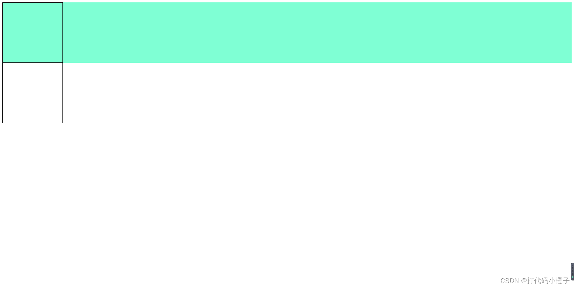
2. div宽度变化
<!DOCTYPE html>
<html lang="en">

<head>
    <meta charset="UTF-8">
    <meta http-equiv="X-UA-Compatible" content="IE=edge">
    <meta name="viewport" content="width=device-width, initial-scale=1.0">
    <title>Document</title>
    <style>
        div {
            background-color: red;
            border: 1px solid;
        }
        .float{
            float: left;
        }
    </style>
</head>

<body>
    <div>1234</div>
    <div class="float">1234</div>
</body>

</html>
效果图

原则上来讲,div不设置宽度的画都是撑满父元素,但是设置浮动之后div的宽度就会变为内容宽度。
3. 清除图片直接的空格
清除浮动(常考)
<!DOCTYPE html>
<html lang="en">
<head>
<meta charset="UTF-8">
<meta http-equiv="X-UA-Compatible" content="IE=edge">
<meta name="viewport" content="width=device-width, initial-scale=1.0">
<title>Document</title>
<style>
.main {
border: 1px solid rgb(219, 35, 179);
margin-top: 10px;
}
.float {
float: left;
width: 200px;
height: 200px;
background-color: red;
}
.height {
height: 200px;
}
.box {
height: 200px;
}
.BFC {
/* display: inline-block; */
overflow: hidden;
/* position: absolute; */
}
.VEle::after {
content: "";
display: block;
clear: both;
}
</style>
</head>
<body>
<!-- 直接设置高度 -->
<div class="main height">
<div class="float">float</div>
</div>
<!-- 底部放入一个div撑住 -->
<div class="main">
<div class="float">float</div>
<div class="box"></div>
</div>
<!-- BFC -->
<div class="main BFC">
<div class="float">float</div>
</div>
<!-- 伪元素 -->
<div class="main VEle">
<div class="float">float</div>
</div>
</body>
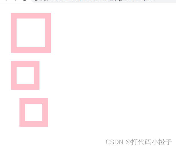
</html>9. box-size属性
(1)box-sizing: content-box; //默认值 内容真正宽度 = 设置的宽度
解释一下就是,我们设置的width实际上是内容的宽度,当我们设置padding,border时盒子会被撑开。
(2) box-sizing: border-box; 设置的padding,border包括在我们设置的宽度内。
(3)box-sizing: inherit;// 规定从父元素继承此值
例子:
<!DOCTYPE html>
<html lang="en">

<head>
    <meta charset="UTF-8">
    <meta http-equiv="X-UA-Compatible" content="IE=edge">
    <meta name="viewport" content="width=device-width, initial-scale=1.0">
    <title>Document</title>
    <style>
        div {
            margin: 30px;
        }

        .box1 {
            width: 100px;
            height: 100px;
            border: 20px solid pink;
            box-sizing: content-box;
        }

        .box2 {
            width: 100px;
            height: 100px;
            border: 20px solid pink;
            padding: 20px;
            box-sizing: border-box;
        }

        .box3 {
            box-sizing: border-box;
        }

        .box4 {
            width: 100px;
            height: 100px;
            border: 20px solid pink;
            padding: 20px;
            box-sizing: inherit;
        }
    </style>
</head>

<body>
    <div class="box1"></div>
    <div class="box2"></div>
    <div class="box3">
        <div class="box4"></div>
    </div>
</body>

</html>
效果
10. CSS有哪些单位?
CSS 有两种类型的长度单位:相对和绝对。设置 CSS 长度的属性有 width, margin, padding, font-size, border-width, 等。
相对长度:
单位 描述
em 它是描述相对于应用在当前元素的字体尺寸,所以它也是相对长度单位。一般浏览器字体大 小默认为16px,则2em == 32px;
rem 是根 em(root em)的缩写,rem作用于非根元素时,相对于根元素字体大小;rem作用于 根元素字体大小时,相对于其出初始字体大小。
vh viewpoint height,视窗高度,1vh=视窗高度的1%
vw viewpoint width,视窗宽度,1vw=视窗宽度的1%
vmin vw和vh中较小的那个。
vmax vw和vh中较大的那个。
% 相对父元素
————————————————
版权声明:本文为优快云博主「老吴与小仙」的原创文章,遵循CC 4.0 BY-SA版权协议,转载请附上原文出处链接及本声明。
原文链接:https://blog.youkuaiyun.com/pengxian00007/article/details/116716226
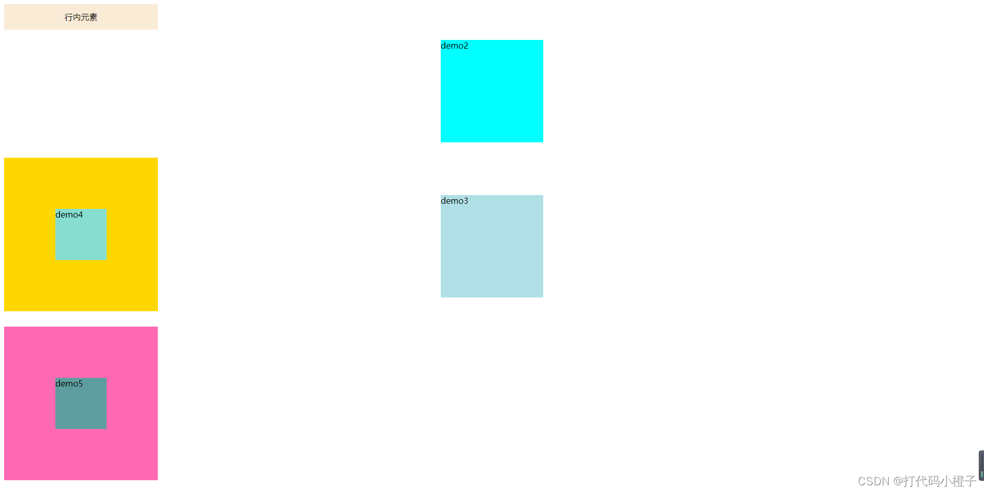
11. 元素居中
(1) 行内元素或行内块元素居中----demo1
(2) 块级元素居中----demo2
(3) 绝对定位元素居中----demo3
(4) flex居中----demo4
(4) grid居中(纯有毛病,但是看起来很厉害)----demo5
代码
<!DOCTYPE html>
<html lang="en">

<head>
    <meta charset="UTF-8">
    <meta http-equiv="X-UA-Compatible" content="IE=edge">
    <meta name="viewport" content="width=device-width, initial-scale=1.0">
    <title>Document</title>
    <style>
        .demo1 {
            text-align: center;
            line-height: 50px;
            height: 50px;
            width: 300px;
            background-color: antiquewhite;
            margin-bottom: 20px;
        }

        .demo2 {
            margin: 0 auto;
            width: 200px;
            height: 200px;
            background-color: aqua;
        }

        .demo3 {
            position: absolute;
            width: 200px;
            height: 200px;
            top: 50%;
            left: 50%;
            transform: translate(-50%, -50%);
            background-color: powderblue;
        }

        .demo4 {
            margin-top: 30px;
            width: 300px;
            height: 300px;
            display: flex;
            justify-content: center;
            align-items: center;
            background-color: gold;
        }

        .demo4-child {
            width: 100px;
            height: 100px;
            background-color: rgb(135, 222, 208);
        }

        .demo5 {
            display: grid;
            grid-template-columns: repeat(3, 33.33%);
            grid-template-rows: repeat(3, 33.33%);
            grid-template-areas: 'a b c'
                'd e f'
                'g h i';
            width: 300px;
            height: 300px;
            margin-top: 30px;
            background-color: hotpink;
        }

        .demo5-child {
            grid-area: e;
            background-color: cadetblue;
        }
    </style>
</head>

<body>
    <div class="demo1"><span>行内元素</span></div>
    <div class="demo2">demo2</div>
    <div class="demo3">demo3</div>
    <div class="demo4">
        <div class="demo4-child">demo4</div>
    </div>
    <div class="demo5">
        <div class="demo5-child">demo5</div>
    </div>
</body>

</html>
效果图
12. 块级元素
常见的块级元素
<div>、<p>、<h1>...<h6>、<ol>、<ul>、<dl>、<table>、<address>、<blockquote> 、<form>。
块级元素的特点:
每个块级元素都是独自占一行,其后的元素也只能另起一行,并不能两个元素共用一行。元素的高度、宽度、行高和顶底边距都是可以设置的。元素的宽度如果不设置的话,默认为父元素的宽度。
13. 行内元素(内联元素)
常见的行内元素
简单说就是常见的 <a> <input> <code> <img> <span>
行内元素的特点
行内元素的水平方向的padding-left,padding-right,margin-left,margin-right 都产生边距效果,但是竖直方向的padding-top,padding-bottom,margin-top,margin-bottom都不会产生边距效果。(水平方向有效,竖直方向无效)
————————————————
版权声明:本文为优快云博主「u013514659」的原创文章,遵循CC 4.0 BY-SA版权协议,转载请附上原文出处链接及本声明。
原文链接:https://blog.youkuaiyun.com/u013514659/article/details/90902179
14. position定位
static:静态定位(默认值),正常文档流定位,不脱离文档流
relative:相对定位,即元素相对于自身的位置进行定位,不脱离文档流
absolute:绝对定位,相对于 static 定位以外的第一个父元素进行定位,脱离文档流
fixed:固定定位,根据屏幕视口的位置来定位,脱离文档流
inherit:这种方式规定该元素继承父元素的position属性值。 (不常用)
sticky: 粘性定位,基于用户的滚动位置来定位。基本上,可以看出是position:relative和position:fixed的结合体——当元素在屏幕内,表现为relative,当元素要滚出显示器屏幕时,表现为fixed。必须指定 top, right, bottom 或 left 四个属性中的其中一个,粘性定位才会生效。否则其行为与相对定位相同。且元素不会脱离文档流。
————————————————
版权声明:本文为优快云博主「一鹿有你~」的原创文章,遵循CC 4.0 BY-SA版权协议,转载请附上原文出处链接及本声明。
原文链接:https://blog.youkuaiyun.com/qq_33207292/article/details/117531199
实例
<!DOCTYPE html>
<html lang="en">

<head>
    <meta charset="UTF-8">
    <meta http-equiv="X-UA-Compatible" content="IE=edge">
    <meta name="viewport" content="width=device-width, initial-scale=1.0">
    <title>Document</title>
    <style>
        body {
            height: 3000px;
        }

        div {
            width: 200px;
            height: 200px;
            border: 1px salmon solid;
        }

        .absolute {
            position: absolute;
            top: 30%;
            left: 30%;
            background-color: aqua;
        }

        .fixed {
            position: fixed;
            top: 0%;
            left: 0%;
            background-color: rgb(76, 0, 255);
        }

        .relative {
            position: relative;
            top: 0%;
            left: 20%;
            background-color: rgb(255, 0, 140);
        }

        .static {
            position: static;
            background-color: aqua;
        }

        .sticky {
            position: sticky;
            top: 300px;
            background-color: blanchedalmond;
        }
    </style>
</head>

<body>
    <div class="absolute">absolute</div>
    <div class="fixed">fixed</div>
    <div class="relative">relative</div>
    <!-- 被上一个相对定位的盒子挤下去了 这俩都不脱离文档流 -->
    <div class="static">static</div>
    <div class="sticky">sticky</div>
</body>

</html>
15. flex布局
这个非常详细
这里有个非常能考的属性 flex-basis 可以看下面这篇文章
flex-basis_奔跑吧、GZB的博客-优快云博客_flex-basis
flex-basis默认作用在content box上,IE11会忽略box-sizing;width只是flex-basis为auto时候间接生效,其余时候使用优先级更高的flex-basis属性值;- flex子项元素尺寸还与元素内容自身尺寸有关,即使设置了
flex-basis属性值; flex-basis数值属性值和width数值属性值不要同时使用;flex-basis还支持很多关键字属性,只不过目前兼容性不太好;flex-basis使用得当可以实现类似min-width/max-width的效果。
16. grid布局
17. 写个等比例盒子
<!DOCTYPE html>
<html lang="en">

<head>
    <meta charset="UTF-8">
    <meta http-equiv="X-UA-Compatible" content="IE=edge">
    <meta name="viewport" content="width=device-width, initial-scale=1.0">
    <title>Document</title>
    <style>
        #demo1 {
            width: 10vw;
            height: 20vw;
            background-color: aquamarine;
        }

        #demo2 {
            width: 20%;
            padding-bottom: 40%;
            background-color: blueviolet;
        }
    </style>
</head>

<body>
    <div id="demo1">
        <div id="child1"></div>
    </div>
    <div id="demo2"></div>
</body>

</html>


 扫一扫
扫一扫


 3172
3172

 被折叠的 条评论
为什么被折叠?
被折叠的 条评论
为什么被折叠?
 到【灌水乐园】发言


