


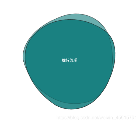
核心代码border-radius, 以及animation:
<!DOCTYPE html>
<html>
	<head>
		<meta charset="utf-8">
		<title>转啊转</title>
		<style type="text/css">
			html,body,div,a,p,span,ul,li {
				padding: 0;
				margin: 0;
				list-style: none;
				text-decoration: none;
				font-family: monospace;
			}
			.center {
				width: 500px;
				height: 500px;
				margin: 50px auto;
				line-height: 500px;
				text-align: center;
				position: relative;
			}
			.moveing1, .moveing2, .moveing3 {
				position: absolute;
				width: 300px;
				height: 300px;
				top: 20%;
				left: 20%;
				border: 1px solid #eee;
				background-color: rgba(10, 120, 120, .6);
				z-index: -1;

			}
			.moveing1 {
				border-radius: 38% 62% 63% 37% / 41% 44% 56% 59%;
				animation: anim 4s linear infinite;
			}
			.moveing2 {
				border-radius: 38% 62% 63% 37% / 41% 44% 56% 59%;
				animation: anim2 3s linear infinite;
			}
			.moveing3 {
				border-radius: 38% 62% 63% 37% / 41% 44% 56% 59%;
				animation: anim 4s linear infinite;
			}
			.text {
				color: white;
			}
			@keyframes anim{
				from{
					transform: rotate(0deg);
				}
				to{
					transform: rotate(360deg);
				}
			}
			@keyframes anim2{
				from{
					transform: rotate(360deg);
				}
				to{
					transform: rotate(0deg);
				}
			}
		</style>
	</head>
	<body>
		<div class="center">
			<span class="moveing1"></span>
			<span class="moveing2"></span>
			<span class="moveing3"></span>
			<div class="text">
				旋转的球
			</div>
		</div>
	</body>
</html>
效果图:


 扫一扫
扫一扫


 4271
4271

 被折叠的 条评论
为什么被折叠?
被折叠的 条评论
为什么被折叠?
 到【灌水乐园】发言


